Norah

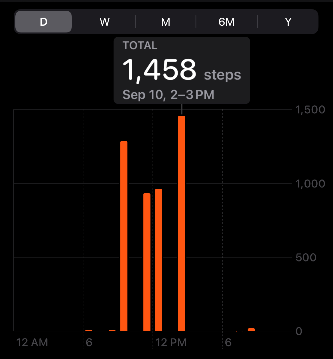
For my 1km project, I watched the full 45-minute episode, season 3 episode 6 “The Ambush” of Real Housewives Of New York. In this time frame, I recorded every time a housewife’s name was mentioned in my notebook. After recording multiple 1km walks I found it takes me about 1500 steps to walk a kilometre, I tallied up the names and number of times mentioned until I got to 150 names mentioned, then I took ten steps for each name in order to take 1500 steps for a kilometre of housewives!
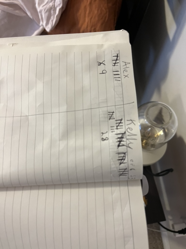
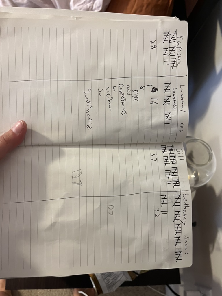
I watch Housewives in the background while doing mundane tasks like laundry, cleaning, cooking etc. Because of this, I find these boring activities entertaining and associate memories of me cleaning and taking care of myself (and my surroundings) with the names and voices of the cast of Real Housewives as they argue over ridiculous things. Additionally, I found it interesting how the number of times certain cast members are mentioned reflects their involvement in the drama or conflict of the episode.

Questions:

  1. Post an image from one of Rist’s videos that you are most interested in. Summarize the action of the video. Who is performing, and how? Describe the images – including framing, colours, and movement. How did she shoot and edit the video? Describe the sound and how it interacts/enhances/competes with the images. How is it installed in a gallery – in terms of projection/scale/presentation in the context of other things? How does the work strike you?

This image of Rist’s “Open My Glade” being displayed in Times Square is quite eye-catching and particularly stuck with me. The video consists of Rist pressing her face against the glass as if she is stuck and trying to escape face first. Her eyes are captivating and it feels as if she is looking directly at you, this can be due to the large scale of the artwork as well as the artist’s facial expressions. 

This artwork stands out due to its political relevance. At the time of this display in Times Square, Trump was a month away from being sworn into office as the president. The shock that a man who publicly treats and talks about women the way that Donald Trump does, could be voted to be leader of a country is not only deeply disappointing but very scary for women. The artwork is political because of the way Rist presents herself as a woman, messy, smeared makeup, ‘grotesque’, improper, etc. This goes against the many societal beauty standards that we are used to seeing when we see women on Times Square building boards (for example, Cindy Crawford down below). The theme of feminism in Rist’s artwork is not uncommon and very near and dear to the artist’s heart. Rist herself remembers women in Switzerland gaining the right to vote in national elections (1971), it is perhaps due to Rist’s upbringing in a country with a hundred-year battle for female equality that formed her innately bold and feminine style of performance art. In many ways, the message of “Open My Glade” can be applied and compared to both the past and present political and social views of women worldwide.

Cindy Crawford Times Square 

  1. Rist has had a long career in video art making – how do you relate it to the kinds of video that you might see all the time on Tik Tok or You Tube, in our time? Reflect on her performances and also – on her ideas (particularly about women’s bodies, and sexuality, exposure, behaving strangely or subversively…) and how they play out from examples in her works.

Rist’s style of video art is often a display of female freedom and independence. Rist’s videos often feature bright saturated colours that catch the eye and light up the screen making the videos more attractive to viewers. 

Rist challenges what is socially acceptable for women exposing herself emotionally and physically to the world, as a woman. Her video creations paved the way for feminist video culture and continued to influence women on a large scale. For example, Beyonce used one of Rist’s feminist videos where the artist smashes a car window with a flower and recrated the scenery with a bat, this music video was huge and the message of the song was rooted in female independence, rage and strength, just like the message from the original video “Ever is Over all”. Therefore, we see her artistic work directly referenced in video culture today.

  1. Experiment: While still at school – put on your sweater/shirt INSIDE OUT. How does this change how you feel? Is it changing how other’s are treating you? If you can wear your sweater/shirt inside out all day – make a few notes about the results of this very small change in your presentation in public. Is this a performance? Why?

Last Thursday I worse my sweater inside out to my European cinema class, only one person said anything, my friend breeze, but other than that not much different happened I guess it was due to the sweater I picked not being as noticeably inside out as other sweatshirt designs. 

September 27th Field Trip Blog Post:
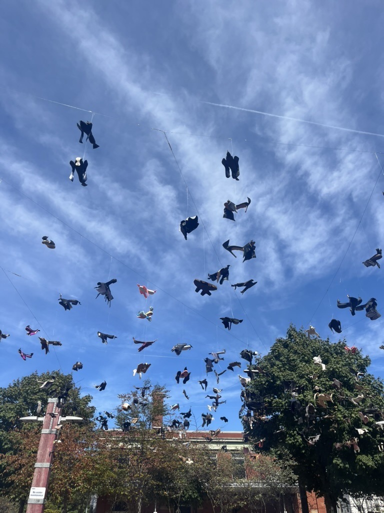
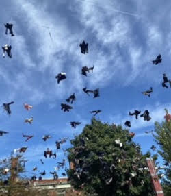
On the field trip I found Maria Ezcurra’s Passing, 2020, quite interesting and eye-catching. The placement and design of the shoes make the figures look very similar to birds mid-flight and the artist’s ability to create motion out of motionless objects is incredibly impressive!! Not only does the physical artwork mimic real-life birds in flight but the shadows below the shoes also mimic the shoes’ bird like form. This artwork not only beautiful to look at but has a very personal connection to the artist as the artwork is about Maria’s experience as an immigrant and migrating to a different place. Maria is a Mexican-Candian artist who is currently living and working in Montreal. the deconstructed shoes are used to represent the strength and vulnerability of the many people and populations who migrate. The shoes can be used to represent the journey of migration as well as the birds themselves being the biggest representation of migration as many birds migrate yearly to survive and avoid the cold winters in Canada (for example). This artwork draws attention to the strength and resilience of migrant populations as well as the migratory experience and it’s connection to one’s social, economic, environmental and political aspects of life. Overall this art work is very bold in presence as well as it’s message!

video project:

For this project, my partner and I explored traditionally “gross” table manners/behaviours. The videos focus on women’s behaviour and the societal expectations set (specifically) for women to follow. The setting is meant to replicate a dining table with the performer on one end and the viewer on the other, as if the audience is dining with the person on screen. The audience is supposed to feel as if they are in real time eating a meal with the performer as they display improper table manners.

NEW Sequence.mov

One Shot.mov

Loop no sound.mov

audio project:

The zipper was first introduced as a scandalous idea, in A Huxley’s Brave New World to show the sexual advancement society has made the author included zippers in the characters’ wardrobes. Zippers at the time of the novel’s release were considered scandalous as they (unlike buttons) were easier to get off and therefore attached to the idea of quick nudity easy (access to) sex and sexual liberty. Just as in Huxley’s novel, my own personal use of zippers is meant to provoke the scandalous connotations that zippers were originally introduced with. Additionally the idea was for the sounds of the zipper to overwhelm/overstimulate the audience and provoke a sense of discomfort, just as the idea of zippers would have 60-80 years ago. Additionally, the sound of the zippers is meant to be overwhelming and replicate the commotion and constant rush of the brain. For my second attempt, I went with a slow zipper to further my original idea/concept of zippers and the connection the this clothing based device and sexuality and or sensuality.

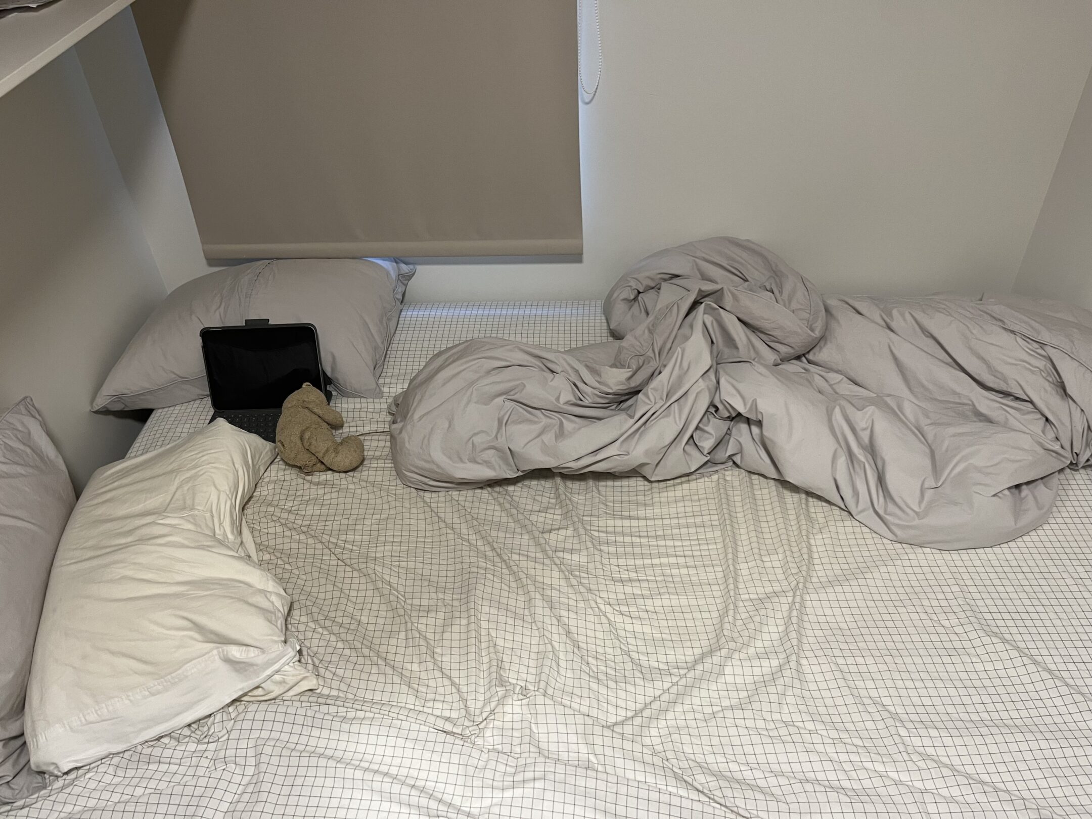
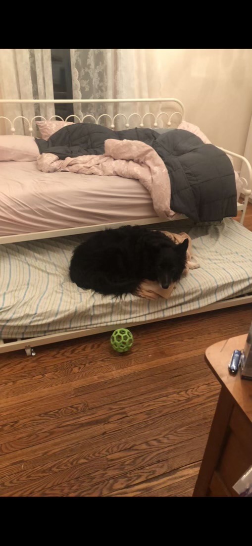
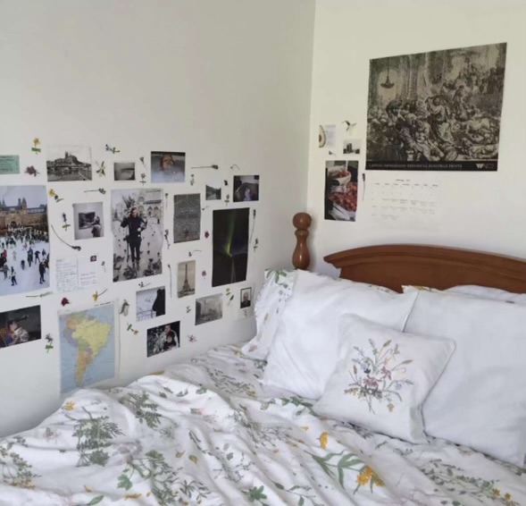
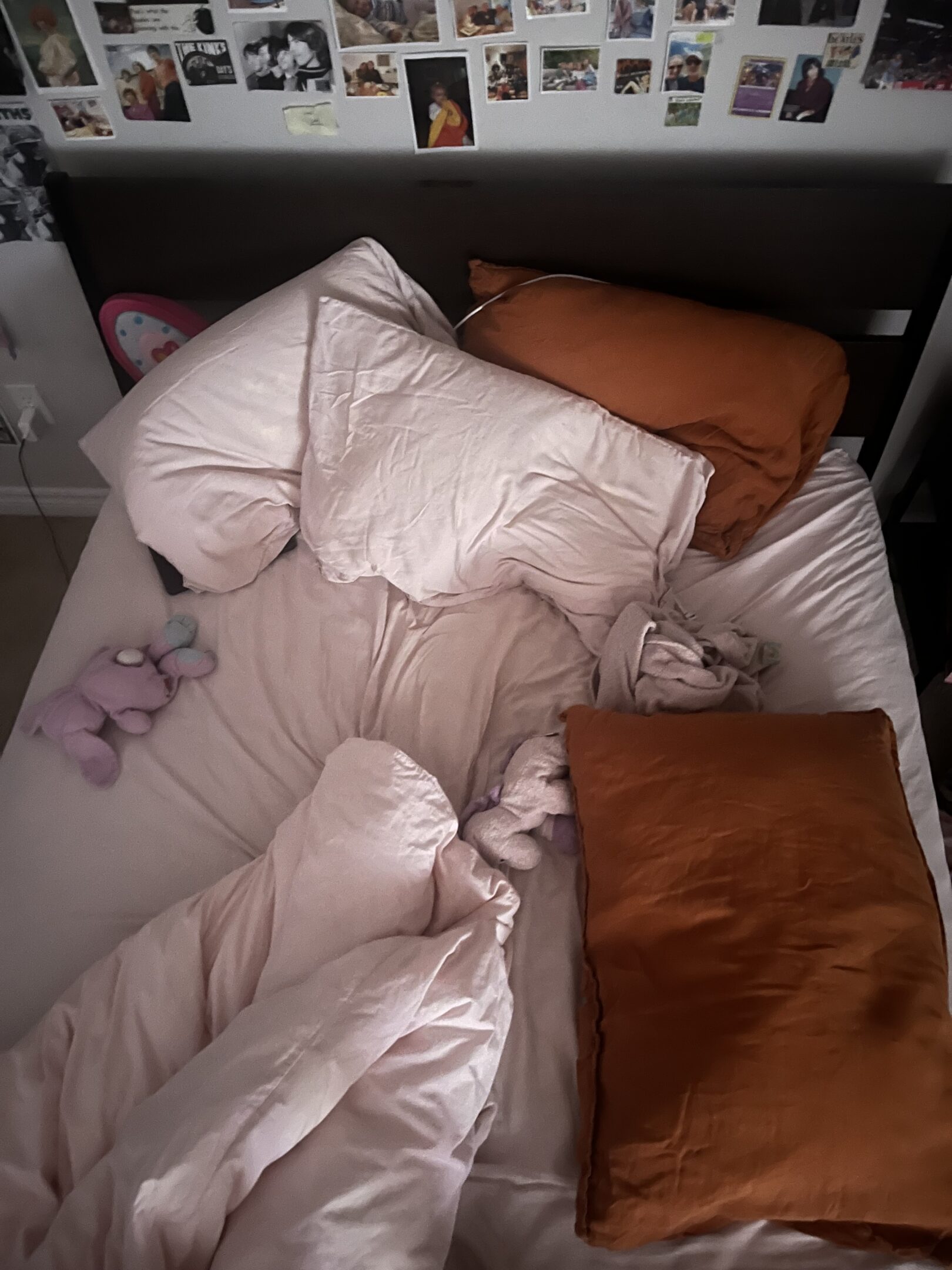
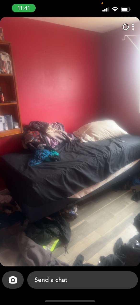
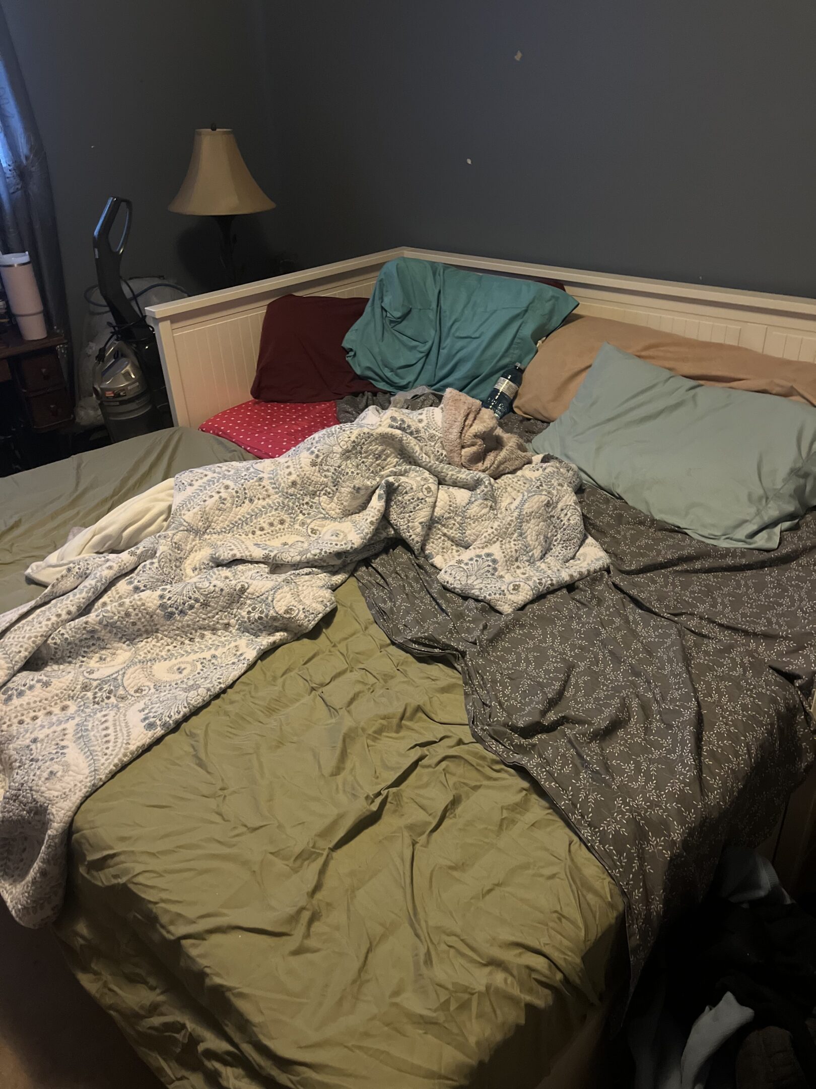
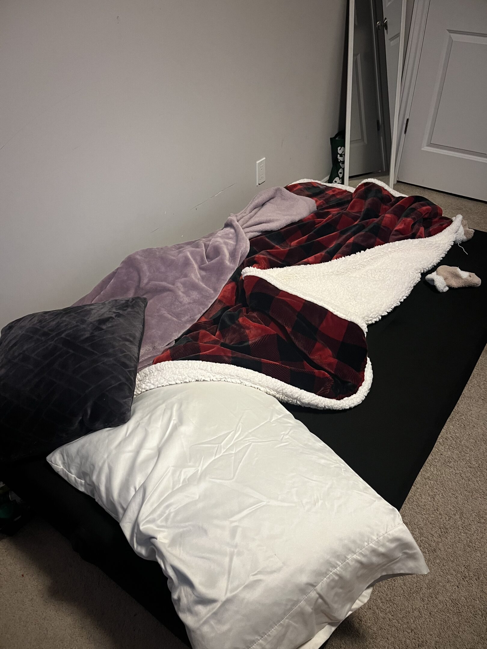
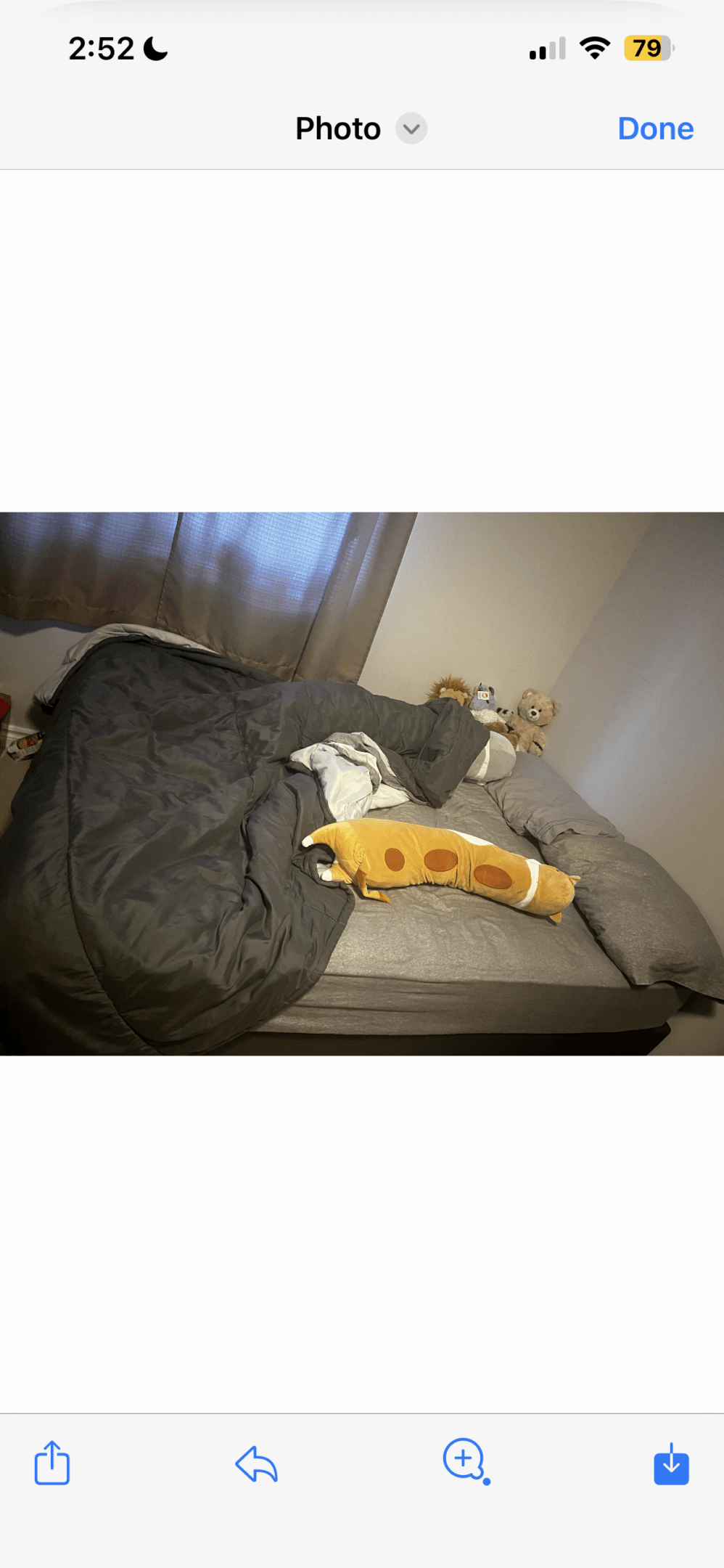
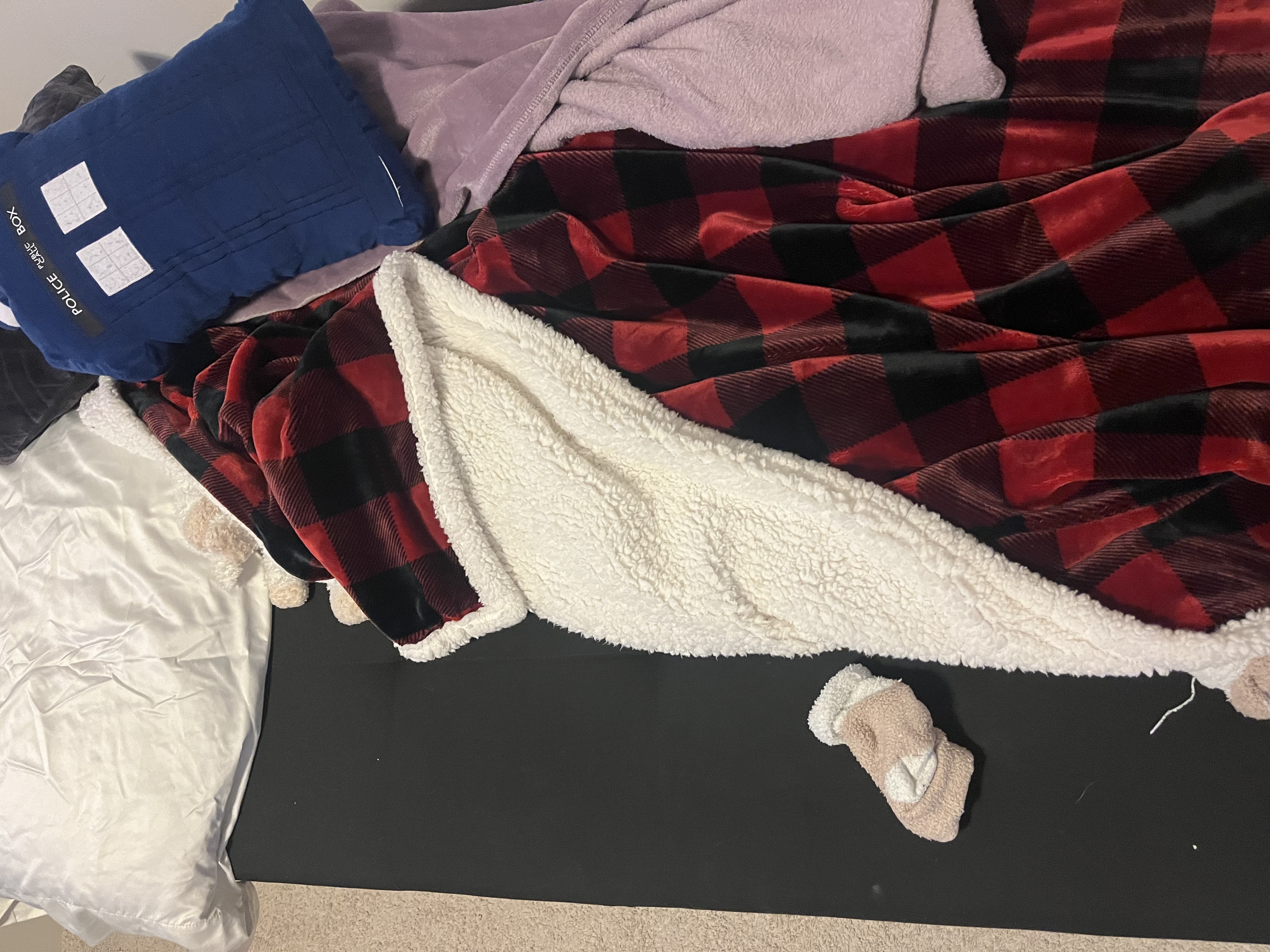
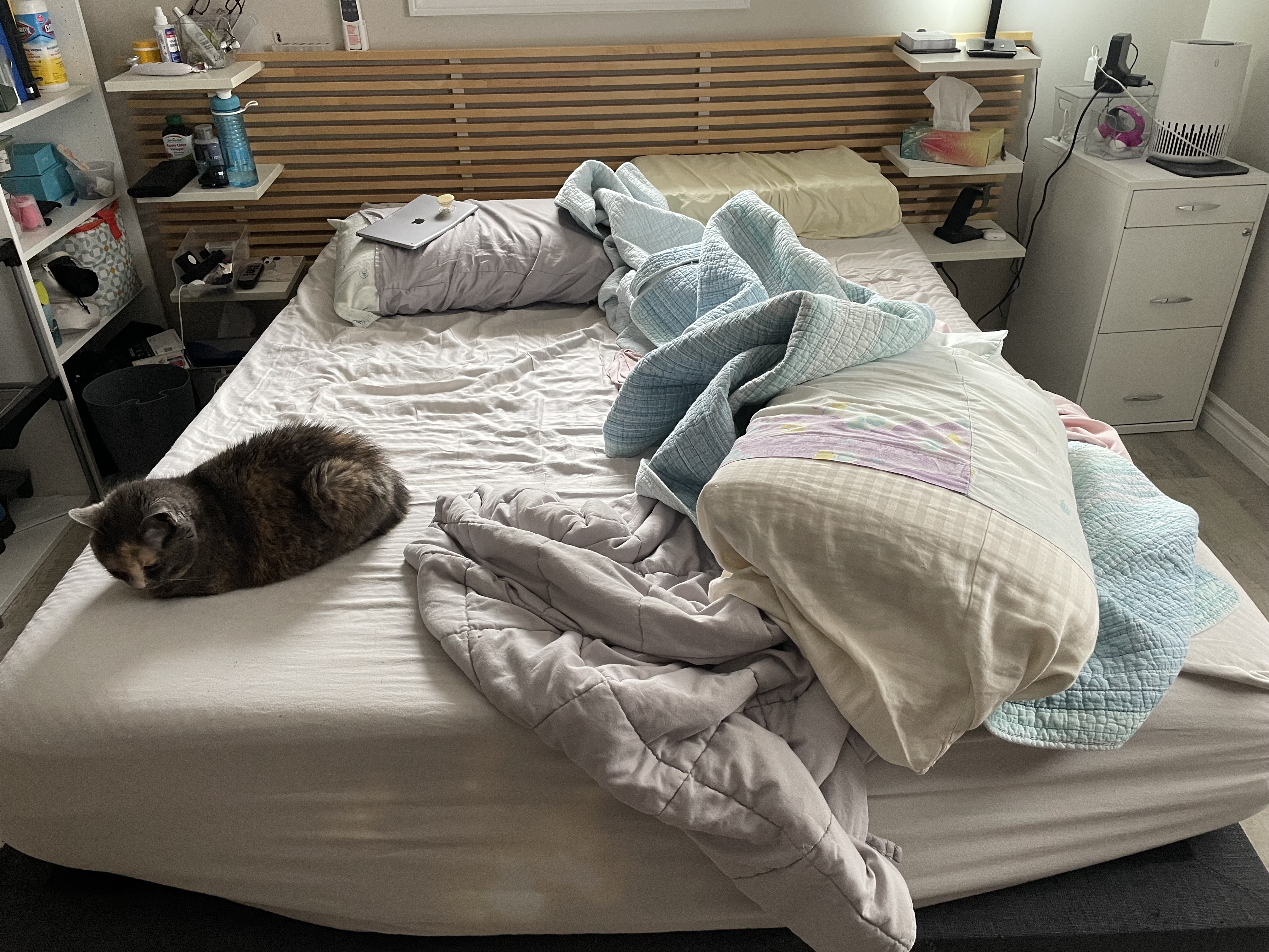
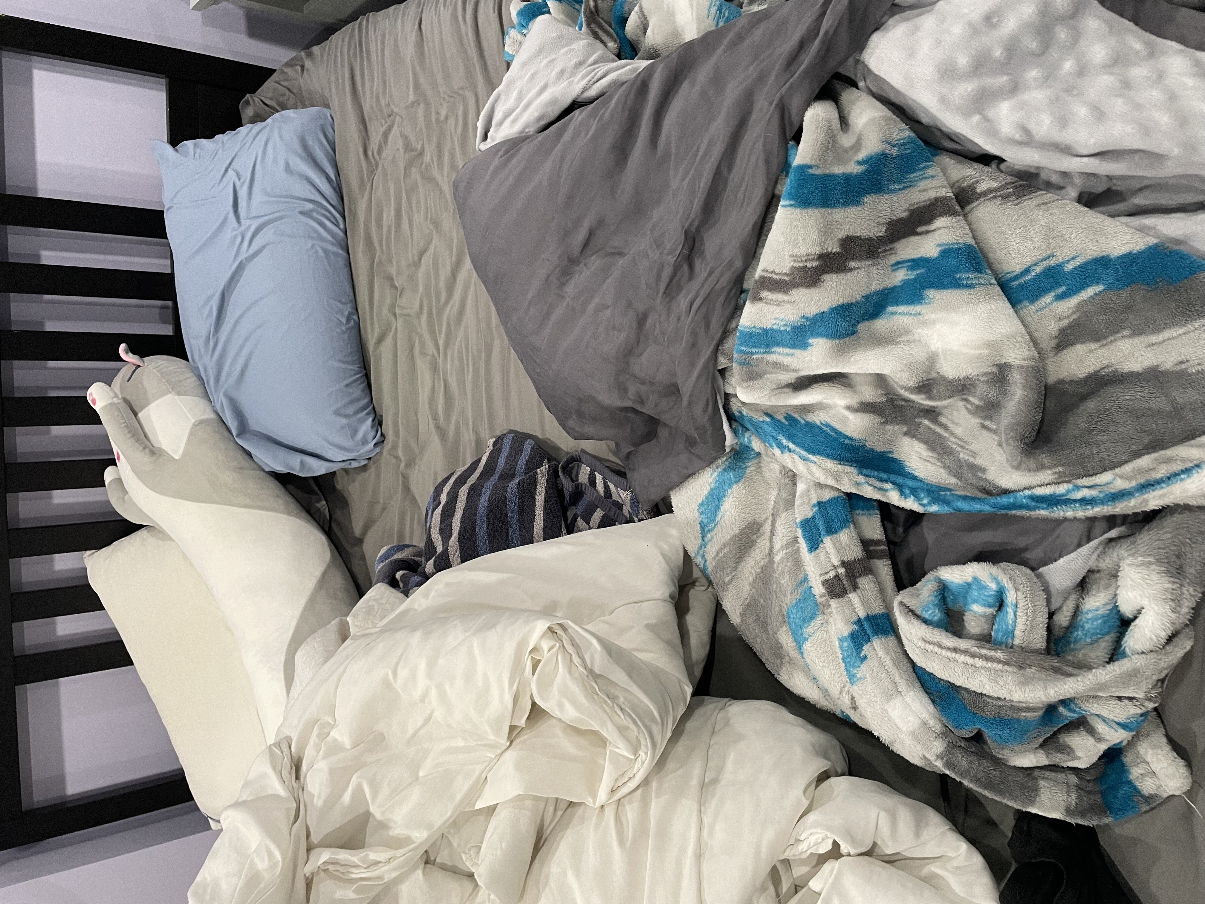
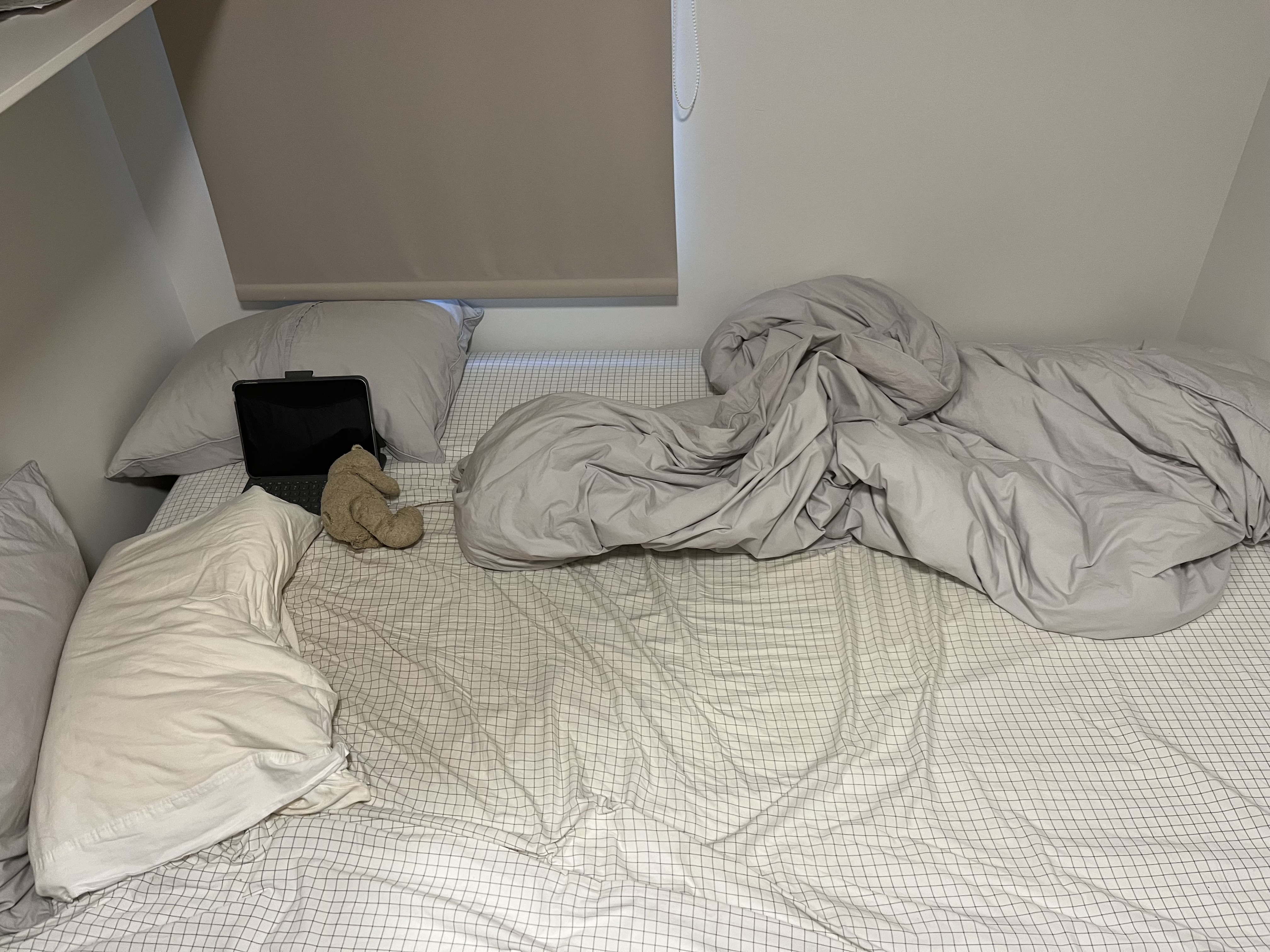
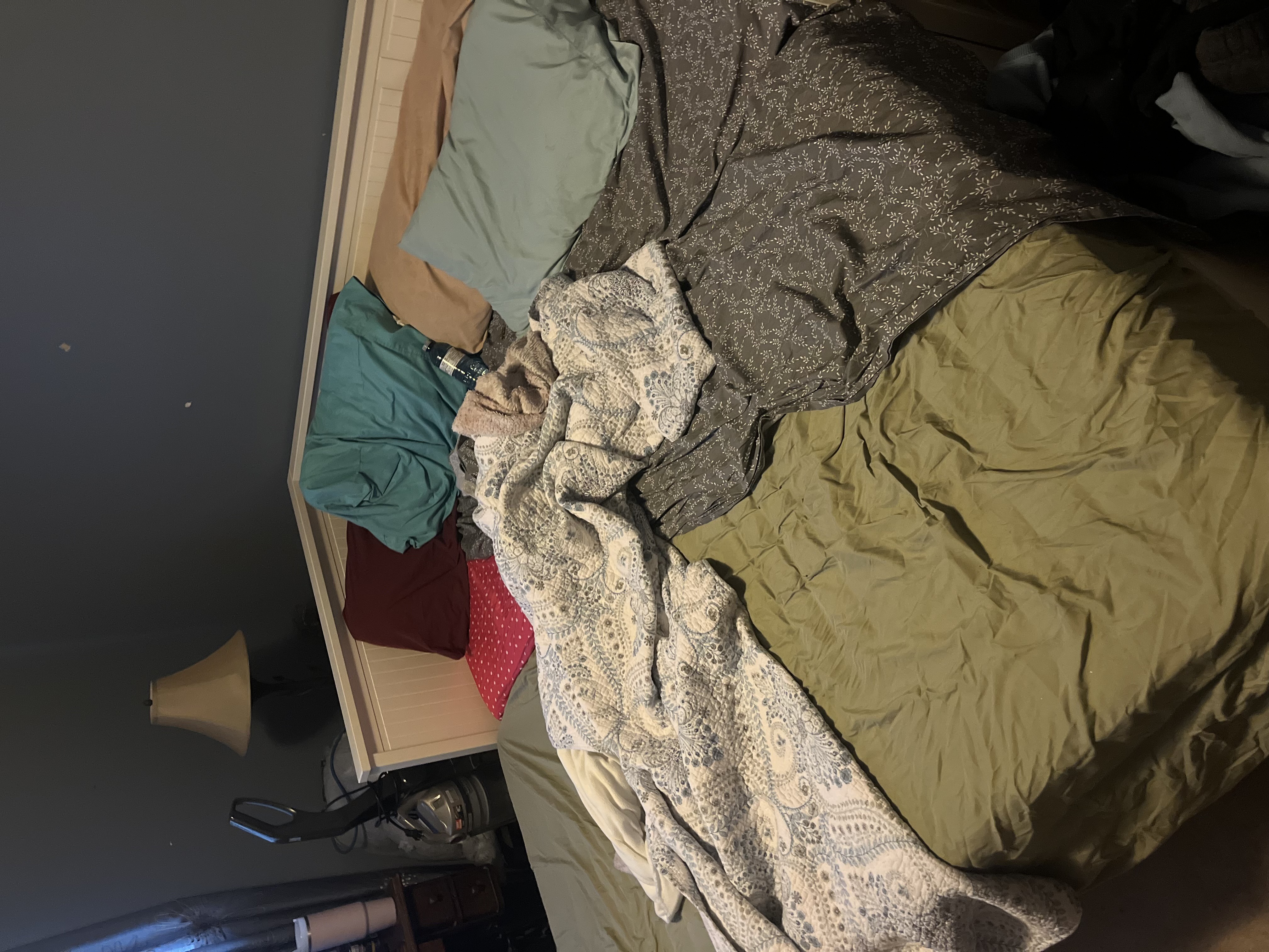
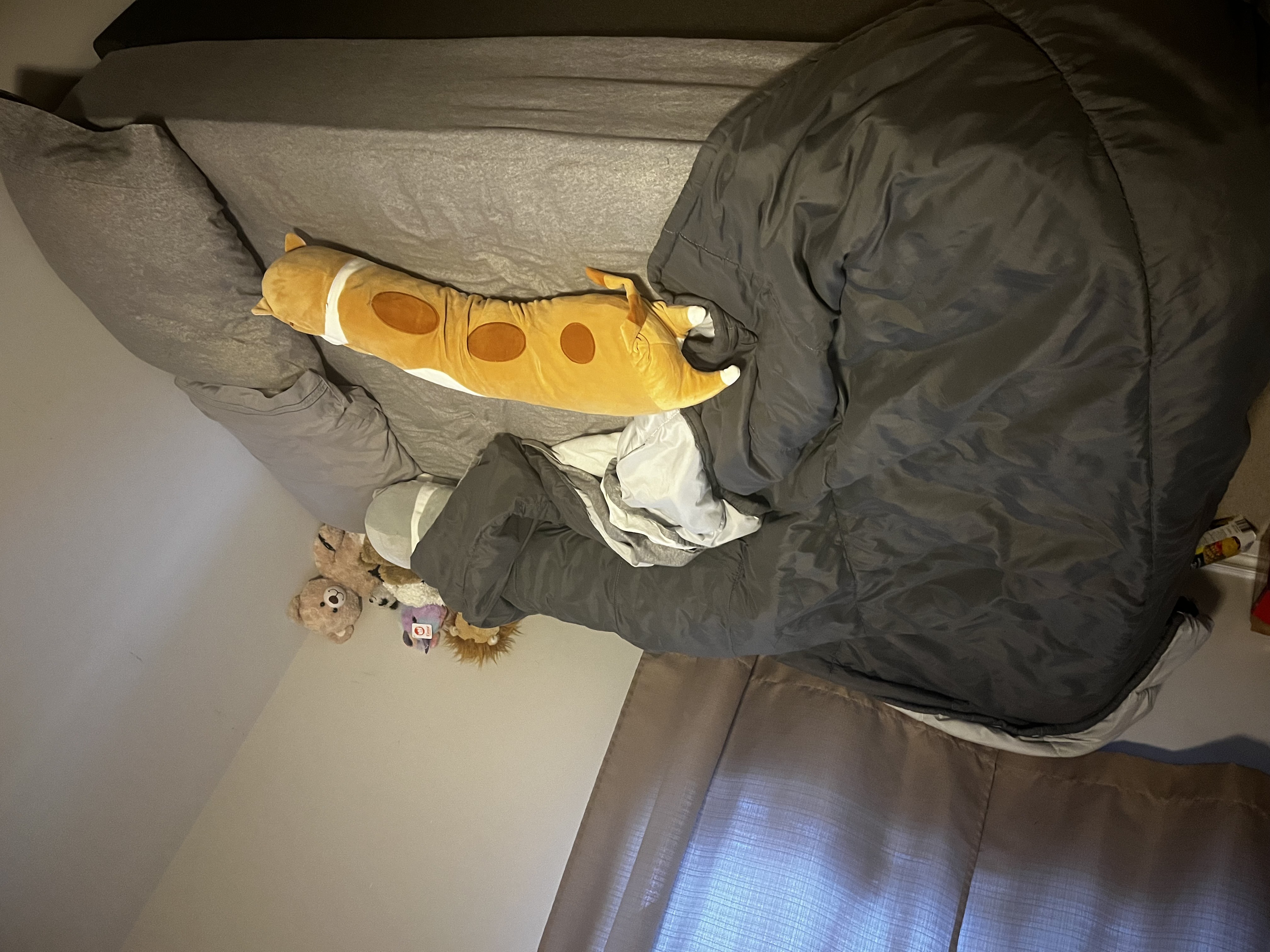
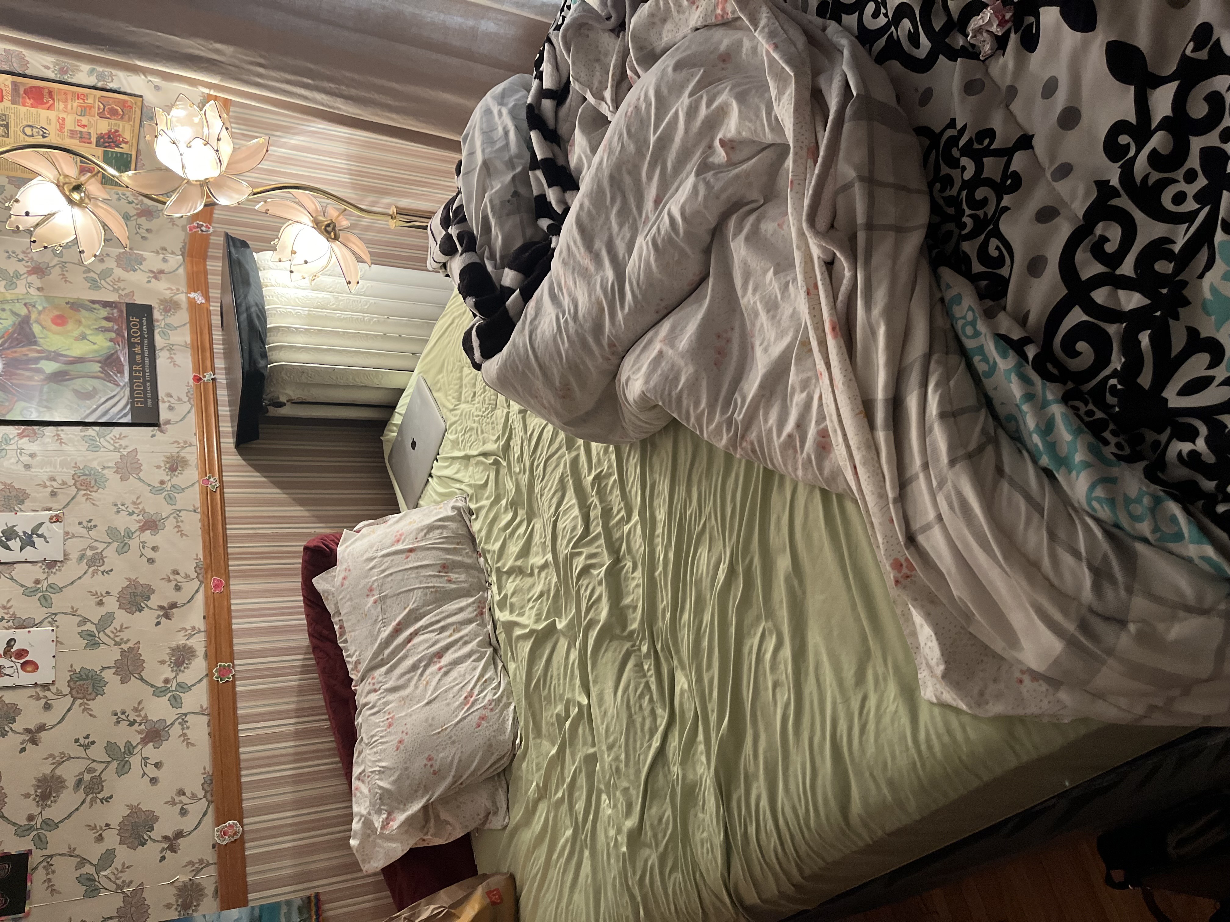
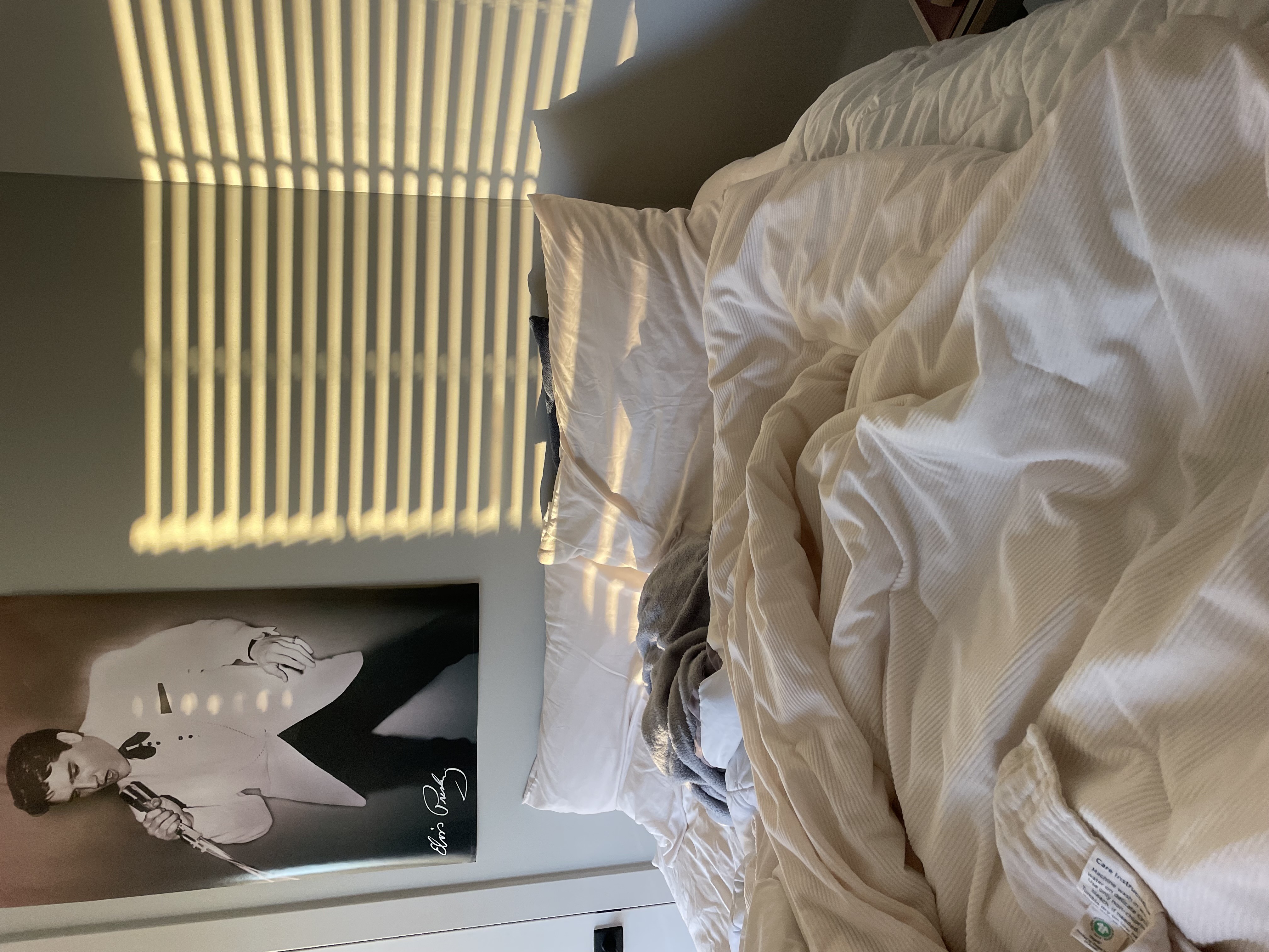
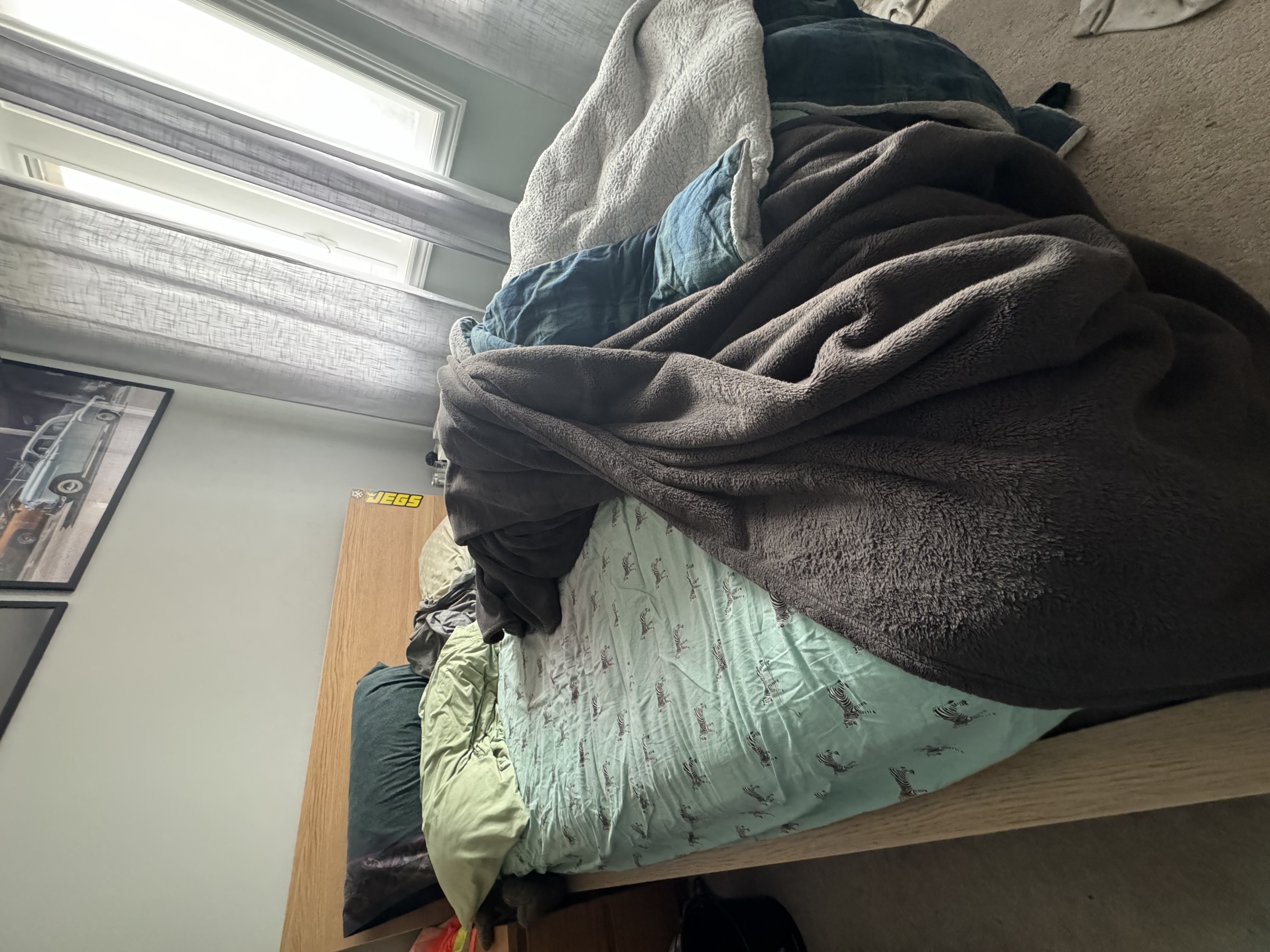
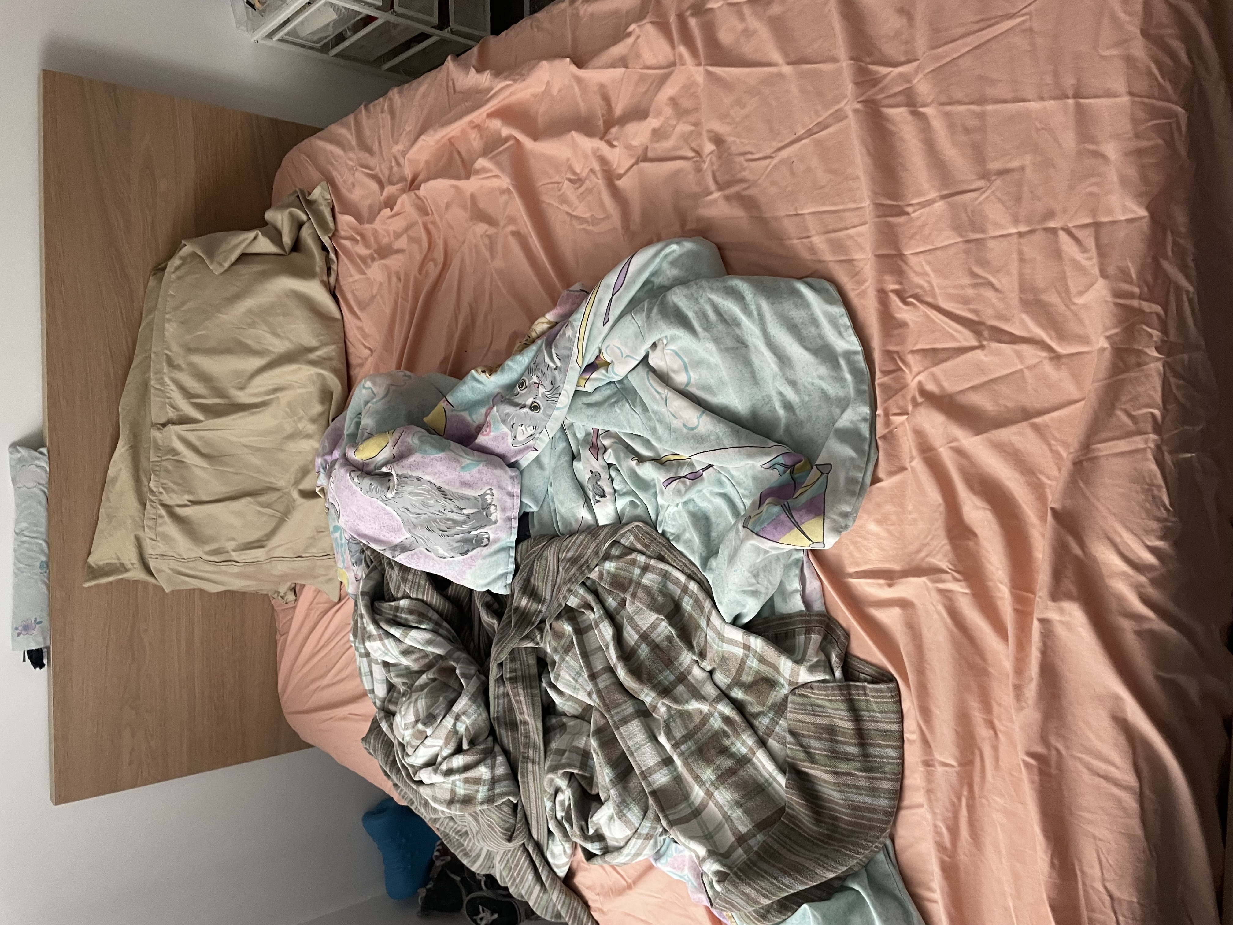
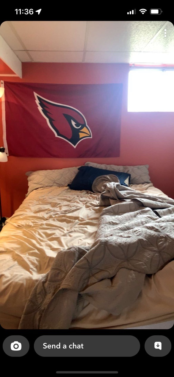
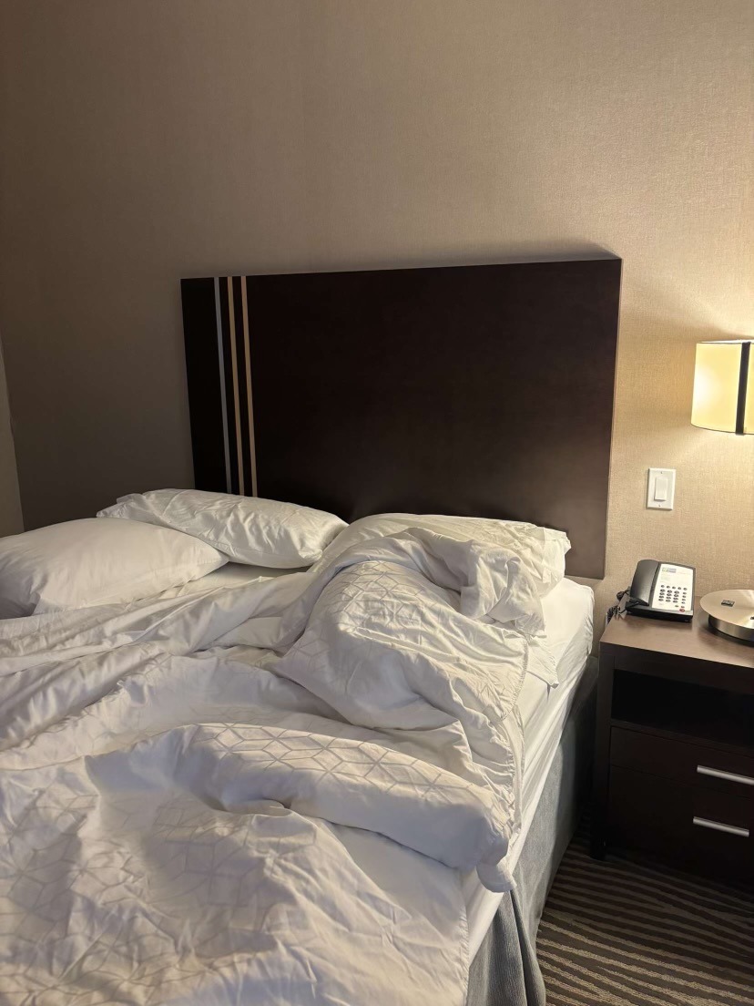
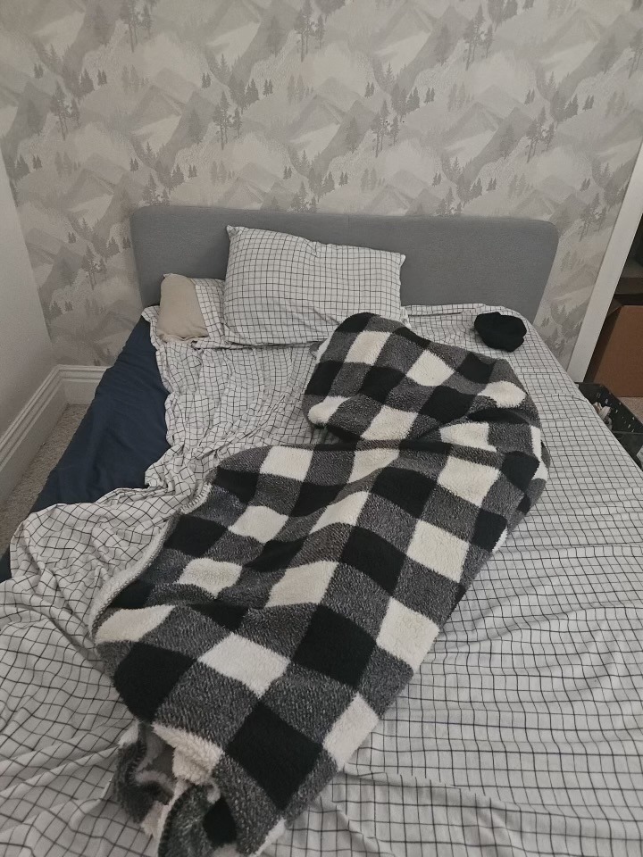
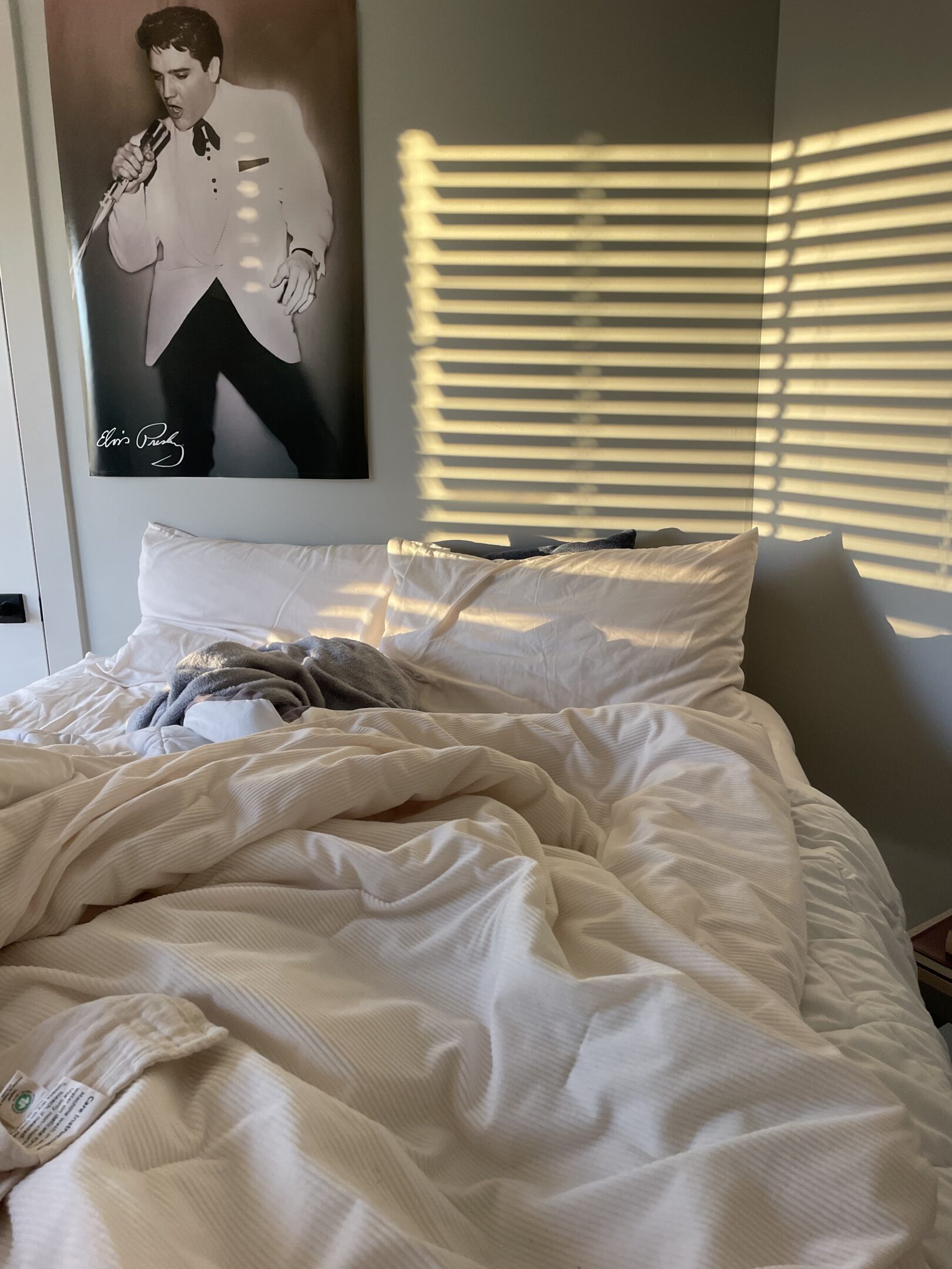
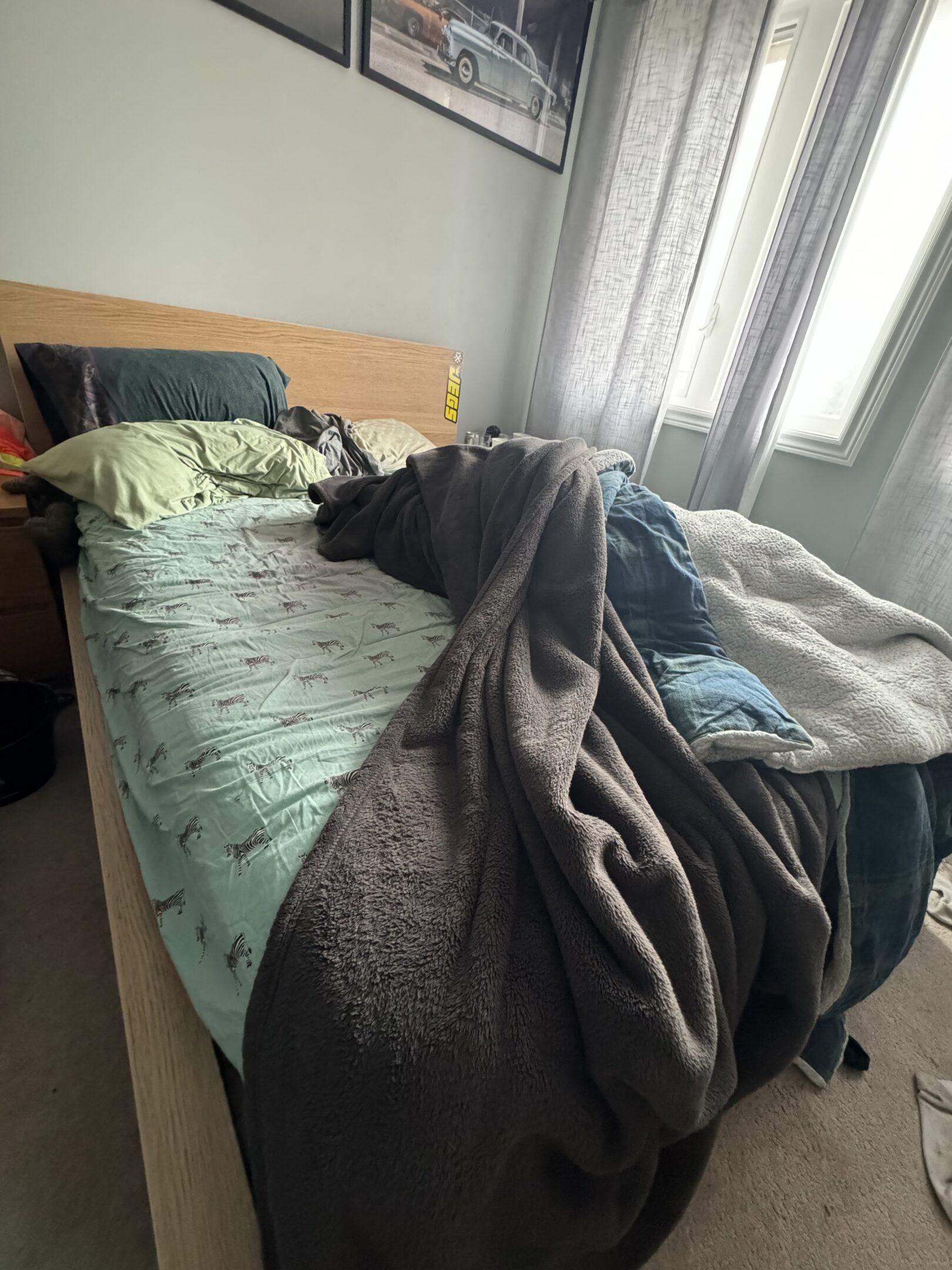
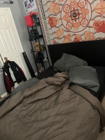
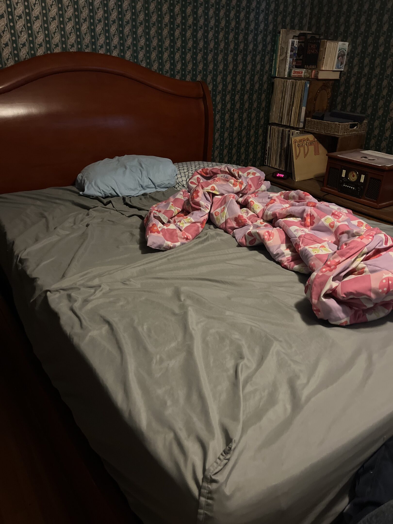
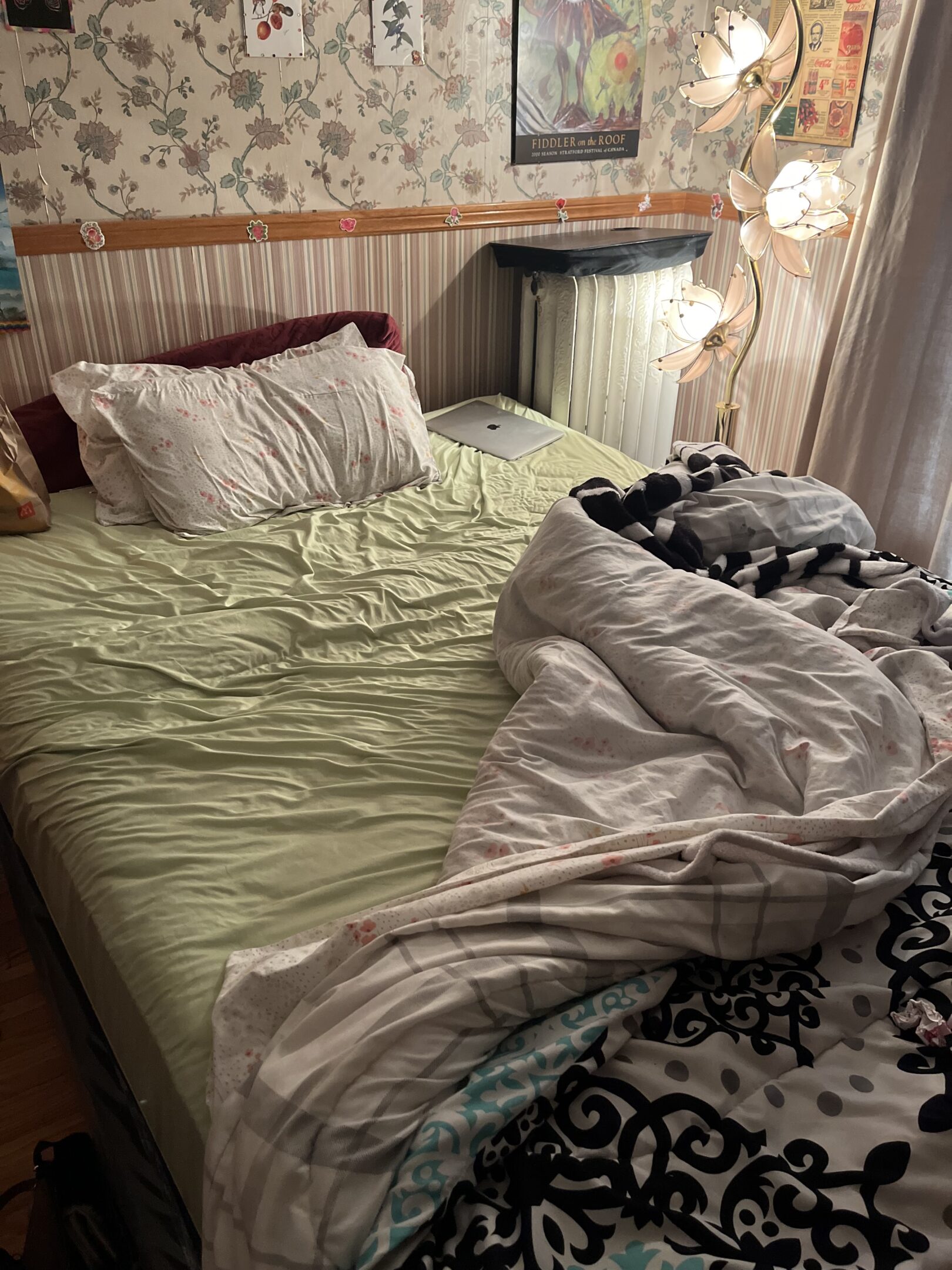
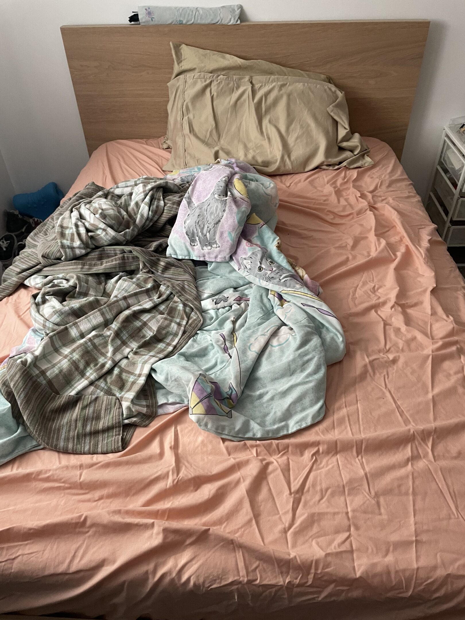
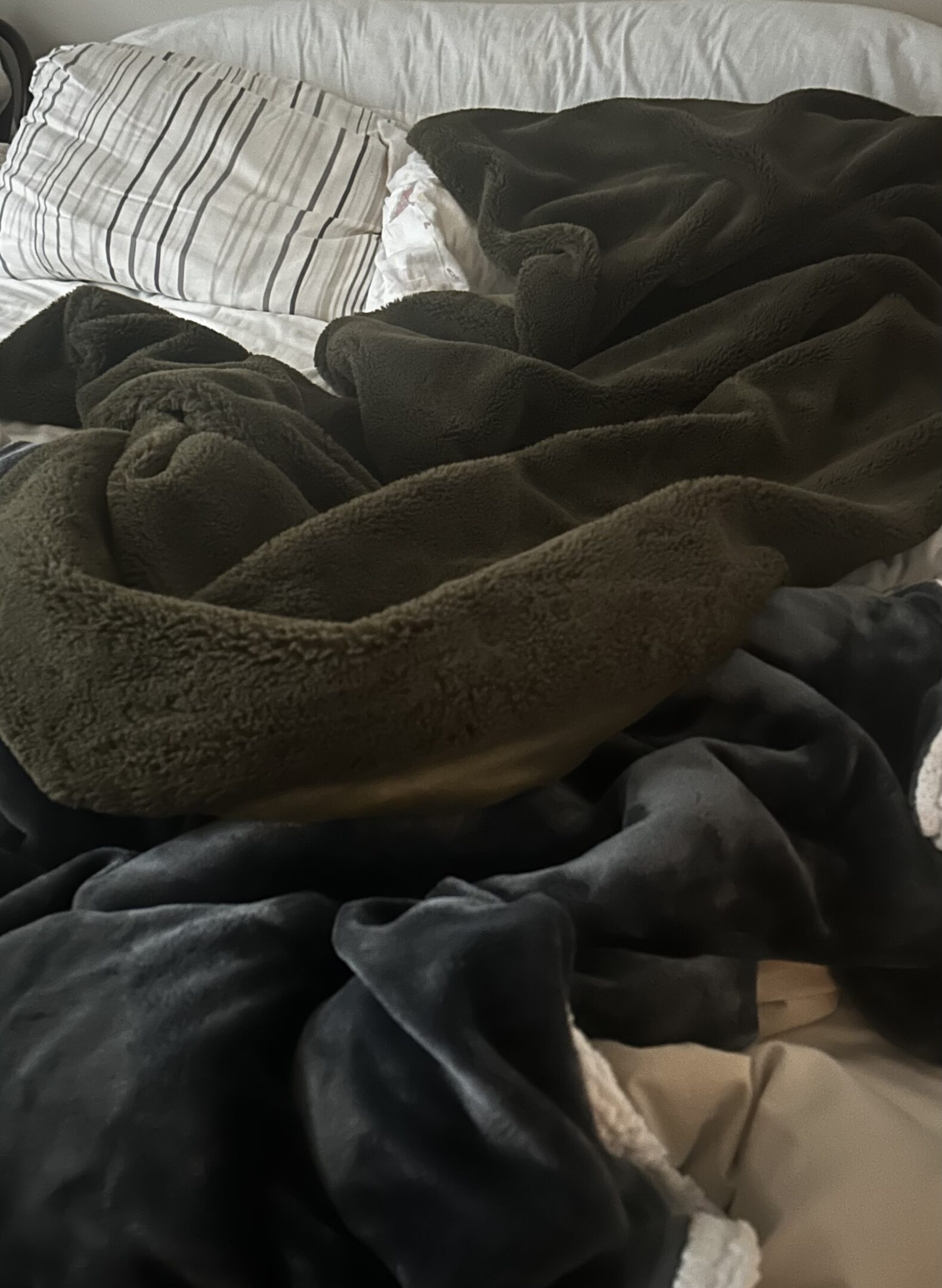
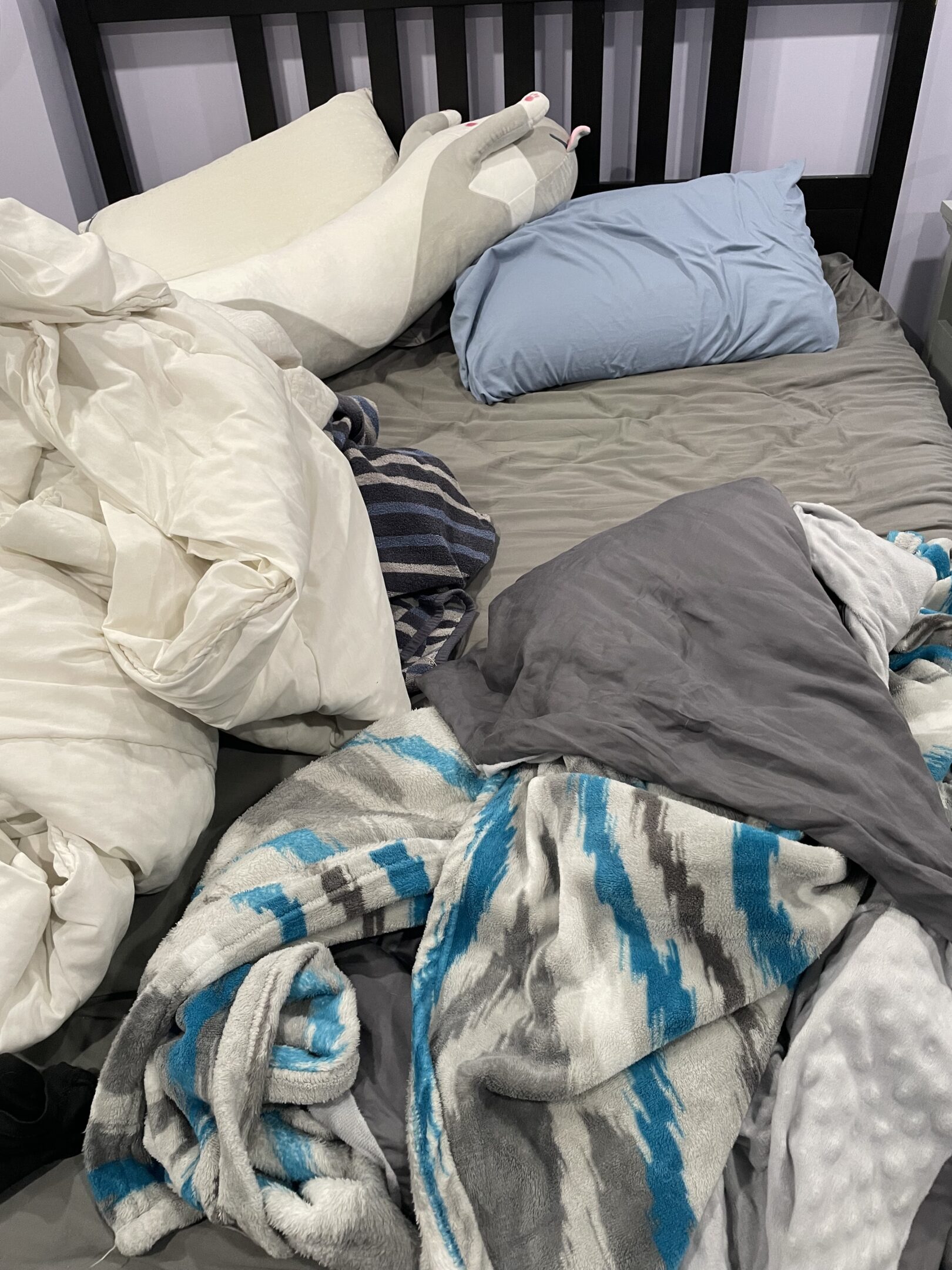
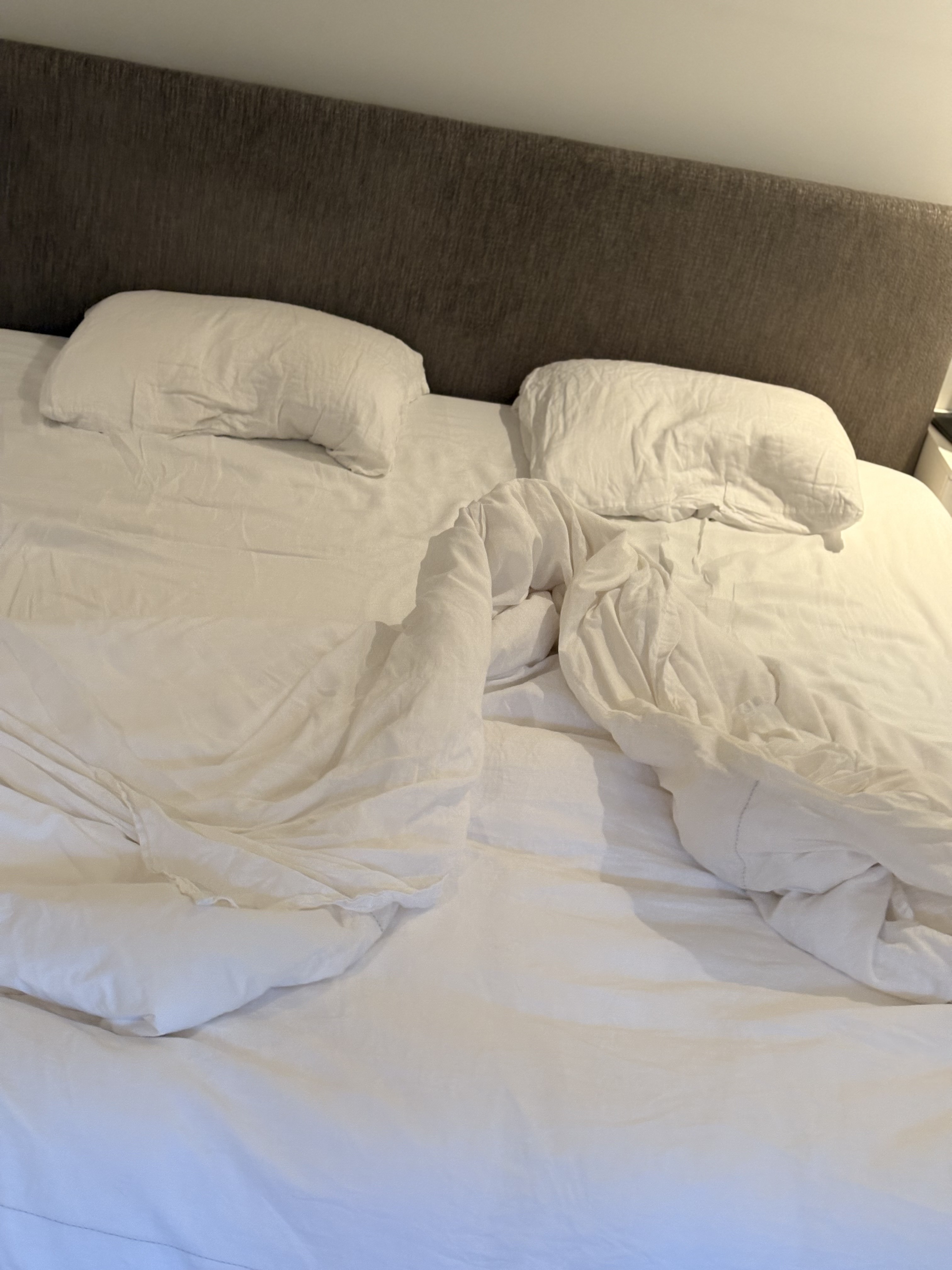
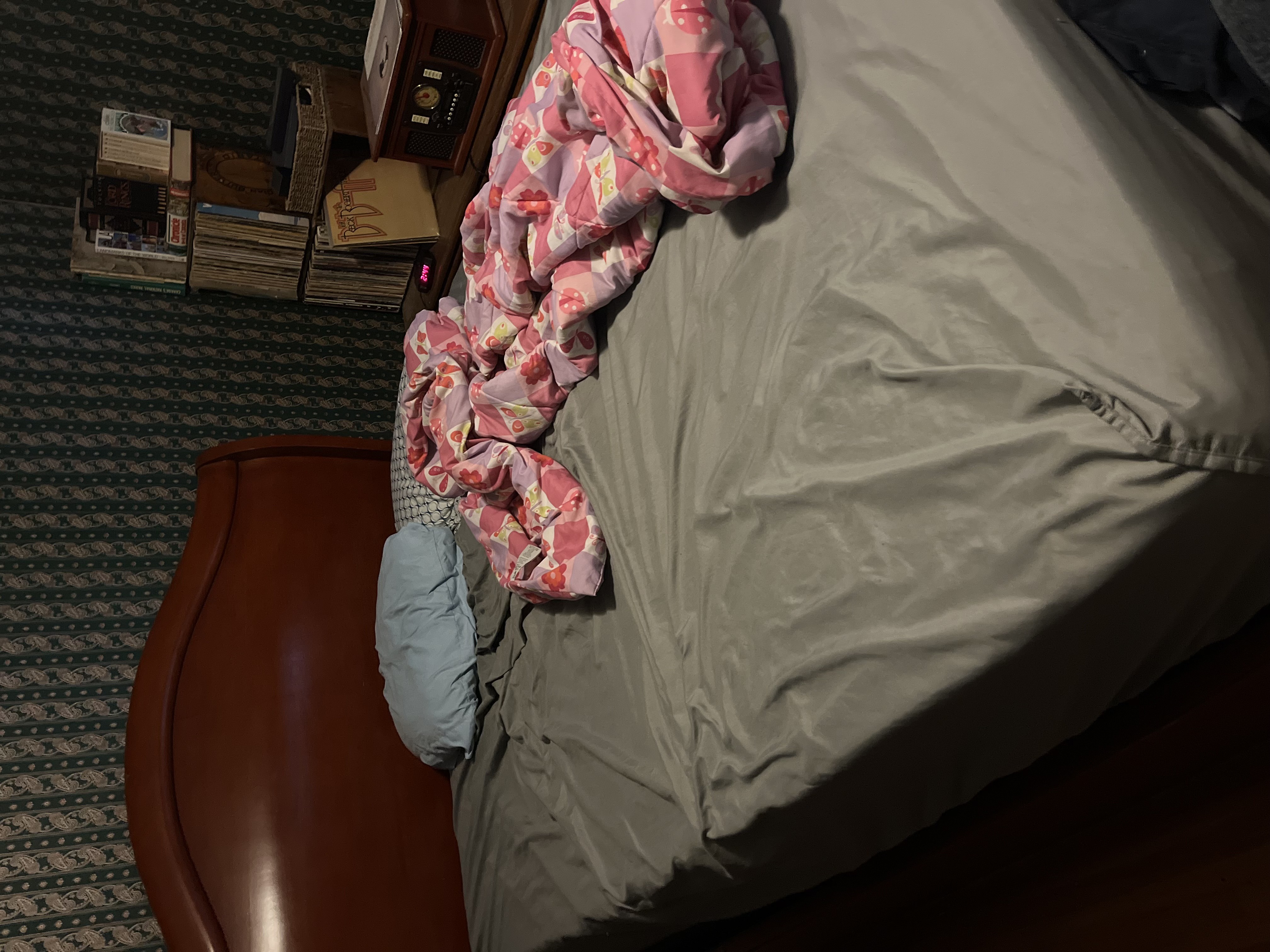
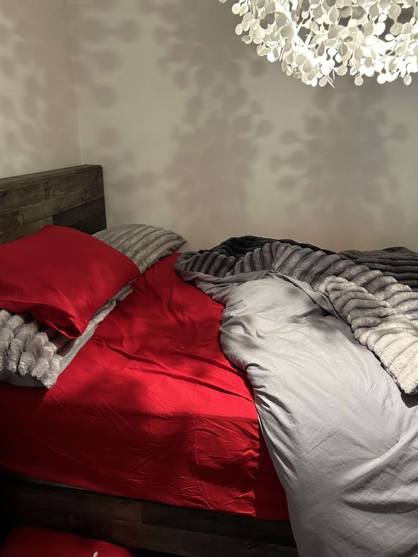
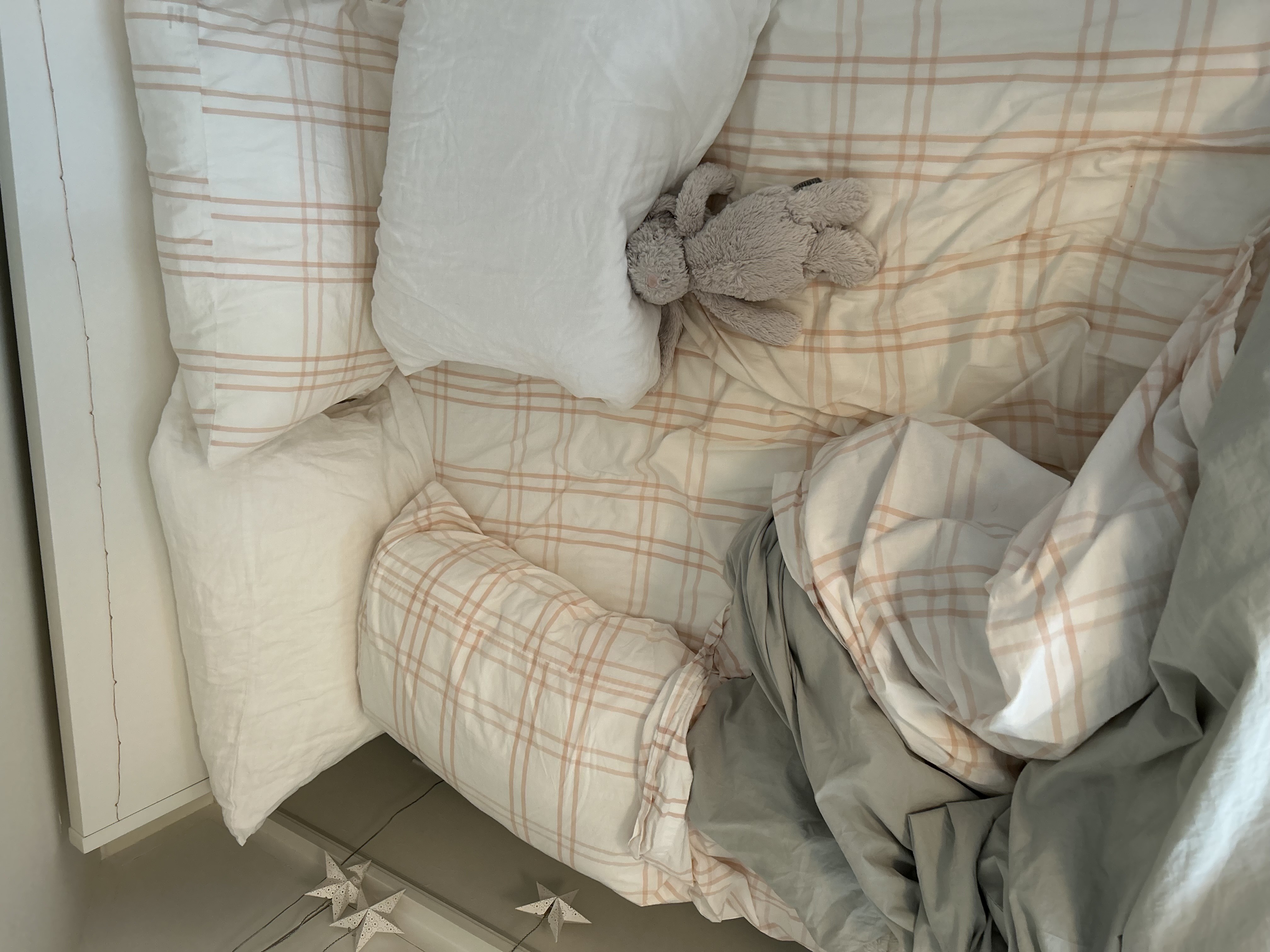
For my conceptual portrait, I chose to use beds as the everyday object in the portraits. Beds are often seen/associated with safety, comfort, and a place to lay your head after a long day. Beds are not only stylistically different depending on the person, but the sleep patterns, bodily prints left in the sheets, the favourable objects (chosen to be in one’s bed)  and more associated with sleep and bedding, differ. Additionally, The print of one’s body left in the bed is visually interesting as well as the destruction (or lack of) left by one’s sleeping pattern. If beds are considered sanctuaries of peace and rest what does one’s bedding arrangement explain about them? what point of their life are they at? What do they favour or require in a place of rest etc.
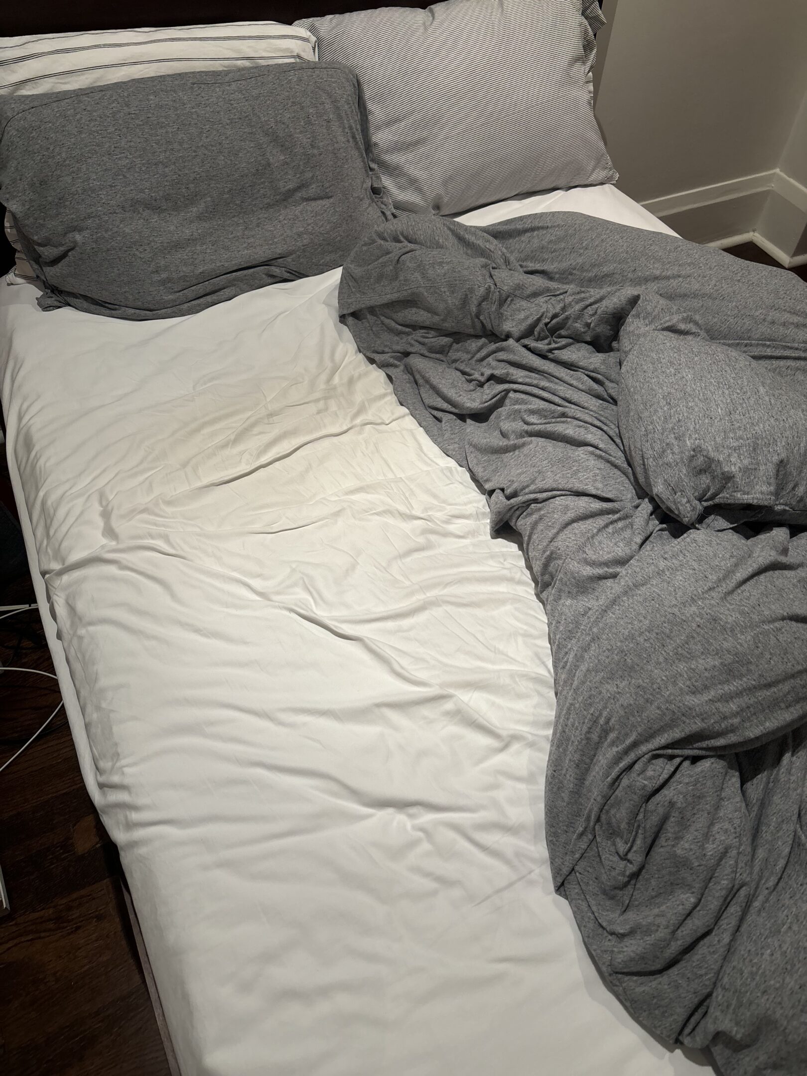
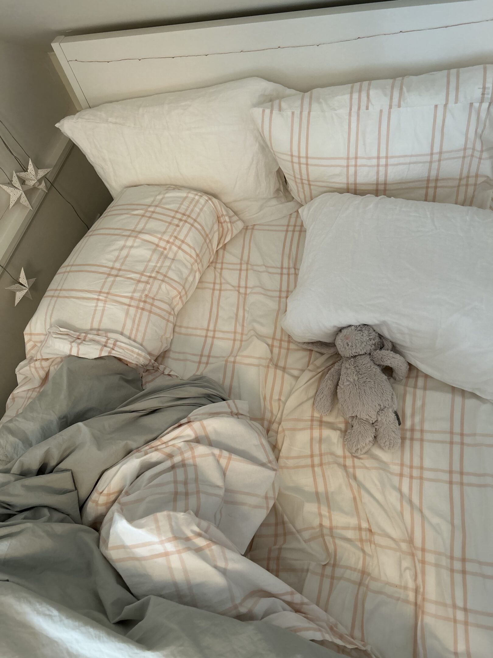
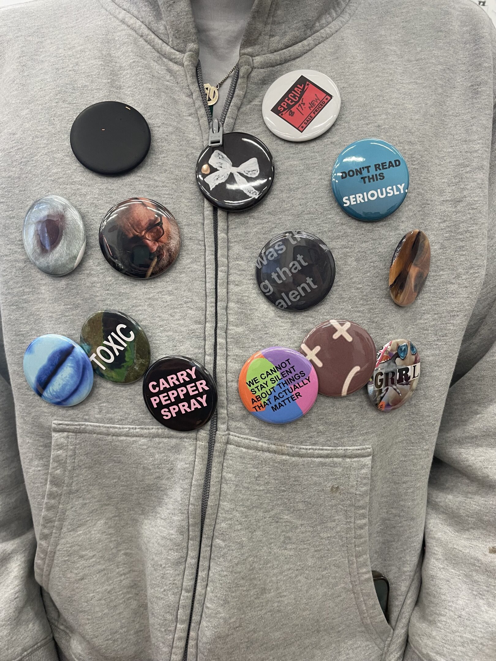
For the final project, I have chosen photos of an artist’s (Fiona Apple’s)  lips. I was interested in the individuality that comes with singing, unlike musical instruments, voices are much more unique in the sounds they produce, a musician art work is made more important by the power and use of their voice, whereas instrumental music can be replicated more easily. These buttons provoke conversation about whether people think instrumental sounds or vocal sounds are more important to a good song/ successful song. Additionally, these buttons showcase this particular artist’s instrument of choice, her use of her voice to create art and the uniqueness that comes with individual voices. 

Liv

Oliwia Kasina

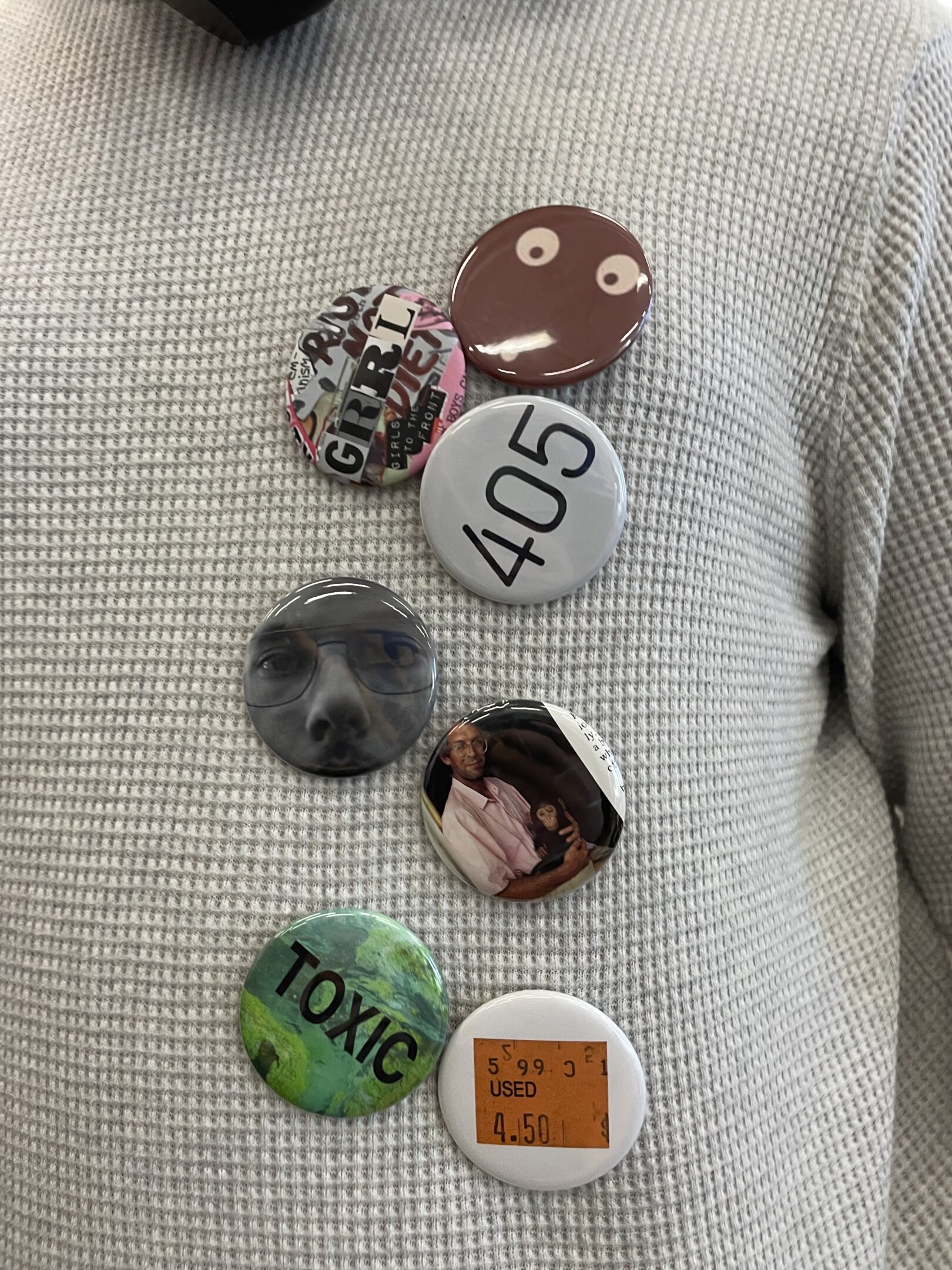
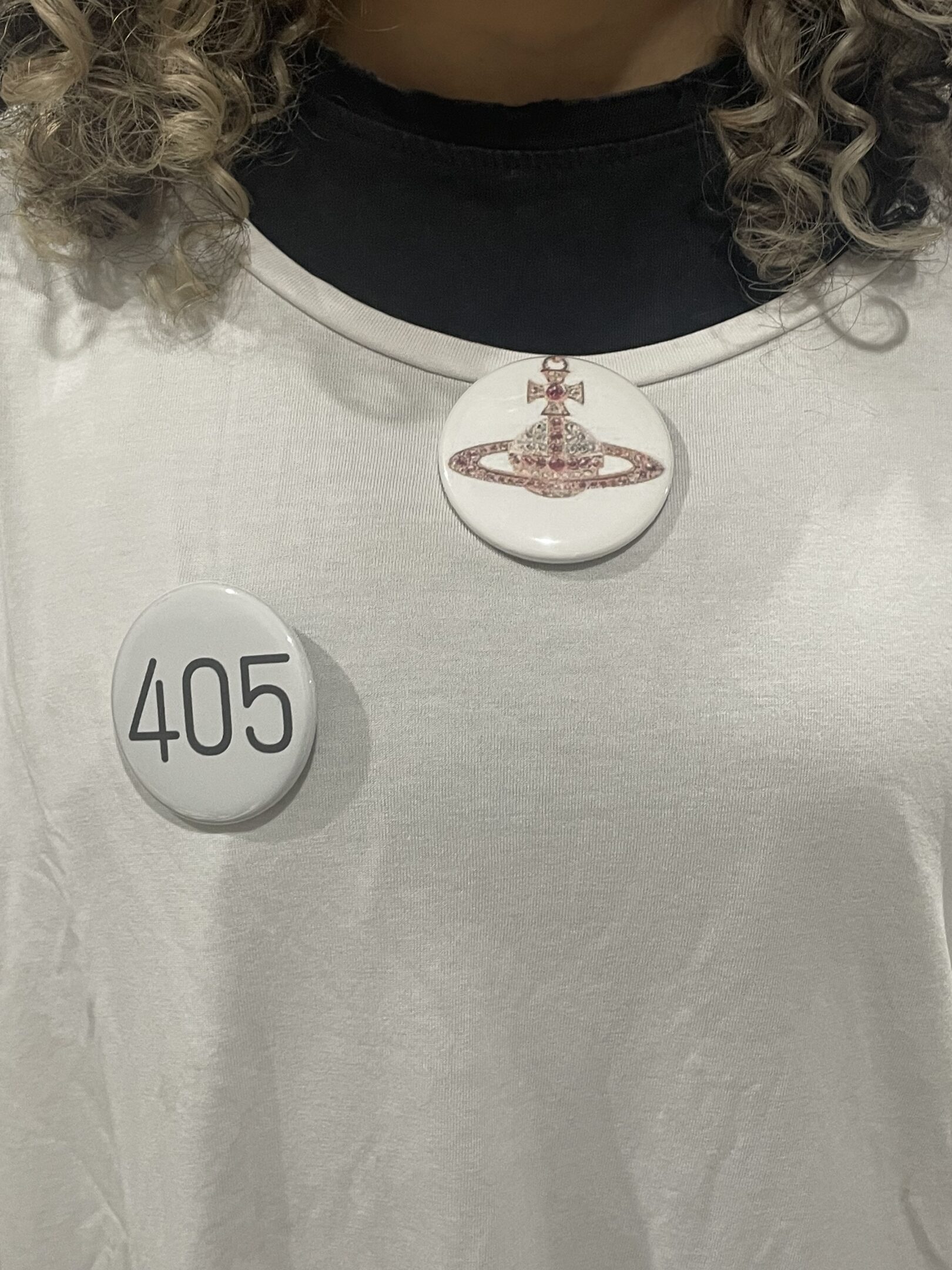
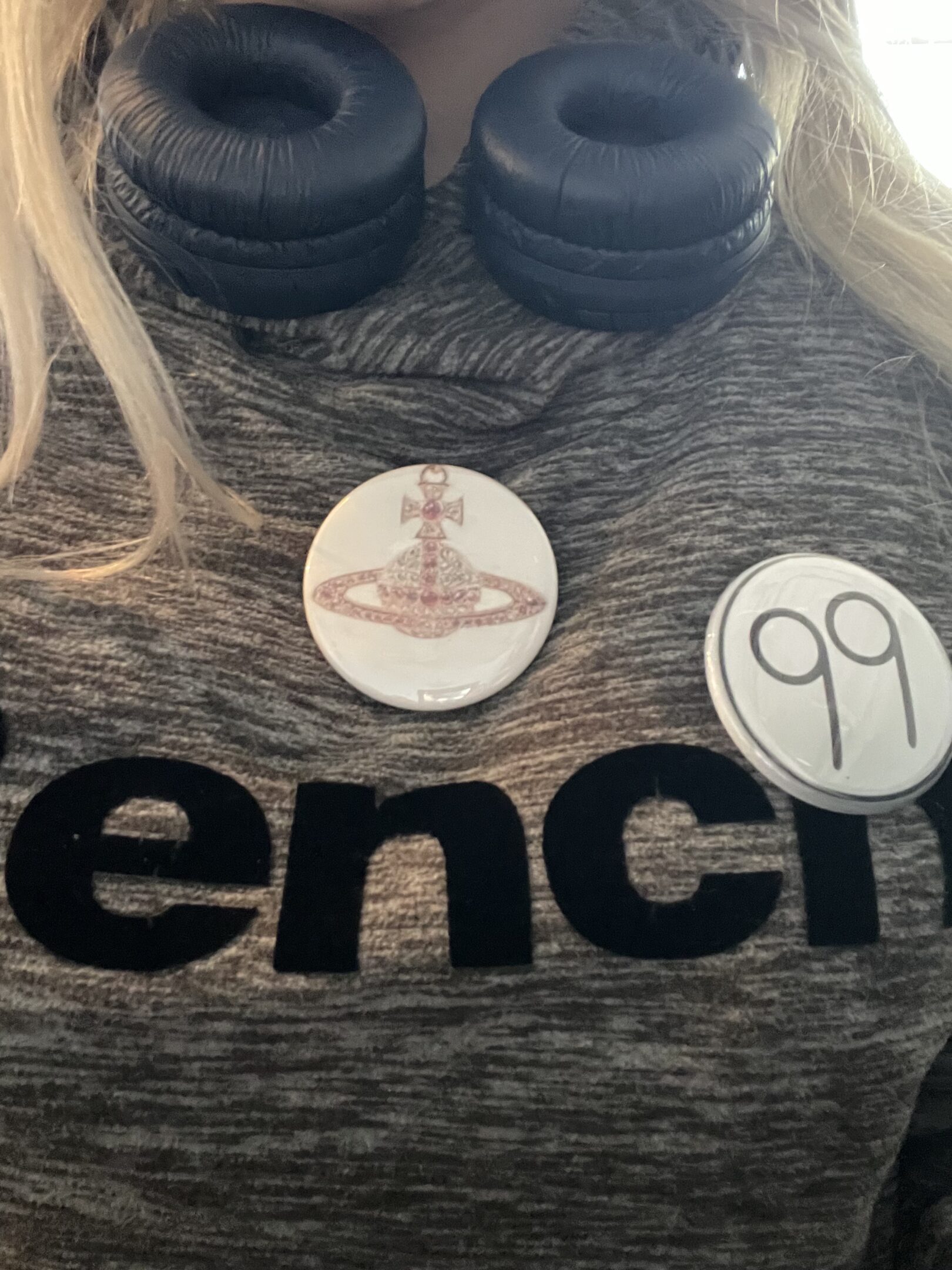
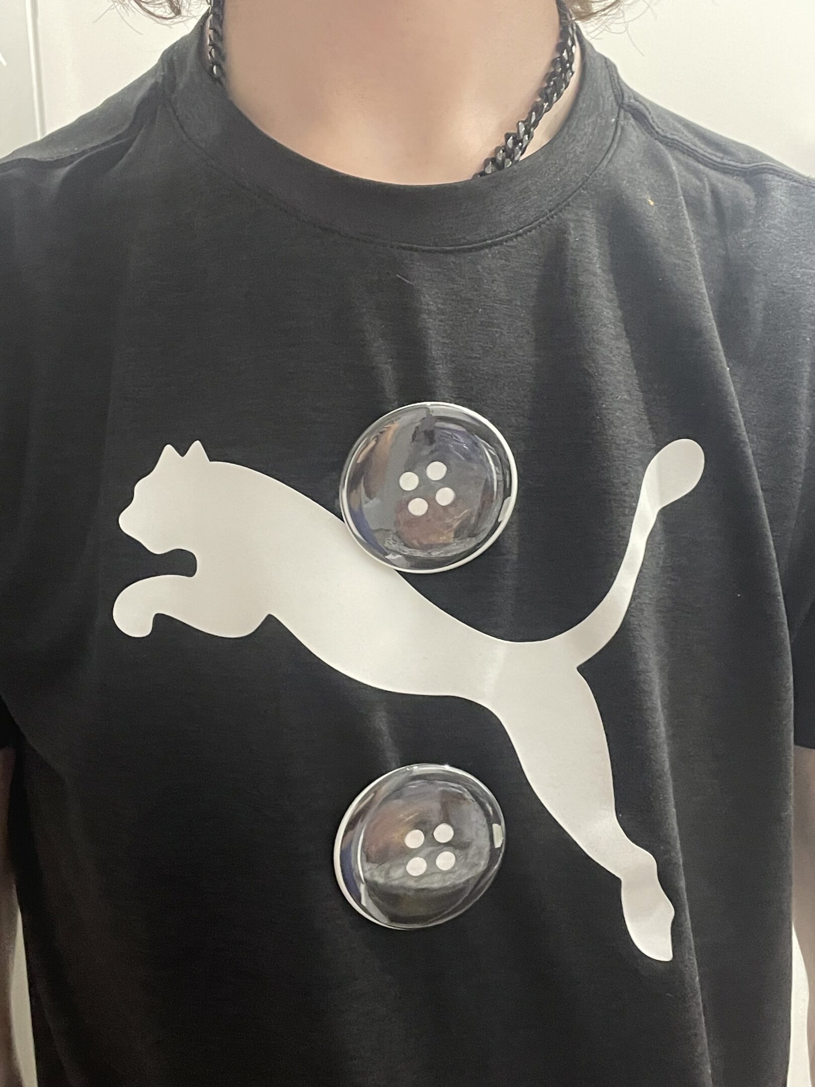
Buttons!!

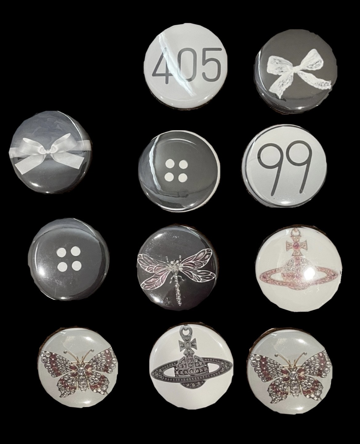
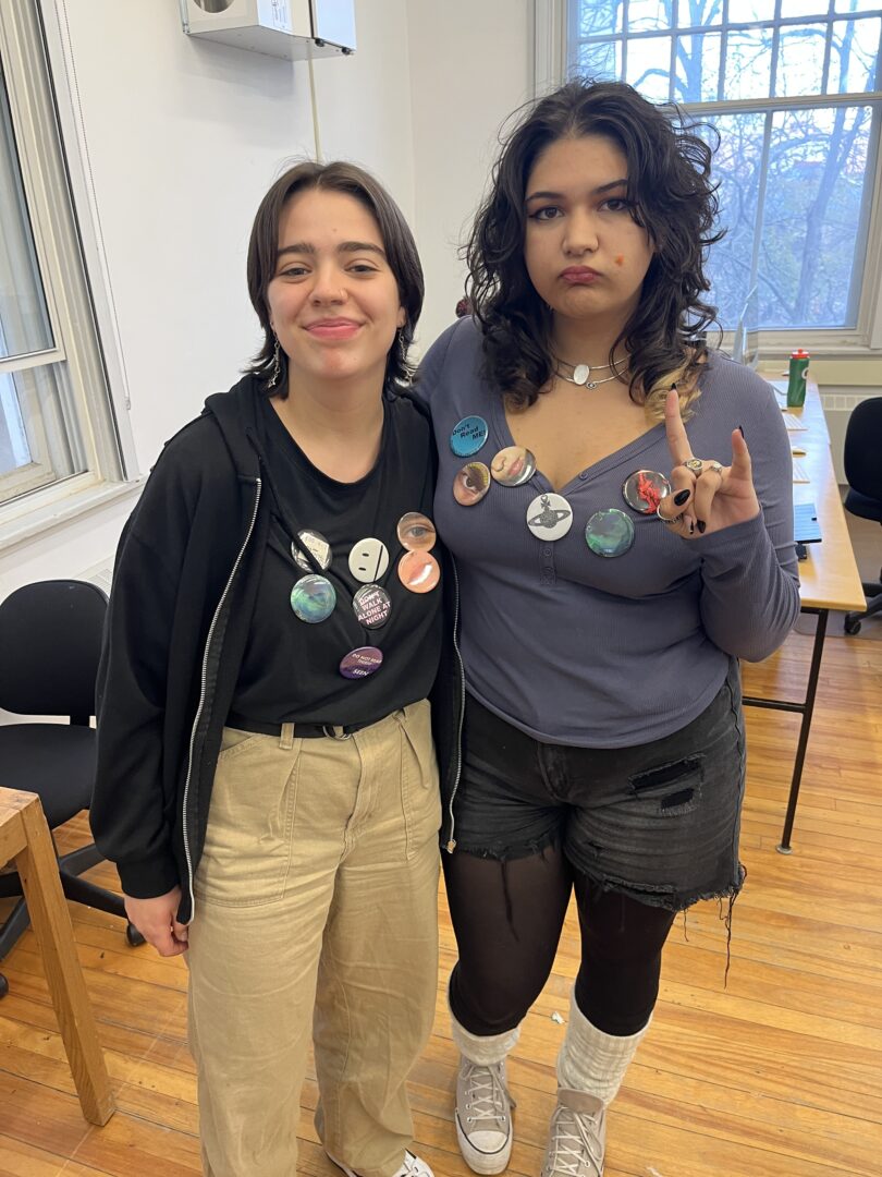
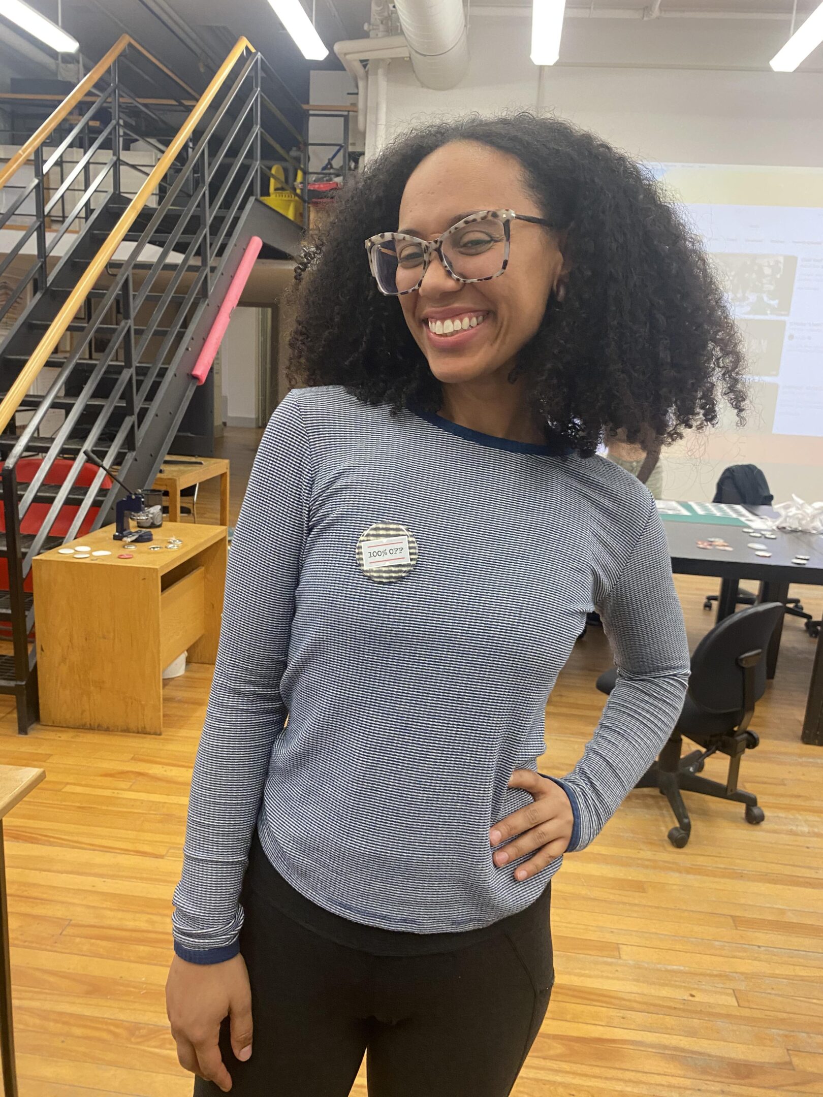
I wanted to make wearable, fashionable pins that would spark conversation. These pins are the perfect accessory for any outfit or bag. Amongst the bunch, there are buttons of buttons, broaches, pendants, badges, and bows.  I wanted to test and bend the norms of dressing up in a traditional sense by adding something that most would not plan to use as a part of their outfits.

Conceptual Portrait

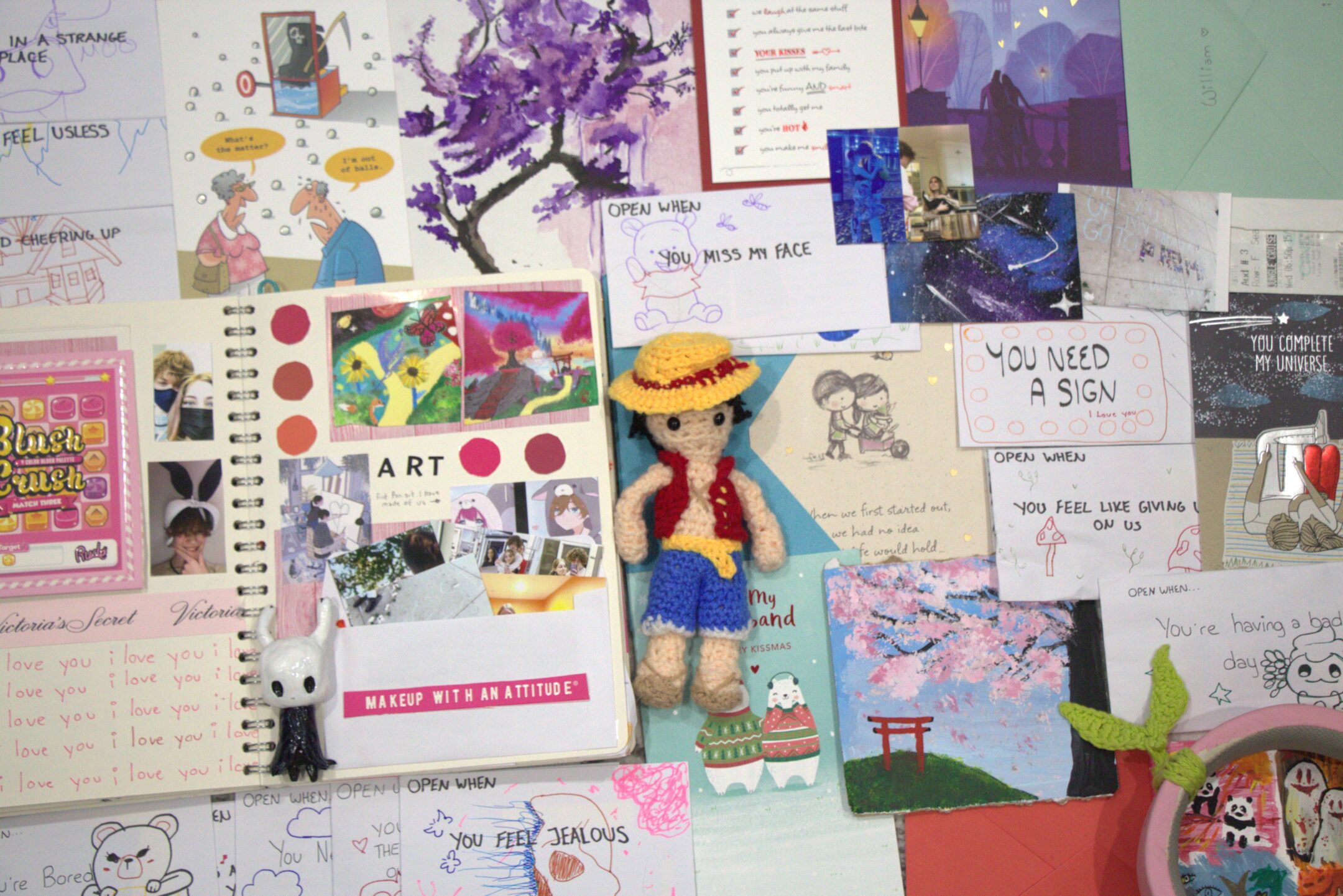
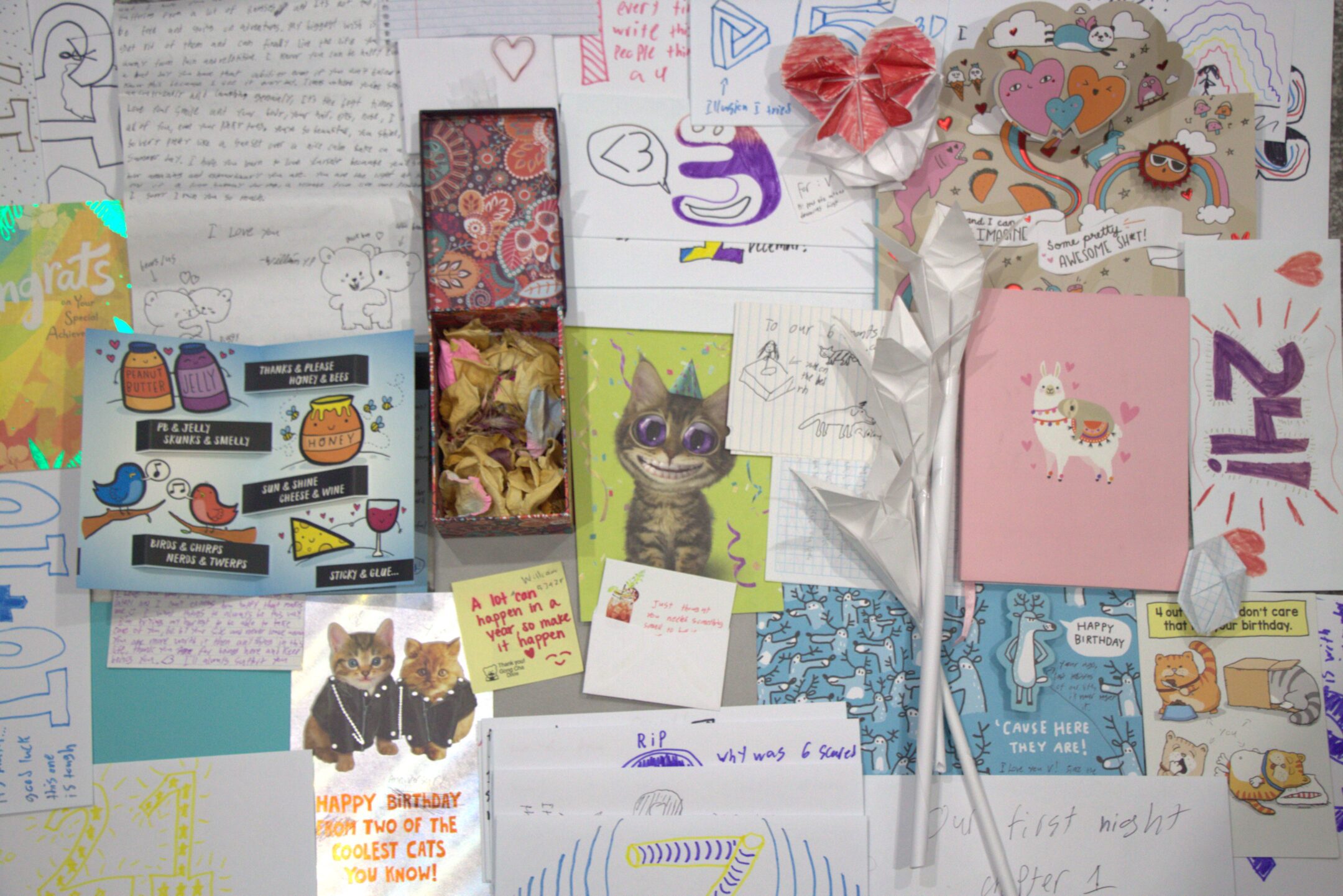
This piece is a portrait of the love between to people. I have decided to portray it by photographing love through art and gift-giving. On the left we have the gifts that were given to the male and on the right are gifts given to a female. One of these people is an Artist and the other is a business major. Everyone expresses love toward each other in different ways and I wanted this piece to showcase these two people's personalities through what they made for eachother.


This piece was made by using a dangling microphone as a cat toy. It is supposed to take on a new perspective of mimicking how it would sound like if you were the cat's toy. This audio consists of 2 cats in different locations playing with the same microphone an hour apart. You can hear the noises of the predators clawing at the "prey", biting it, and the microphone being tossed around and running away from them. Near the end, you may even hear a "meow" from the distance. 

Video Series

This piece showcases a person staring at a reflection of themselves over two minutes. As the audience you feel like a spectator of this intense and personal scene. You can witness how this individual interacts with themself. That moment is broken once the individual stares right at the camera making it feel like they are aware that you have been there. There are 3 screens and cameras in this piece, the one on the top showcasing the subject's entire face, the one on the bottom showcasing a zoomed-in portion of their eyes, and the one that records this whole scene.
Reflection of Humanity is a piece that includes a sample of randomly selected people sitting down in front of 5 screens with no instructions. It is a piece about individuality and self-identity. The subjects are able to observe themselves from all sorts of angles. For some, it is intimidating, while others feel comfortable. In this video, you are able to observe how this sample of people behaves in a new situation, isolated only with themselves and the TVs. You can see each tiny gesture that is unique to them. And in someway see part of their true identity.
This video loop showcases a person doing their makeup in a reflection on a TV that inverts them. You can see all of their emotions and small movements as their face is displayed on a zoomed-in screen. It is interesting to see how technology may not exactly replicate reality. In this case, it replicates a mirror yet is much more difficult to use and does not give the same result. The loop also indicates the constant struggles of failure and perfectionism as the makeup keeps on getting put on and wiped off.

Passing

Passing (2022) is a piece by Maria Juxtapose representing birds made from torn-apart shoes. It is a visual piece that allows you to walk under a sky filled with many birds. At first glance, they seem like beautiful birds but with more observation, the more destruction you see in the shoes that the birds are made of. The symbolization of this piece is human and natural migration and its struggles of which tend to go unnoticed by others. It relates to me as my family and I immigrated to Canada and I got to witness the good and bad of it firsthand. To everyone in Europe (where we immigrated from) it seemed as if we were going to live the perfect life as showcased in “American movies”. They did not see the struggle of trying to find a place to live and a completely new life without others to rely on.

Pour Your Own Body Out

This interactive piece is 7354 cubic meters. Its purpose is for the audience to bring their body into this studio to watch and feel what they see. They are allowed to treat it as their own space, to sing or dance if they please. In the middle of this studio there is a circle of couches and in the middle of them are speakers. Along the walls are projections, that consist of many blues, greens, and reds. Their overall theme seems to be connected with nature. The video projections include one human, one pig, a snake, and worms. The videos seem to have been recorded in a choppy way as if they were recorded for filler parts of a film, focusing on small elements like the worms or grass with a steady hand moving slowly along the images. The music and video have a slight surreal type of feel to it mixed with nostalgia.

Rist VS Tiktok

Rist shows a lot of self-expression in her pieces. Both her and modern videos on Tiktok align with the idea for the audience to explore their theme of identity exploration, to see and feel things that they typically would not experience otherwise. They also both have a sense of community, for TikTok, it consists of things such as trends and shared experiences through videos. While for Rist it is about bringing a crowd to experience her work. For example, the piece Pour Your Body Out creates a sense of community by bringing all of these different people to experience the visuals, music, and overall vibe of her work.

Experiment

I wore my shirt inside out for a whole day. Feelings of insecurity and anxiety filled me as my brain tricked me into thinking that everyone was looking at me. As if they knew that something was off. In reality, many people did not tend to notice, they did not even bat an eye. Even if strangers did realize they did not act on it, they probably had better things to do with their time. I met up with 4 friends that day. Out of the four only one noticed and told me so I was aware that my shirt was backwards. I guess that it would also make a difference in what type of shirt I would wear backward, the one I had on was a plain black tee, so it may have been hard to tell that it was on the wrong way as the only indicators were small seams and the tag on my back. What I got from this experiment is that even though you may feel embarrassed about what others think of you, you should not really care as you will only see them for a part of the day and perhaps never again.

1km

We travel many kilometers every day and don’t really take in the surroundings, so the little things along the way tend to go unnoticed.

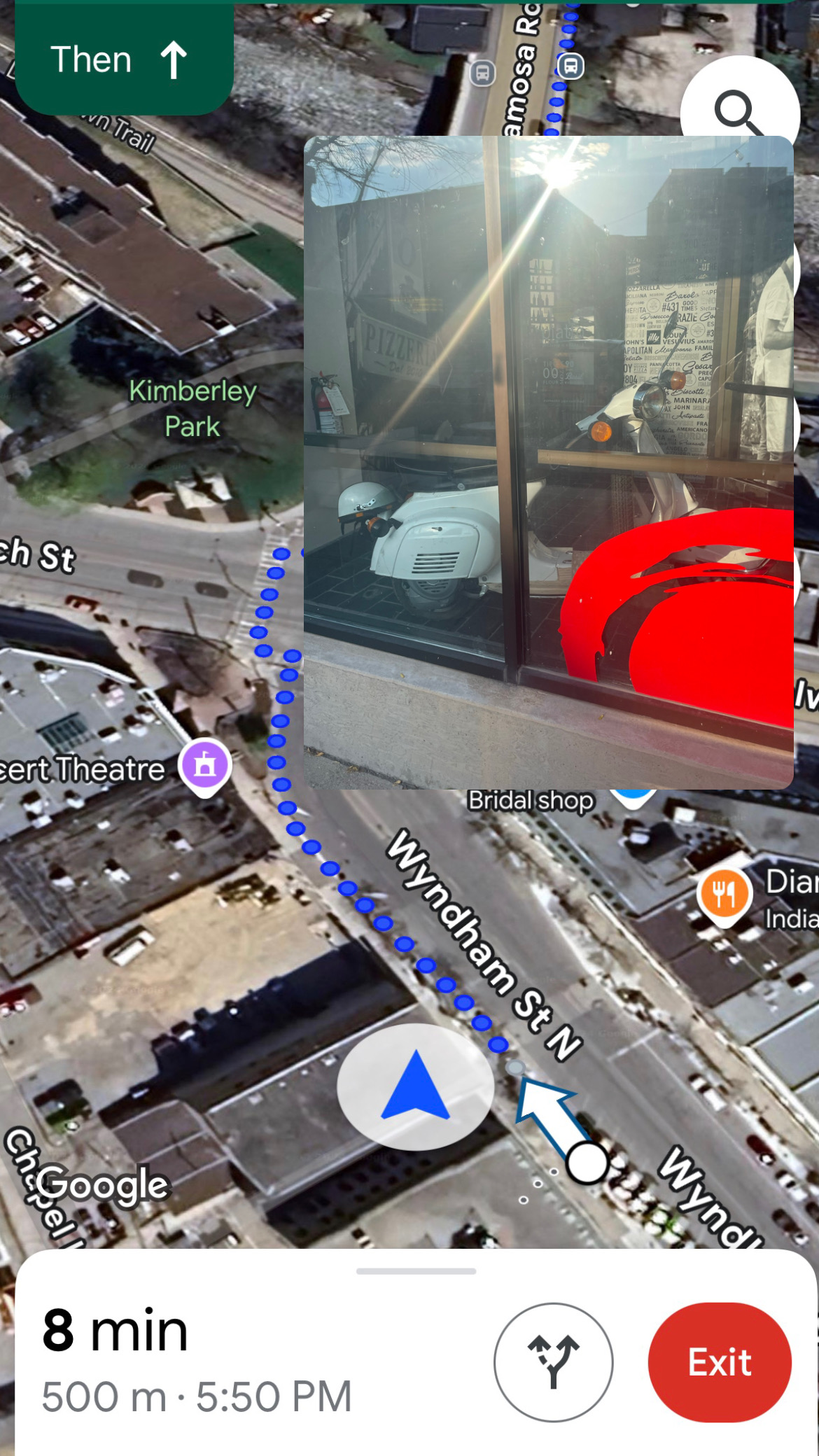
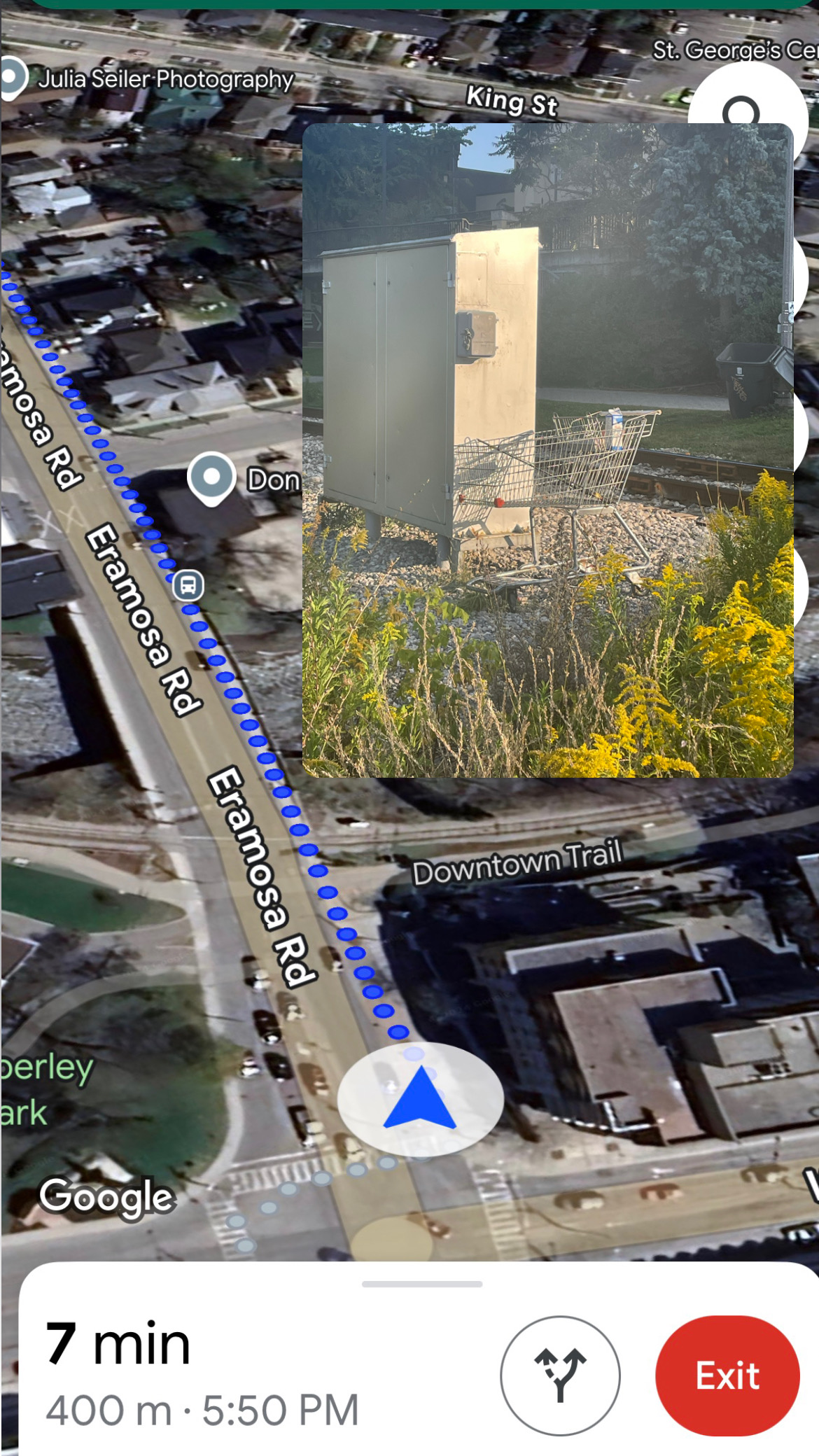
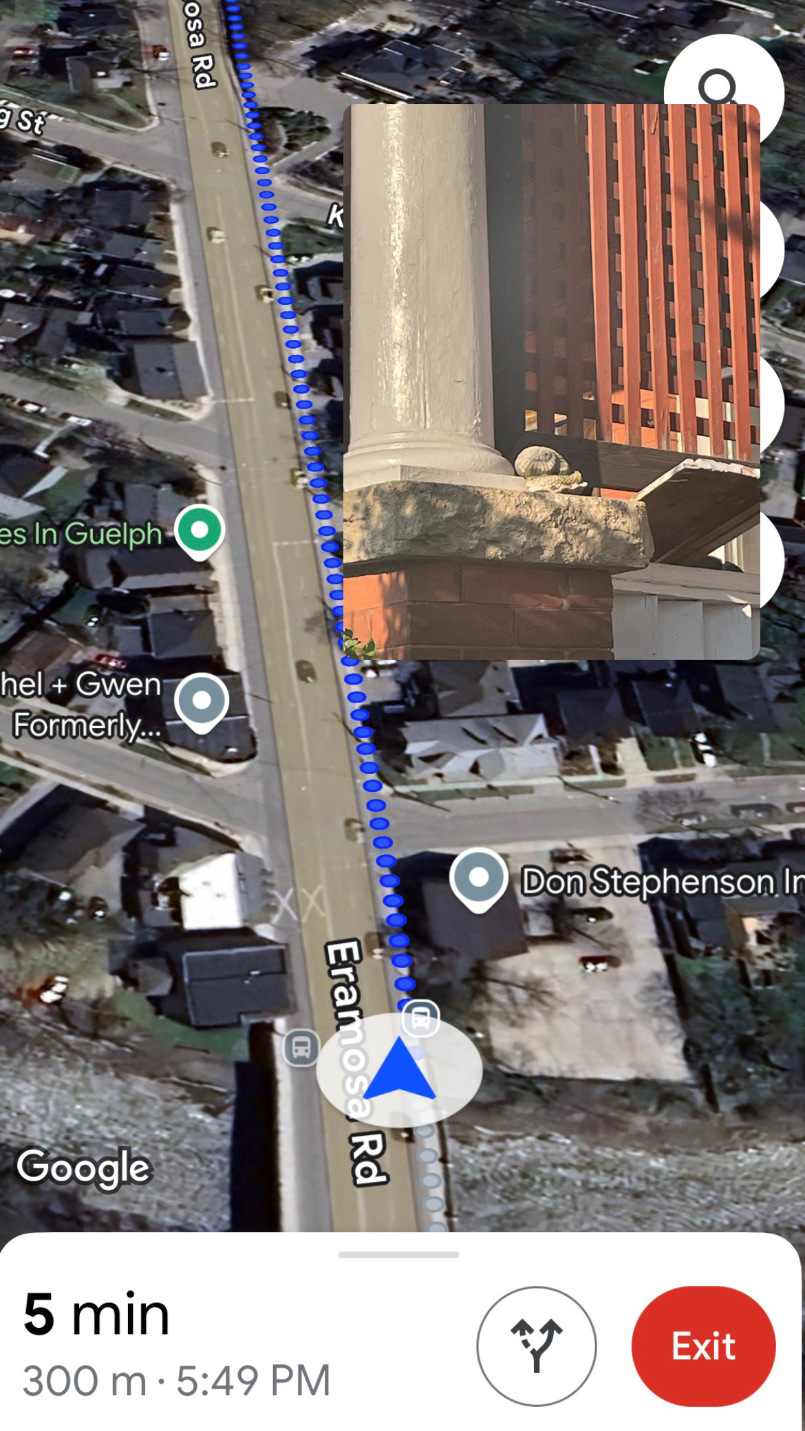
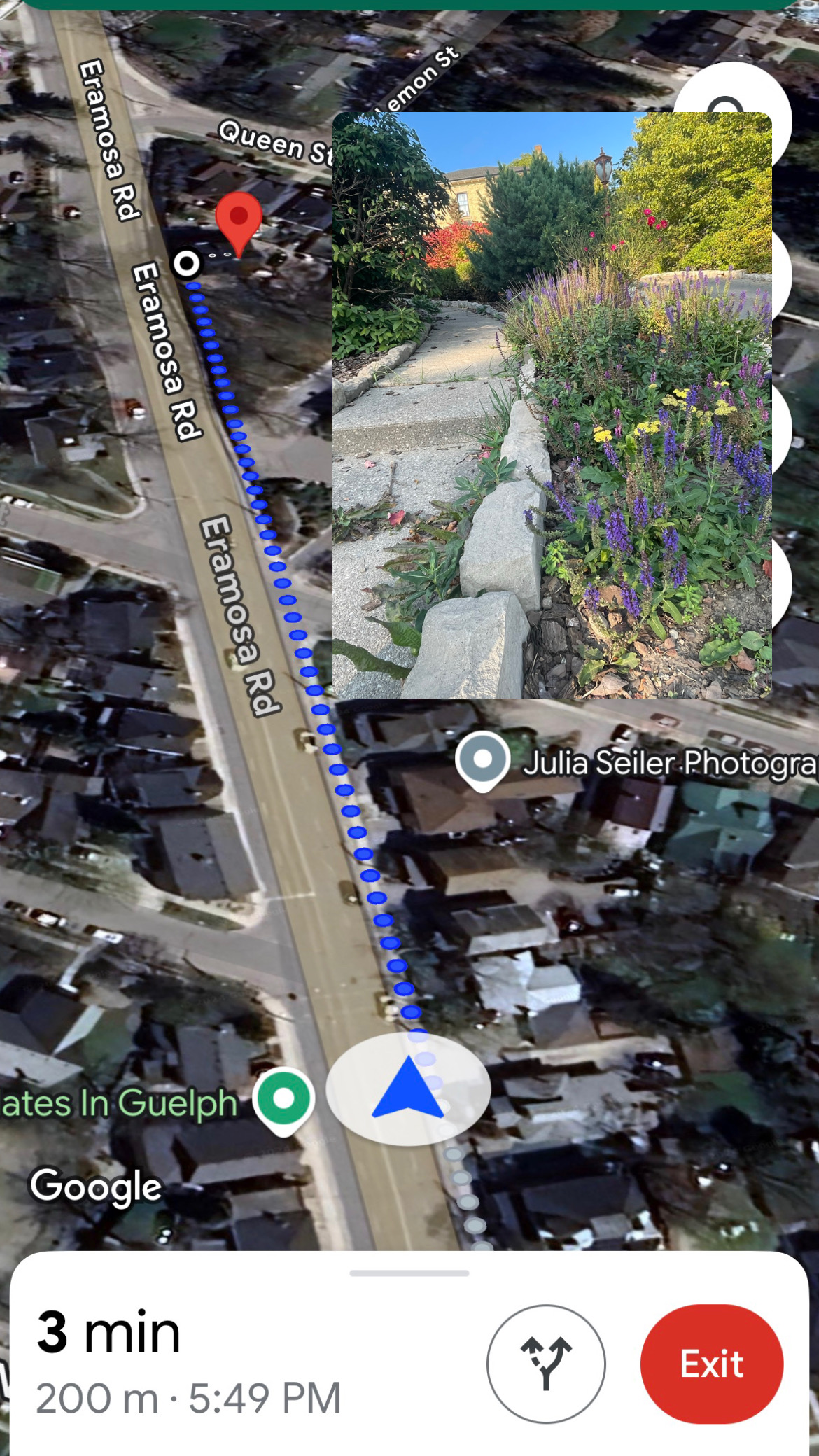
I plan to Walk A Km and take 1 photo every 100M showcasing how long a Km is and how many different things go unnoticed in that sort of distance, the deeper image to me behind this would be to slow down and appreciate the little things that you see every day

I’m starting at a bus stop in the middle of downtown Guelph and walking a kilometer down a familiar path to me to see the small things that I miss daily.

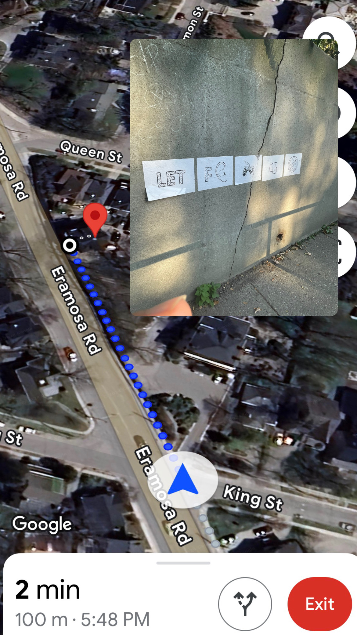
Walking down and stopping every 100m gave me a lot of mixed feelings. It was nice to stop and appreciate the surroundings but on the other hand, it also did not feel safe doing that as a girl downtown.

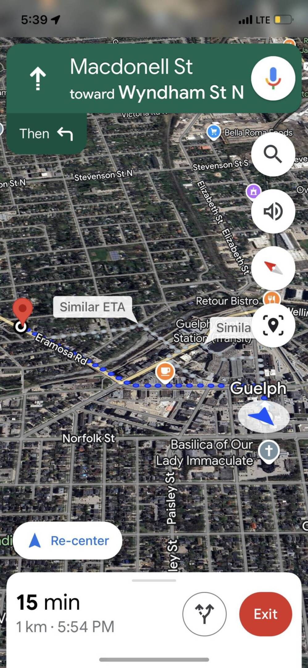
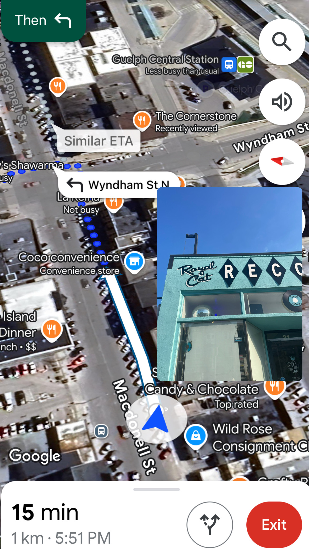
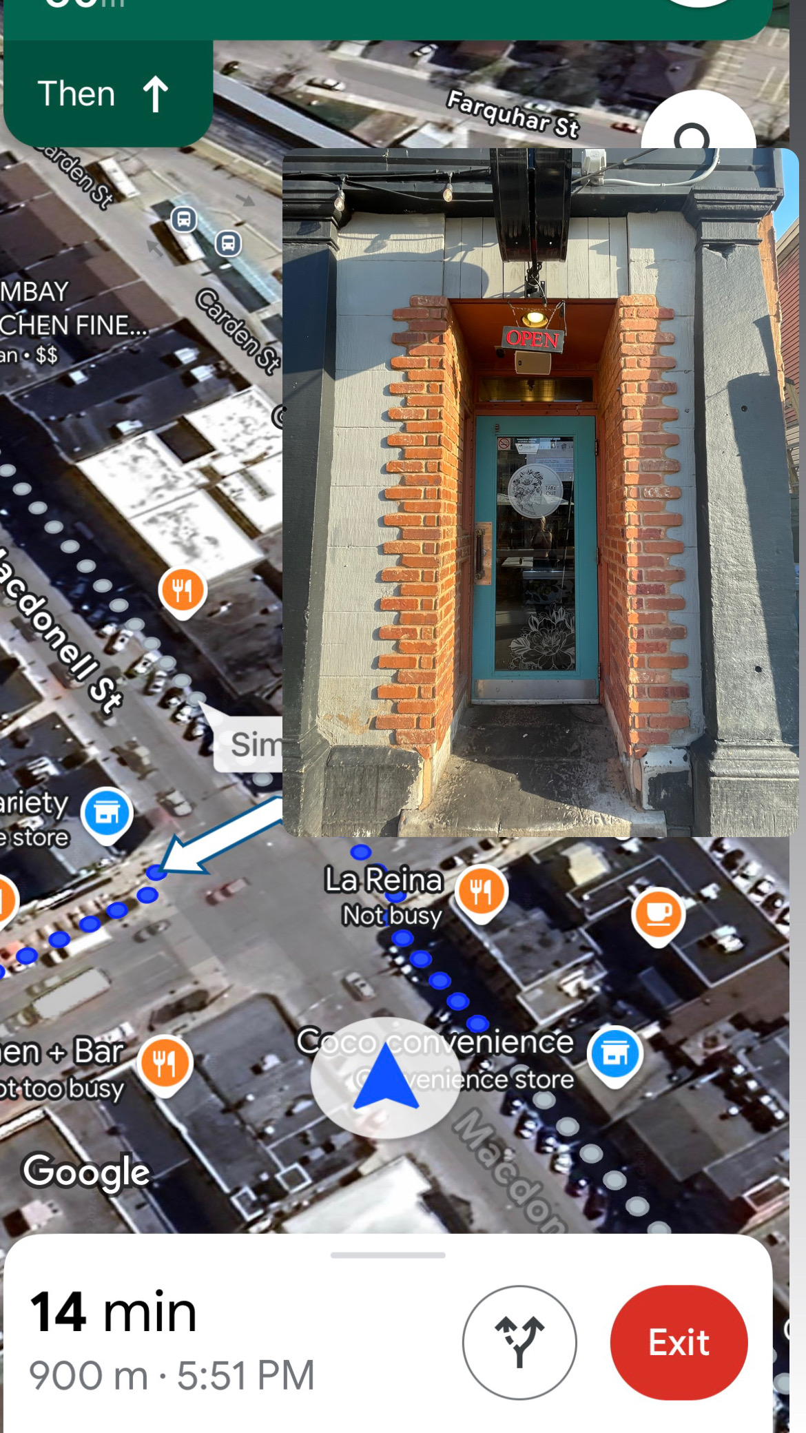
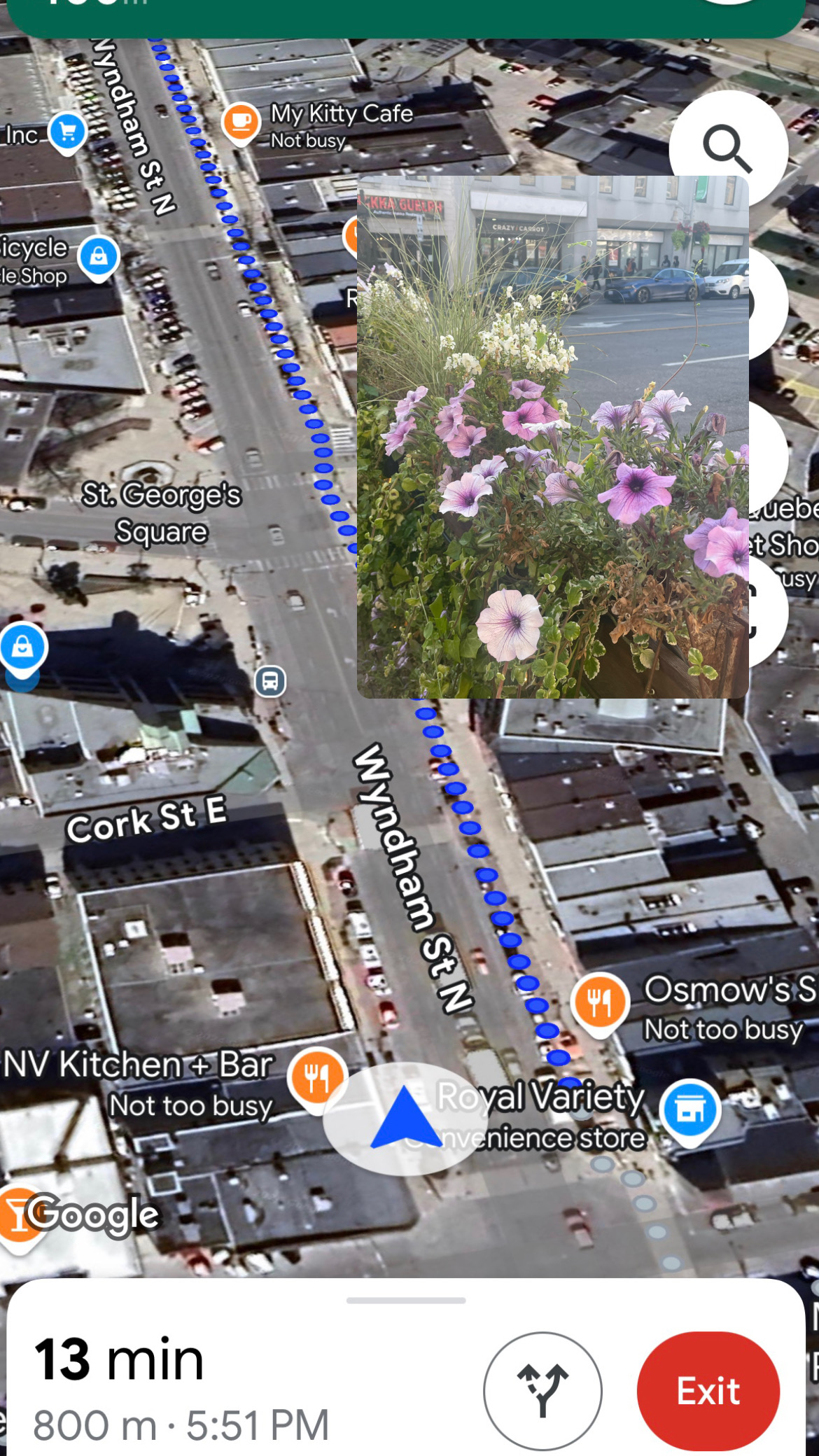
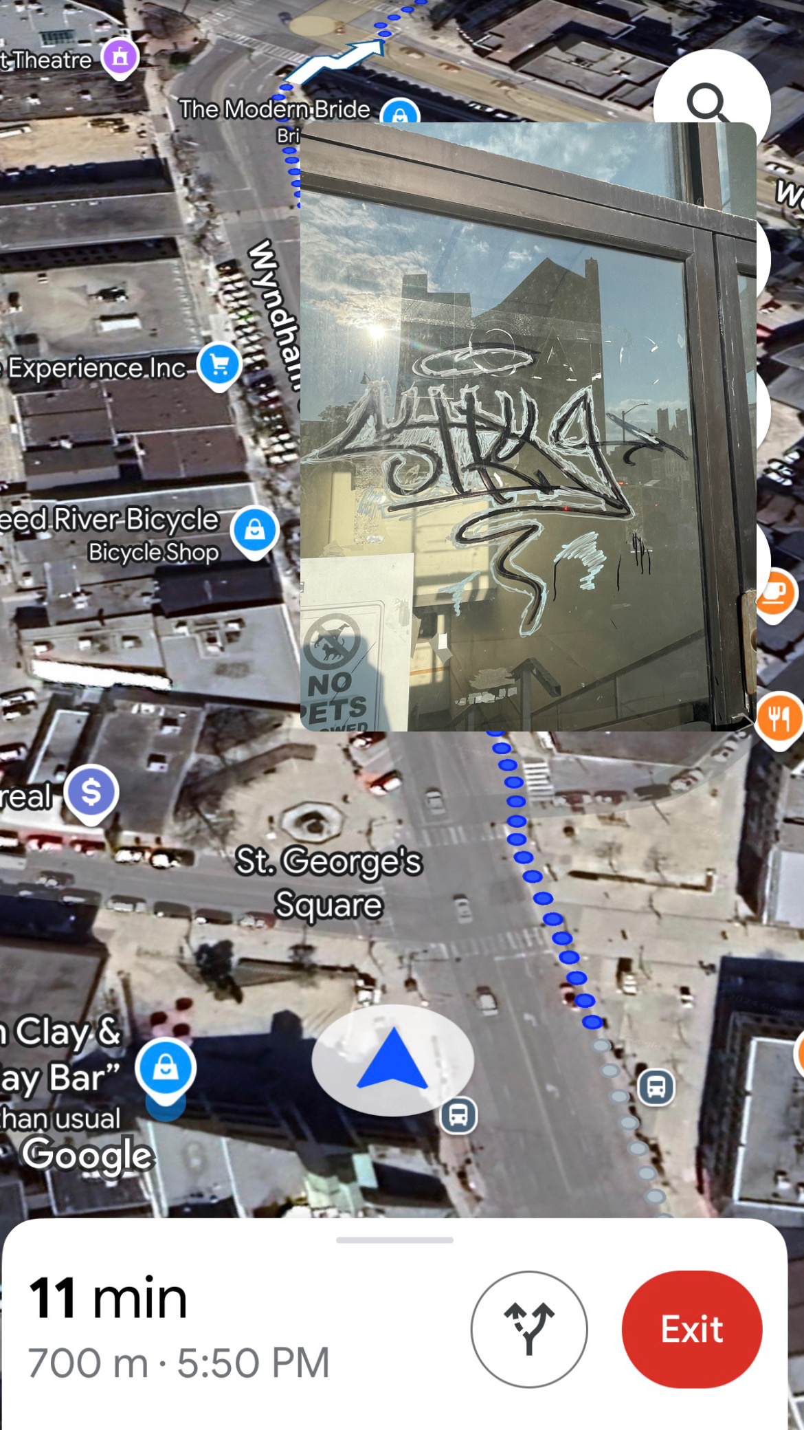
In the photos down below I displayed the path taken along with the images at each destination, at the bottom left you can see how far from my destination I am.

Path Taken:

Screenshot
Screenshot
Screenshot
Screenshot
Screenshot
Screenshot
Screenshot
Screenshot
Screenshot
Screenshot

Marina


Conceptual Portrait:

180 minutes of spit

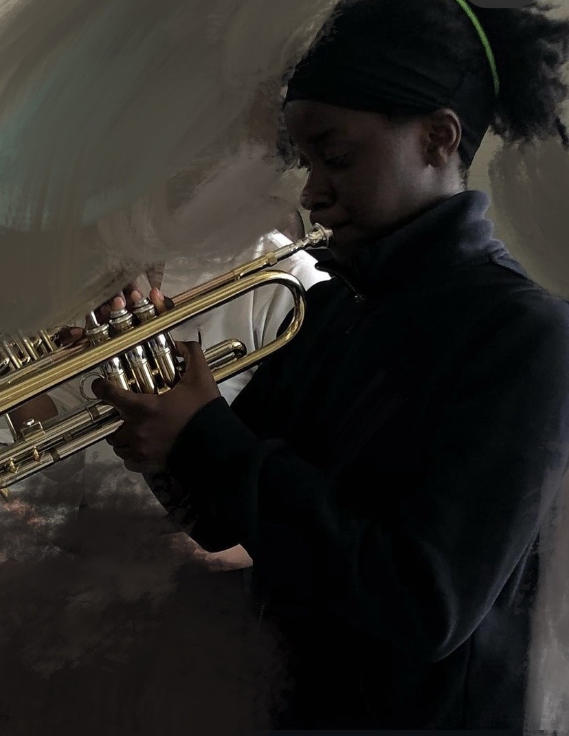
For my conceptual portrait, I decided to keep the theme of music, and show the residual effects of an artists practice, and skill. Straying away from the piano, I chatted with my friend Phyllis, who plays Trumpet in a band, and partnered with her to record how much time she took practicing her trumpet for an upcoming performance, and to display that time in a conceptual way.
for this piece, I wanted there to be a relationship between time and the material and the subject, to create A single form of documentation as a Portrait. The way I captured this portrait was after every hour worth of Playing, I held up a piece of paper, stuck to a piece of cardboard, and had her blow out her spit from her spit valves in her trumpet. To make the spit easier to see I told her to chew on a colourful piece of gum before she went into practising, however it didn’t show up as clear as I thought, but you can see a bit of pink colour on the sheets of paper. Thinking of a way to display the sheet of paper, I thought a really clean display would just to be to line up all three sheets one beside another and label how many hours worth of practice per sheet, which was one hour each, Which I think I will represent in minutes instead due to the title. Phyllis took a break every half hour so she was not playing for an hour straight however the spit accumulated is equivalent to one hour of practice per sheet

TRUMPET-

IDEA:

  • Hard work
  • Practice
  • TIME
  • MATIRIAL
  • SUBJECT
  • DOCUMENTATION

TIME:

  • It takes a lot of time to accumulate spit in a spit valve, therefor there is a concept of time within the portrait

MATIRIAL:

  • Coloured spit on paper
  • Maybe framed- professional

SUBJECT:

  • The portrait is of practice and time
  • Residual effects of an artists work

Ideas and themes:

-Classical music- piano keys, playing a song, multiple people playing in a band on different instruments

This idea would require some recording of where someone’s fingers would land on a piano during the playing of a classical piece, such as swan lake. I would ask someone to cover their fingers in something like paint or glue and glitter or charcoal, therefore after they play the piece you will be able to trace back the where fingers were pressed to play the piece.

Another music themed piece would be covering not only the piano players fingers but also the sticks playing on a drum and the fingers of a guitar player. The goal of this afterwards would be to be able to trace back the bands movements through the tracing of pigment that initially covers their hands and instruments. The overall profile would be to a specific song and/ or band (my sisters band), and it would be in a photograph, including nothing but the instruments (no people) and the colourful pigment representing the aftermath.————— Another way this can be done is by individually taking multiple pictures of each instalment, for example the piano keys up close, the faces of the drums and sticks, and the strings of the bass or guitar.


AUDIO ASSIGNMENT

Same old scare:

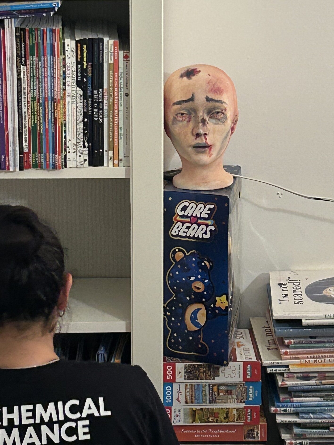
When making this project I wanted to work heavily with the idea of jumpscares. I decided to take that on in two different ways; one being scaring my family members with the same scary object (pic below)

, and capturing their reactions and screams, which turned into a jumpscare audio itself. The other piece I came up with was to take jumpscare clips from old 80’s horror movies and overlap all of the screams.

I picked 80’s movies in particular because they all have that really iconic theatrical acting and music which I feel like would be the most recognizable for horror movies. I took clips from close to 15 different movies. The clips were all a bunch of dramatic jump scares, and I overlapped them in a way where the “scare” or “scream” went off all at the same time. After making and combining all the clips however, it doesn’t sound like there are even so much as 2 different movies in there. Somehow the audio just sounds like a dramatic scary clip from a single movie. I thought that this was kind of interesting because it made it evident that all 80’s movies really do have the same iconic music and bad acting, which definetly contributed to the audio turning out more seamless than intended. I think that it actually works very well for how the piece turned out and makes it all the more interesting.

For my second clip, I really liked the idea of making somebody’s fear a scary element for viewers. Using the screams as jump scares, I combined an audio clip of my family members screams after I scared them. I think it was really effective as a jump scare as I tested it on multiple people, and the anticipation was violently long.


VIDEO ASSIGNMENT

ONE SHOT-

For our one-shot, we started by brainstorming something around a “bang” or a “splatter”. Our first attempt was to manipulate the lens of the camera, which then turned into the main subject for this project. What we did was add some colourful paint, reds yellows and blues, to one of our hands and while one of us help a pane of glad, acting as a camera lens, the other hit the pane and splattered th paint. After cit however, we took a turn to use just black and white paint instead, creating our overall piece.

LOOP-

Next, we did our loop. We enjoyed the idea of having one person apply paint and have the other scrape that paint away, creating a constant loop. In our first attempts, we again set up the glass to act as the lens, and used our hands to apply and scrape away the paint. However we ran into some trouble because our hands were not scraping away the paint efficient enough, making the paint harder to see when it was applied again due to all the residue being left over. So we looked around the painting class and found this giant brush to scrape.

EDITED-

Our initial idea the first few times filming was to have the camera pointed at us, as one person held a canvas, the other would have just their arm in frame, painting with different objects, and we would switch off between who was painting and who was holding the canvas. However, it was too messy in the end and we needed to come up with another alternative. Instead, we used different objects to paint, and made reference to Pipilotti Rist as I smooshed my face against the pane of glass, painting with my face.


WEEK 3- FEILD TRIP

As someone who hasn’t experienced contemporary art or Looked into it at all, I really enjoyed some of the works in the contemporary art museum. They all struck me to have questions about what kinds of conversations were had in order to create these pieces, and it was interesting to be able to explore different kinds of contemporary art. I enjoyed a lot of the works in the museum that surrounded ideas of culture and invited people to look at and understand vital parts of some peoples identities.

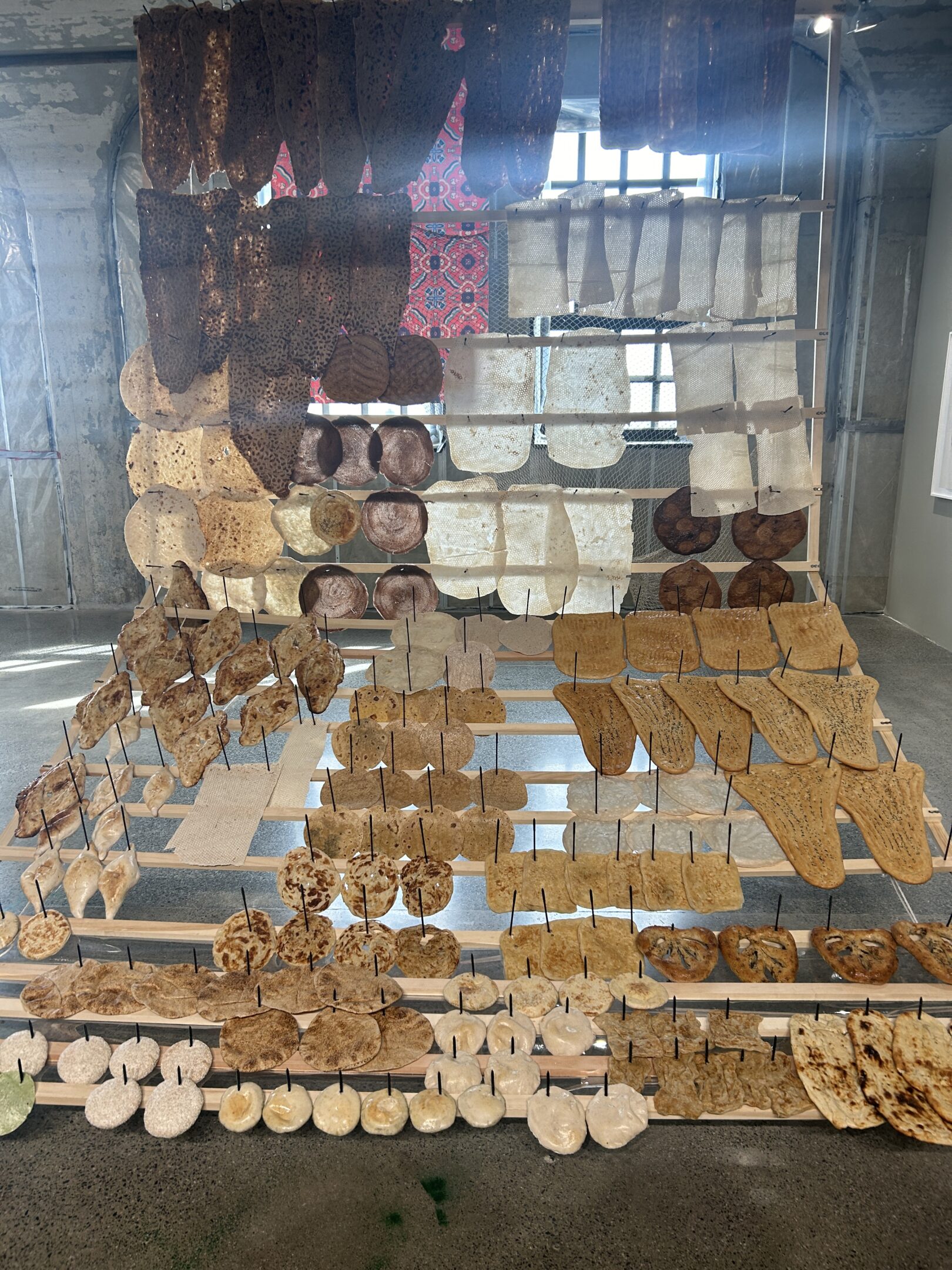
FLATBREAD LIBRARY

This flatbread piece by Sameer Farook caught my eye for how large the piece is and for how much I love food sculptures. When I first looked at The work, I was interpreting it as the evolution of flatbread all across the world and how different parts of the world made their flatbread. However, after reading up on it, I discovered that all these different kinds of flatbreads come from different bakeries in Toronto, Which is amazing because it just shows how diverse the city is in terms of cuisine. All of these breads are originally baked on an oven called a tandoor, which was used in south Asia, the Middle East and North Africa. Experiencing the sculpture itself was also really cool. I got to see all different textures and colours of all the different breads and it struck me to think, Different kind of bread meant to be eaten with something specific?

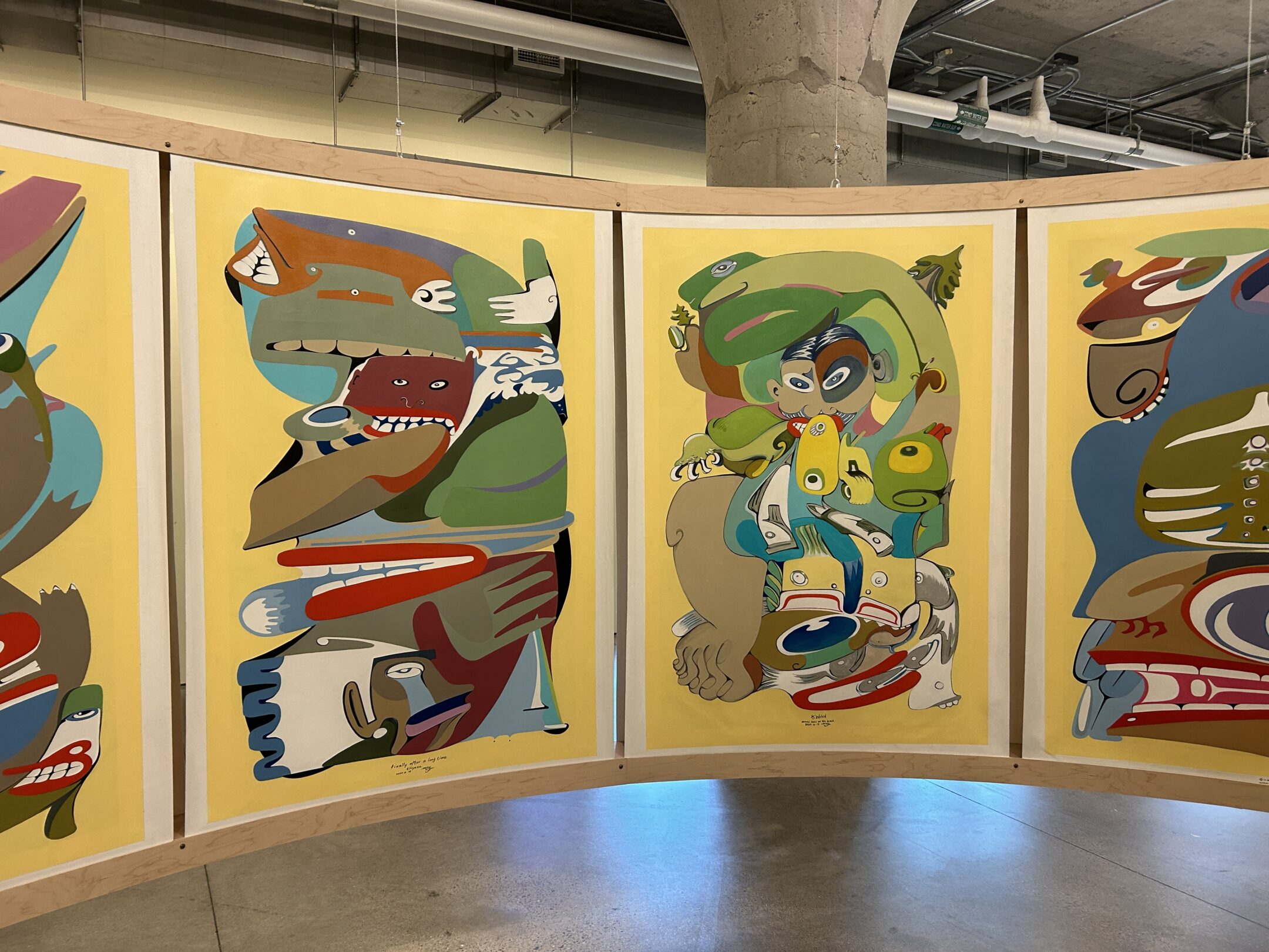
Another really cool work that I found was by Michael Nicoll Yahgulanaas, Who is a contemporary illustrator that uses materials like paint and ink, and creates a lot of mixed media pieces. I really enjoy his work because of how fluid they look, And even though there’s no shading to his work or anything it’s still looks really 3-D and there’s quite a lot of depths to it. I also really enjoy his style of illustration I think that all of his hand drawn/painted work is very smooth and confident, which made all of these panels side-by-side look like chain of events.

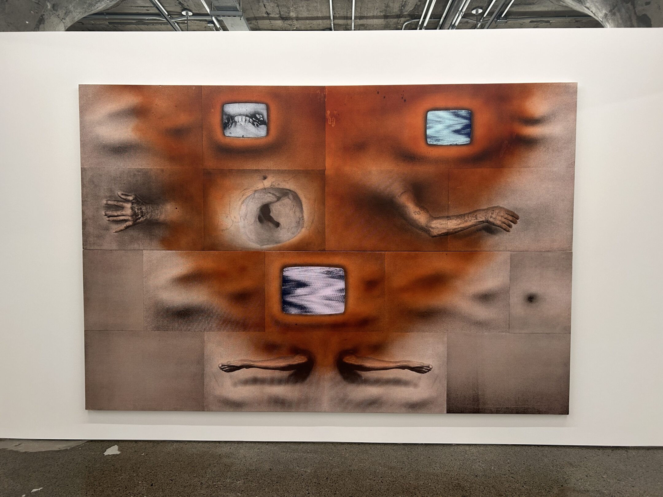
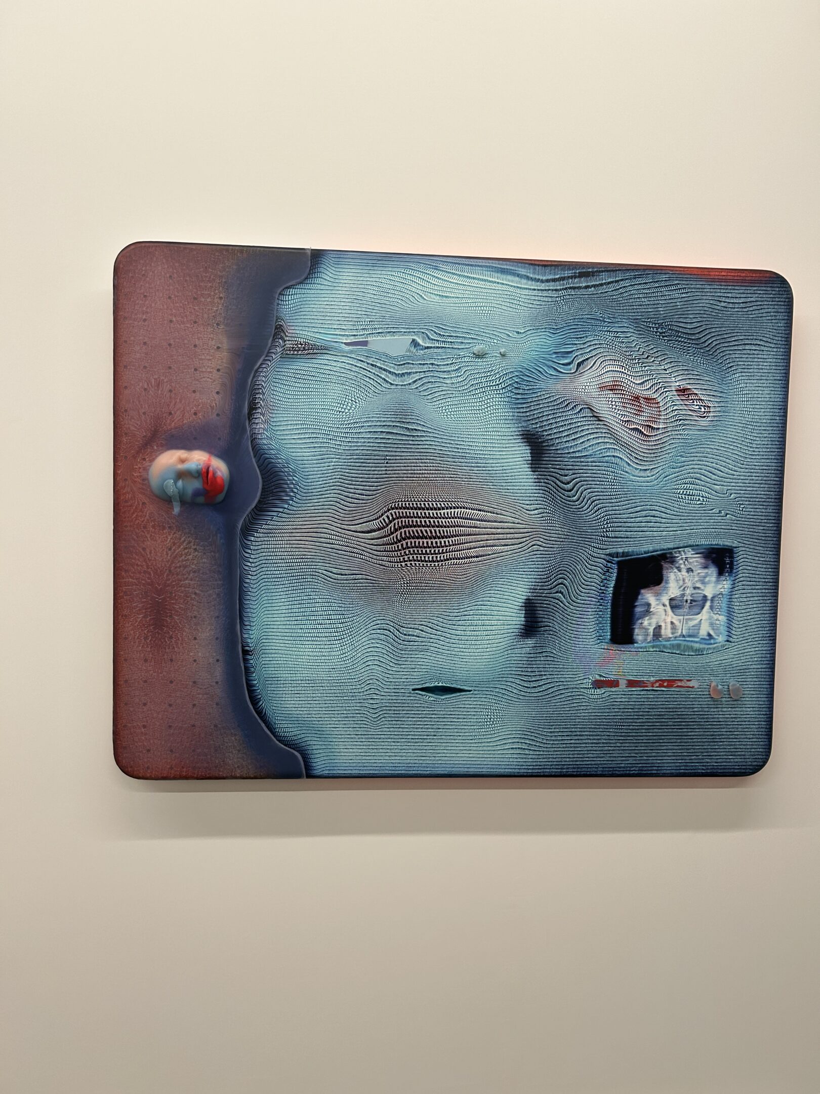
Unfortunately, for these last pieces, I didn’t get to look too much around the gallery as I didn’t have enough time, However, These pieces were really cool to experience and look at because of their size and freaky shading. The printer effect along with all of the body parts Was really interesting. I think I overheard some other people in the gallery talking about how this artist was exploring new ways to incorporate Technology into his sculptures with the idea of pixels and glitching. I could definitely see that in the visuals and editing that he put into these photographs, Or screen prints, And it made it almost creepy. Unfortunately, I didn’t get a picture of it, but there was this massive wall that you could walk around, The entire thing was flat other than these random flesh like sculptures that stuck out from the wall, almost like handles. I thought that they looked out of place. But it was also weird , And obviously would make more sense if I read about it, But there were small nipples around this wall as well, I wonder if this is supposed to add a vulnerable or erotic component to whatever the sculpture was.It definitely was something I’ve never seen before and was completely new to me to even use materials like this, and I’m definitely going to be looking at more artists who use mixed media’s like this one because it just creates such a freaky effect that I’m interested in.


WEEK 2- PIPILOTTI RIST

  1. Post an image from one of Rist’s videos that you are most interested in. 

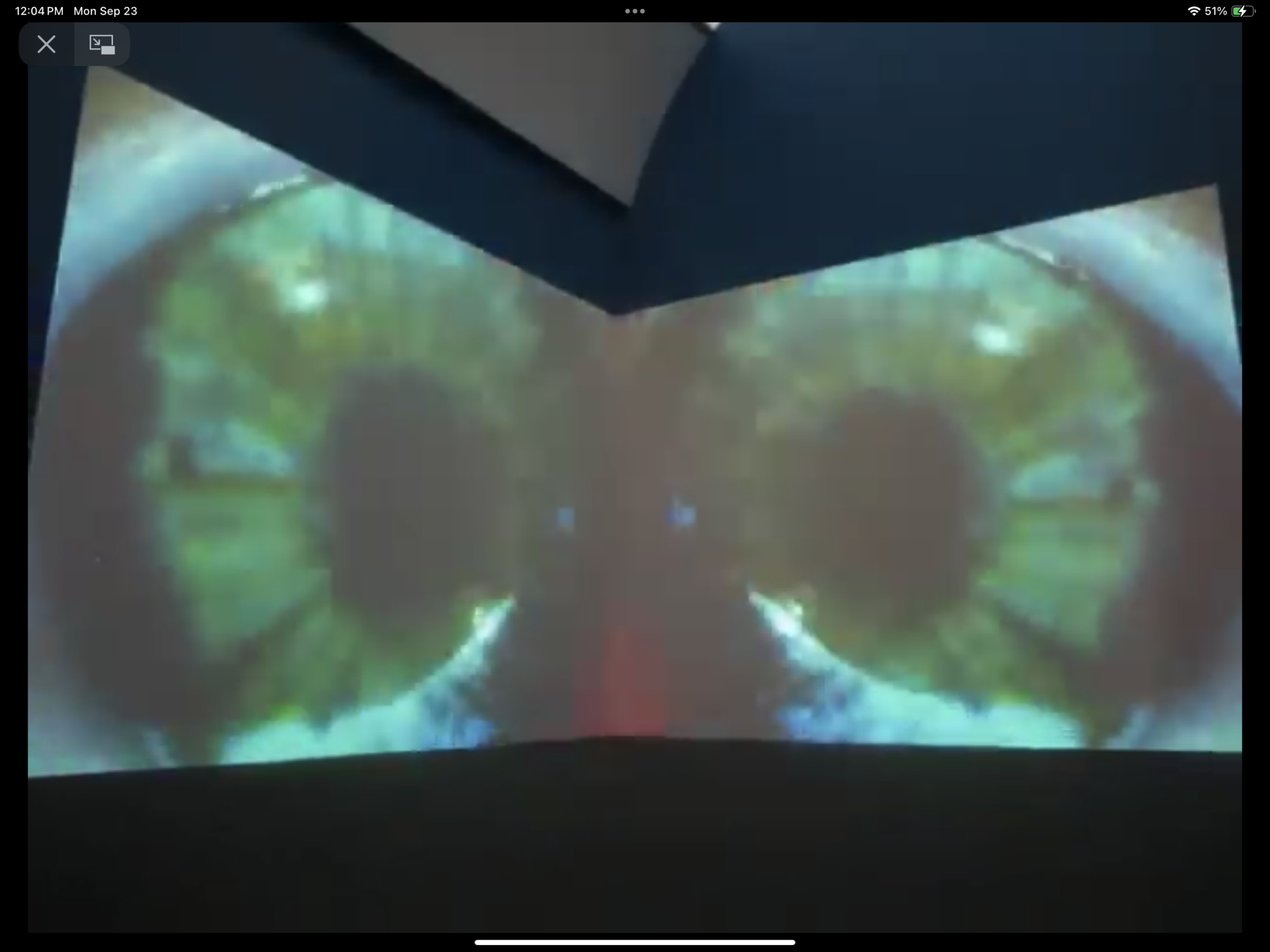
   Rist’s “sip my ocean” is a captivating mirrored recording of both ocean landscapes and the human body, which seem to overlap eachother due to the mirrored effect. This was inspired by christ Issac’s Wicked Game, as Rist found the ideas of wanting to fall into the other as well as being afraid that the other will destroy us, very relatable. The way she goes through with representing these ideas in video is by using a mirrored effect to represent the tension one would feel, integrating a loss of control when the voice of the music flips. As for the contents of video, she keeps the shots of the human body very close and personal, the shot being very detailed. In Some of the scenes, you can see hair follicles and sweat as an example of how close it really is. Throughout the video, you can see rist swimming in the ocean, having the camera focusing on parts such as her hands, close ups of her eyes, arms and even the turmoil in the water she creates while swimming. It’s all very eerie and definitely represents the idea of tension with how some of the subjects almost rip away from eachother. As for the video editing, Rist adds quite a vibrant saturation to the video, causing the blues and greens of the ocean and the eyes to pop out. It creates a connection between the environment and the subject (in my opinion) and overall makes the video more visually appealing. Because the video is directly inspired by Wicked Game, the song plays over the video, adding to its hallucinative vibe. Personally I think the high pitched guitar in the beginning of the video also has a slight tropical  vibe, which adds a lot to the connection between the visuals and the sound.  Because the piece is pretty straight forward, the way they display in gallery’s is by using two corner walls and projecting the mirrored recording onto these two walls, having the line of mirroring be directly where the two walls meet.  This work was very striking to me as I think it was an excellent depiction of what Rist was trying to create. The part about tension and how she decided to display that with mirroring was so well through out and I loved the visual effect it gave. I think a really big part of art is to evoke some sort of feeling, weather its simple or complex, and this piece definitely make me feel a sense of harmony and corruption.

  1. Rist has had a long career in video art making – how do you relate it to the kinds of video that you might see all the time on Tik Tok or You Tube, in our time?

I feel as if this is definitely a situation where artists walked with videography so we could run with it. The exciting obscure approach with videos in media today  definitely takes from how artists such as Rist were thinking and exploring engaging results back then. I can definitely see the relation between how wow factor media today carries some of the weird and psychedelic editing that rist applies to a lot of her work, like sip my ocean and pixel forest. Editing like that is now used in a lot of music related content, more so punk videos, as its seen as trendy and cool, instead of speaking on the meaning of the idea itself. We don’t use that kind of editing now as literally to the idea as rist does in her works. Usually the glitchy, overexposed content in Rist’s work speaks on the multitude of different feelings and actions that Rist includes in her work. Its usually heavily linked with giving out and exploring the limits and mistakes of people, providing people with another view to look into, other than oneself and the world. It strives away from the average landscape of life and invites people to explore different ways of thinking. Her works show you things you wouldn’t typically be introduced to if it wasn’t in the specific way rist intends to display vulnerable gazes into the human body and desires.

Experiment: While still at school – put on your sweater/shirt INSIDE OUT. How does this change how you feel? Is it changing how other’s are treating you? If you can wear your sweater/shirt inside out all day – make a few notes about the results of this very small change in your presentation in public. Is this a performance? Why?

After wearing my shirt inside out for about an hour on campus, I can conclude that it made me feel quite stupid, and very conscious of others. I began to think things like do they know I know its inside out? Or do they think I have no idea. If I acted confidently even though the shirt I was wearing was very obviously inside out, with tags sticking out, would anyone say anything? So, after sitting in the library, I have experienced two people that came up to me and informed me that my shirt was in fact inside out. The question if this is a performance or not is complicated to answer for me, because I’m not sure about the intent behind doing so. I think in a way doing this would be a performance because you have an idea and a documented result. But on the other hand, it speaks on human experience In general, as people wear their clothes inside out by accident all the time. But what if you wore it by accident and was aware of it, but wore it anyway? It stuck many questions for me but overall I would conclude that it made me realize how analytical people can be, even when you think people aren’t aware of you.


Week 1- Jax’s Kilometer

I decided to explore a kilometre using my dog.

My first idea in which I brought to critique was that I walked a kilometre with my dog, in an area he has been before.

However, I concluded that I could make my assignment more interesting by placing my dog in a spot he’s never been, and walking where he wants for that kilometre.

In this kilometre, I wanted to explore the world in the lense of my dog, stopping for what he’s interested in, and exploring where he so chooses. When walking, I was able to discover a lot of cool things, and even stumbled across a new park I had no clue about in my home-town.

Like before, I included a video of my dog before the walk (video above) mainly just to mark the beginning of the journey. We also ended up driving and parking near the spot since it was quite far from my house and my dog cannot walk that far of a distance.

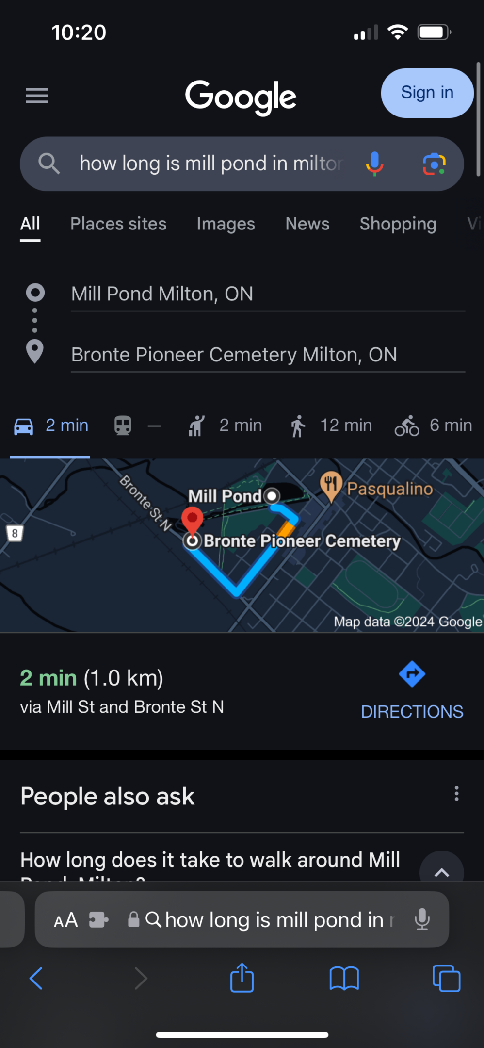
I started at a local pond named Mill pond in my home town, and walked along side it. In order to ensure that I would be able to properly document the kilometre, I stoped to check where we were on the trail every once In a while, slowly leading up to exactly 1 kilometre from mill pond to a cemetery.
here is a overview of where we walked on google

At first my dog was stopping at a bunch of trees, circling around little bushes and such. But as the walk went on I started to discover some things that were much different from our usual route

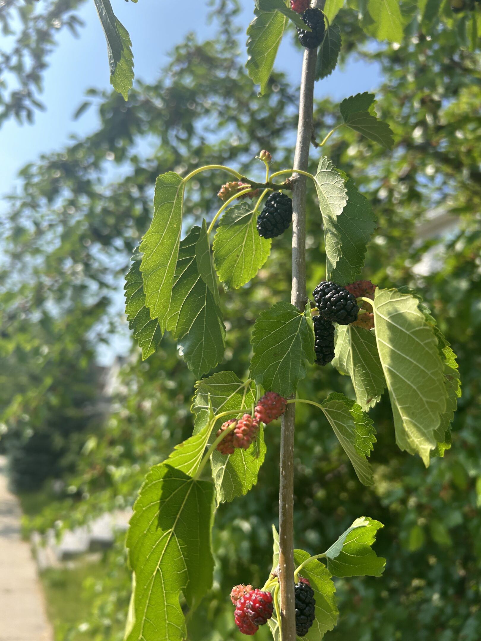
First we stumbled about wild berries, in which my dog sniffed but did not eat, only to later discover  that they are possibly poisonous, which strikes the question did he know they were poisonous? Could he tell?

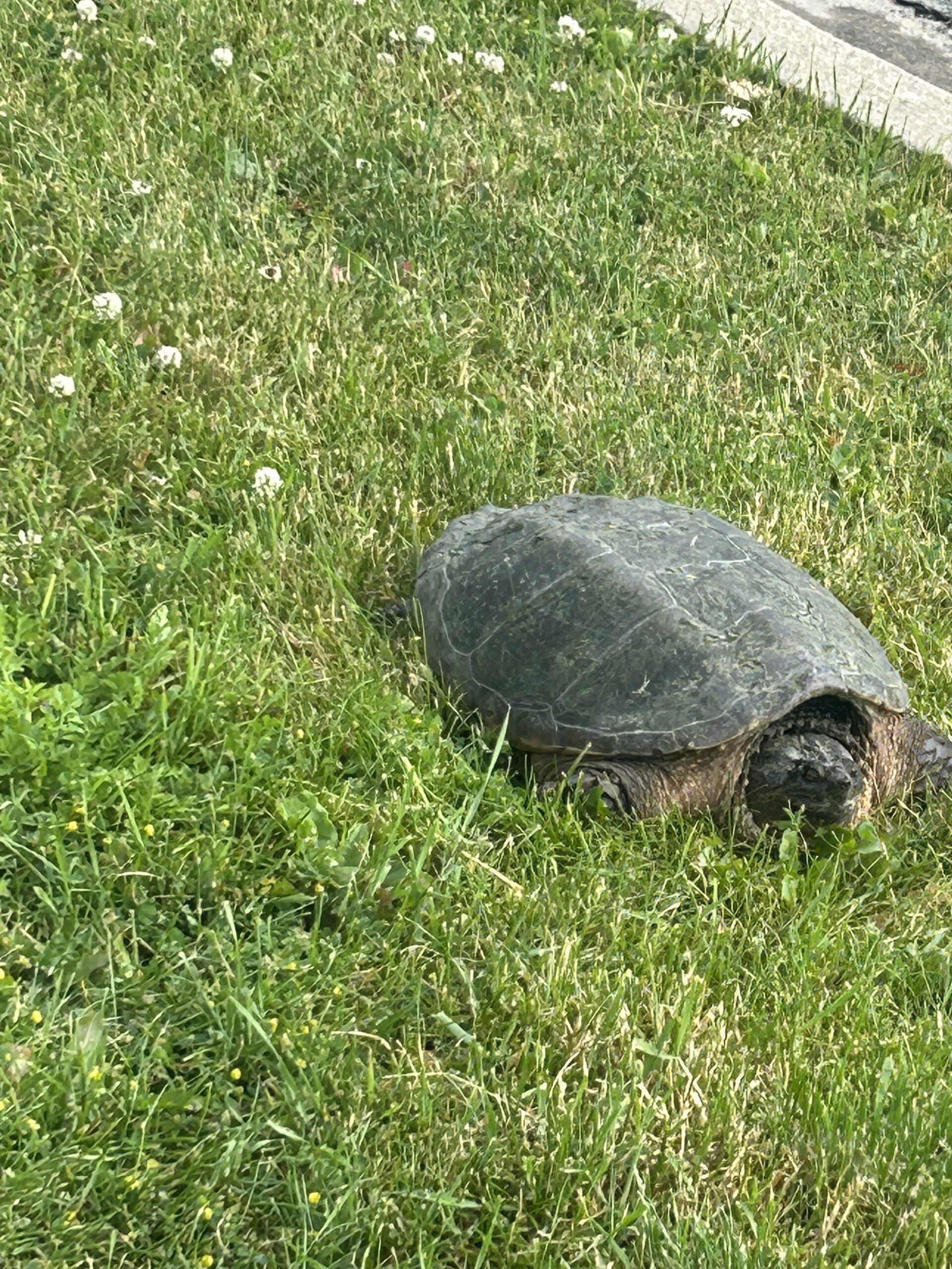
Then we stumbled across a tortoise. My dog was definitely not too happy, he seemed quite intimidated. But I could tell he was curious about the animal. It was cool to experience what he decided to pay attention to vs what I would normally stop for. He definitely also did not just happen to walk past the tortoise, he went quite deep near the water to find it.

We also came across a small waterfall, which he drank from. This also made me question if he found the water on purpose and if he wanted to meet the water because he was thirsty. When I think back to his manurisms, he did seem confident in going towards this direction, which gave the impression that it was what he was looking for.

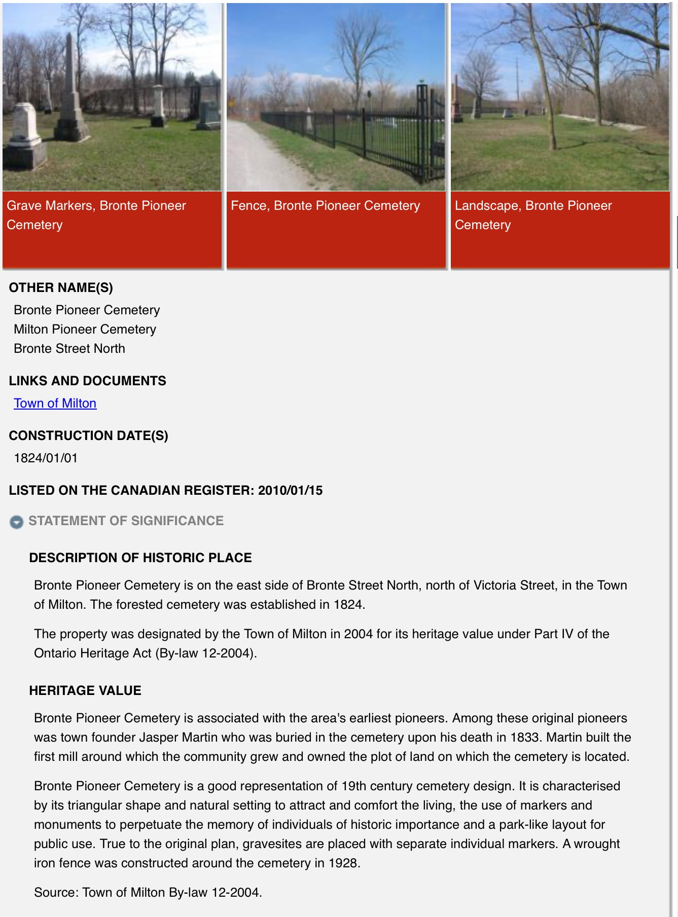
Then, nearing the end of the walk, we game across a cemetery that was hidden (was not private)

It was a pioneer cemetery in which the founders of my town were buried, and was a traditional 19th century style cemetery. It was cool to walk through, as I don’t think many people knew about its existence. The plants were overgrown and overall it looked really cool.

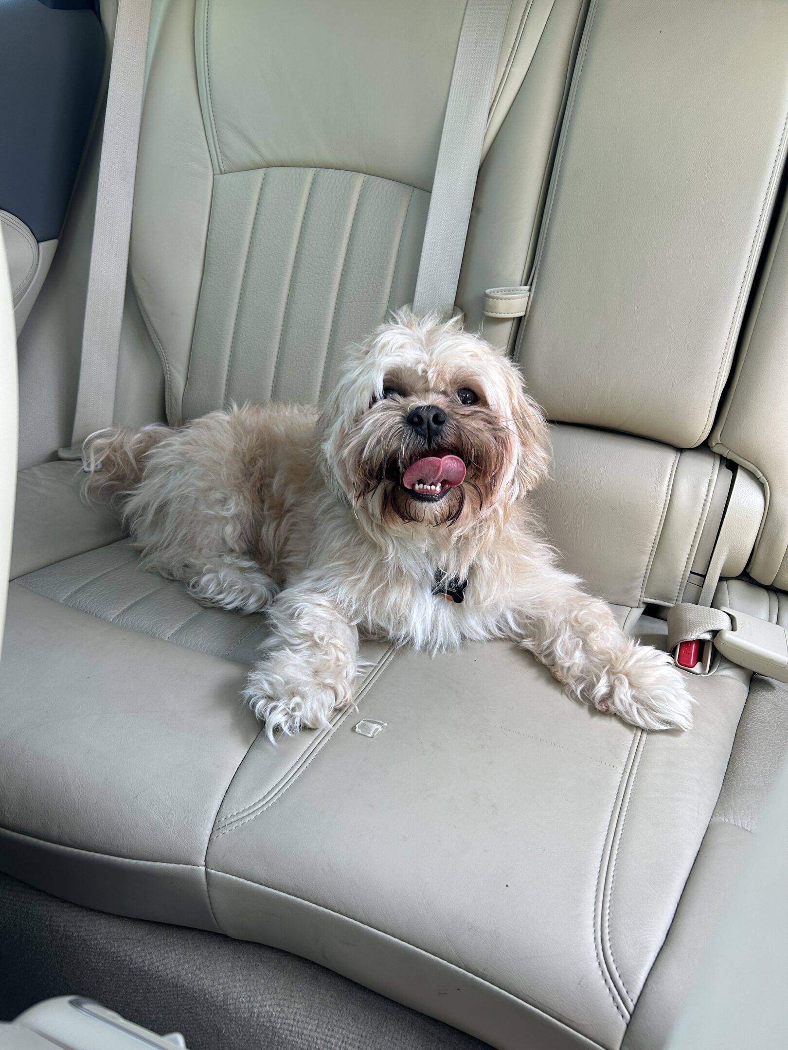
And then here’s a pic of Jax back in the car, quite tired after the walk.. so I gave him an ice cube.

Making A Kilometre Project

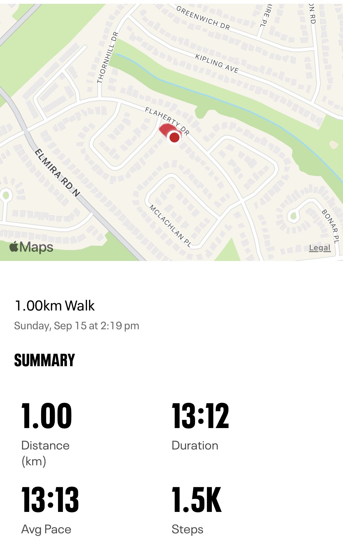
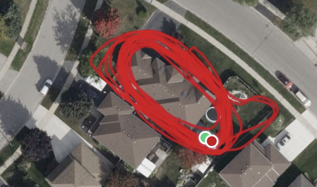
When thinking about the “Making A Kilometer Project” I wanted to recognize the true distance a Kilometer can cover. This is something I heavily underestimated, and I did not realize the amount of distance that could be covered if you’re walking in a confined space. For example, I wanted to demonstrate a kilometer by a number of laps around my house, where I originally thought 1km would be approximately 10-15 laps. However, once I completed my 13-minute walk I realized it was way past my estimation and came out to be 22.3 laps. Where I tracked my progress with Mapmywalk to give me an exact kilometer.

I found it very interesting how inaccurate my guess was since I walk/ travel several kilometers in a given day. Moreover, how much less joy comes from a short walk since walking around a building 20 times becomes very repetitive. In turn, I am making the kilometer feel much longer compared to different settings. Putting in perspective how large a kilometer is and dependent on the activity you are doing. 
 

Screenshot

Toronto Trip

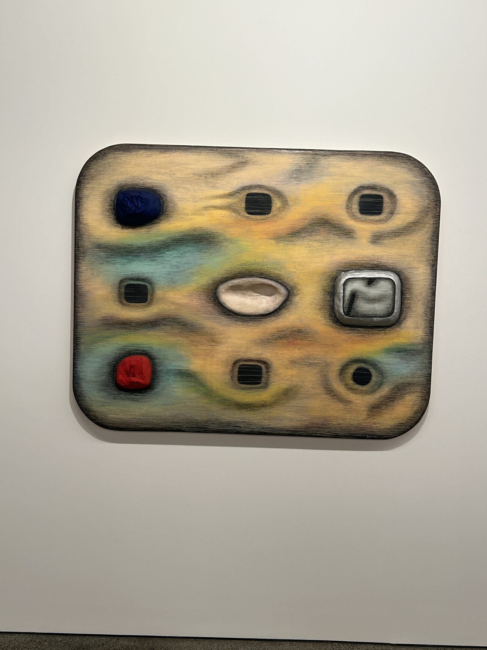
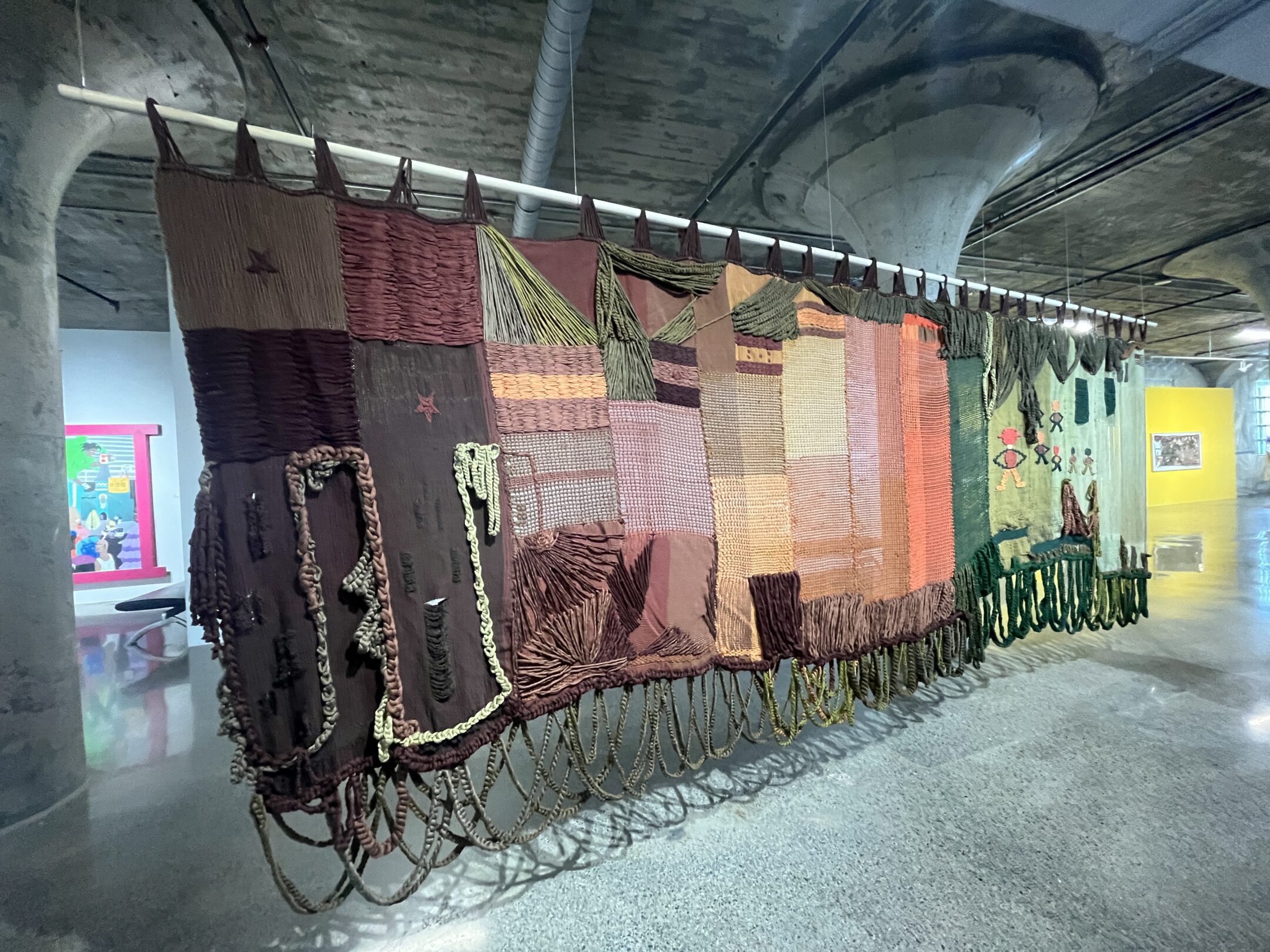
Angélica Serech an El viaje de Yibo (Yibos Journey) is a 2024 artwork that explores the connection between personal and collective histories, emphasizing the emotional effects of migration and forced displacement. This large-scale textile was one of my favorite pieces from the trip because of its bright colors and the artist’s techniques to make it look three-dimensional. Specifically, the threads and knots emphasize the idea the artist is trying to express. In addition, having the piece hung up in the center of the room draws your eyes toward the piece and makes it stand out. 

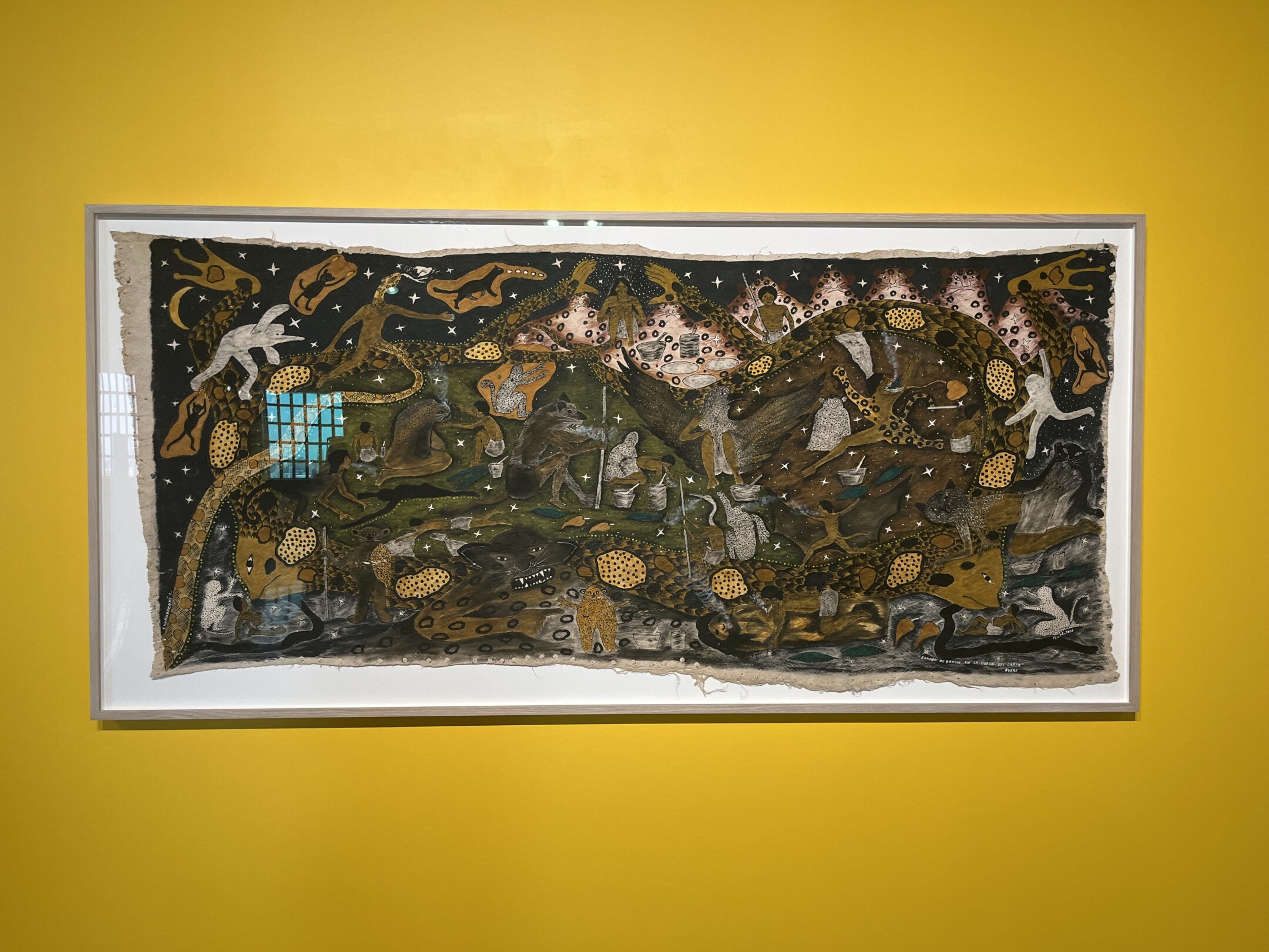
Santiago Yahuarcans is an artist who draws from his indigenous heritage from the Huitoto people of Peru, blending mythological elements with personal reflections on nature, memory, and cultural identity. Another one of my favorite pieces was a part of Santiago’s paintings, particularly the one on the right. It fascinated me how the artist merged nature with various figures within the painting. The more I looked at it, the more details and objects I discovered. Additionally, the use of a vibrant, warm yellow wall in the background created a striking contrast with the content of the painting.

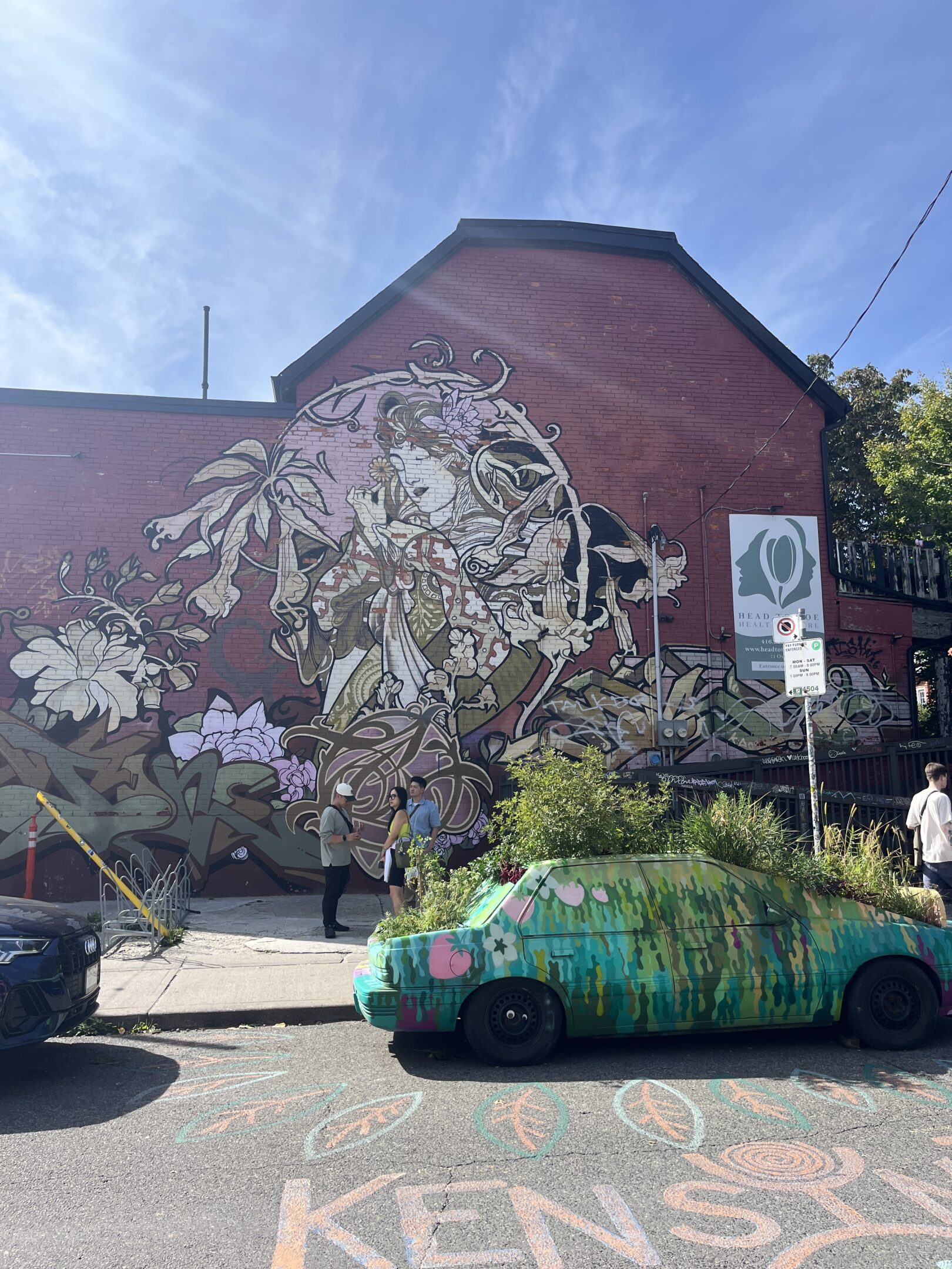
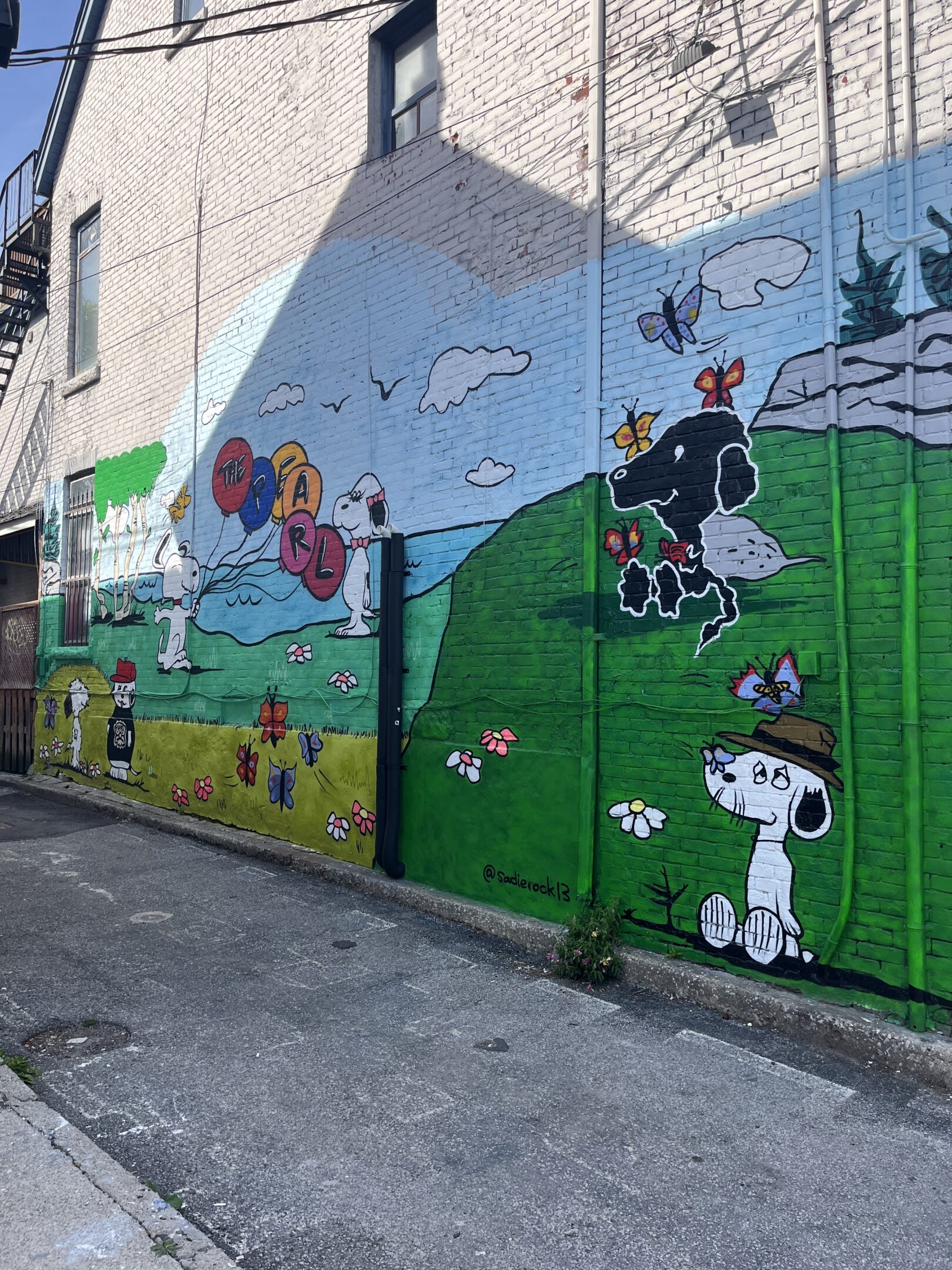
Both of these murals were from Kensington market. Which was filled with life brought out from the colourful and unique designs of the artists.

Video Project #1

Video #1 : This Video titled ” The Struggle ” is a one-shot video of me stomping on bubble wrap attempting to pop the bubbles. Initially, I thought it would be easy but I discovered that even pressure couldn’t pop them. Resulting in using different unplanned techniques to make the sound clear. Also, all the videos are intended to have a simple style, with a white background and a simple outfit consisting of a black shirt and jeans.

Video #2 : The second video, titled “The Box,” features a continuous loop of me entering the frame, popping bubbles, and then exiting, repeating the pattern continuously.

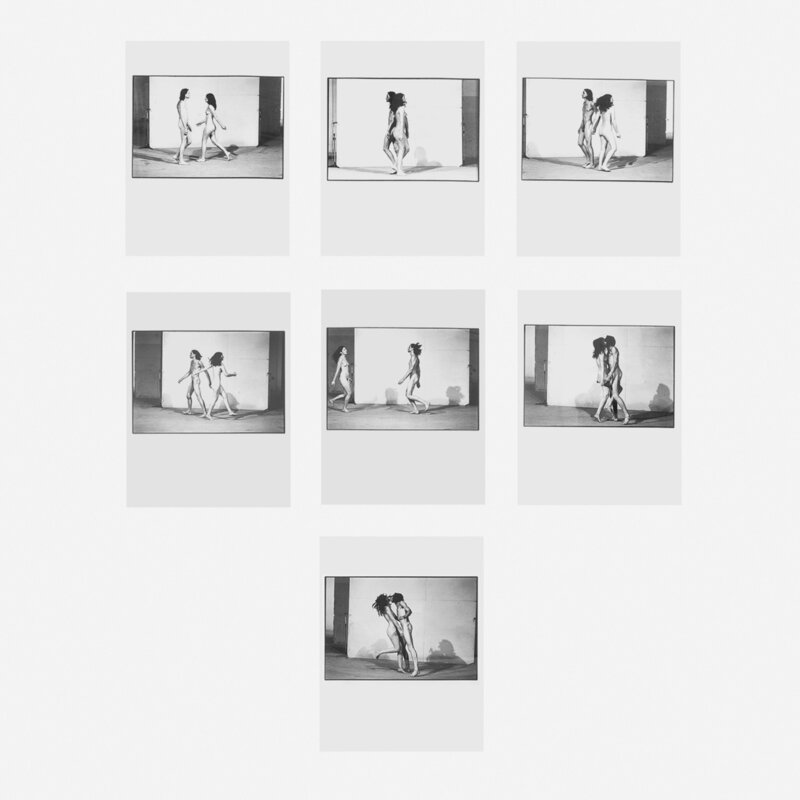
Video #3 :The last video, titled “Wrapped In Space,” relates to the piece “Relation In Space” by Marina Abramovic and Ulah. It demonstrates a sequence of events building up towards the same action found in Abramovics piece, but takes a unique approach by being wrapped in bubble wrap. 

Marina Abramovic and Ulahs “ Relation To Space “

Audio Assignment

All the sounds you hear come from 22 separate sounds that I took while cooking seafood pasta. Where I broke it down further to simple noises that sound good together. I gave myself the task to record each step of making the pasta from start to finish like cutting vegetables, making the sauce and cooking the pasta. Combining all the sounds and noises heard through the process of cooking to create a music beat. I wanted to keep the original sound as close as possible so I didn’t edit any of the sounds rather the timing of the sound. Also the only foreign sound I added was drawn from a simple guitar riff in the back Half of the song for the sounds to be more cohesive.

Conceptual Portrait

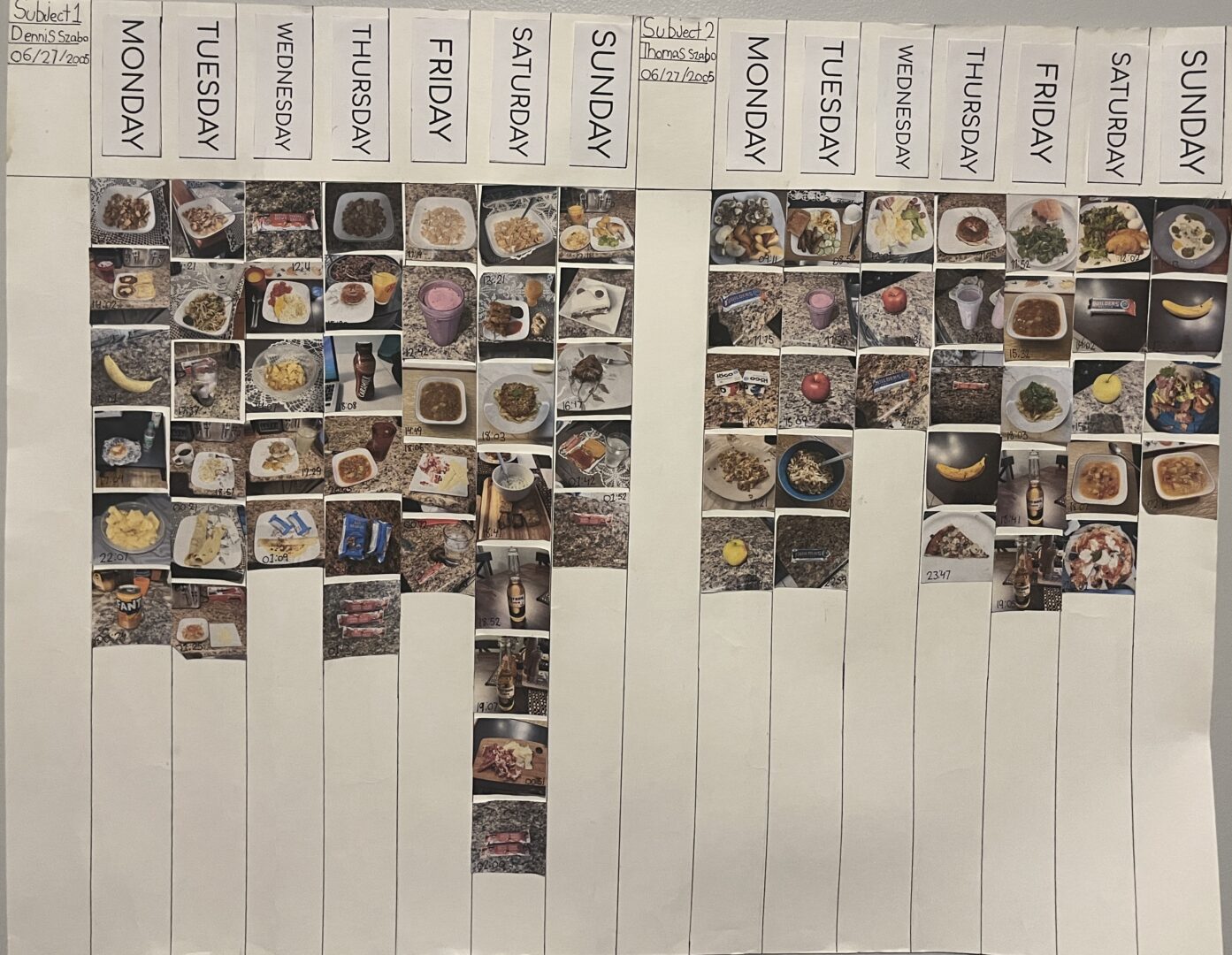
For my Conceptual Portrait, I wanted to create a visual representation of what my twin brother and I eat in a given week. My goal was to uncover any eating patterns or similarities we might share. As twins, we are often viewed together or compared to one another. However, since my brother is pursuing an entirely different degree, this project highlighted distinct aspects of our daily habits. For instance, the amount of food he ate varied based on his schedule—he typically woke up earlier and went to bed sooner than I did. That’s why I decided to include time stamps. Additionally, after receiving critiques, I realized I needed to make some changes to my poster, as the main idea was slightly unclear. I should have created a more direct comparison of our meals; for instance, placing both our meals side by side for Monday through Sunday. Furthermore, the days of the week and the minimal information I provided might not have been necessary. I found it challenging to determine how much content was required for viewers to gain a solid understanding of the concept.

Artist Buttons

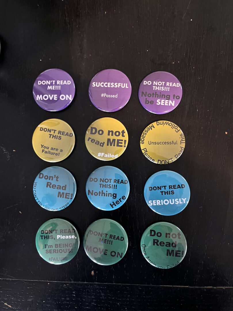
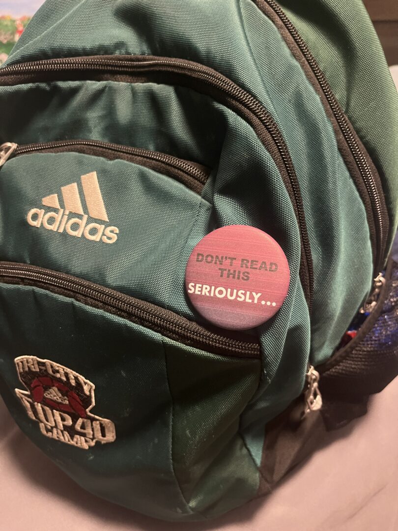
The concept for my buttons is quite simple: it is designed to elicit an immediate reaction from the viewer. Each button features straightforward instructions, such as “Don’t read me,” along with variations of this theme, followed by a negative outcome like “#failed.” Since reading text on people’s bags or clothes is a common habit, my buttons would be most effective when placed among everyday objects.

Maximilienne


Kilometer Project

After briefly examining the work of artist Jenny Holzer, I grew interested in knowing the degree to which viewers effectively engage with these types of message-oriented installations. Specifically, I was curious to determine if observers derive any value from these works, or if they completely overlook them in the first place. In order to explore this concept, I developed a series of cards designed to travel a precise distance of 1 km, using the receivers of these cards as the vessels for their transit.

Knowing that the walking distance from my house to the university is approximately a kilometer in length, I began by calculating where the exact distance would situate me. Through mathematical calculation, I was able to establish that a kilometer would equate approximately 1,450 steps, taking into consideration my height and average walk speed. I then left my house and walked straight towards the university to see where this many steps would take me. By sheer luck, this distance ended up bringing me to the intersection of Gordon and Stone road, directly next to the university’s well known gryphon statue.

I pinpointed this as my 1 km mark, and established the location as where the cards had to be brought to for the experiment to be successful.

I then designed a simple card to be created in 11 copies, and which were distributed to, respectively, 11 different households in my neighbourhood.

The cards draw direct inspiration from Jenny Holzer’s projections, replicating the simple, text-only design that characterize much of her work. Similarly, the grain of the print, although not initially intentional, created an interesting factor to interpellate viewers. Further, the cards were created with straightforward yet not overly specific instructions, reproducing the sense of mystery that makes Holzer’s work effective.

The households in which the cards were distributed to were chosen very specifically, taking into consideration only people that lived away from me, and on the same route that I took to get to the 1 km mark. Individuals would be anywhere from 800 to 200 meters away from the end point. Further, people to which I brought the cards to were individuals that I knew personally, yet had no knowledge of the project I was conducting. To avoid suspicion, these people did not see me bring the card to their doorsteps.

I waited 4 days before going to retrieve any potential cards. As a result, I found that out of the 11 cards I had distributed, only 2 had traveled the 1 km distance and been actually brought to location as asked for.

What struck me the most about this project was holding the cards in my hand after having retrieved them. In my palm was an exact kilometer, a tangible token of the distance traveled. We often imagine a kilometer as a very vague, conceptual, and overall ambiguous thing, because it is. The cards I retrieved represented the exact distance mentioned, having adventured from my house my neighbours’ households, to the statue as intended. But if I ever moved the card from the place it was found, nestled under the statue’s front hind paw, this would mean that it would no longer represent an exact kilometer. I believe this perfectly exhibits the nature of a kilometer, so delicate and cryptic at the same time.


Pipilotti Rist

Pipilotti Rist – Ever Is Over All. 1997

1. Pipilotti Rist’s video installation, Ever Is Over All, presents a striking tableau for the audience, featuring a women walking along a city street, while simultaneously damaging parked cars along her route. Rist incorporates an element of absurdity in this work by presenting things that appear unrealistic or out of context. For example, the women smashes car windows utilizing a flower as her weapon, whilst a police officer walks by, acknowledging her actions with a cheerful salute. While these two occurrences may be improbable in reality, they enhance the intrigue of Rist’s work. Various camera angles, such as frontal, distant, close-up, and side perspectives, are utilized to portray the woman. In this way, Rist is either situating her within the tangible environment of the street, offering a perspective as if one were strolling by, or framing her more centrally, thereby inviting the viewer to engage with her intimate experience and emotions. While the woman is seen in a sticking blue dress and red heels, the colours of the work are deluded with a slight green tinge, and a hazy effect is seen across the screen. Meanwhile, a soft humming sound resonates in the background, enhancing the enigmatic atmosphere of the piece. The work is showcased in conjunction with slow-motion visuals of nature, with the two videos merging in the middle and producing a dream-like effect.

2. Rist’s creations bear a resemblance to modern video culture, as she frequently incorporates a subtle element of chaos into her pieces. This approach effectively captures the audience’s attention, rendering her work both engaging and entertaining. This approach is frequently used in TikTok and YouTube videos. If we reflect on the numerous social media trends that have gained popularity in recent years, we may be quick to classify several of them as “weird,” or “crazy,” seeing that they challenge our societal norms. Further, both Rist’s work and contemporary videos captivate the audience almost instantaneously, drawing them in and creating the impression that one could engage with the content for hours on end. This being said, Rist’s work has an artistic depth that I believe is lacking in many contemporary videos. Her work is meticulously organized, from composition to colour, and is driven by a genuine purpose and meaning. In contrast, most videos on platforms such as TikTok or YouTube have for only aim to entertain, most times rather stupidly, which often leads to us feeling like we have wasted out time watching said videos.

3. Experiencing a day with my shirt worn inside out made me feel strangely vulnerable. I am generally accustomed to avoiding the spotlight, as I tend to be quite reserved and have an aversion to excessive attention. This experiment certainly did the opposite of what was within my comfort level; I suffered from many questioning stares and, on occasion, a few chuckles, which left me feeling rather uneasy. However, I am glad to have successfully navigated this challenge, as it does illustrate the delicate nature of social acceptance. I think that whether this could be considered performance is contingent on the intention behind it. We often say that anything can be art when we say that it is art, and the same applies here. If this was carried out deliberately with the intent to provoke a reaction, I would argue that it qualifies as art. However, if this was simply accidental, there would be no intent behind the piece, and thus it would be more of a mistake than art.


Everyday Gestures


Toronto Field Trip

The artwork that stood out to me the most whilst on my trip to Toronto was Alex Da Corte’s Ear Worm installation at MOCA. What captivated me most about this work was the sensory aspects that can be encountered upon entering the room. The darkness of the space, juxtaposed with the vibrance of neon-coloured lights, and combined with the coming together of audio from the video projections, created an amalgam that was both overstimulating and profoundly exhilarating. In fact, the auditory experience begins before the elevator even opens, with the striking audio reverberating against the door’s very walls, and filling the viewer with initial confusion, or excitement, for what is to come.

Adjusting to the surroundings takes some time, but once habituated, the videos reveal themselves as being equally striking. My thoughts shifted rapidly as I navigated from one film to another, simultaneously trying to see them all at once while also attempting to focus on them independently. At first, I found that the pieces appeared confused; after all, what does a singing witch next to Oscar the Grouch have to do with anything? Then, they seemed strange and grotesque, with the diluted images feeling uncanny. But at last, I was able to appreciate the quality and detail of the work. The fact that Da Costa performs the parts of all characters is remarkable, and the attentiveness that is displayed in creating each set is equally exceptional. Not to mention, the very fact that this work goes on for two full hours with different videos really does goes to show the amount of work that was put into the installation, and the attentiveness to making the viewer have a stimulating experience.


Video Project: Bad Table Manners

Upon observing various video examples related to this project, my partner and I noticed that a large number of them focused on the manipulation of food, often with the intent of eliciting disgust or discomfort in the viewer. This idea captured our interest, and prompted us to delve into the exploration of what aspects of food manipulation contribute to its perceived repulsiveness or abnormality. We notably achieved this by observing unconventional dining etiquette, particularly concentrating on opposing societal norms imposed upon women’s conduct, to construct the most bizarre and disconcerting situations we could possible associate with mealtime.

By representing a table scene, my partner and I aimed to construct a scenario where the viewer could imagine themselves dining in the presence of the person on screen. By positioning the audience as a force who experiences the sensation of having a real time meal with the improperly behaving performer, we were able to achieve the sense of discomfort we desired as an outcome.

Loop

In this video, we aimed to highlight the absurd manipulation of food, particularly by adjusting the framing to concentrate on the plate. This allows the viewer to focus on the action being performed, rather than the person it is being performed by.

One Shot

This video focuses on absurd food manipulation through the utilization of a prop. We framed the video frontally, allowing the viewer to fully engage with Norah’s straight face as she performs a ludicrous action, in order to provoke an even more disconcerting reaction.

Sequence

This video aims to focus on pushing the idea of absurd food manipulation by having the performer bathe in the food.


Audio Project: Bilingualism

In this work, I aimed to investigate the experience of communicating in multiple languages, particularly the confusion that arises during interactions with others. The audio features a conversation simultaneously presented in both French and English, creating a disordered and challenging listening experience. This arrangement is intended to reflect the confusion I frequently encounter when switching between the two languages, often mixing vocabulary from one with that of the other. With a concentrated effort, the listener can comprehend and appreciate the dialogue of each language individually. This illustrates the externalized conversation perceived by others, despite the internal struggle of the speaker.


Pauline Oliveros: Sonic Meditations

Pauline Oliveros’s Sonic Meditations presents a conceptual framework in which participants collectively engage in the creation of a sonic performance. Specifically, this is done through the processes of creating, imagining, remembering, and listening to a variety of sounds. This heightened awareness of one’s environment fosters an atmosphere that is considered to be both soothing and conducive to positive energy. Oliveros developed this idea in response to her feelings regarding spectators’ omission from musical performances. The intention behind these works is to “[…] eliminate the subject/object or performer/audience dynamic […]” thereby ensuring that all individuals can be integrated into these auditory experiences.

After reading this short article, I became very interested in exploring the auditory experience of Sonic Meditations and determining whether they are indeed as soothing as claimed to be. After conducting some research, I discovered several examples that particularly resonated with me (listed below). To my astonishment, the soft humming, combined with the harmonious blend of voices that nearly resemble a choir, was quite beautiful. Overall, this genuinely proved to be a meditative experience for me, as Oliveros describes it to be.


Tom Kiefer: El Sueño Americano

Upon first encountering Tom Kiefer’s work, El Sueño Americano (The American Dream), one might simply see pictures of mundane, everyday life items. However, these objects collectively form a poignant representation of the discarded possessions of migrants seeking asylum.Kiefer’s work serves as a photographic record of these belongings, which were confiscated near the U.S./Mexico border on the grounds of being deemed either “non-essential” or “potentially lethal.”

I found this work to be extremely heartbreaking. To see these items appearing so forsaken, evokes a deep sense of sorrow. Although they are quite ordinary, they carry immense significance, both in what they represent and in the value they held for the individuals who abandoned them. This sentiment was particularly evident with items like children’s backpacks and toys, which, despite the tragedies they have undoubtedly witnessed, exude an air of joy. Observing these objects was particularly challenging, given the difficult circumstances the world is presently facing; however, I do believe it serves as a stark reminder for the viewers, and one we should not forget.


Conceptual Portrait: Chewed Away

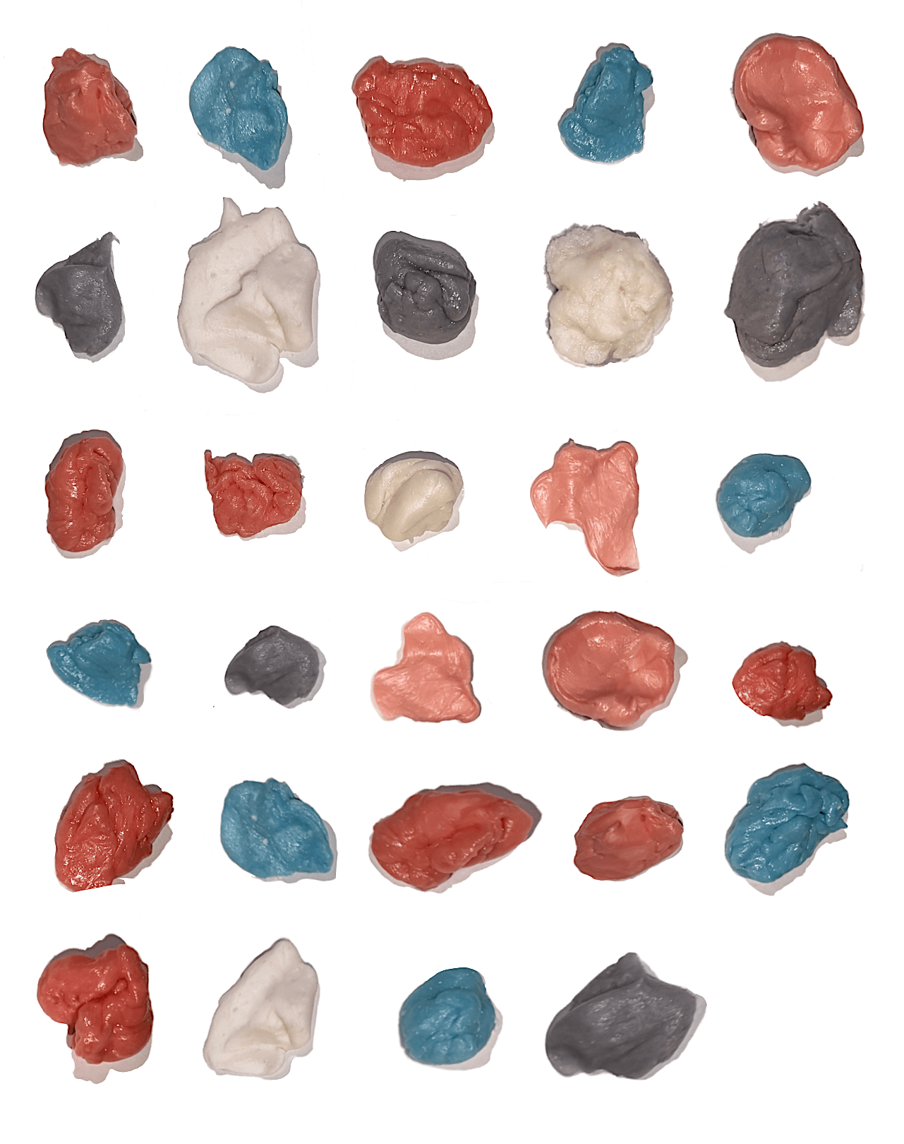
Ever since I was a child, I have suffered from a panic disorder that complicates my day-to-day activities, with attending classes being an especially challenging feat. Although I have adapted to this condition, it still remains a prominent aspect of my reality. To cope with this, I have developed certain strategies which allow me to alleviate the effects of my panic episodes, with the most effective method being the vigorous chewing of gum. For this project, I aimed to photographically document the quantity of gum I chewed over a period of seven school days, in order to assess how I mitigate my academic-related anxiety on a daily basis. In total, I ended up chewing 29 pieces of gum over the course of 10 classes, which encompassed approximately 18 hours of instruction. The daily counts were recorded as follows:

Thursday, November 7 (2 one-hour long lectures): 4 pieces

Friday, November 8 (1 three-hour long lab): 3 pieces

Monday, November 11 (1 one-hour-long lecture): 2 pieces

Tuesday, November 12 (1 one-hour-long lecture): 2 pieces

Wednesday, November 13 (2 three-hour long labs, 1 hour long lecture): 11 pieces

Thursday, November 14 (1 one-hour-long lecture): 3 pieces

Friday, November 15 (1 three-hour long lab): 4 pieces

To complete this work, I proceeded with chewing my gum as I usually would on any given school day. However, every time I tired of a specific piece of gum, instead of throwing it away as I typically would, I rather stored them in a plastic sandwich bag. I labelled each bag with the date so that I could know how much gum I consumed on a given day. The finial photographical documentation puts each gum in order of first to last chewed.

While this may appear to be a rather mundane and simplistic way to approach this project, the final piece proves highly personal. Where one might perceive merely a dull piece of excessively chewed gum, I see the intensity of my chew marks, revealing the fight-or-flight urgency I felt at that moment. Where someone might observe the pale pink hue indicative of a likely bubblegum flavour, I see the once vibrant red of a strawberry flavour, so thoroughly eaten away at that it has become tough and jaw-aching. Most significant for me, however, is that in each chewed fragment, I am able to recognize the precise moment and reason for my being anxious, something only I will ever see.

Following Diane’s recommendation, I ultimately decided to print this image as a poster, to enhance the experience of engaging with this artwork more tangibly. I do agree with the fact that this approach makes the work stand out more, allowing the viewer to engage with the piece in a more direct and immersive manner.


Artist Multiple: Scratched

For my button series, I aimed to convey the passage of time by tangibly capturing the experiences an individual encounters throughout their day. To achieve this, I drew on the concept of rainbow scratch paper, and, on the surface of my pins, applied a medium that can be scored upon friction. In this way, when an individual places the pin on their backpack or clothing and engages in their daily activities, the pins will naturally acquire a distinct roughness that reflects their individual experiences.

In its initial form, the pins are black, and might appear boring or bleak to the viewer. Nevertheless, as they endure the challenges of daily life, a stunning gradient begins to surface, symbolizing the significance of each moment we experience in time. The process of scratching to uncover this image illustrates our engagement with time, and asks the beholder to contemplate whether they have utilized their precious minutes to its fullest potential.

Abby

KILOMETRE PROJECT

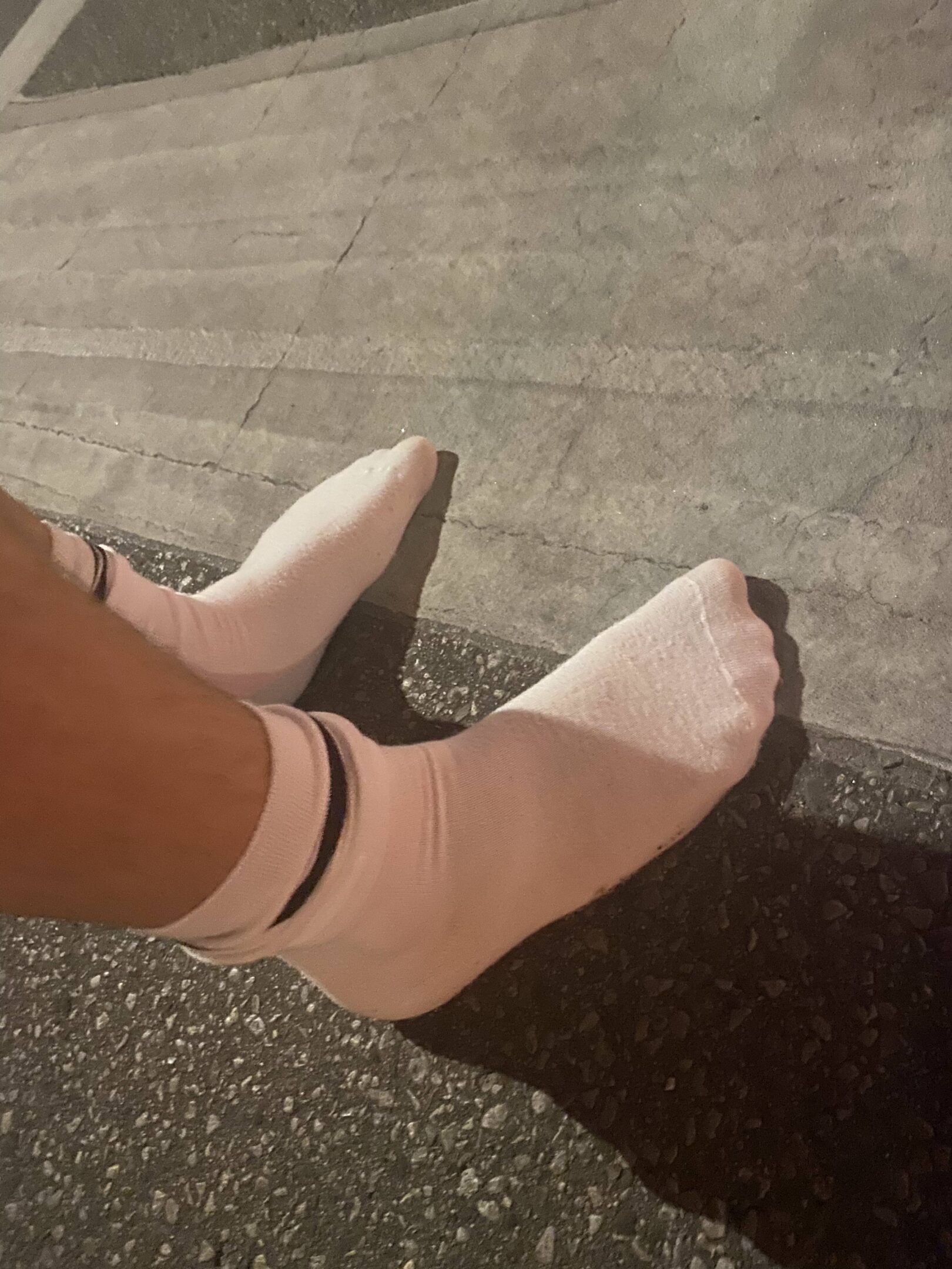
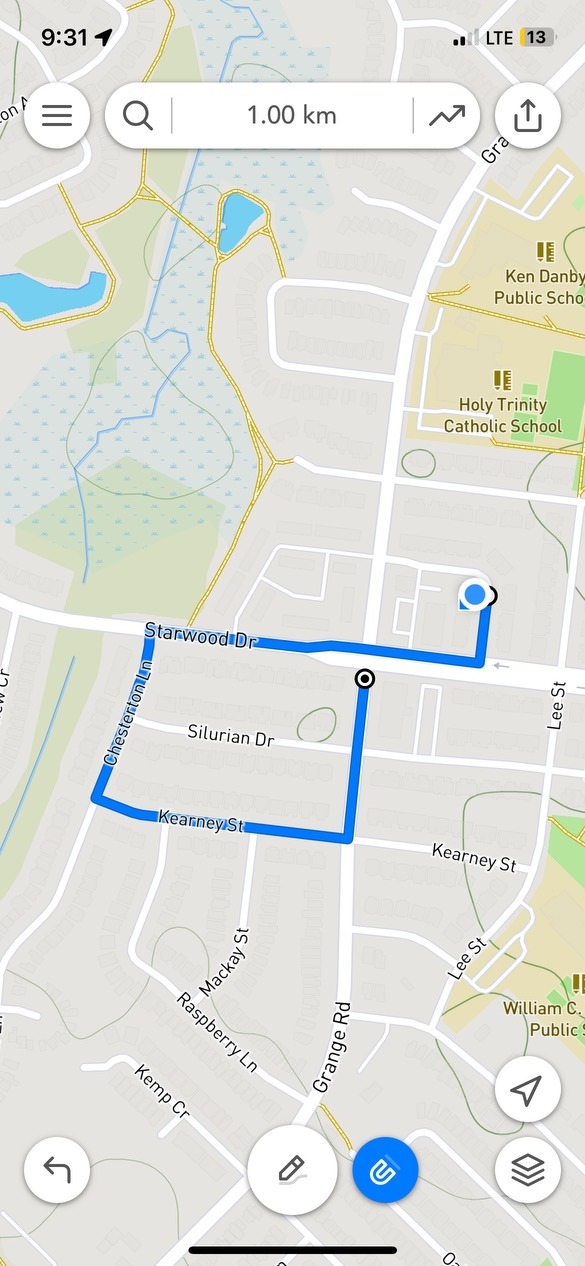
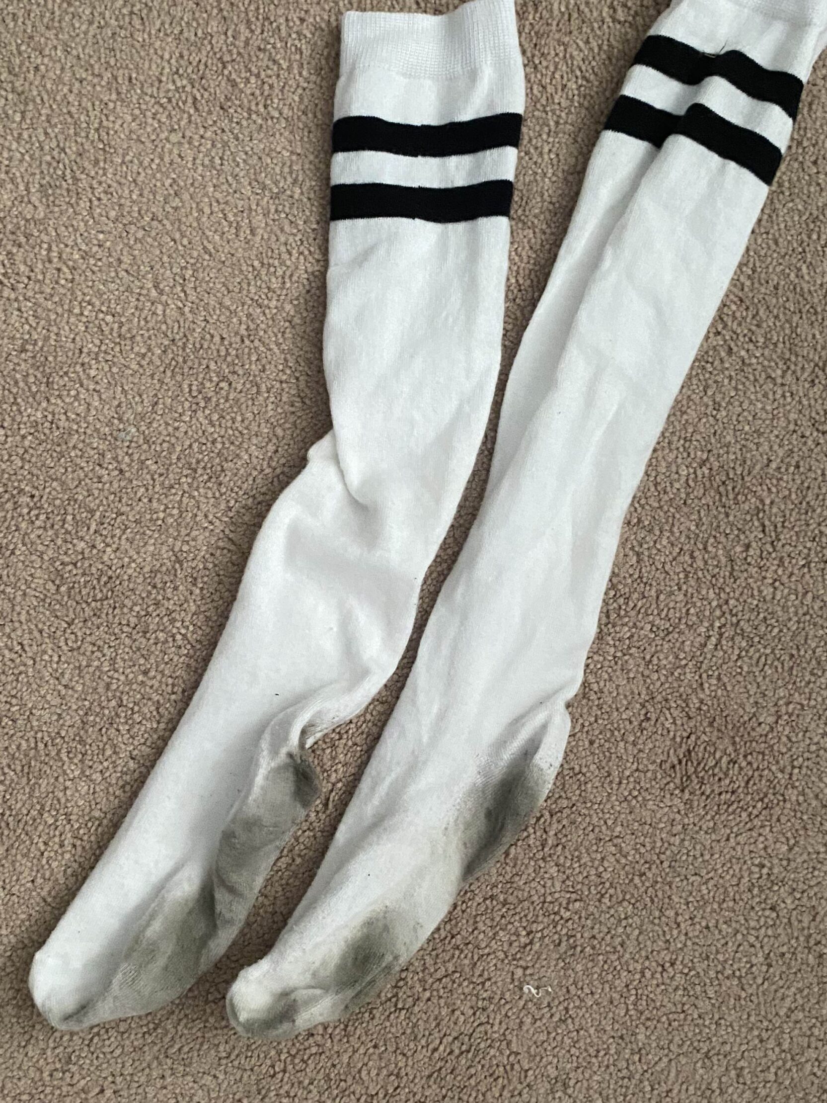
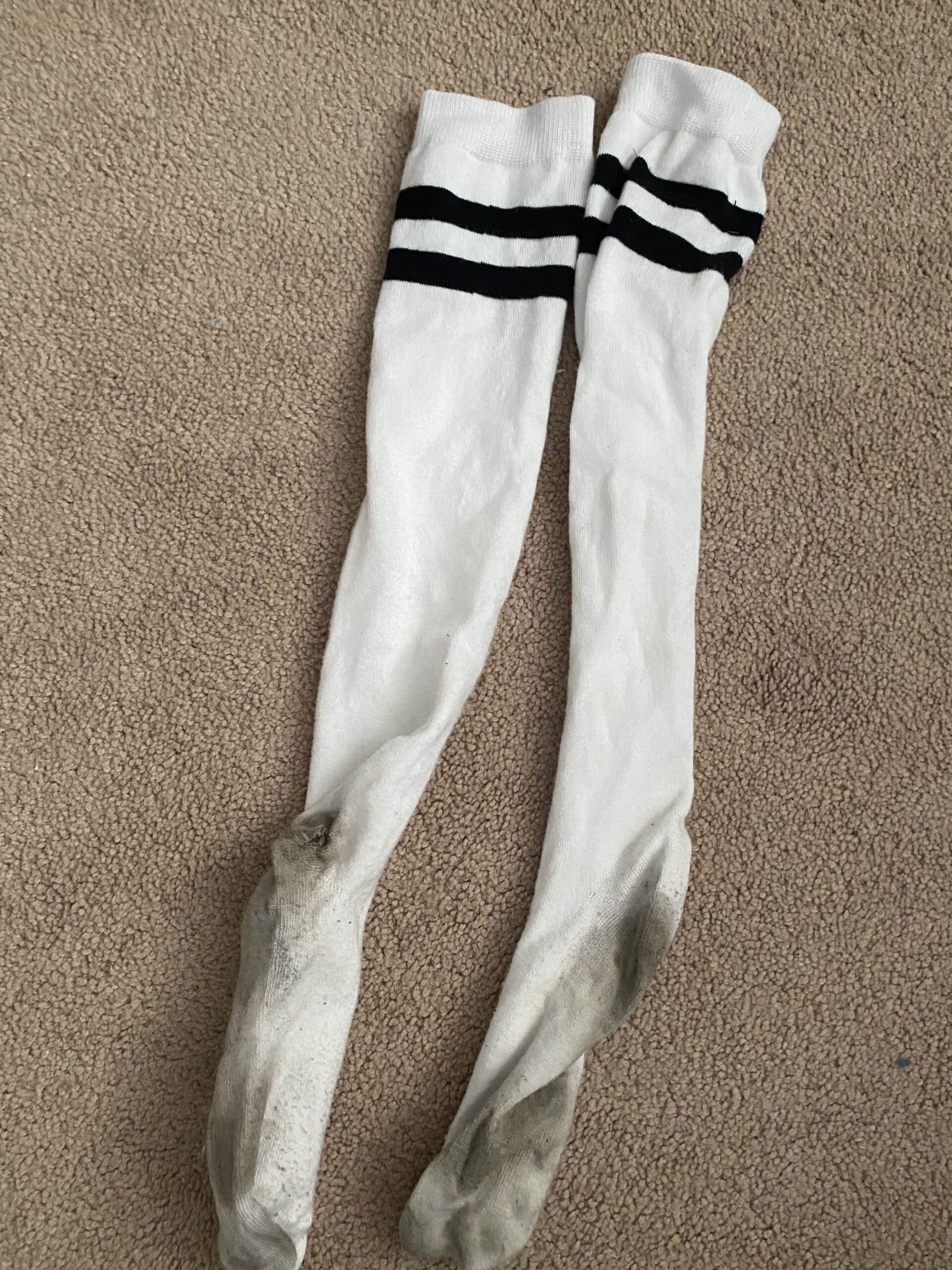
For this conceptual art exercise, I wanted to showcase a kilometre using an object that would show the effects of a kilometre (how it changes over that distance). I decided to use socks, in white so that the “effects” would show, and I asked my boyfriend to walk a kilometre in them, without shoes. We walked around my neighbourhood for exactly a kilometre. We walked on sidewalks, grass, the road, etc.
After walking a kilometre, we observed that the socks were no longer clean and white. They were dirty and worn down. There was even a hole in one. These socks were now a visual representation of 1 kilometre.

This image has an empty alt attribute; its file name is IMG_5074-edited-scaled.jpg

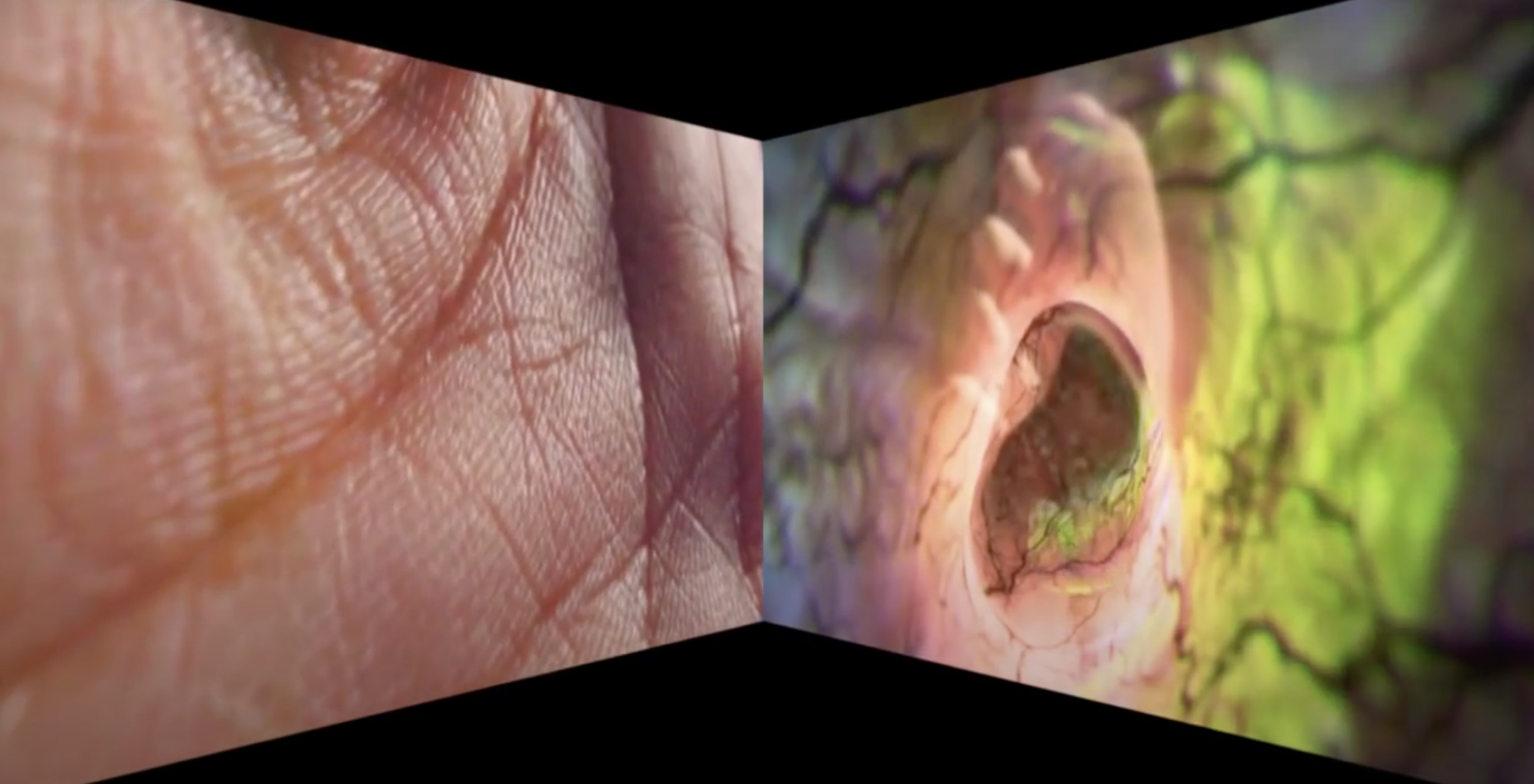
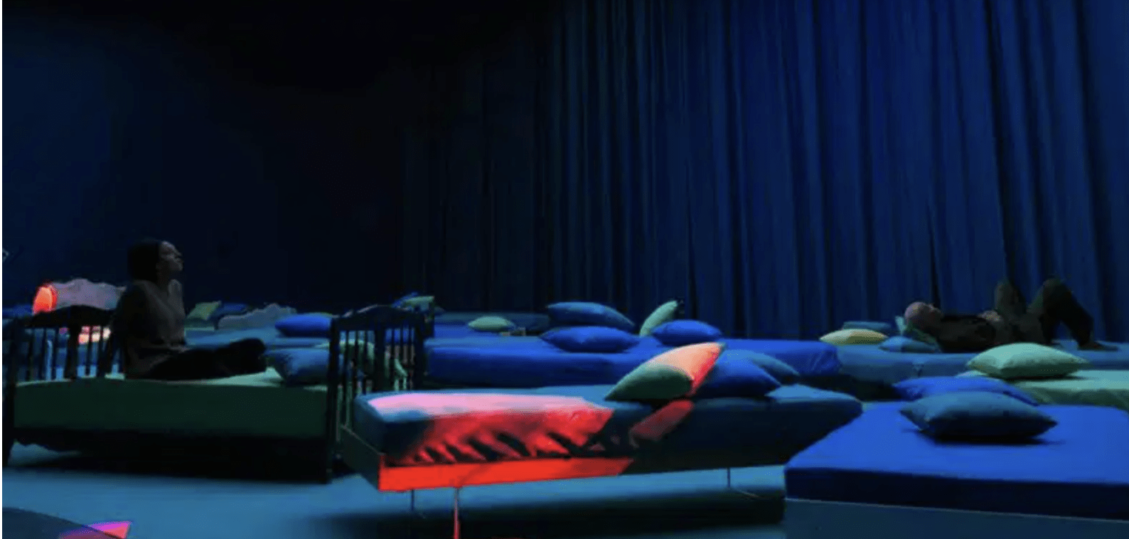
1. This is an image from “Worry Will Vanish,” which was on display at Hauser & Wirth in Savile Row, London in 2014. In the gallery, it was shown in a room where spectators would remove their shoes, and lie down on a carpeted floor under duvets. The video is displayed on two screens that span the entire height of the wall, accompanied by a calming soundtrack with zen music and sounds found in nature, created by Anders Guggisberg. 

“Worry Will Vanish” by Pipilotti Rist

The video features vividly coloured moving images of various elements of nature such as medium shots of plants, close up shots of leaves, underwater videos, shots of bubbles, etc. Sunlight seems to filter through each of these elements, as they fade into each other, or are even displayed like a kaleidoscope. Hands and full figures are shown as well, including very close up shots of skin texture. Videos of what looks like a journey inside of a vein or organ fade into nature clips that usually have similar visuals to one another (ex. veins inside an artery look like the patterns of branches of the plants that are shown). The images are constantly moving, the bright colours are always changing, creating a visually stunning and intriguing piece. 
The title of this work fits it very well, as the calming music and soothing visuals would definitely help someone’s worries to vanish. This work really forces you to pay close attention to your senses, to notice details about things that you might not have noticed before about nature or the body. This can almost be related to grounding techniques used for anxiety, such as the 5-4-3-2-1 method where you point out things you can see, feel, hear, smell, and taste, corresponding to the numbers. This forces you to be present in the moment, and slows your breathing as well. Pipilotti Rist may have had this intention with her piece or maybe she just wants viewers to appreciate the little beauties in life, like small details in plants or on skin. She may have also wanted to point out the visual similarities between parts of the body and nature, connecting their beauty. 

2. I think there are similarities to Rist’s video art and popular media today, such as the randomness of them, and the way that there isn’t often context to the pieces. Often TikToks are short and humorous because of their bizarre nature. They are both usually visually interesting and have some background noise or music. The topics and messages that Rist represents in her videos are also very relevant in today’s video culture. Feminism, body positivity, and sex positivity are major discourses in today’s world and modern media often showcases it. Sometimes the videos with these topics are more educational, with facts or experiences being shared, but there are also more artistic representations on TikTok or Youtube that may have the underlying message of one of these topics, but don’t necessarily say it out right, like Rist’s works.  

I think that similarities can also be drawn to the way that people watch her videos and TikToks or Youtube videos. Rist’s pieces are usually displayed in rooms where the viewers are invited to sit or lay down on couches, pillows, chairs, beds, etc. This is also usually where people watch TikToks and Youtube videos. 
“4th Floor to Mildness” by Pipilotti Rist

3. I went to a couple of classes with my shirt inside out on Thursday. At first I was pretty self conscious, worried that everyone was looking at me funny or that someone was going to say something and I would be embarrassed. But eventually my mind focused on other things like painting in class, writing notes on a lecture, walking around, etc and I wasn’t worried about it anymore. I was not treated differently, until I went home and my roommate pointed out that my shirt was on backwards. But even then, she was just trying to be helpful and not judgemental or rude. I think this could be considered a performance, or even a “happening,” just without a traditional stage and audience in seats. There were still people observing my “performance,” but I was just the only one who knew it was one. It could even be argued that everything we do is a “performance,” because we are always thinking about (even subconsciously) how we are presenting ourselves to people, what message we are sending etc. In addition, in the assigned article, Pipilotti Rist says “The whole question of how to put art into regular life is what interests me the most,” which I think could relate to this experiment because this “performance” is bringing art into everyday life, as it is on display throughout daily normal tasks and events.
TORONTO ART TRIP

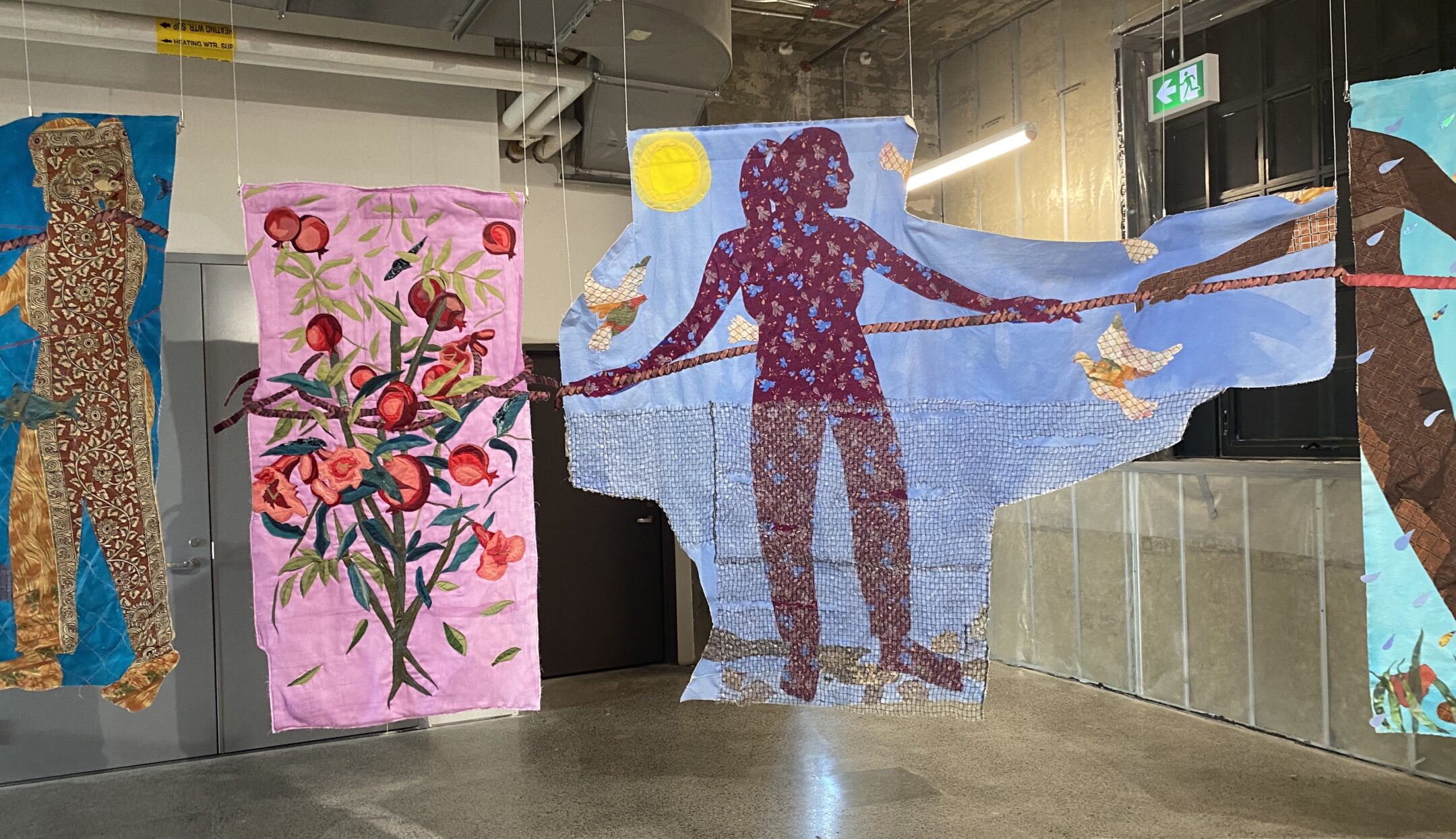
PIECE #1: The Other Home, Hangama Amiri

This piece, from the Toronto Biennial of Art, really caught my eye with its large presence, bright colours, and textural feel. After learning about it from the guide and the description, I loved it even more. The different quilt like pieces are hung in a curved line. Each one has a variety of fabrics and depicts images of people and plants, all connected by a rope. These pieces symbolize the different emotions that come along with the aspects of migration such as homelessness and forming new social bonds. Hagama Amirir herself was a refugee from Afghanistan, so these concepts are very personal. I really like the materials used for this piece, and it brings up feelings of home, comfort, and family. I think this type of work is really important because often the stories about refugees in the media only focus on the conditions of the place they came from, and how their new country has welcomed them. But of course the experience for the refugees doesn’t stop there. There are struggles finding housing, employment, and a sense of belonging, stories which deserve to be told such as through art pieces like this.

PIECE #2: Mouse Museum (Van Gogh Ear), Alex Da Corte

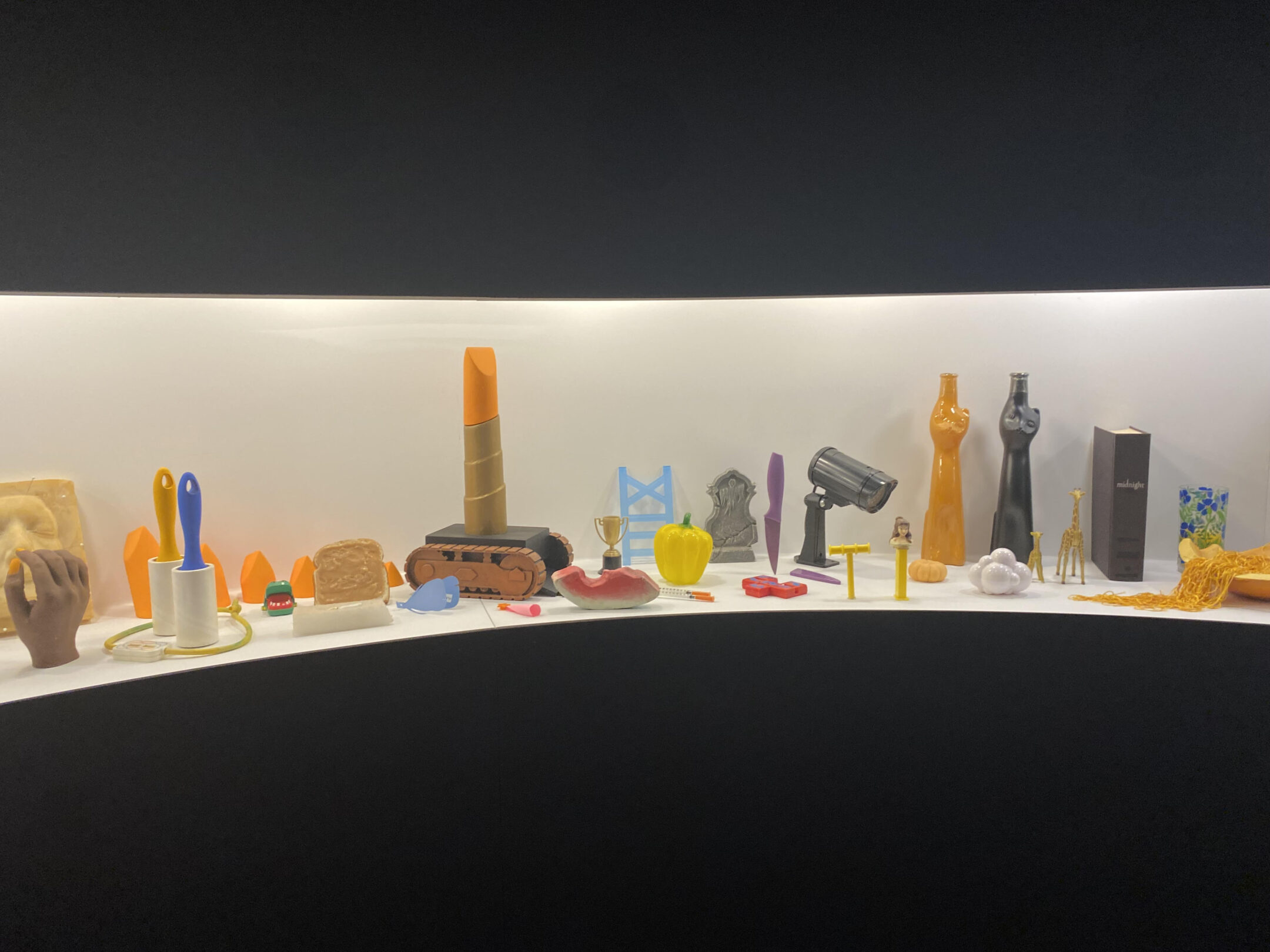
This piece, from the MOCA, is inside of a long, dark structure, is a room with a display case spanning it, showcasing random objects with odd juxtapositions. This is part of Alex Da Corte’s Ear Worm exhibit, which is a dreamlike surreal environment full of pop culture and weirdness. This piece caught my eye specifically because it felt very familiar and nostalgic but with a twist, which I think was the point. It has been described as “a look into Da Corte’s mind,” which I think is really cool because I often feel like this is what my own brain looks like. Lots and lots of random things and memories that collide and mix and create chaos or sometimes if I’m lucky, make an cool idea I can use.

These three videos explore one feat three ways. Liv and I chose to depict the idea of watching yourself being watched through video technology. Various interpretations can be taken from these videos such as how people may feel insecure as if people are watching them in their everyday life, how technology can distort appearances and beauty, the spectrum of human reactions to being in the spotlight, or even possibly the dangers of technology when it comes to surveillance.

ONE SHOT – “The Observer and the Observed”

The first video is just one shot showing how someone can react to seeing themself being recorded and displayed. This forces the person to observe how the world sees them, or more accurately, how video technology captures them.

SEQUENCE – “Reflection of Humanity”

The second video is an edited sequence of multiple clips of different people observing themselves being displayed on many TVs in various sizes and from various angles. This shows how different people react to being “watched” and displayed. It can be fascinating to see the little gestures that people make, and the different responses.
LOOP – “Mirror Mirror On the Screen”

The last video is a loop of a video showing someone attempting to put makeup on their face while only looking at a TV displaying them from a different angle than a mirror would. You can see the different struggles and hesitations with this. This video is looped once. The loop could possibly symbolize the struggle for perfection in beauty.
AUDIO ASSIGNMENT

“Lost in the dryer”

For this audio piece, I originally had an idea to record my boyfriend snoring. But unfortunately, somehow, he did not snore every time I recorded him! So I had to quickly think on the spot and come up with a new concept. I thought about how you can often hear noises coming from the dryer from items left in pockets of clothing or the sound of metal zippers hitting the walls. I decided to exaggerate and play with that idea using other random or unexpected items to see how they might sound in the dryer.

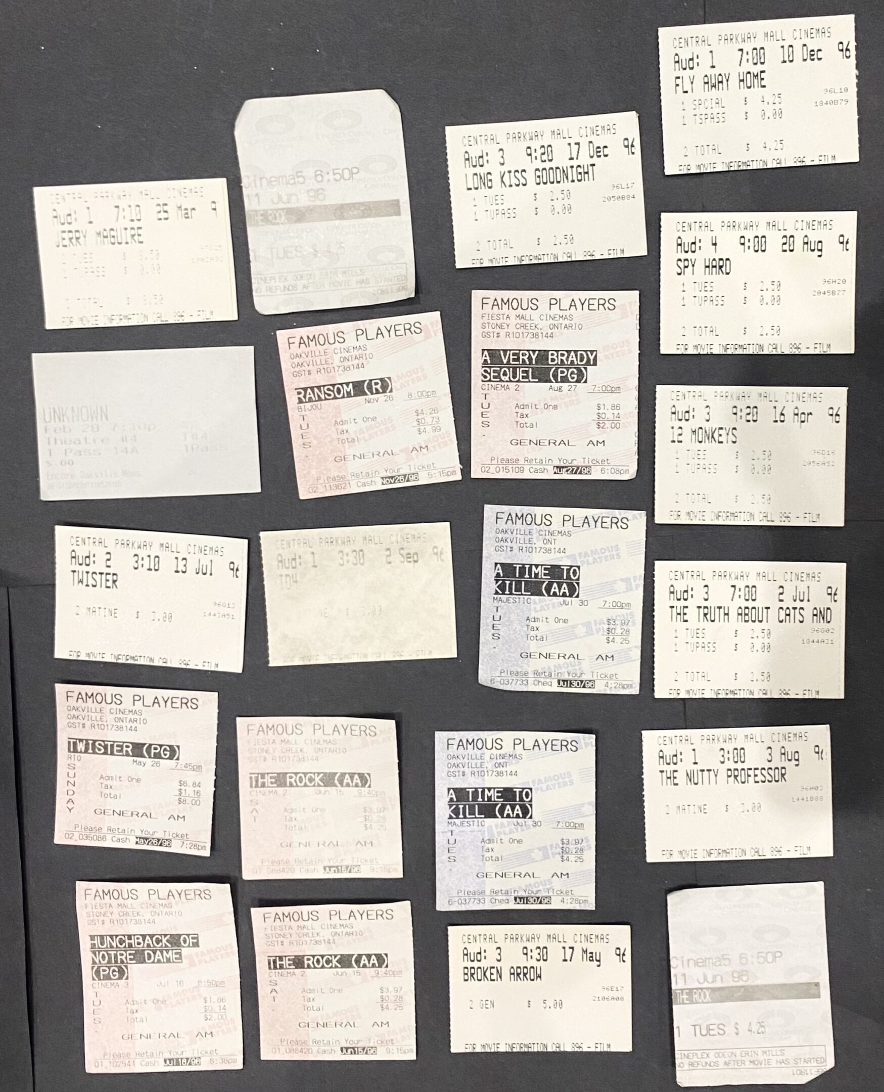
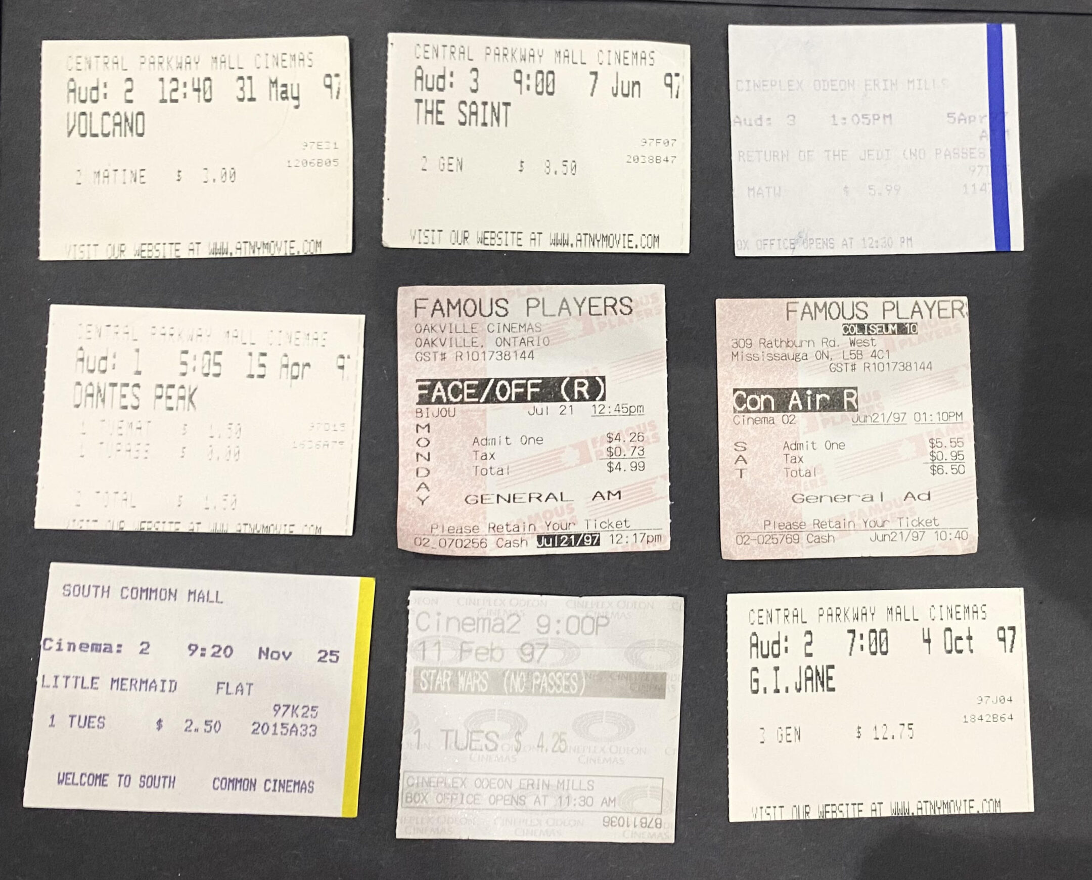
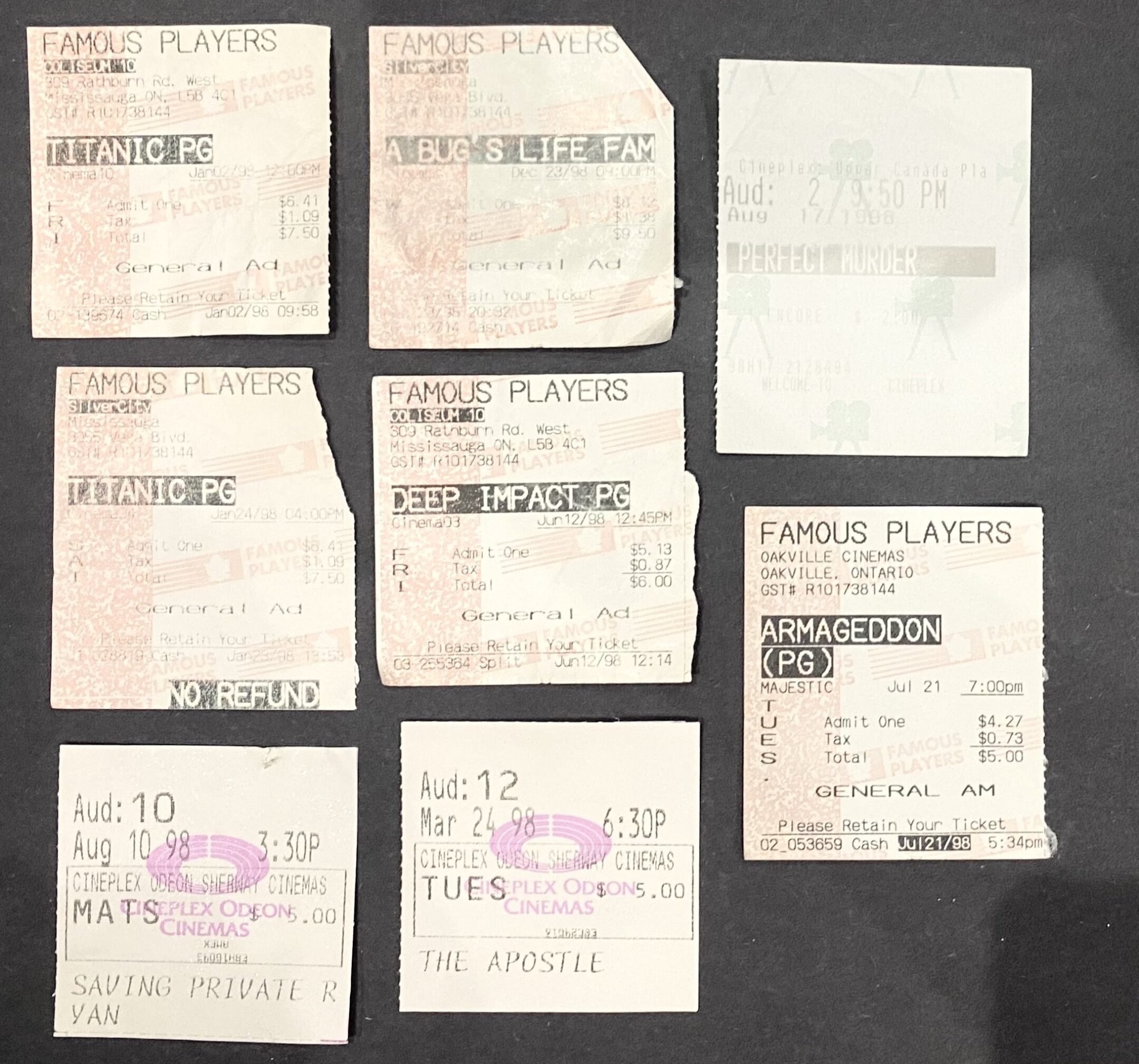
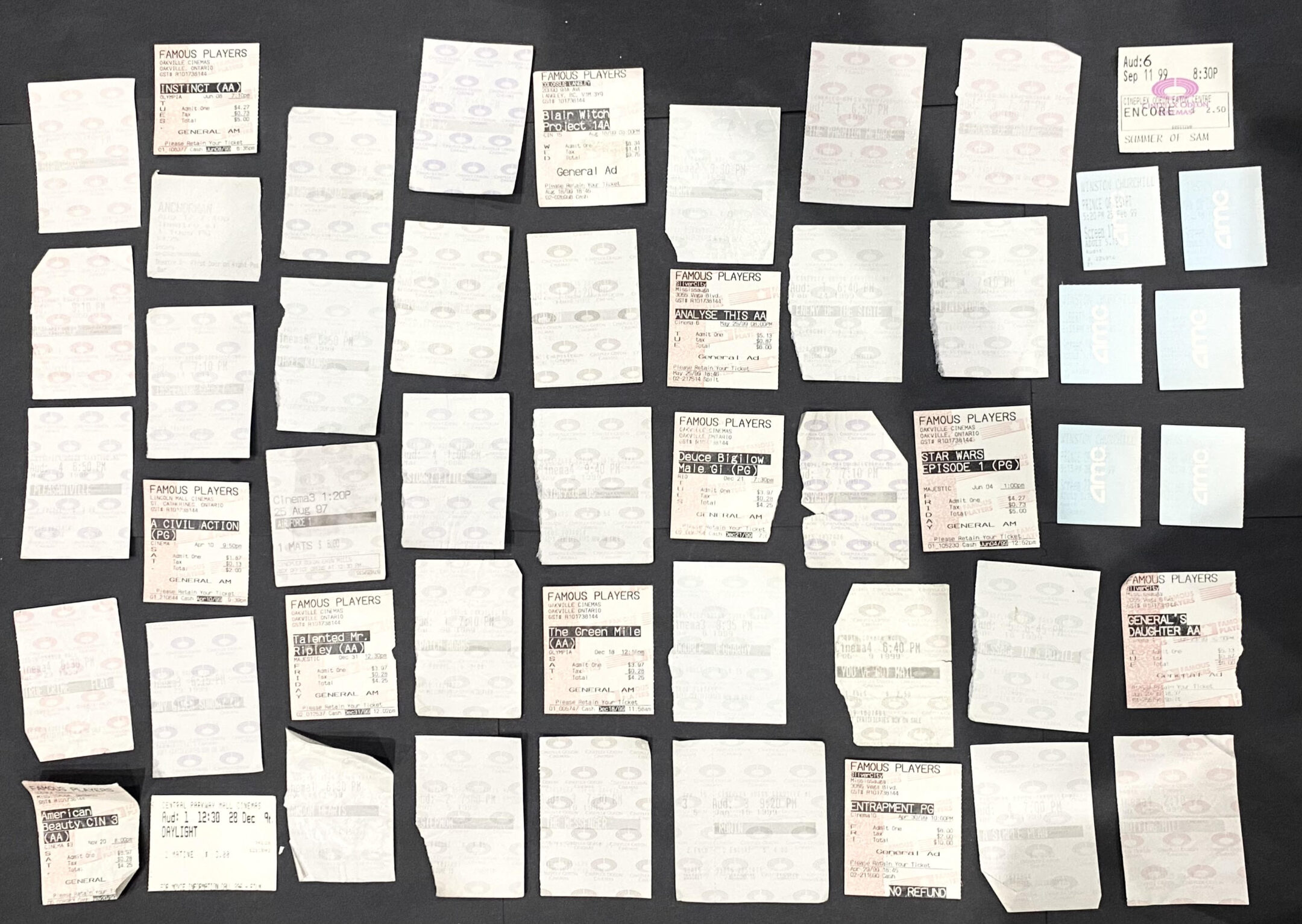
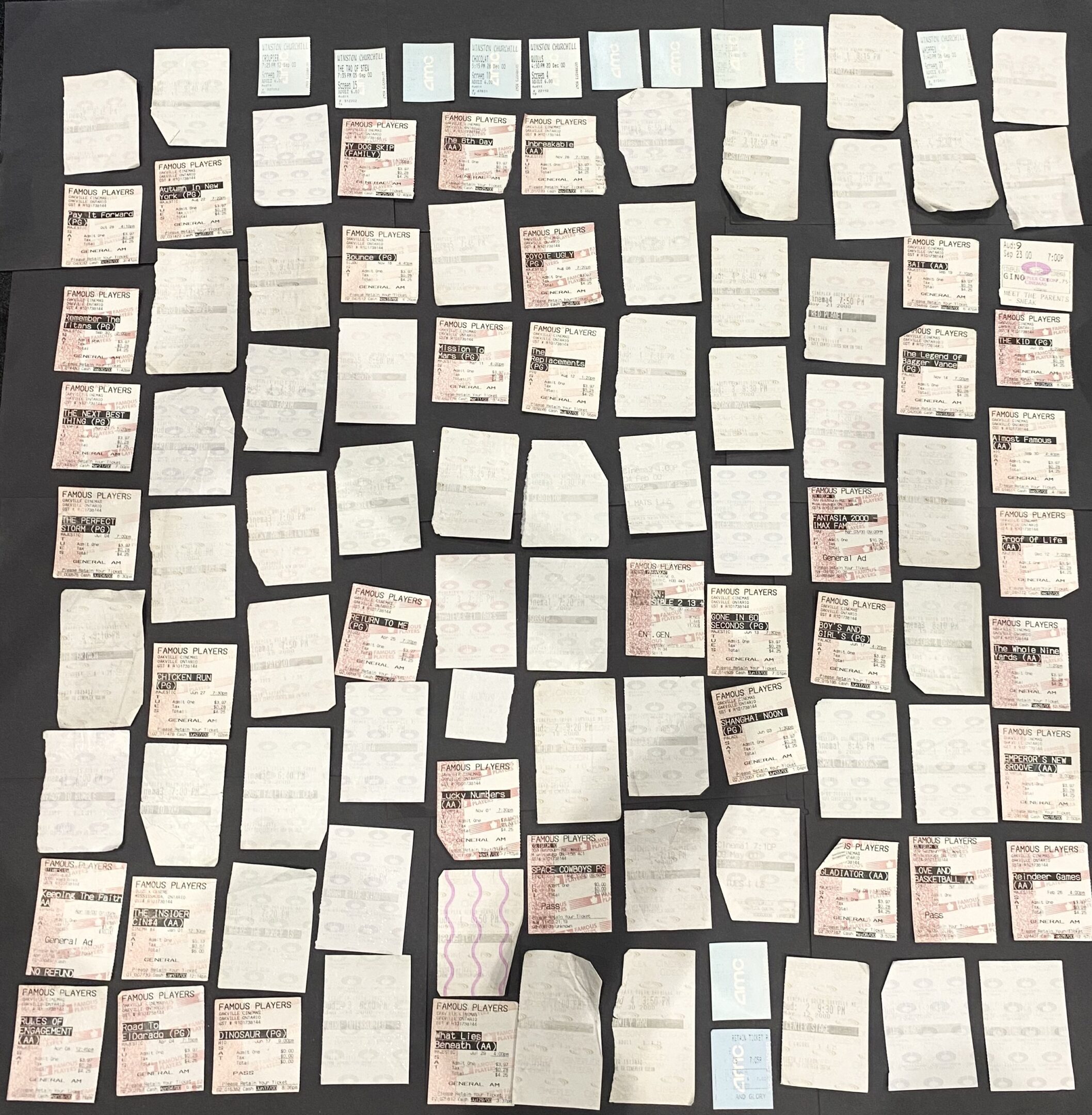
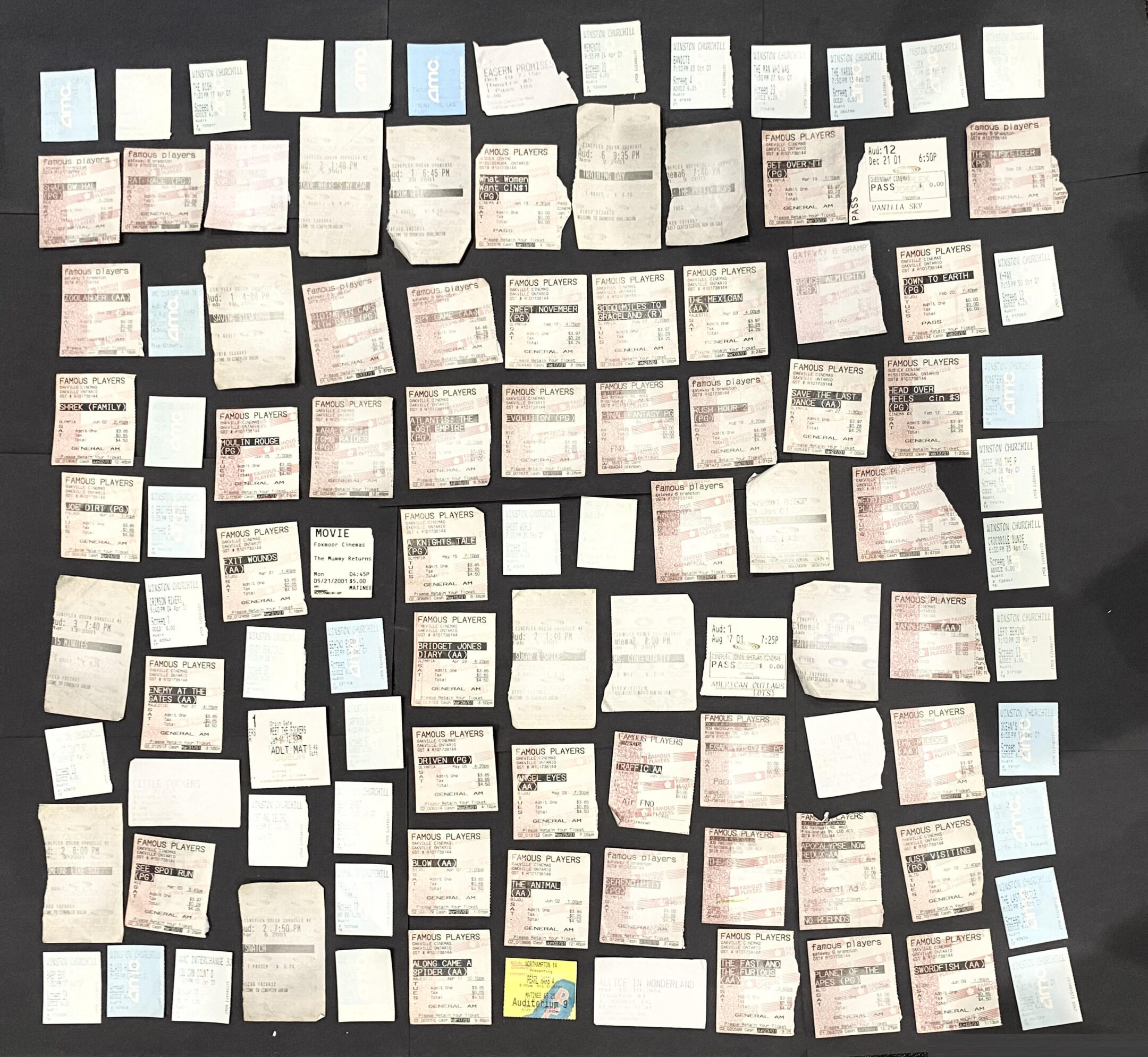
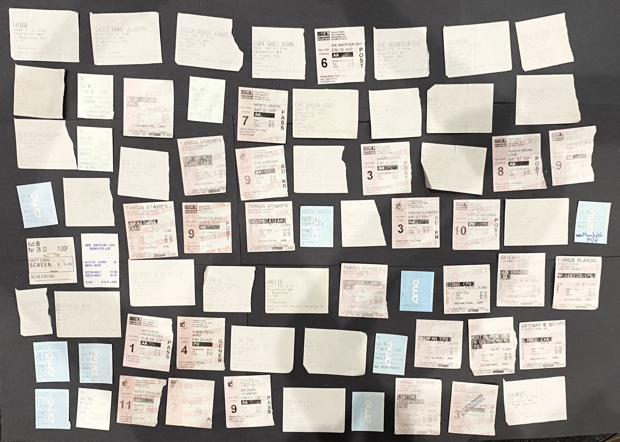
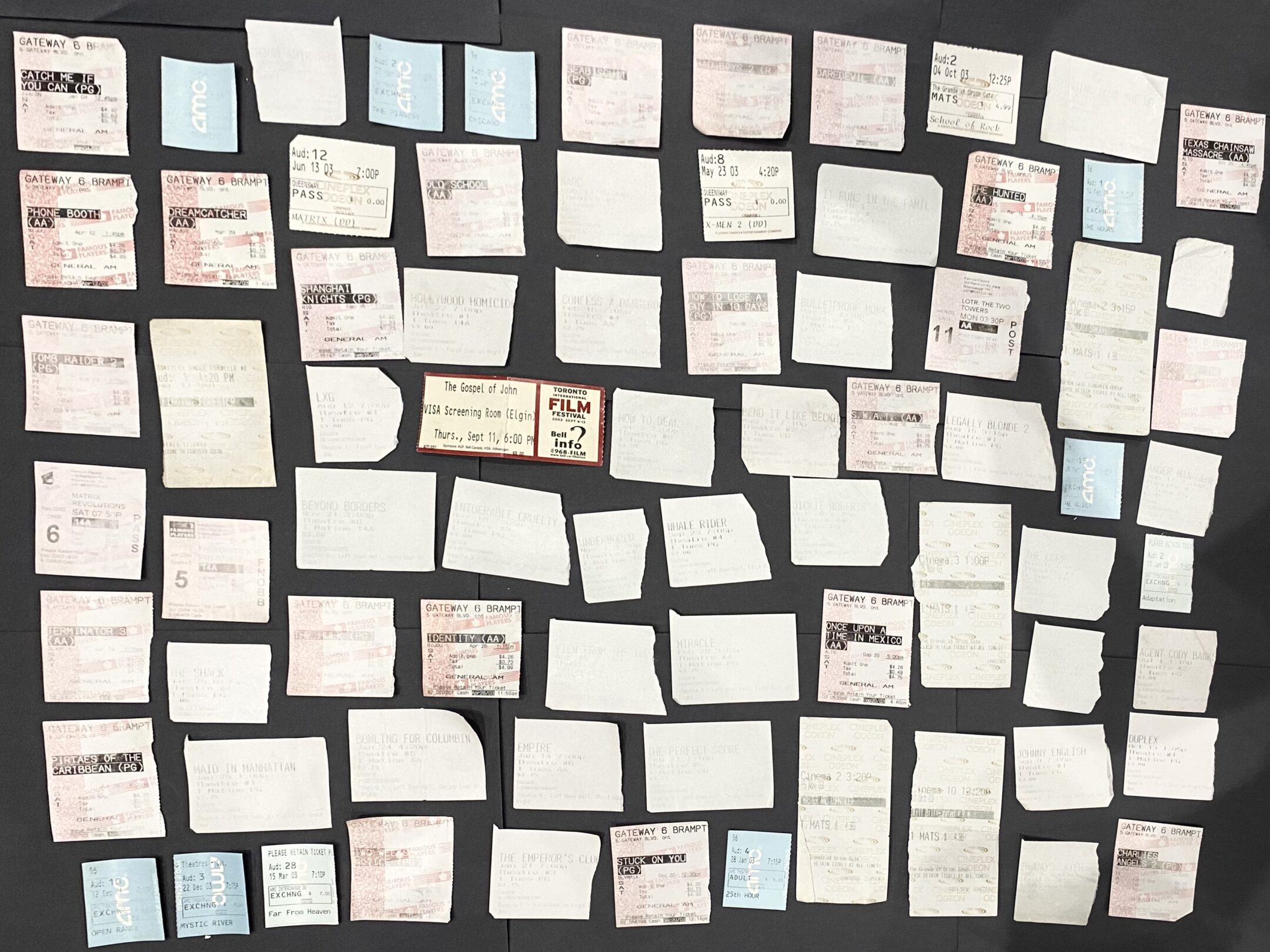
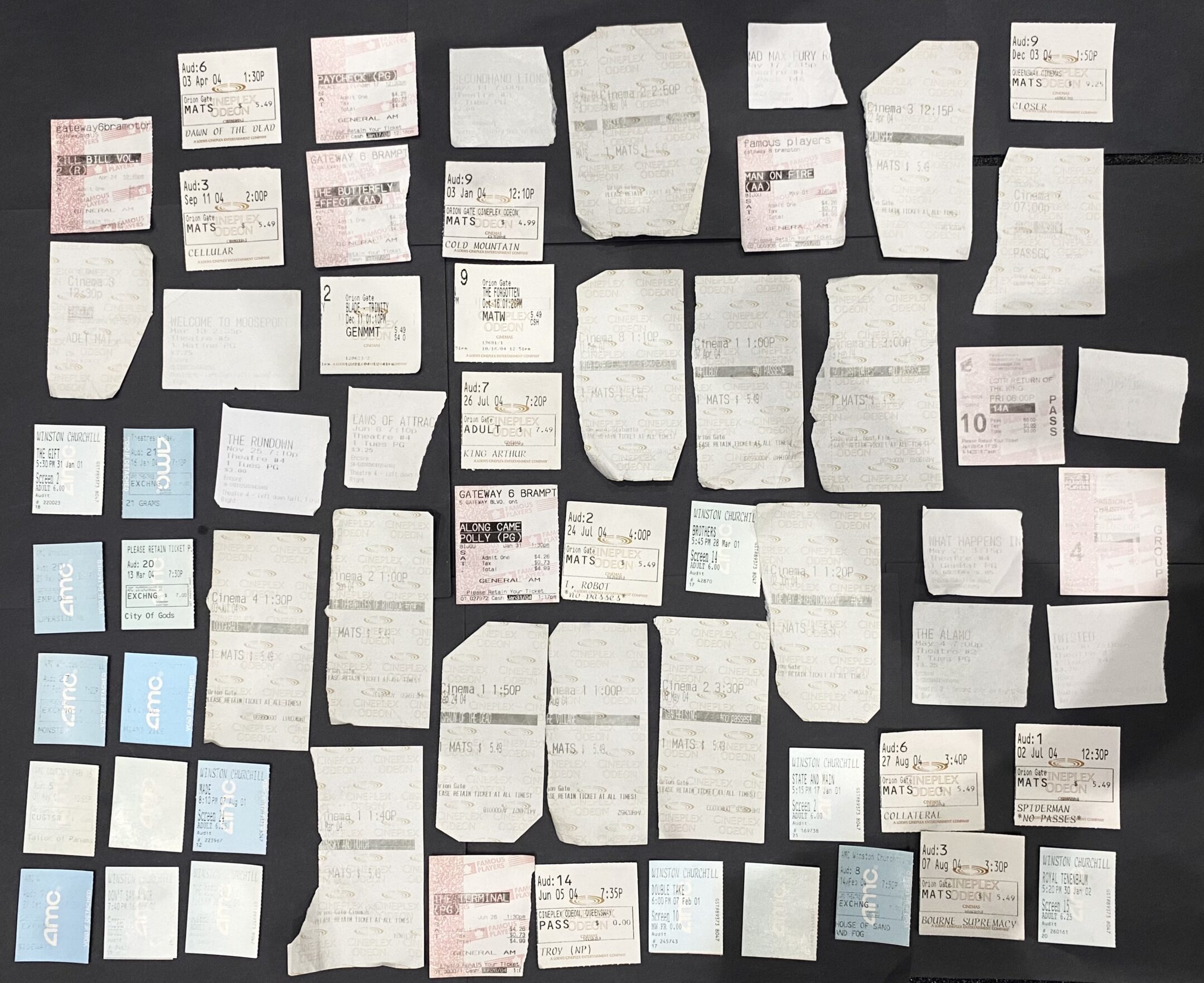
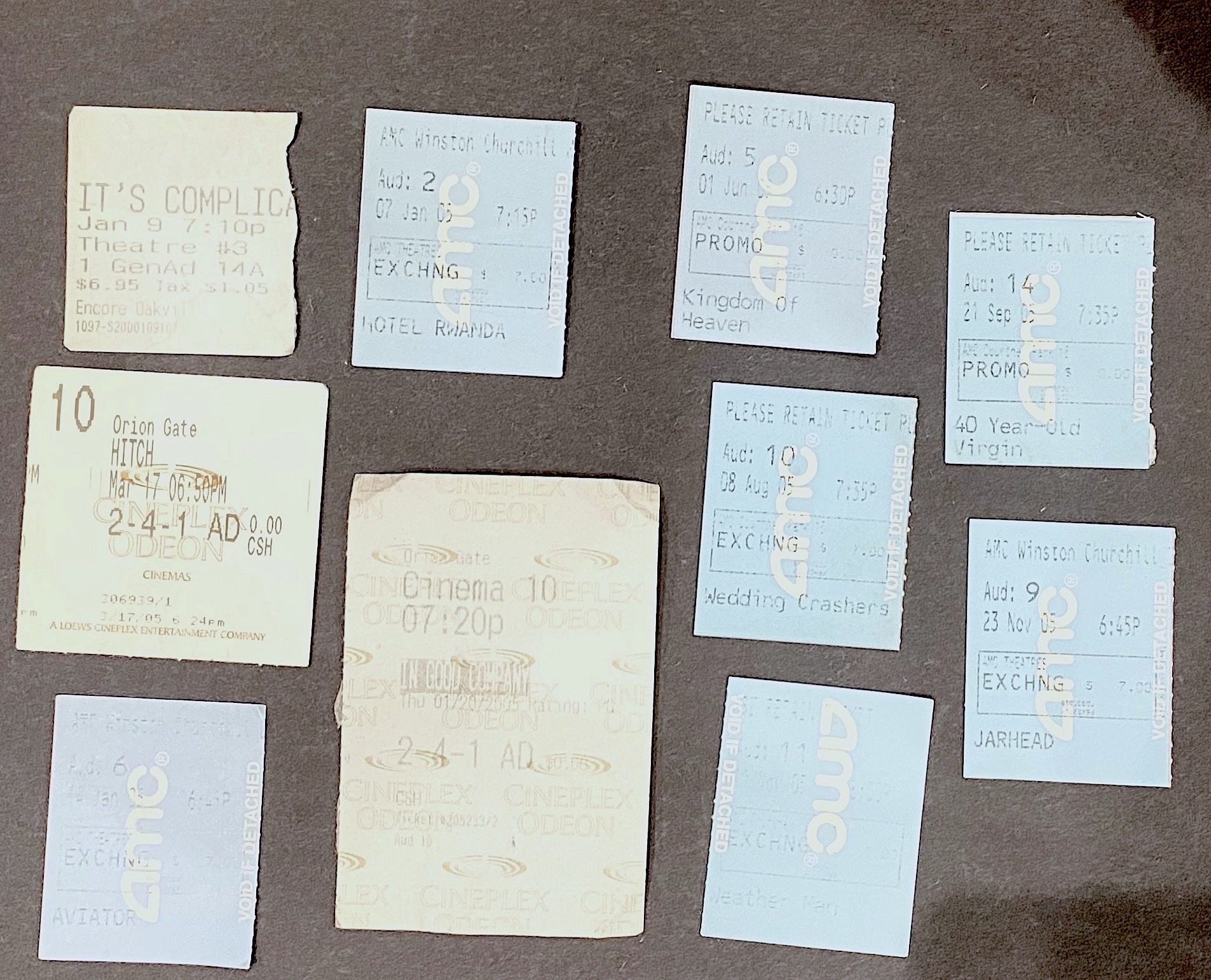
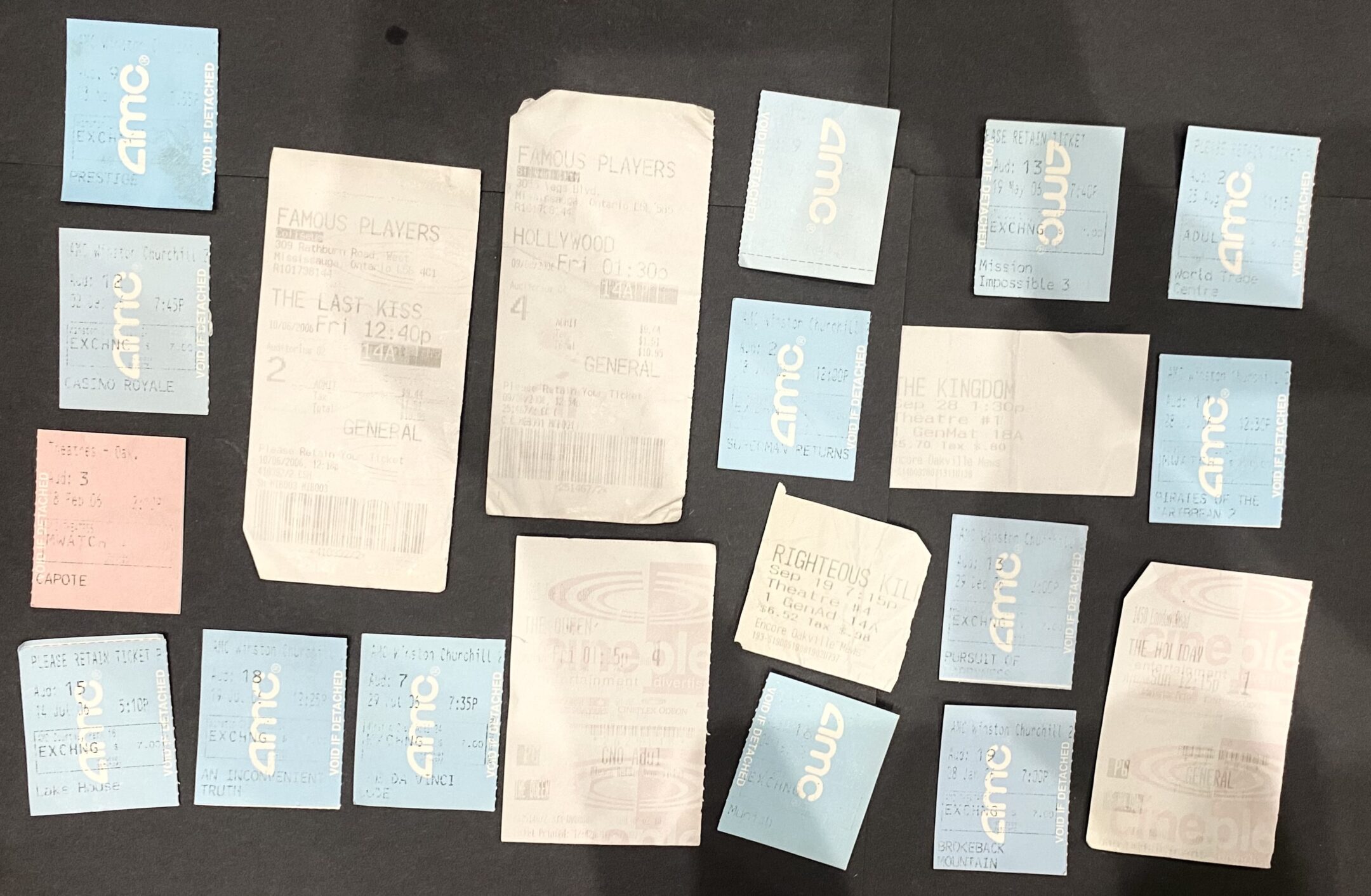
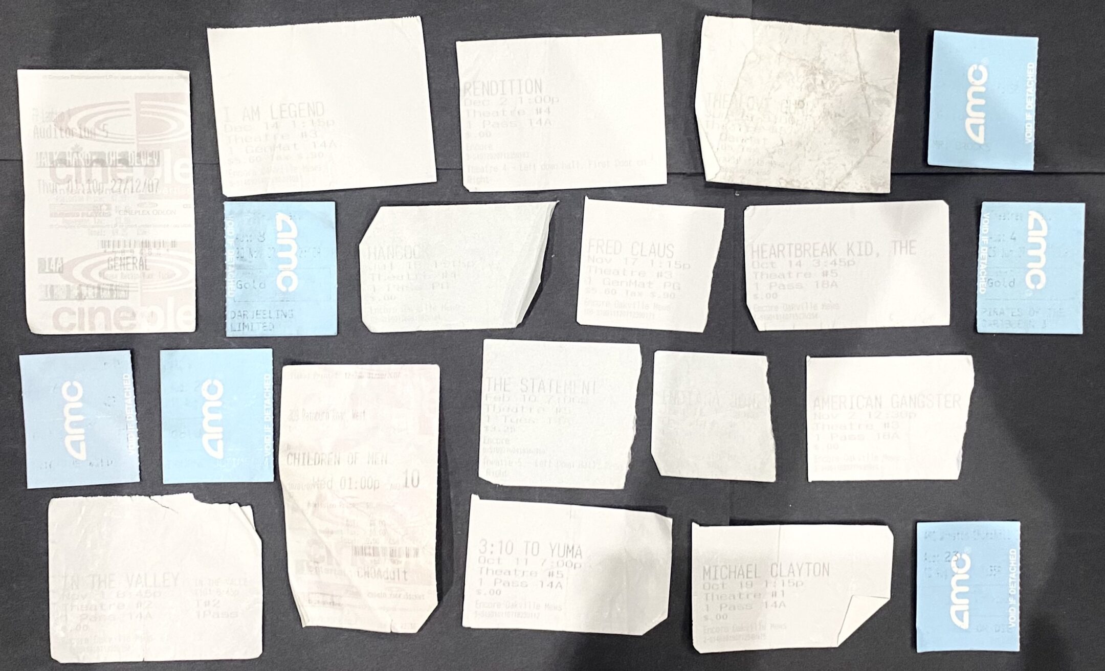
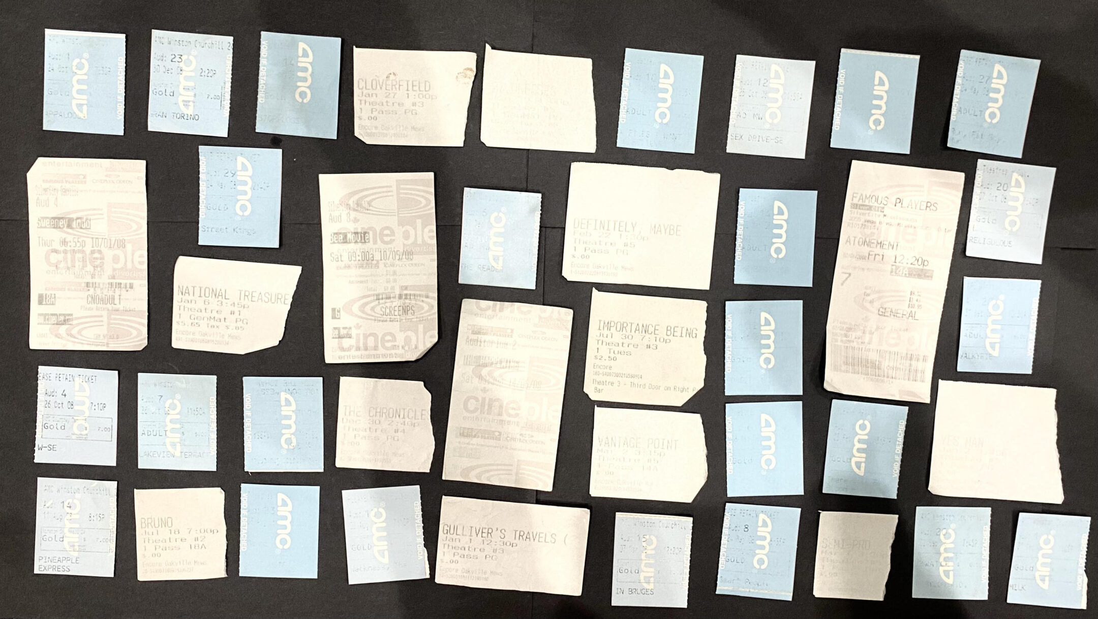
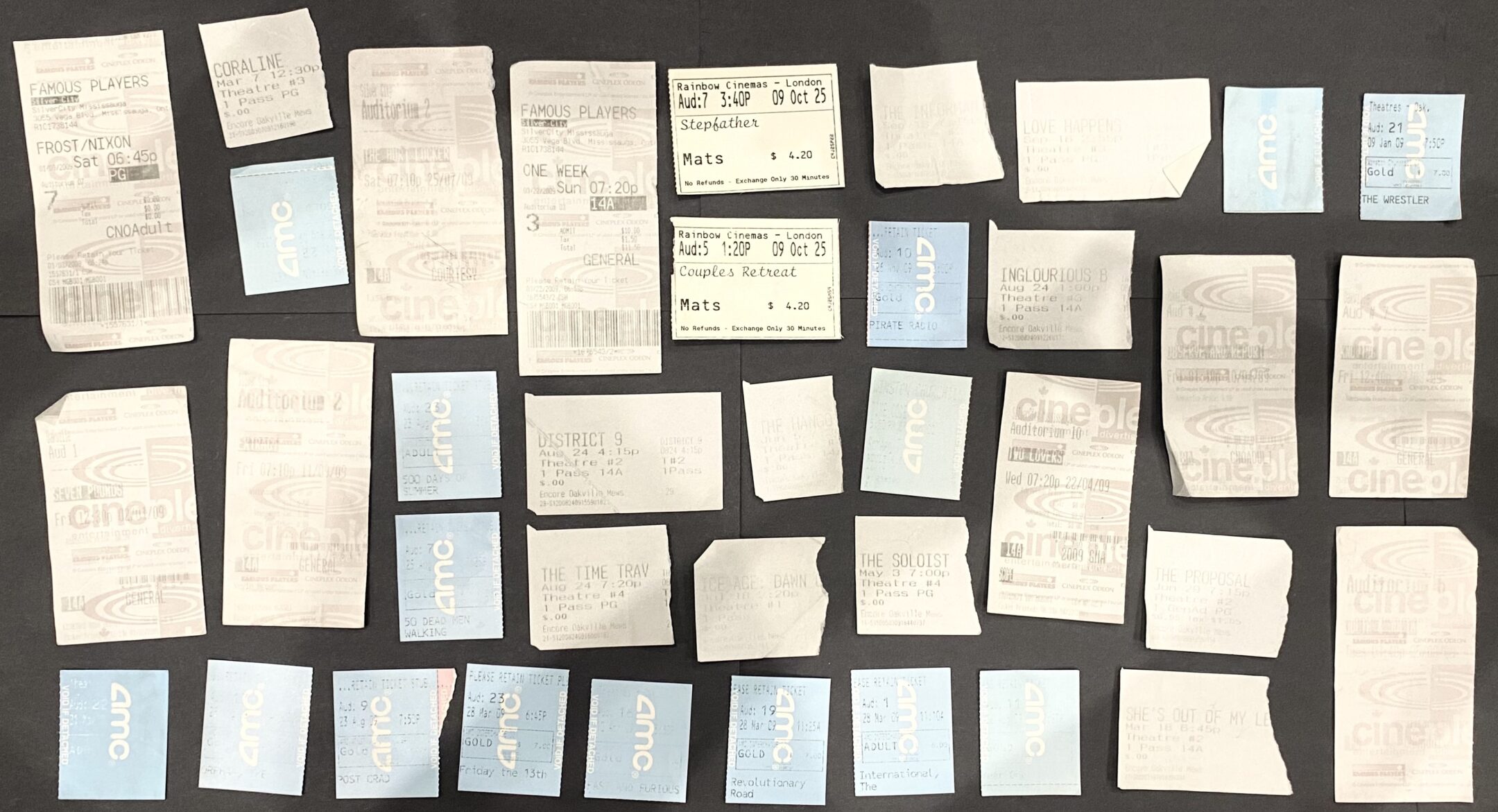
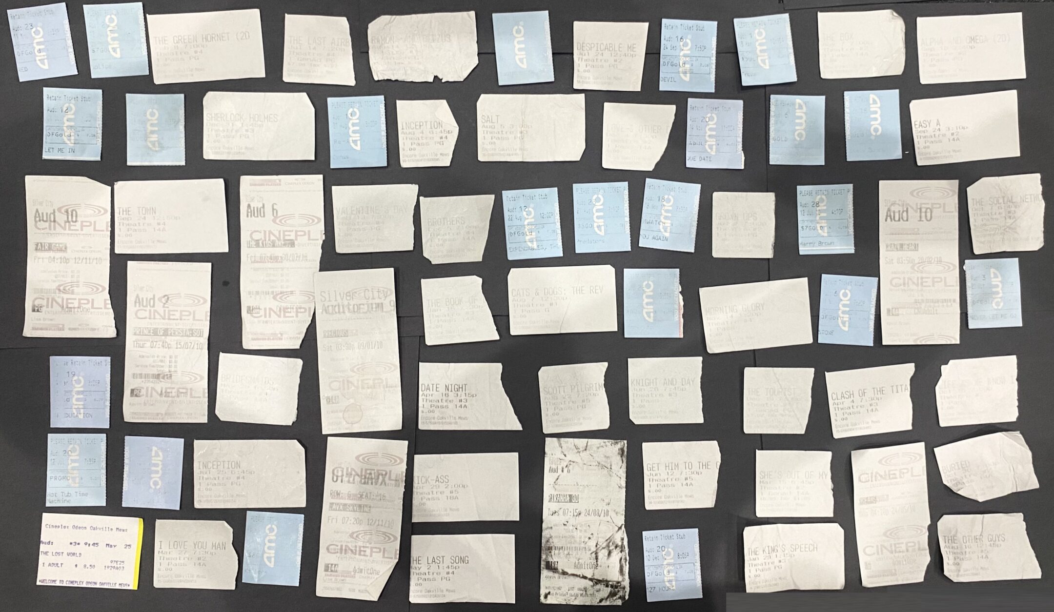
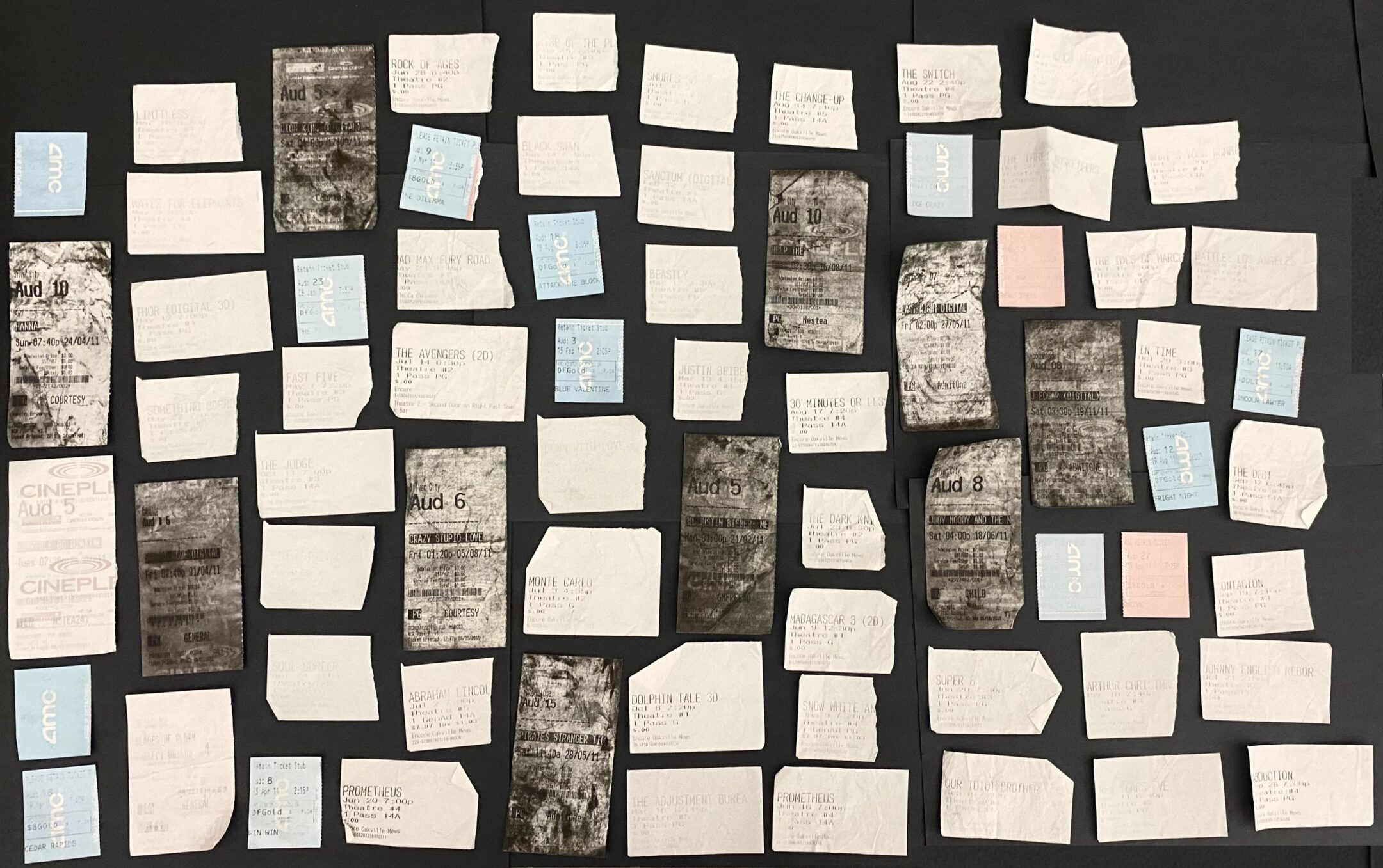
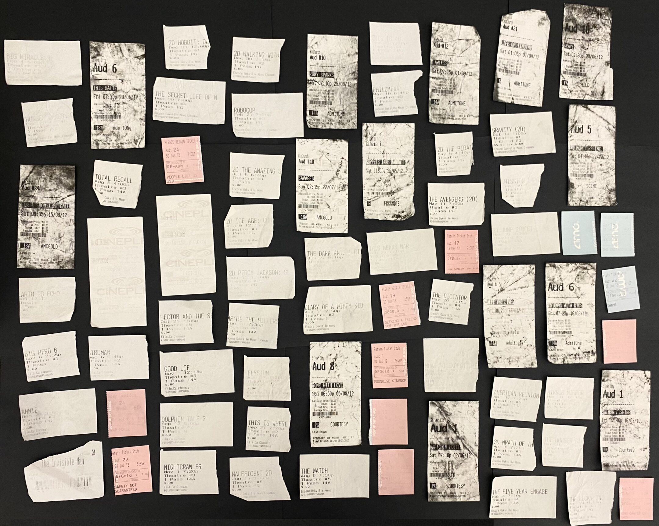
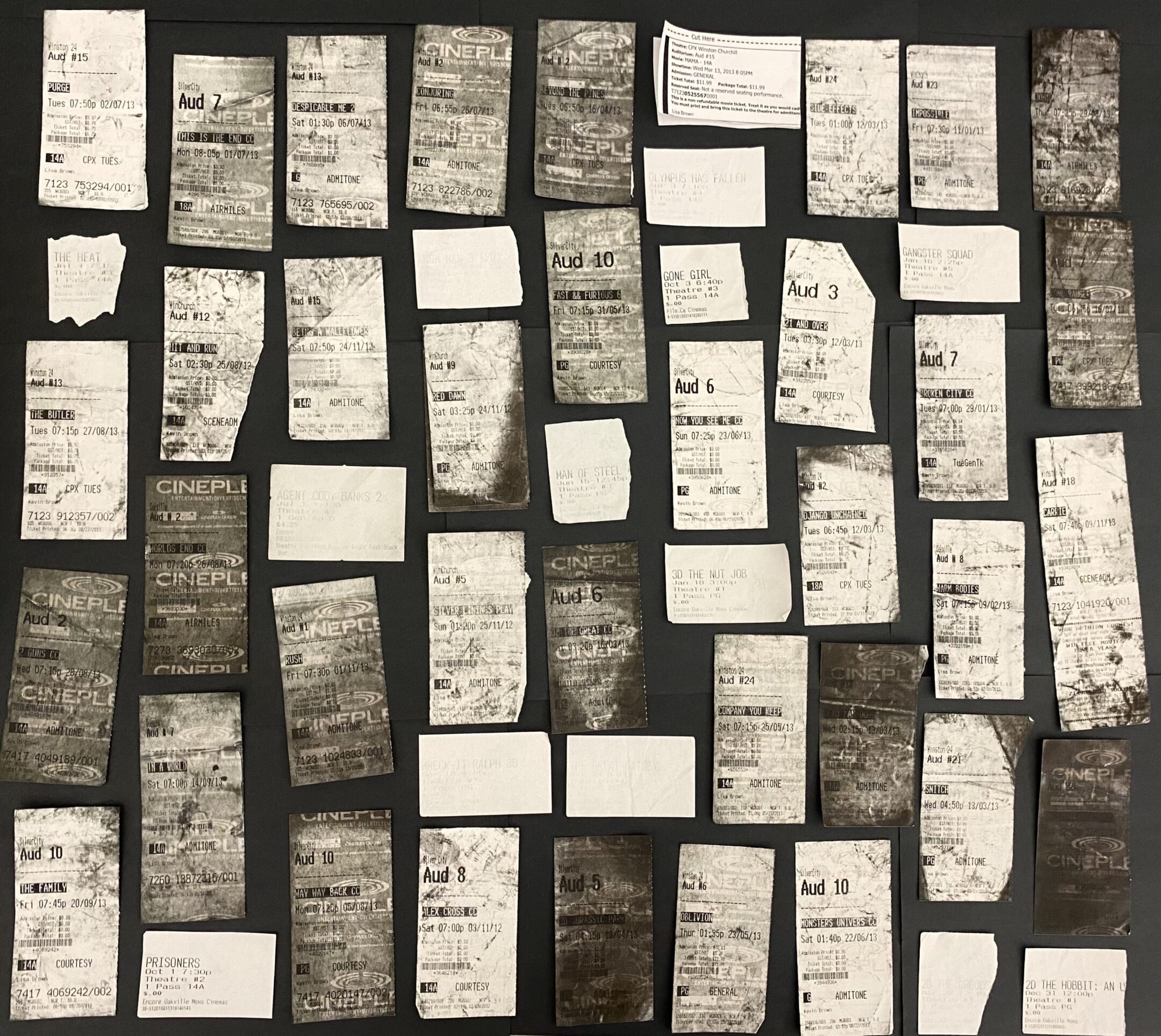
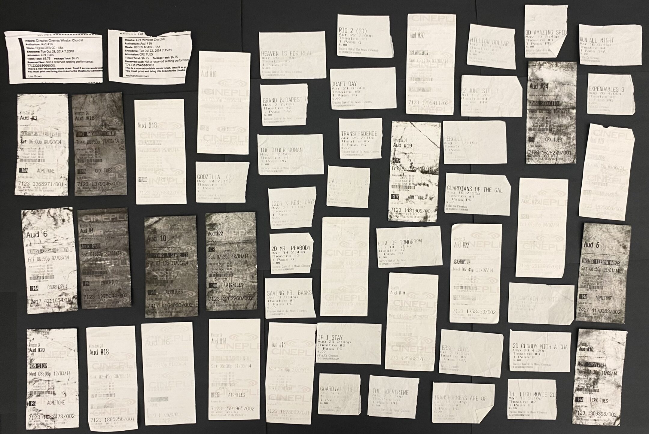
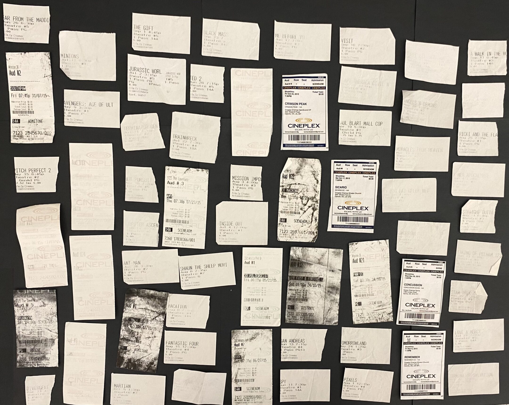
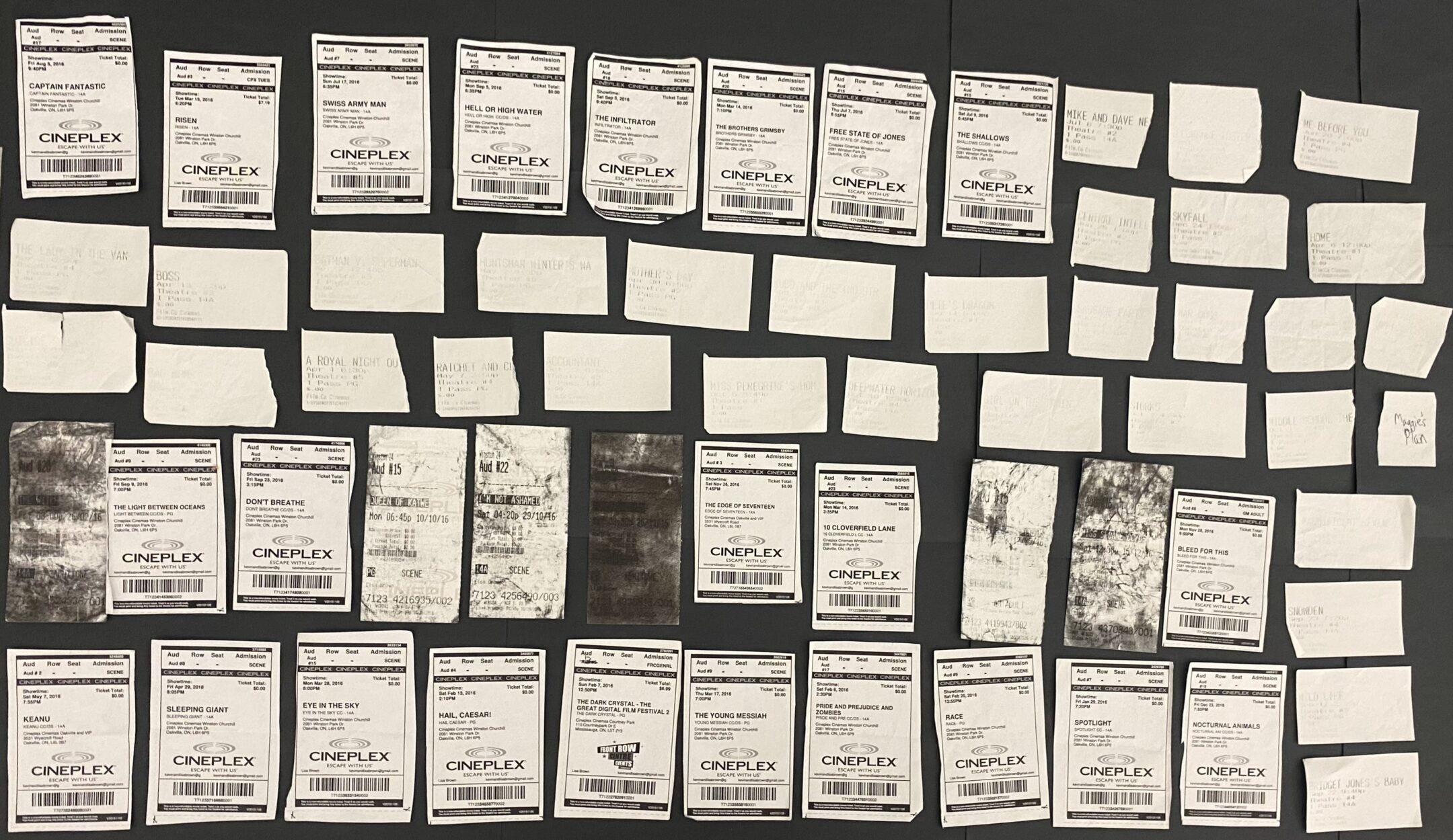
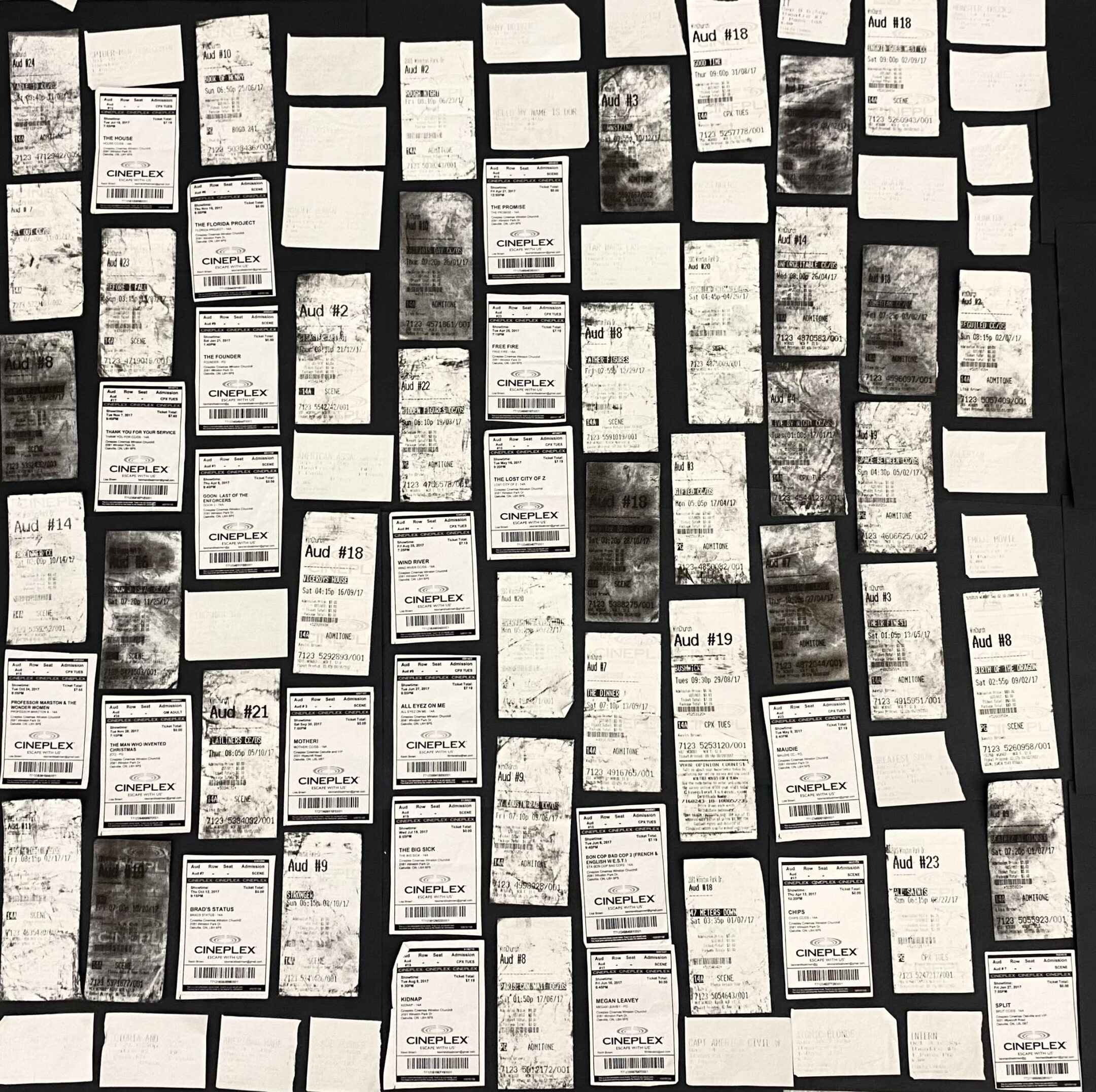
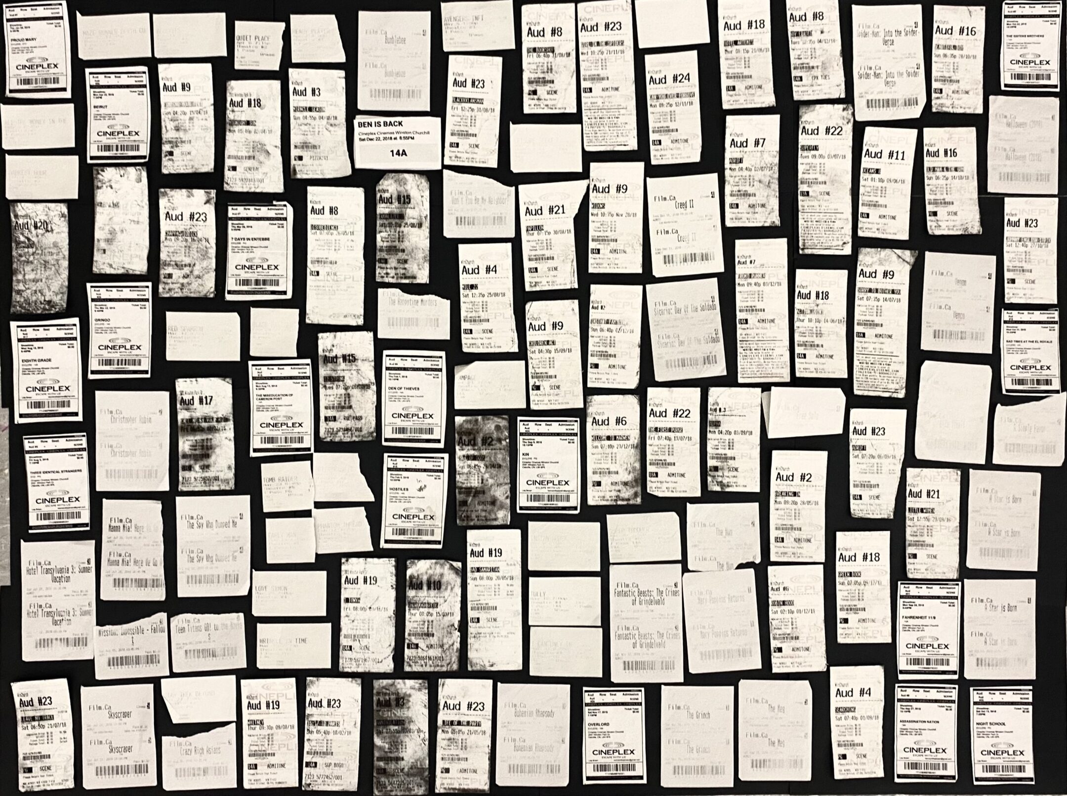
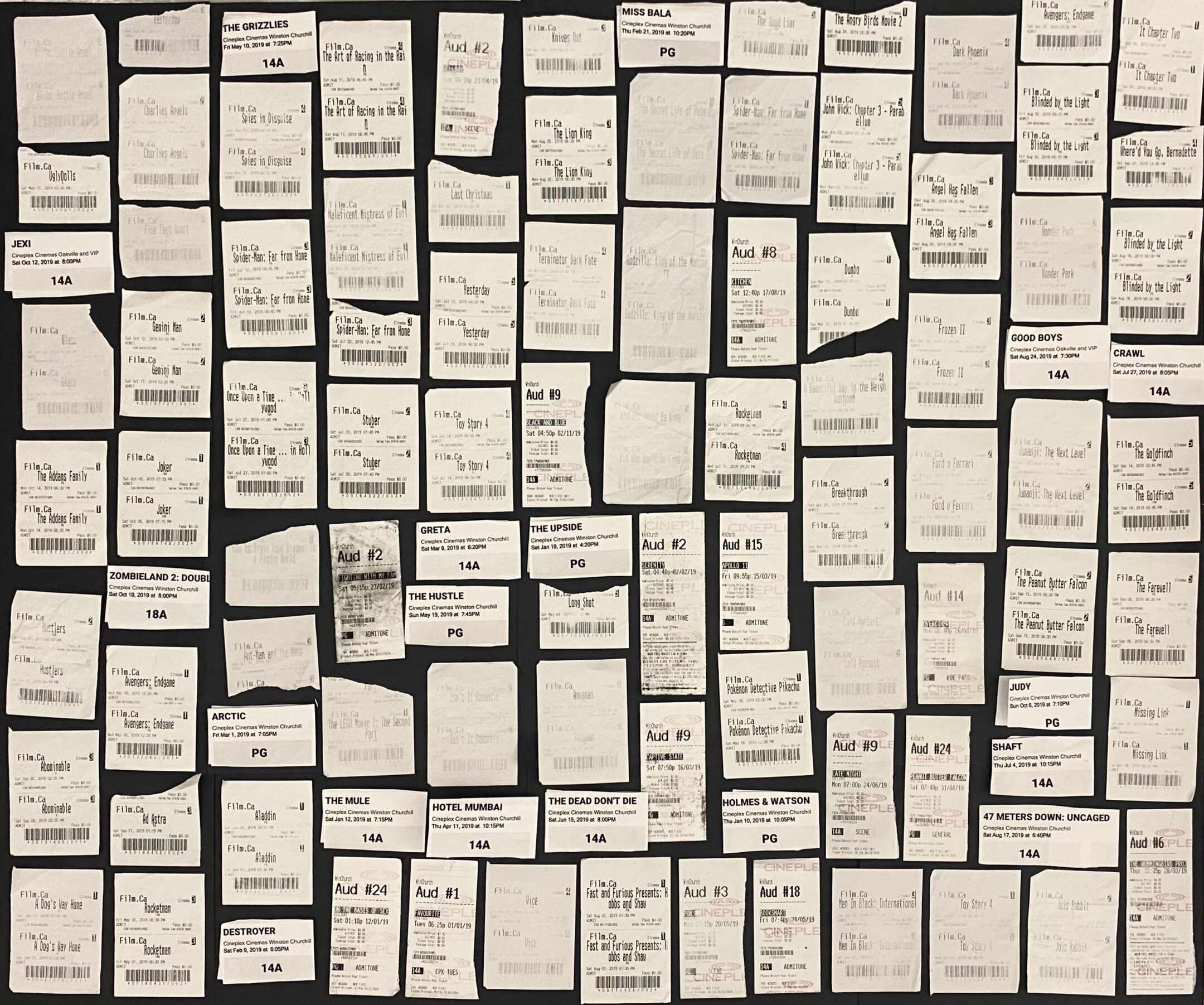
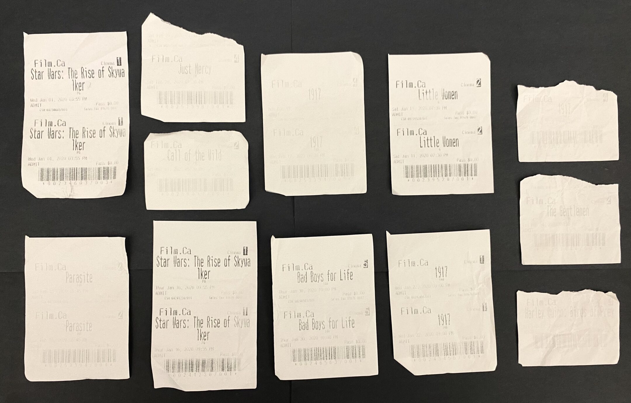
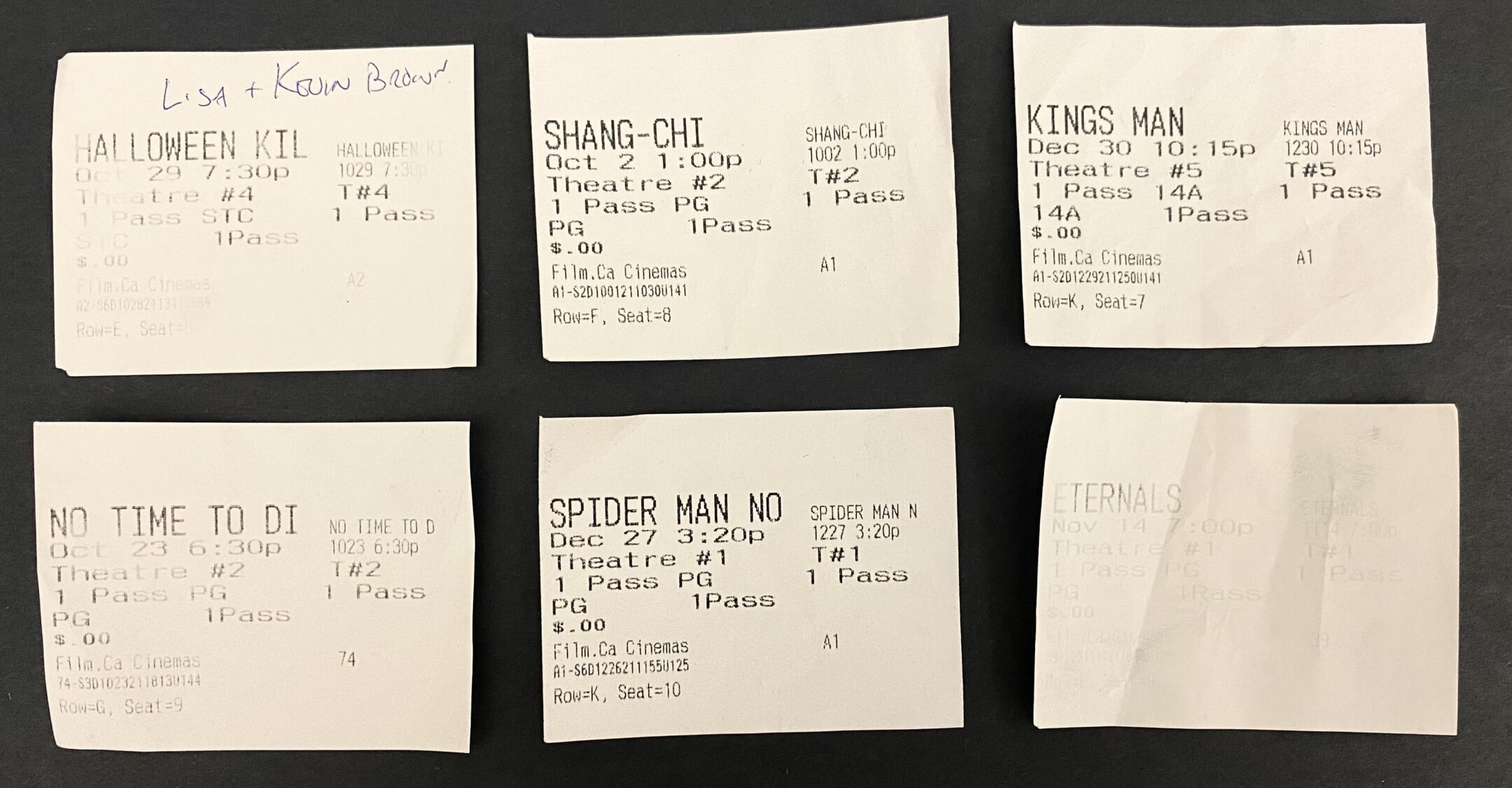
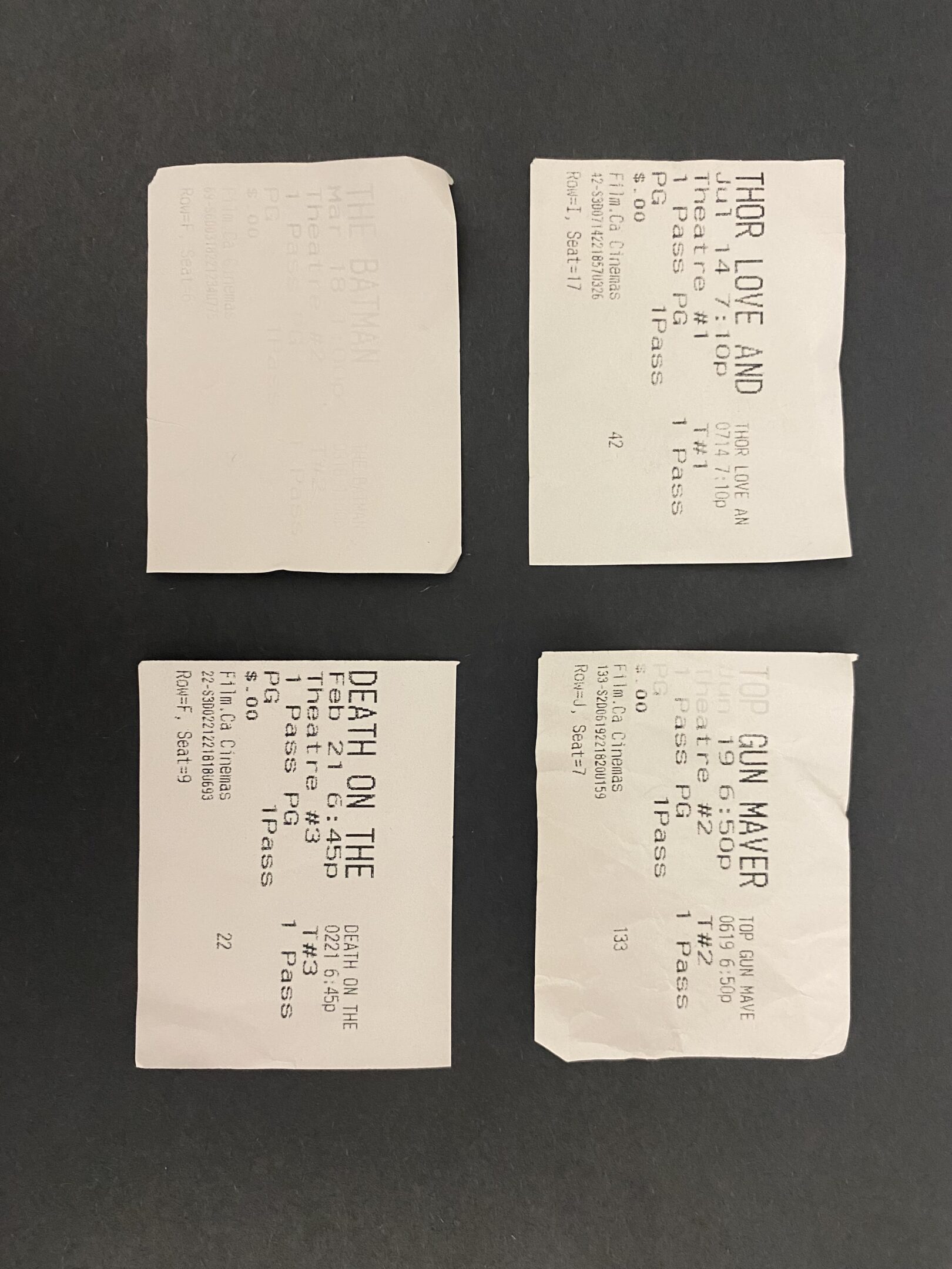
For this project, I decided to make a conceptual portrait of my dad or movies as a whole. Since 1996, my dad has saved every ticket from the movies he’s seen up until this year. Movies have always been a big part of his (and now my) life. They are definitely one of his obsessions and these tickets show a glimpse into what that looks like for him. He kindly lent me his box of tickets and I sorted through hundreds of tickets into the years 1996-2024. I then laid them out into grids on black paper for good contrast and took pictures for each year. I decided to display this as a slideshow but I think that a series of prints could also be really effective. These tickets say a lot about my dad like which movie theatres he went to, the genres he likes, how many movies he saw, and how all of those things change over time. An example of something I found inetresting was that unlike years around the same time, there are only a few tickets from 2005 because that’s the year I was born, and he was too busy taking care of me to see a lot of movies. This portrait also represents movies as a whole, showing how movie prices change and the different movies that came out each year. Even the format of the tickets vary through the years. There are only a few tickets from 2020 indicating when the COVID-19 lockdown was occurring.
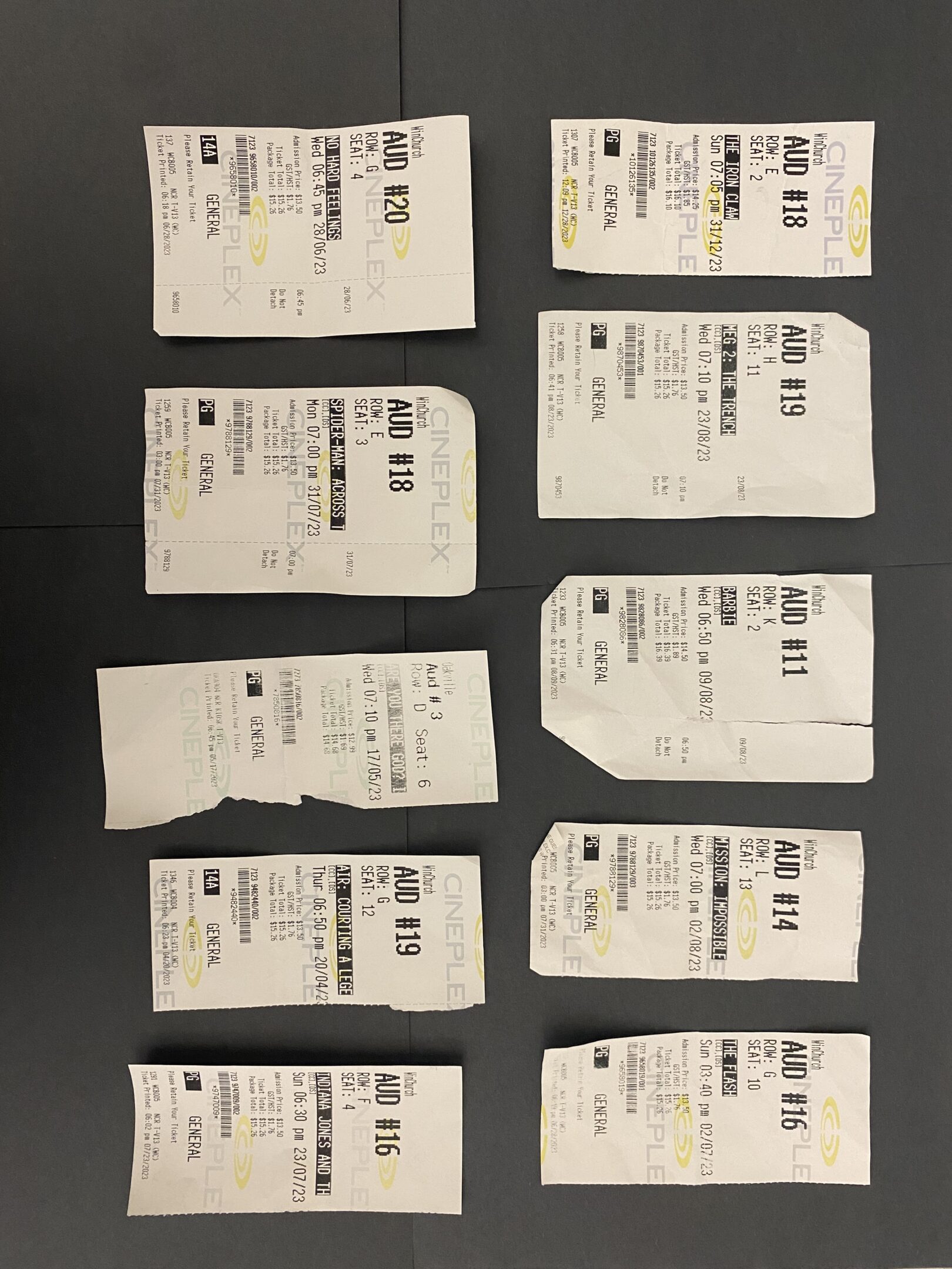
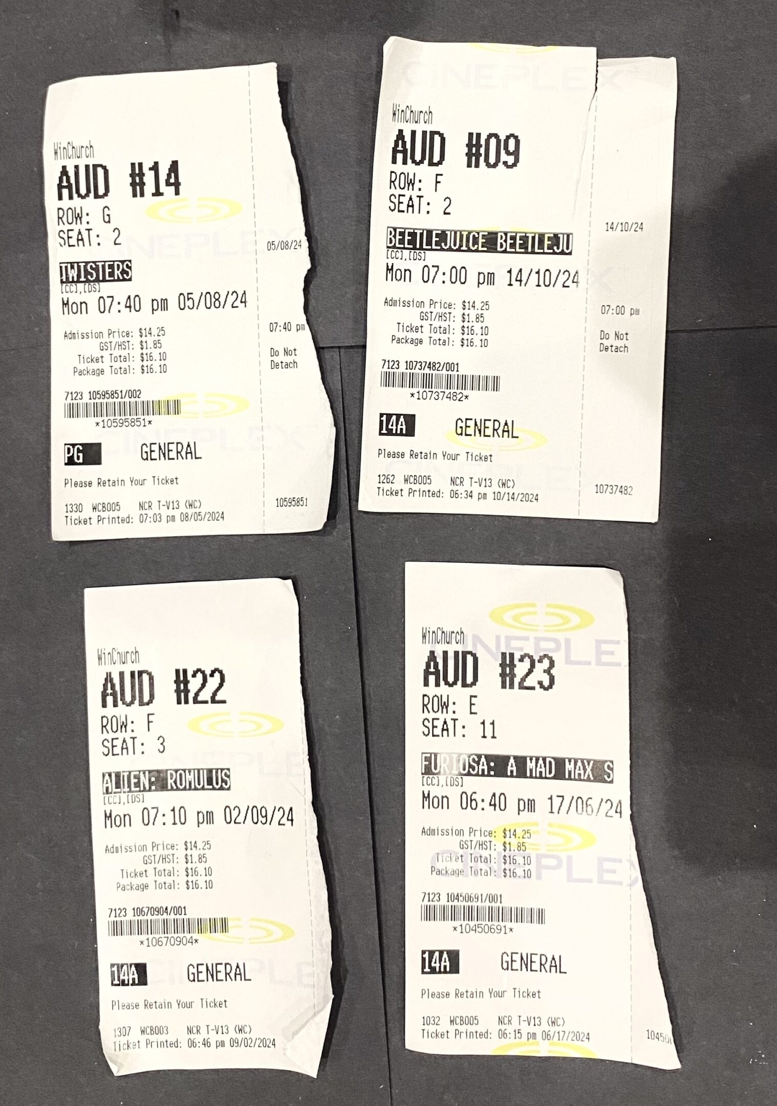
I am very thankful that my dad lent me his tickets that mean so much to him, and I can’t wait to continue to make a collection of my own!


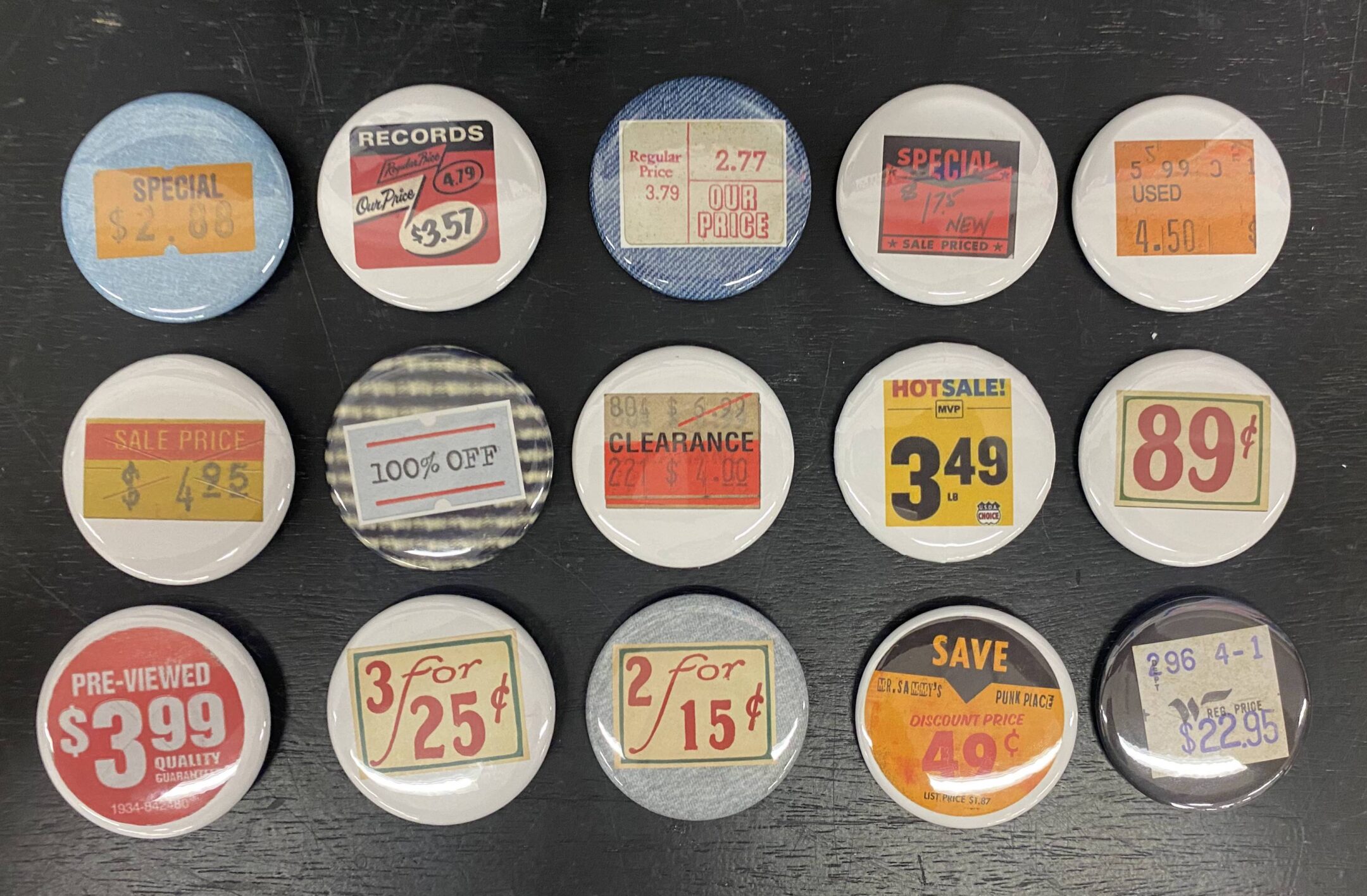
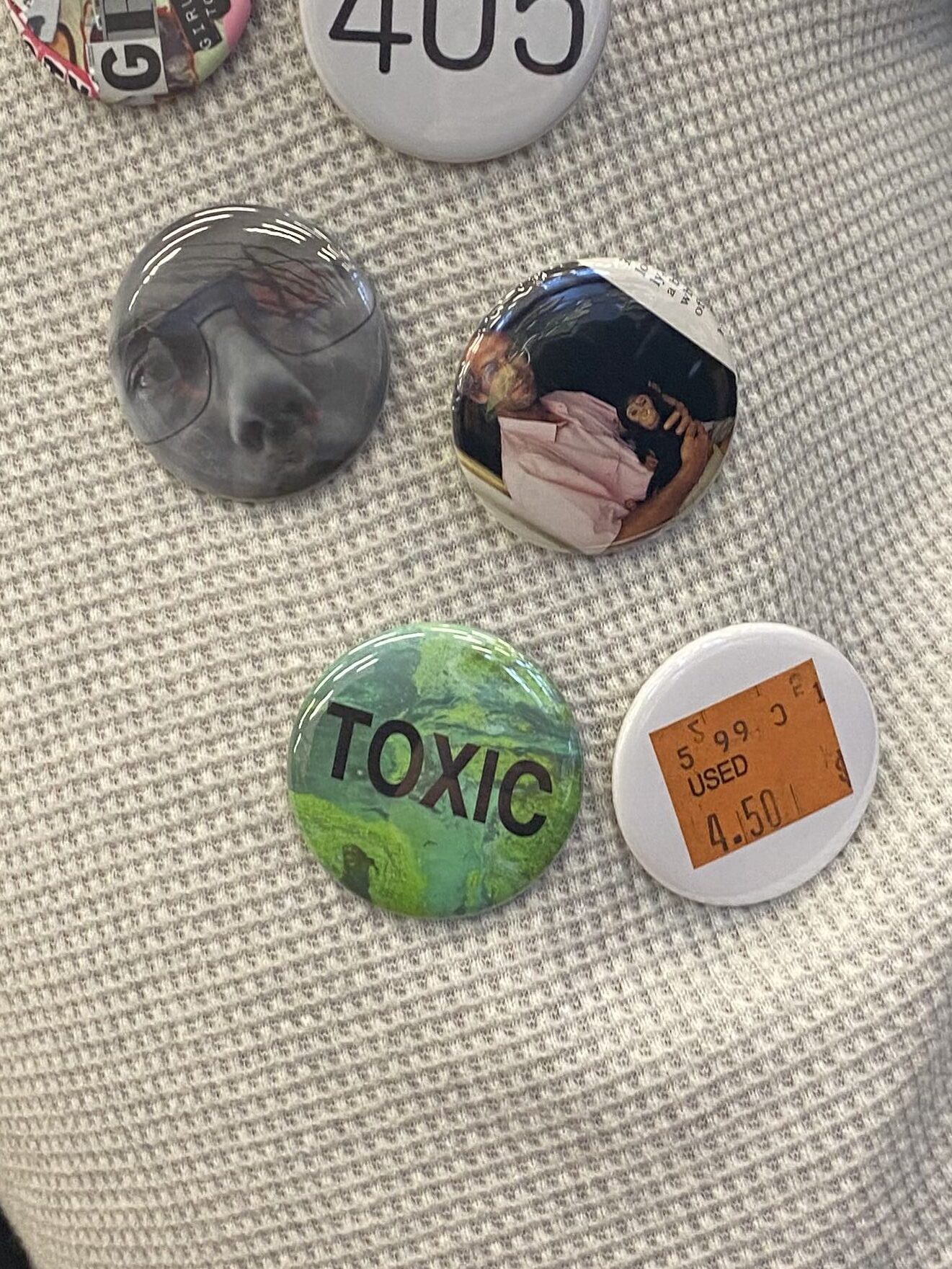
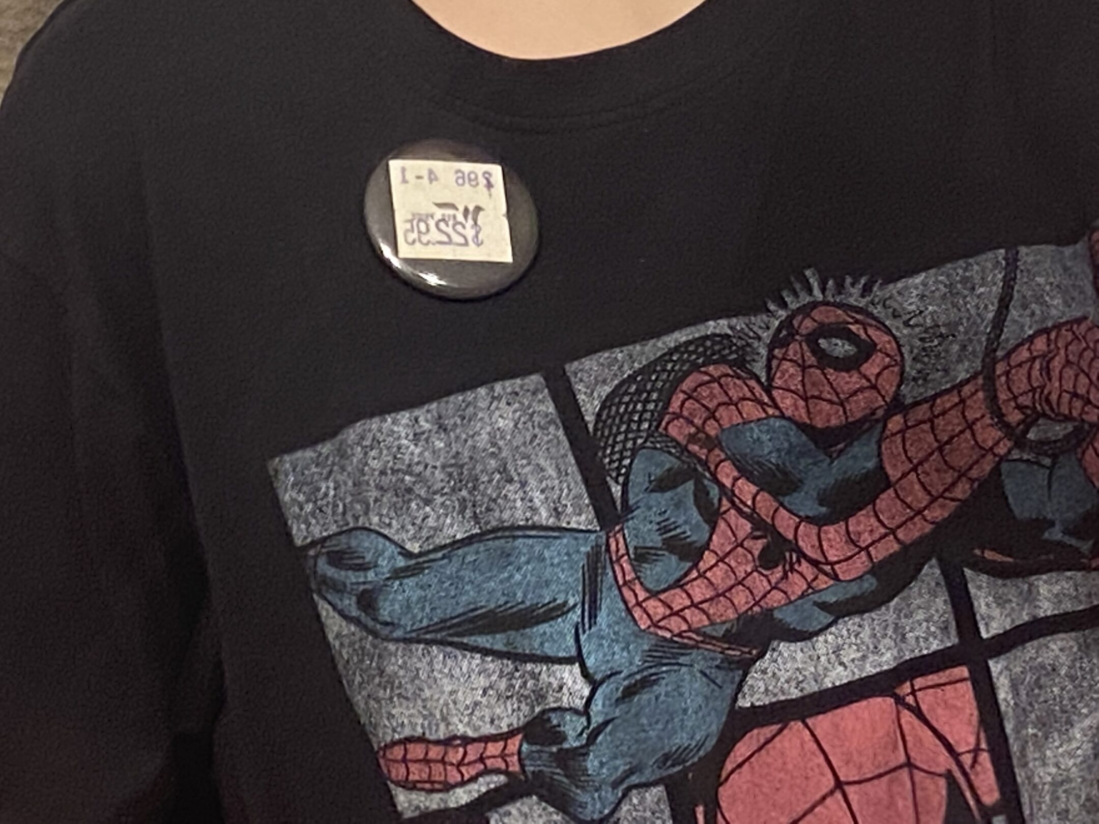
I decided to make my artists buttons feature vintage/retro price tags. Each button has a different price tag with different amounts and other words that go along with it. The concept of someone wearing a price tag can touch on the idea of someones worth, how artists can become commodified, etc. The other words on the price tags also add additional meanings such as “used” or “2 for 15 cents.” I chose retro looking price tags because they are more colourful and interesting than modern day ones. Some of the buttons have backgrounds to match people’s clothing (such as blue denim), to emphasize that the price tag is on the person, not the button.