:)))
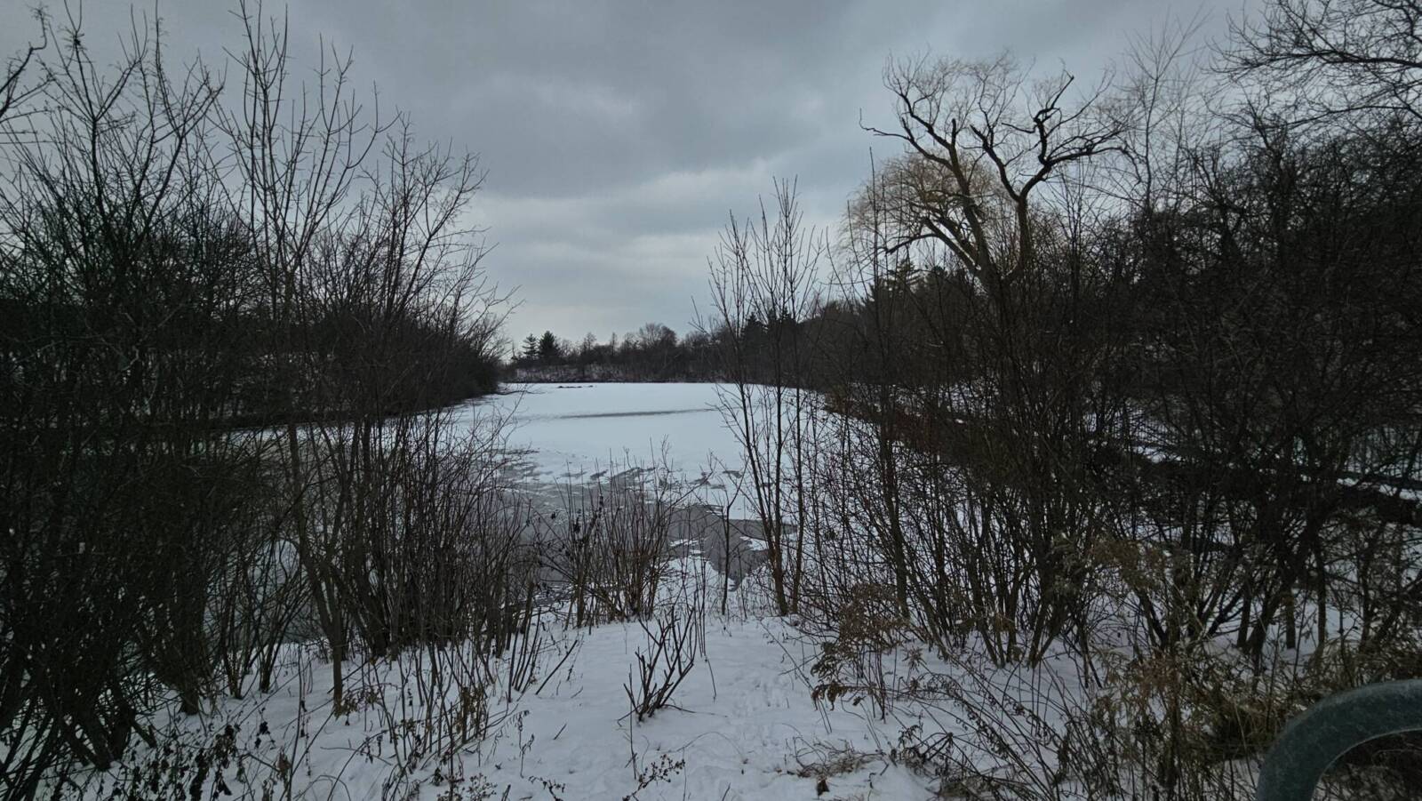
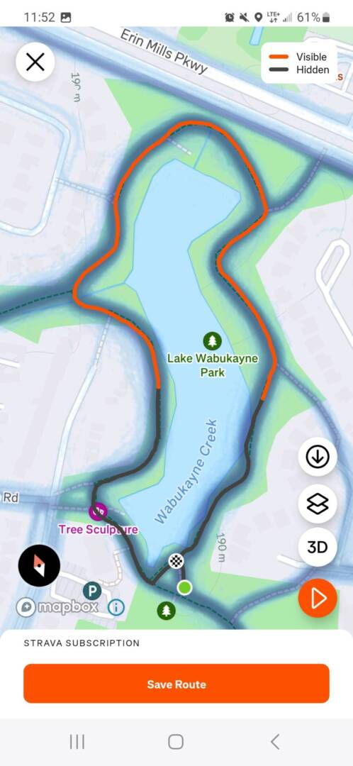
1 Kilometre
For my kilometre I recorded a conversation I had during a 1km walk.
Article Discussion
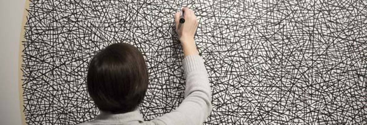
- The work Motus Mori is a project created by Katja Heitmann which records human gestures. While the expected approach to this may to be film or write it down, Katja Heitmann has dances memorize and perform these movements instead. Some of the unique gifts that come with attempting to archive these personal movements is making it so people are more aware of their habits and it also helps capture these unique movements people have. The challenges of this project can be how people can change their movements and try to “perfect” their habits while being watched and how the movements the dancers learn need to remember it properly.
- One example that really stood out to me was Ranti Tijan and how he hides his thumbs and after he realized this he started to wear a yellow jacket. I feel like this example shows on how our movements can reflect our emotions and personality.
- Some habitual movements I’ve noticed in people I know well is my friend has a habit of scratching her thumb while sitting and my other friend tends to fidget with her clothes quite a bit and my mother always fixes her headband.
- These examples of small movements each mean various different things. For my friends it’s more of a nervous habit, whereas for my mother it’s her way of preparing to start something new.
Field Trip
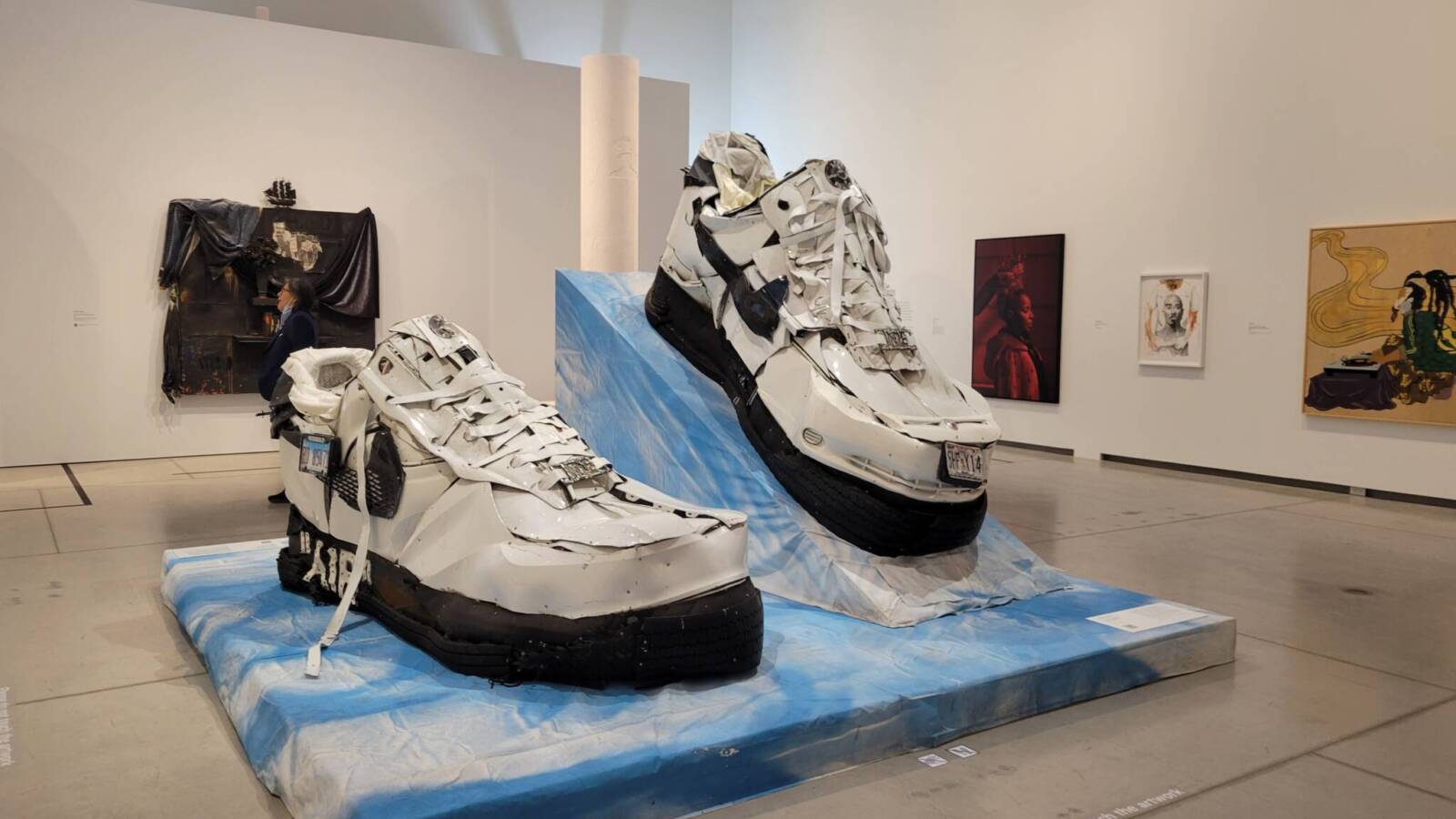
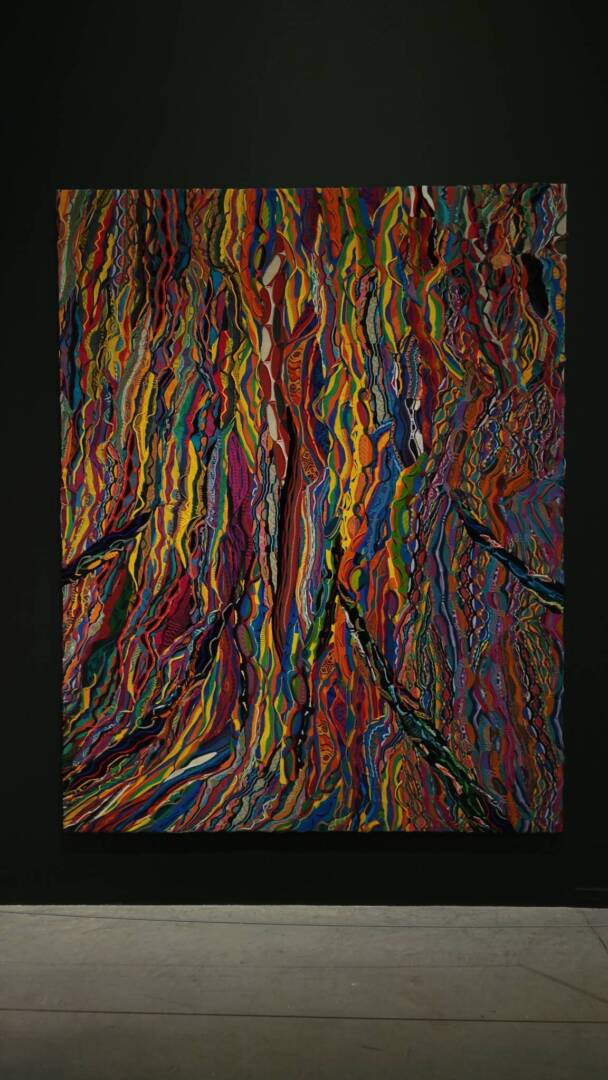
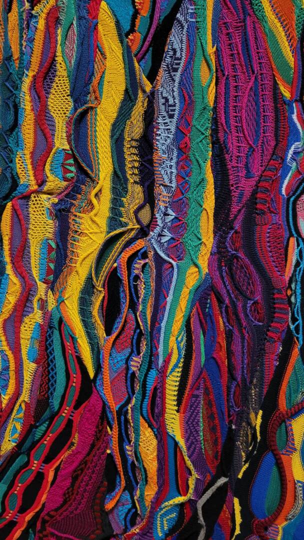
The class went on a trip to the AGO and Power Plant Art Gallery.
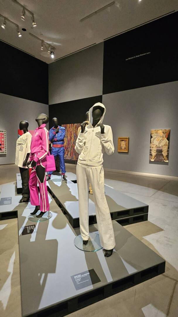
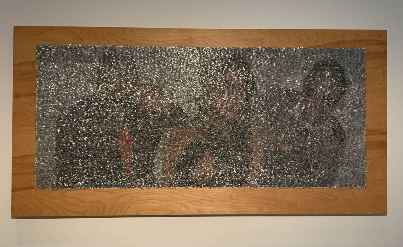
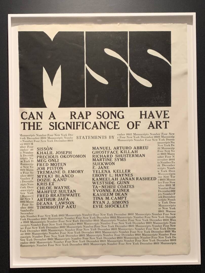
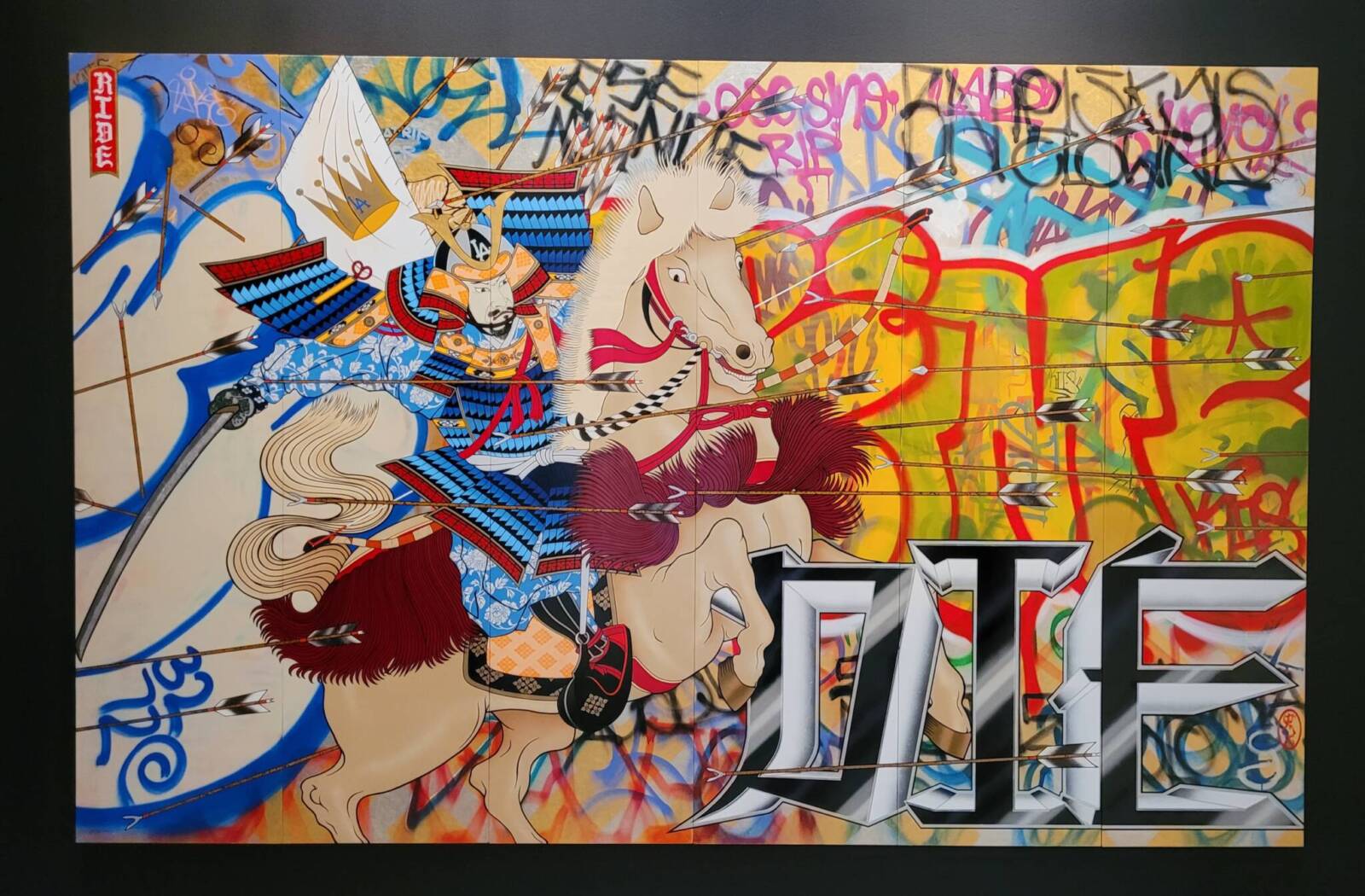
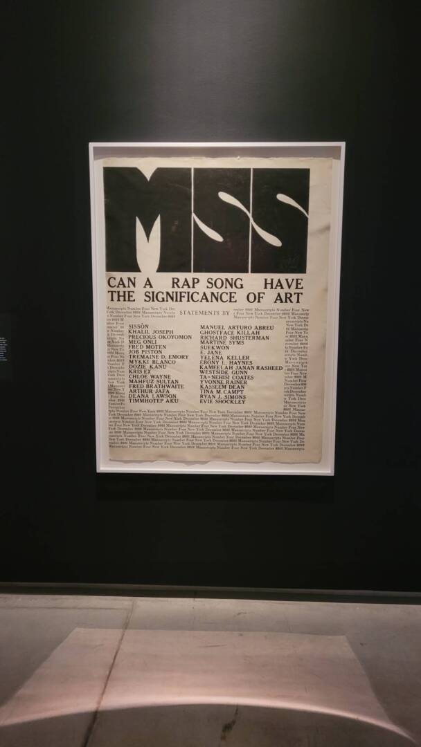
During this trip we saw many interesting works but The Culture exhibition was by far my favourite. I am not very immersed in the hip hop scene, but many of my favourite aritists take influence from hip hop and rap and just seeing the whole exhibit was very interesting, but what caught my eye the most was this piece which showcased many outfits that are seen in the rap and hip hop scene.
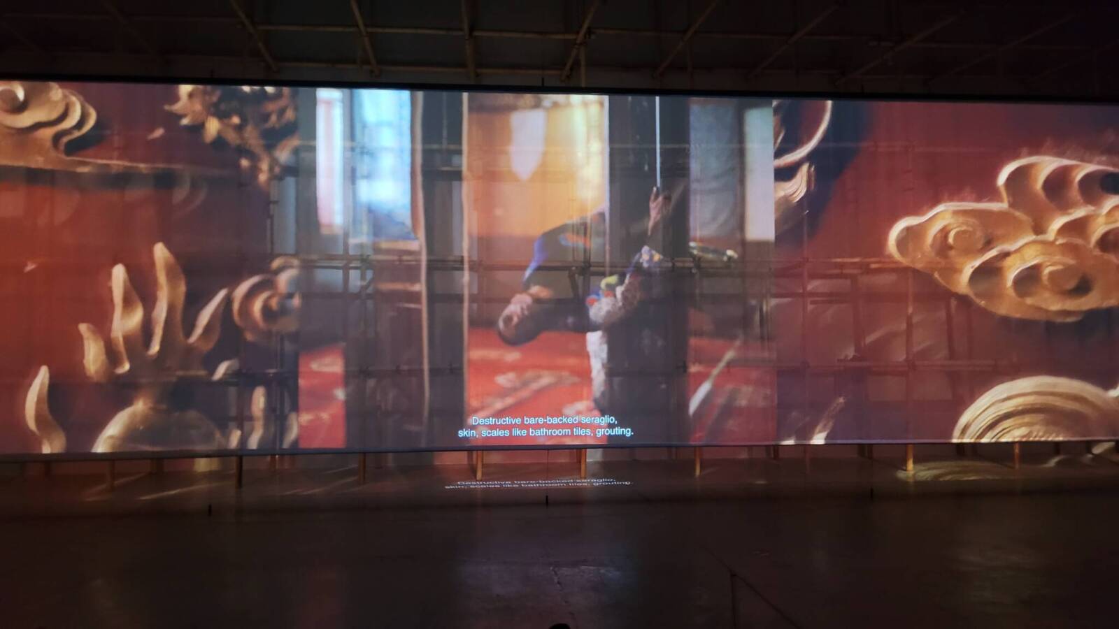
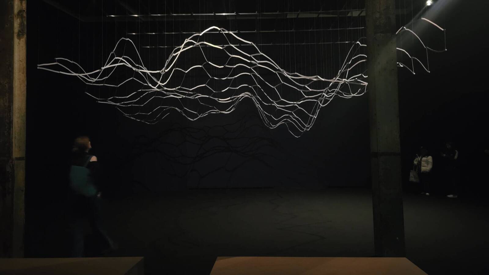
In the Power Plant Art Gallery the exhibit that caught my attention the most was “Floating Sea Palace” by Lap-See Lam. The use of shadows and video made the floating restaurant feel almost alive, like it was a person rather than a ship. It evoked a lot of emotions in me. I left feeling quite sad. It felt like the ship was lost and was searching for what I am assuming is a home or something to attach onto and it never found it. The way it told a story about change and how we hold onto memories really touched me and it was something I felt a personal connection to. This exhibit was the highlight of my trip.
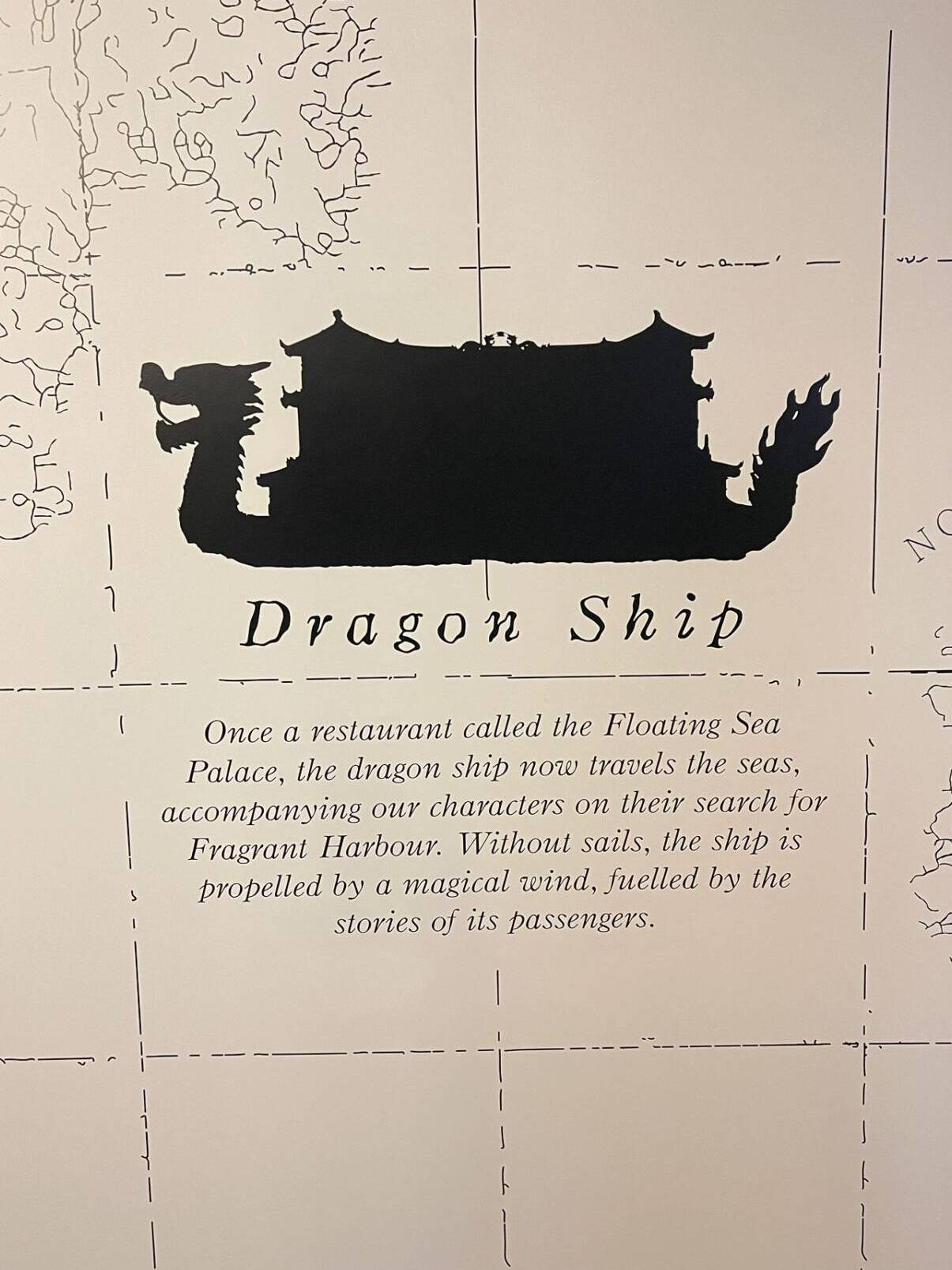
I don’t have any pictures from inside the exhibit seeing as I was completely enchanted the whole time, but the way we entered and were given bits of information really grabbed my attention.
One Feat, Three Ways- Blinking
One Shot
Loop
Sequence
Blinking is an instinctive yet intimate act, a fleeting gesture of both vulnerability and communication. In this series, the simple action of blinking is transformed into a subtle, silent exchange—one that plays with rhythm, perception, and participation. Through three distinct video structures—Sequence, Loop, and One Shot—the act of blinking becomes a dynamic interaction, inviting both observation and engagement.
- Sequence: A structured exchange where each participant blinks one after another, forming a rhythmic pattern akin to a visual relay. This arrangement emphasizes anticipation and control, as the viewer follows the deliberate pacing of each blink, highlighting the individual within the collective.
- Loop: A continuous cycle where all three individuals blink at the camera simultaneously, removing hierarchy and creating a hypnotic, synchronous rhythm. The repetition blurs the distinction between individual and group, reinforcing the cyclical nature of blinking as both an unconscious function and a shared experience.
- One Shot: A direct confrontation between two individuals engaging in a silent blinking ‘tag.’ Through eye contact and shifting frequencies, the game unfolds organically, creating tension and playfulness within the frame. The unpredictability of the exchange leaves room for spontaneity, drawing the audience into the immediacy of the moment.
A cohesive yet varied color palette enhances the depth of each composition, while eye-level framing establishes an equal playing field, placing the viewer in direct engagement with the participants. Across all three formats, the videos explore the mechanics of nonverbal communication, turning an everyday gesture into a focal point of interaction, challenge, and subtle expression.
My Crops Are Dying but My Body Persists, Bridget Moser
Bridget Moser’s My Crops Are Dying but My Body Persists uses internet culture, memes, and weird visuals to explore the themes of privilege, identity, and consumerism. They use a combination of “satisfying” videos, distorted music, and robotic voices to create a sense of emptiness and discomfort. For example, the robotic voice saying “I take showers just to pass the time” adds a feeling of detachment, much like the cold tone of many internet memes. I personally don’t like the feeling of such cold feeling sounds so it gave me an eerie vibe.
The video also critiques consumerism through props like gold balloon animals and pink Himalayan salt, creating a “picture-perfect” aesthetic that feels faker than if it wasn’t so curated. Moser’s use of these props, along with the silk pajamas she wears, represents the obsession with beauty and the perfect image, common in influencer culture which is gaining wide spread popularity as of right now.
The video makes me feel physically uncomfortable, especially with the strange acts like putting moisturizer on white bread. It’s unnatural and looks and feels wrong. This sense of discomfort challenges us to question the content we consume since now a lot of content we see is confusing or misleading. Moser’s props, like fake hot dog hands and balloon animals, highlight the emptiness of consumerism.
Overall, this piece helps critique life in modern times and how people strive for perfection, but it’s never fulfilling enough. As Charlene Lau puts it, “the absurdity remains,” highlighting how consumerism and social media contribute to a feeling of emptiness.
Open Studios
On Wednesday we all had the amazing opportunity to go see the masters students studios. It was a very cool and interesting experience and I got to see many of the art from the graduate students. Everyone had such unique ways of work and different focuses on what they wanted to present in their art and it had me think about and question a lot about what I wanted to do and what sort of messages I wanted to display in my work.
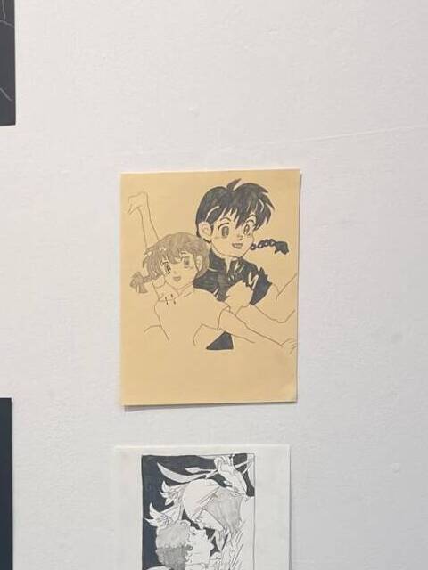
One of my favorite pieces was Permissions by Cindy Hill. The sculpture was so intriguing to look at because the star-covered door had a magical quality that really drew me in and made me curious about the story behind it. Another piece that stood out to me quite a lot was a drawing based on Ranma ½, an anime I really enjoy. Seeing something I’m personally connected to represented in an artistic way made the whole experience feel even more engaging.
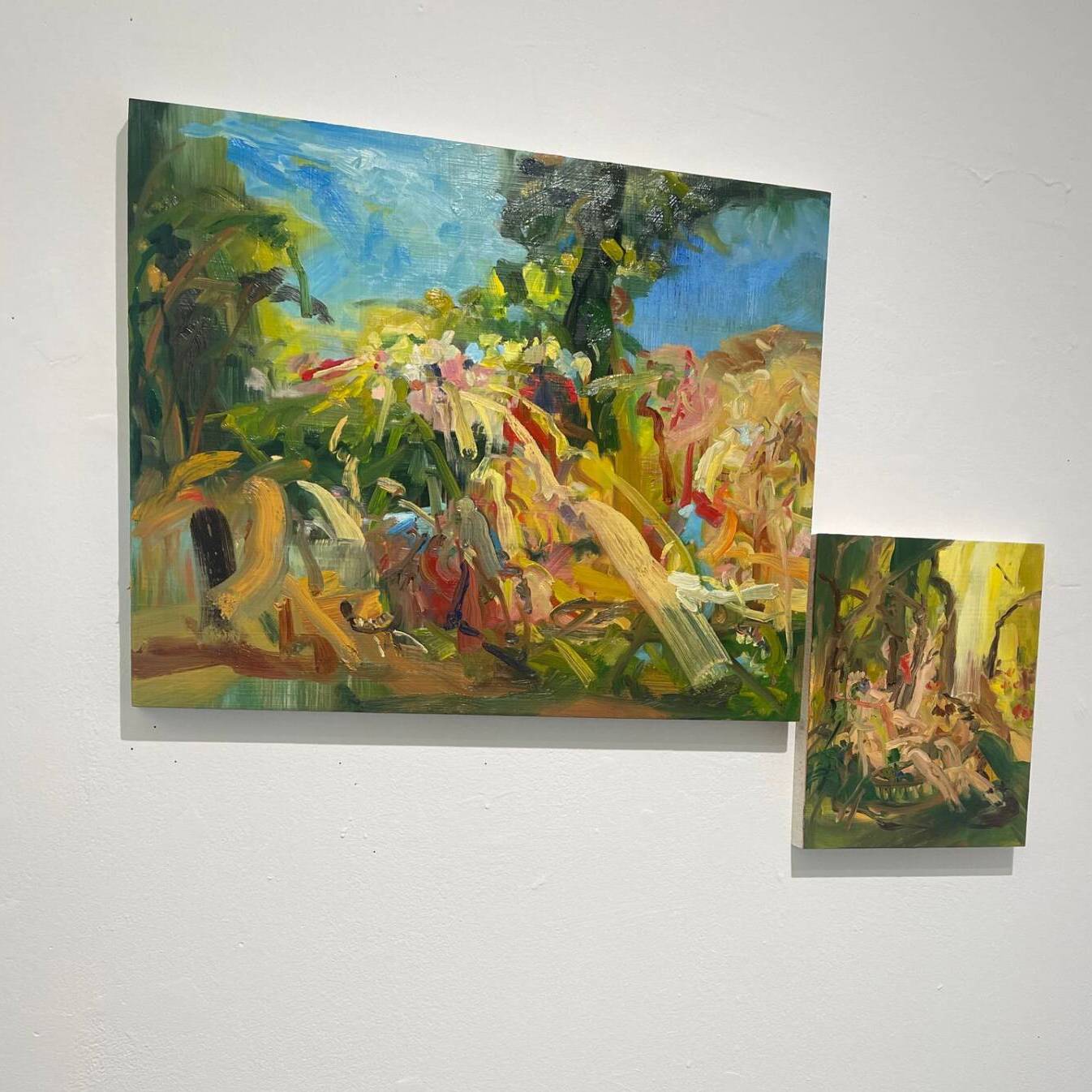
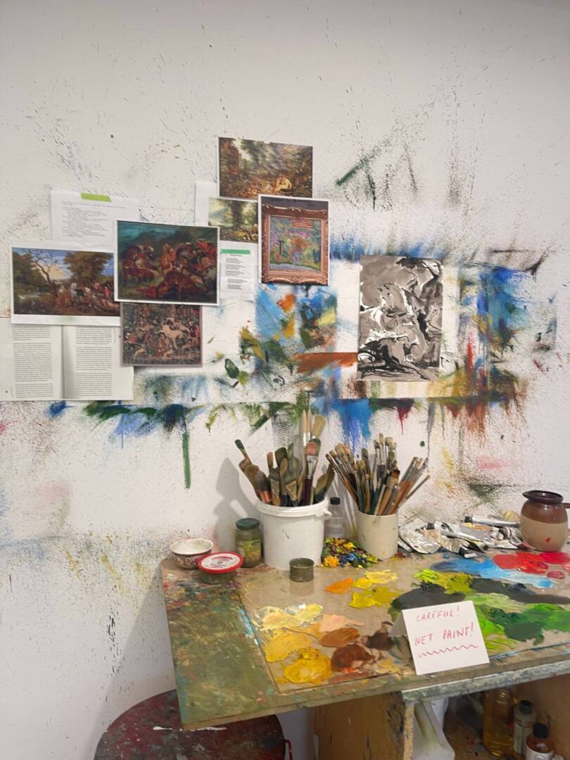
Something else that really inspired me was seeing one artist’s detailed planning process laid out in their studio. It was interesting to see how much thought and structure went into their work before the final piece even began. It made me want to bring more of that kind of intentionality and thoroughness into my own creative process moving forward. Overall this experience gave me a lot of lessons and many things to consider and look forward to!
Audio Art- Keyboard Rage
For this assignment I decided to record myself playing and raging in a bunch of different games and organizing each rage by intensity.
My goal was to highlight how gaming can trigger a wide range of emotions, from mild annoyance to full-blown outbursts without any verbal frustration being shown. I structured the audio to gradually increase in intensity, creating a buildup that reflects how frustration escalates over time. This project is both a personal reflection and a look at the emotional highs and lows of gaming. Through organizing my own reactions, I hope to capture a relatable experience for anyone who has ever raged at a game.
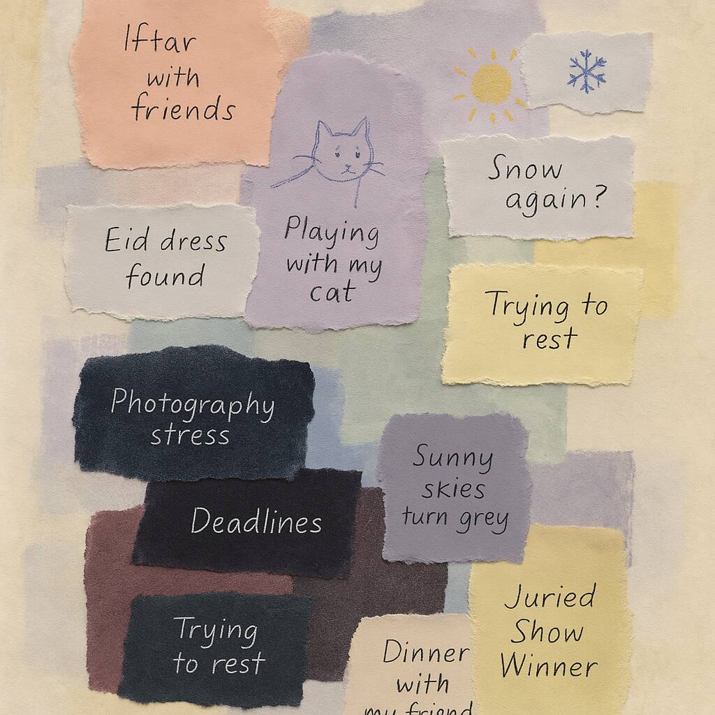
Conceptual Portrait- People as Flowers
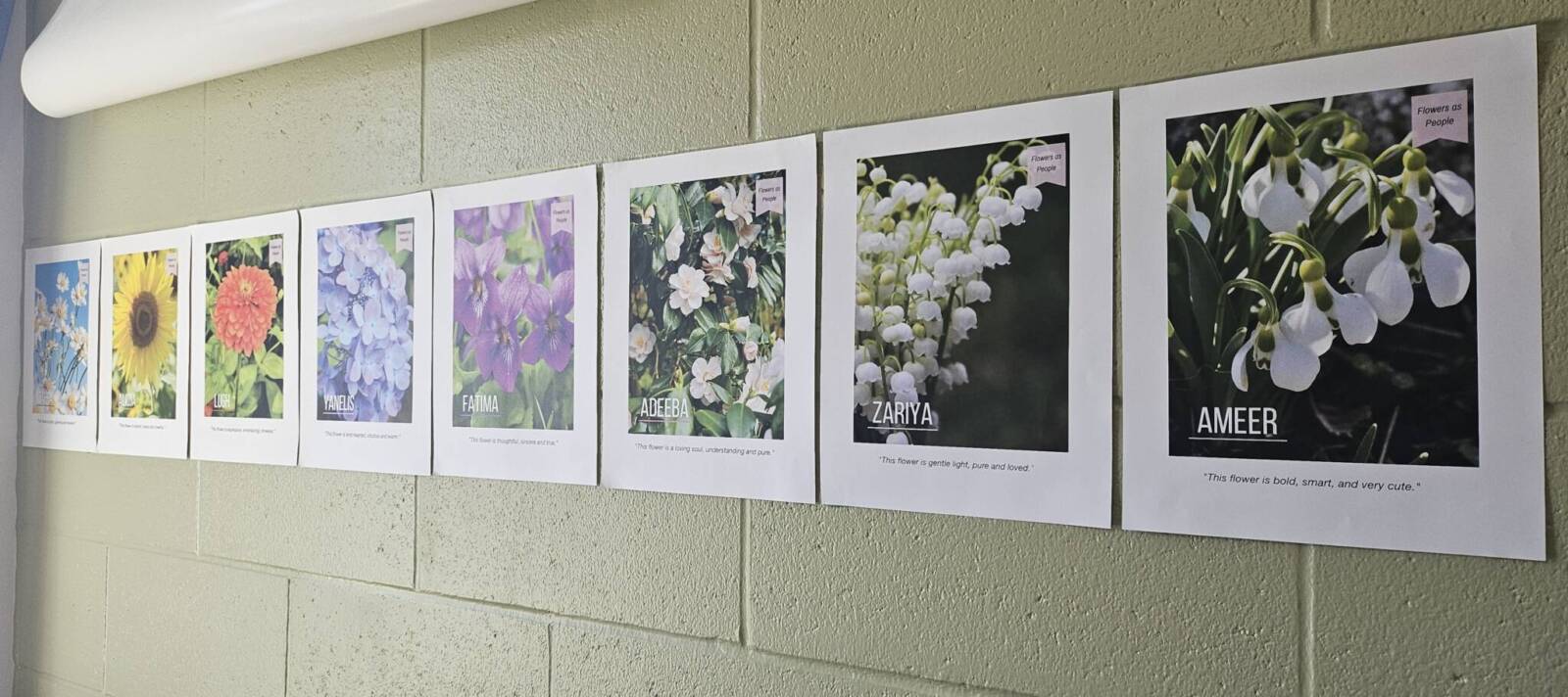
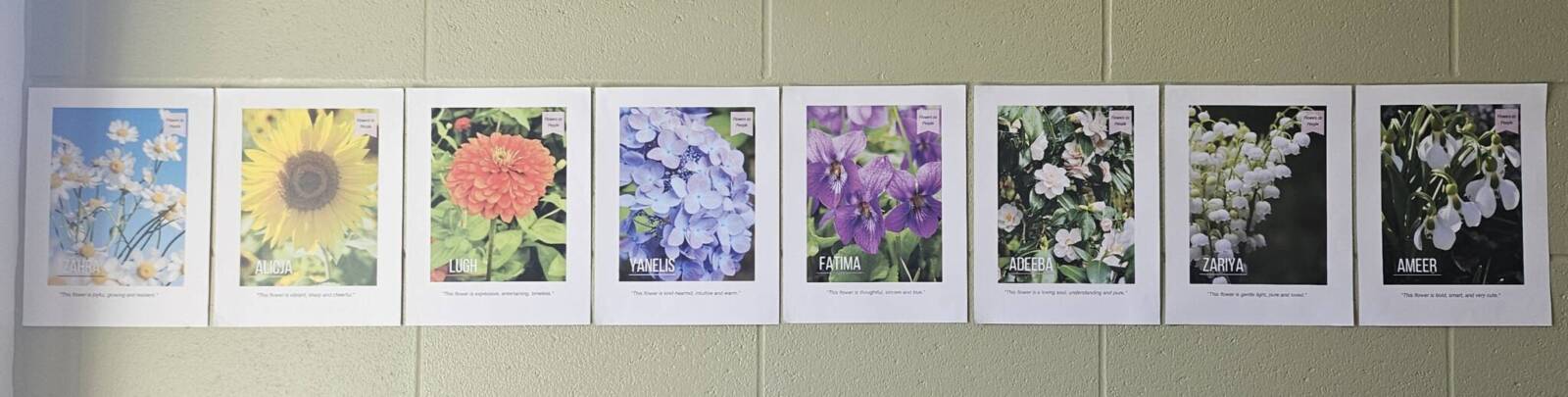
For this assignment I decided to make a series of conceptual portrait posters where I represented people as flowers. The idea came from something I started last year, when I randomly assigned different flowers to people in my life based on how I saw them. That little habit stuck with me, and for this project, I decided to revisit those flower-person pairings and build something more intentional out of them.
Each poster features one person, represented as the flower I had assigned them. Instead of naming the flower, I used the person’s name and referred to them as “this flower” in the description. This way, the viewer is encouraged to think about both the qualities of the flower and the person it represents. I also added a short line of description at the bottom of each poster to tie everything together and give a clearer sense of who they are and why that flower fits them.
My goal with this project was to explore how symbolism can represent personality and how something as simple as a flower can say a lot about a person. It’s a mix of personal reflection and visual metaphor, meant to get people thinking about the connections between nature and identity.
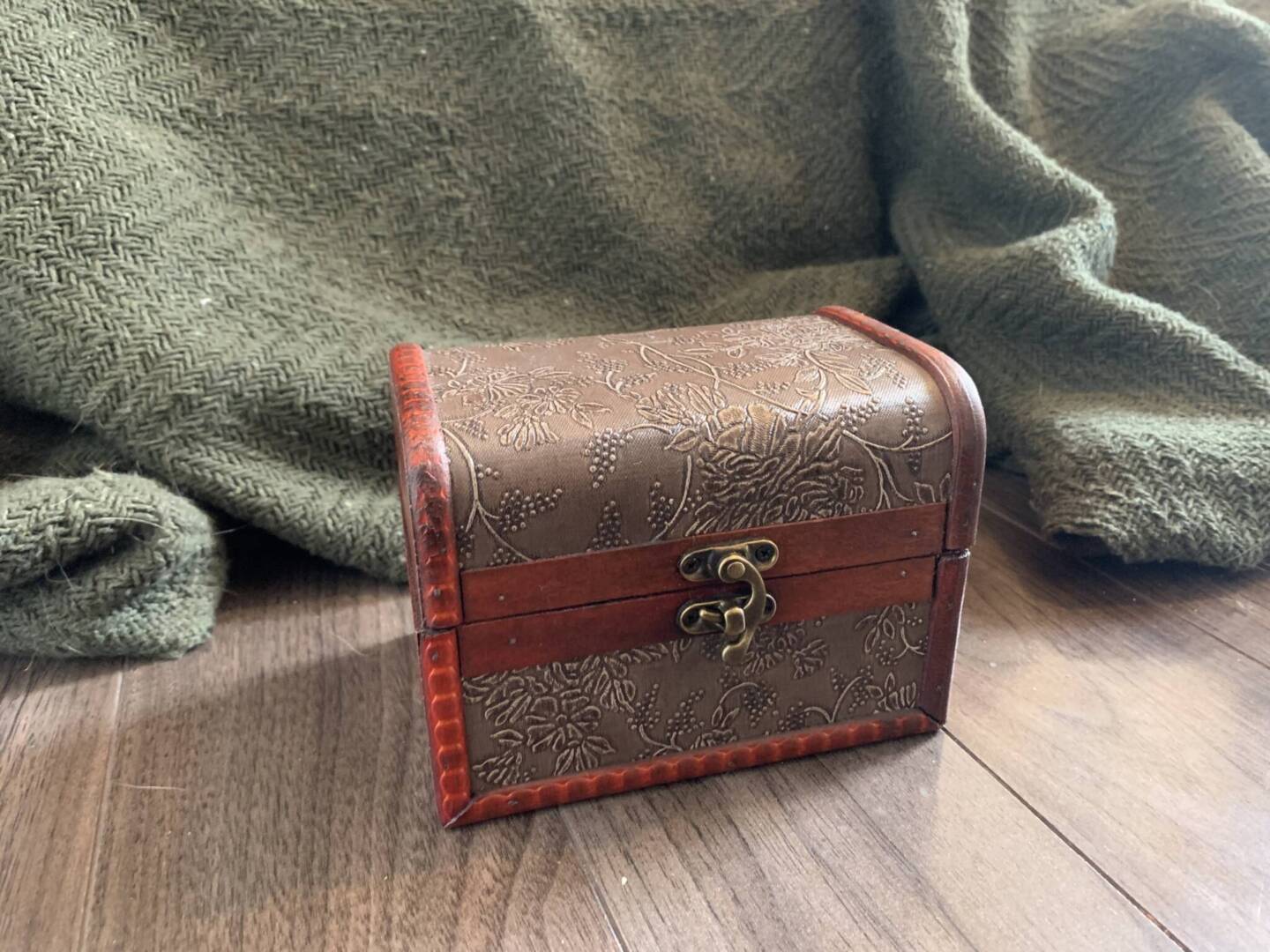
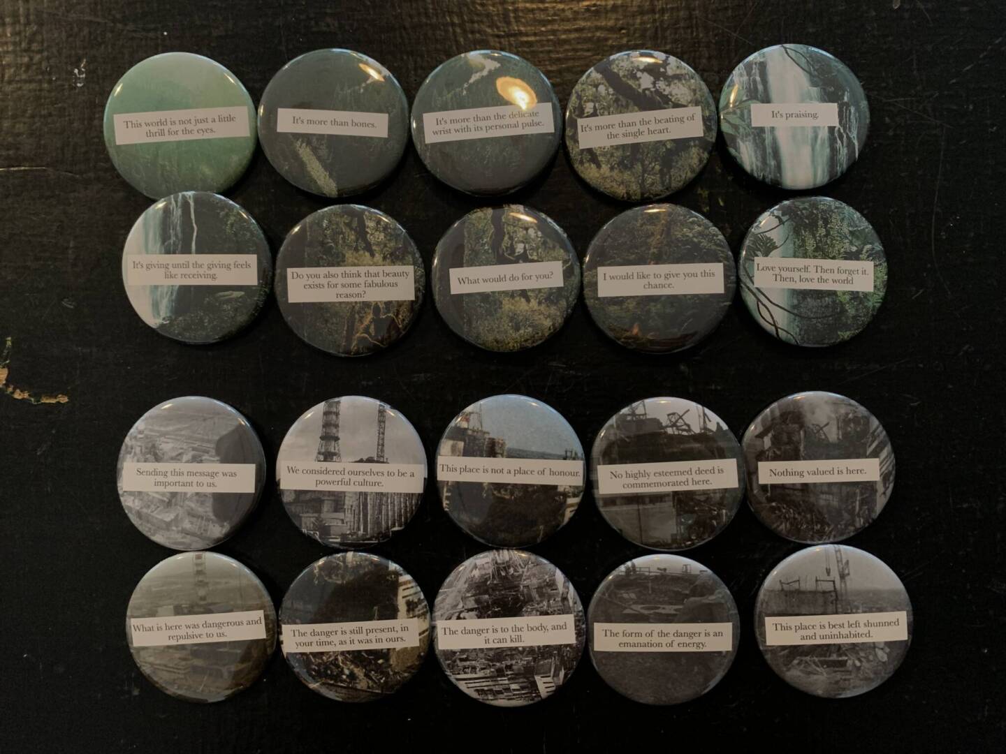
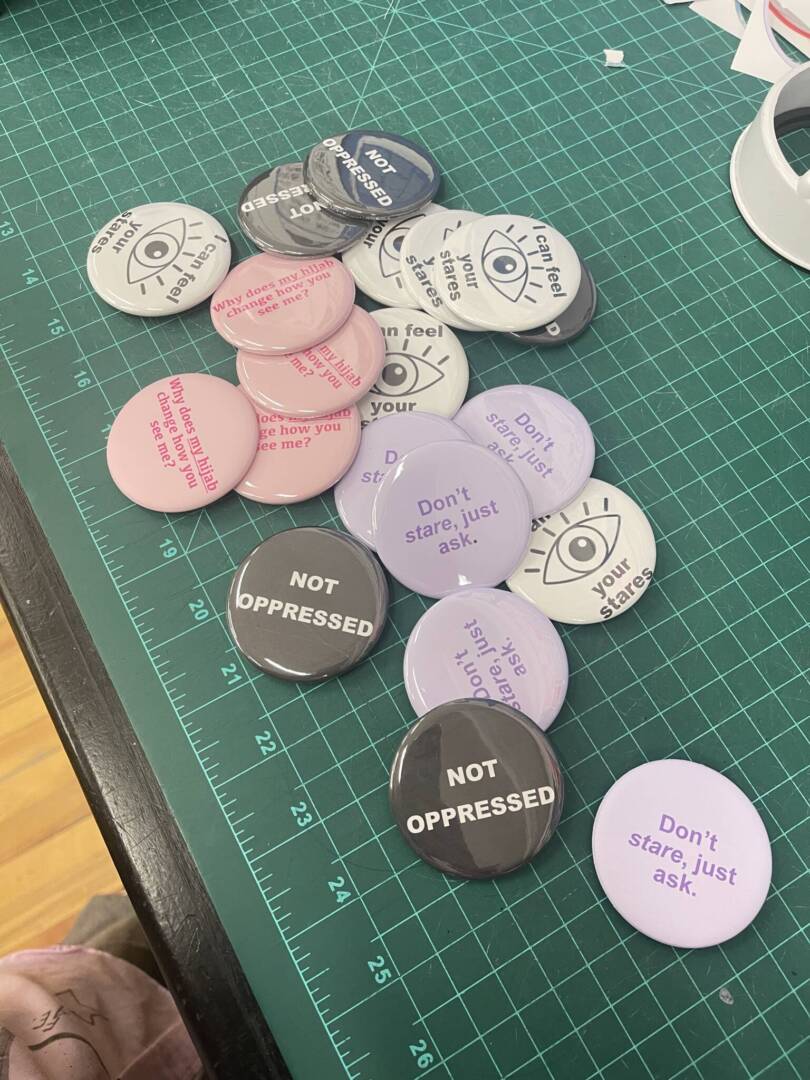
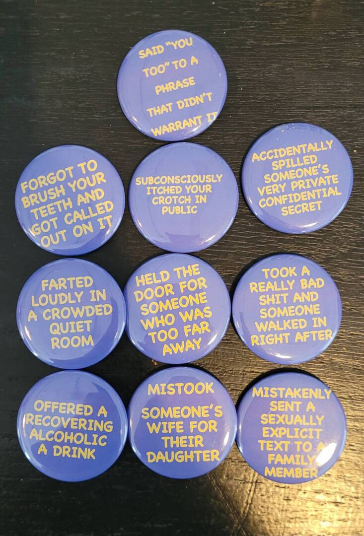
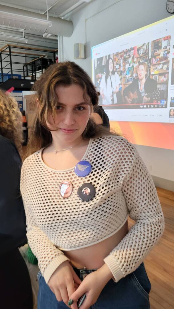
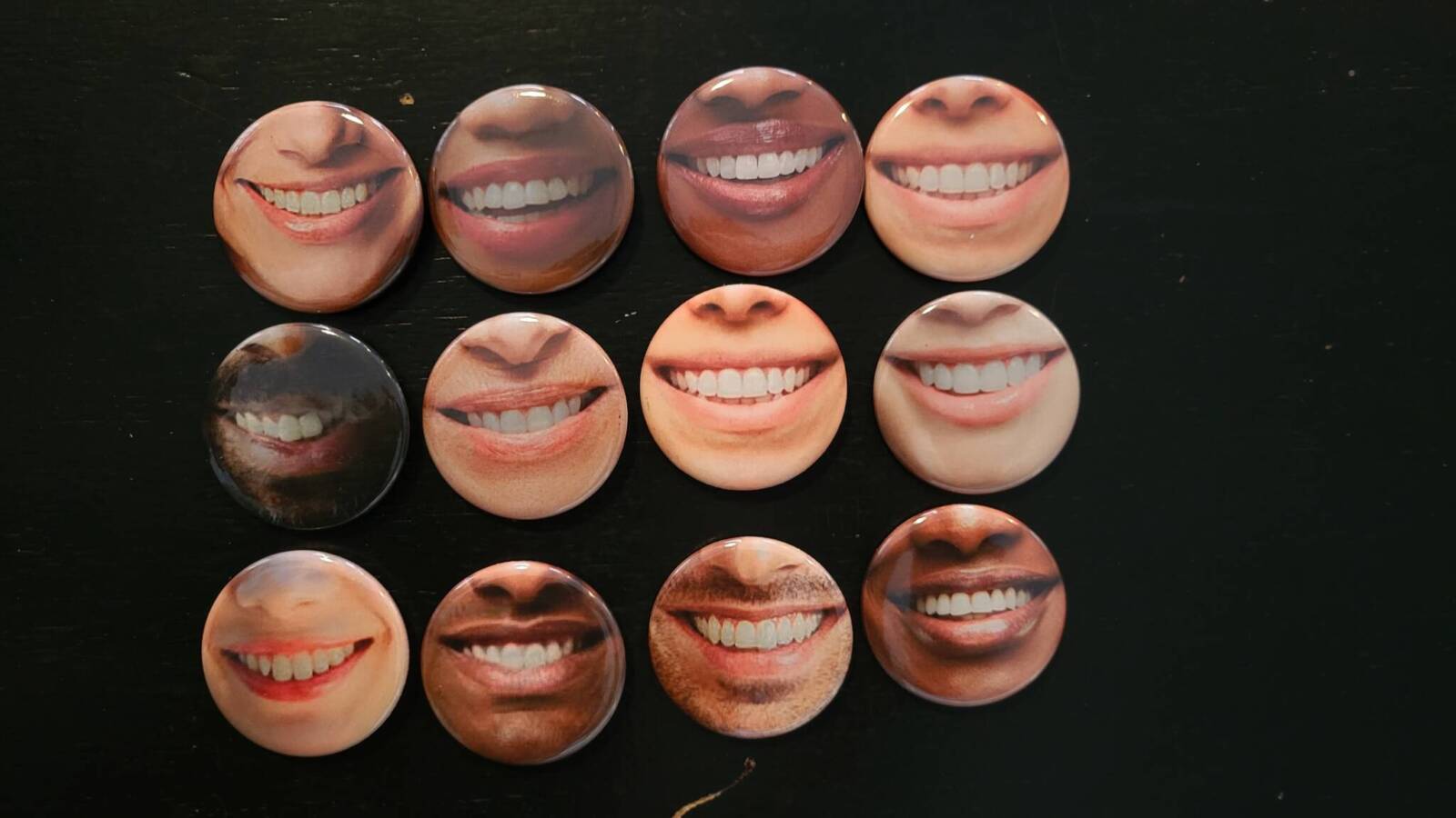
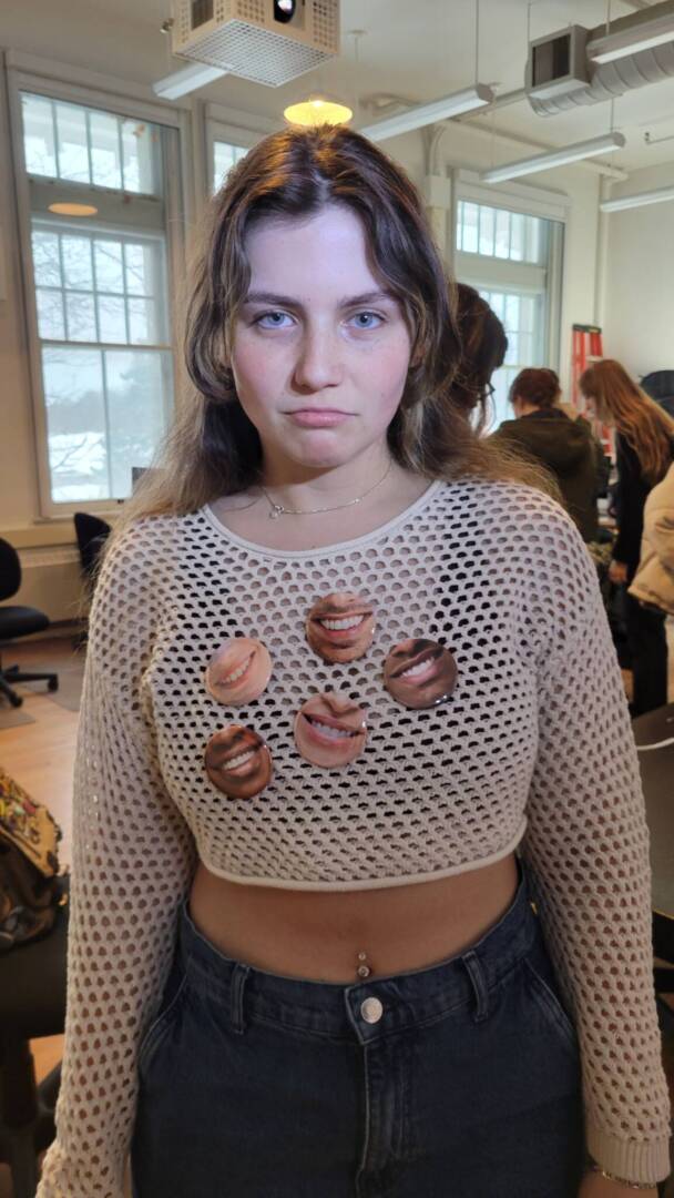
Artist Buttons
For this project, I created a series of artist buttons using the phrases “fight me” and “square up.” I wanted them to feel playful and bold, with a confrontational blurb that grabs attention and sparks a reaction from the other party reading it.
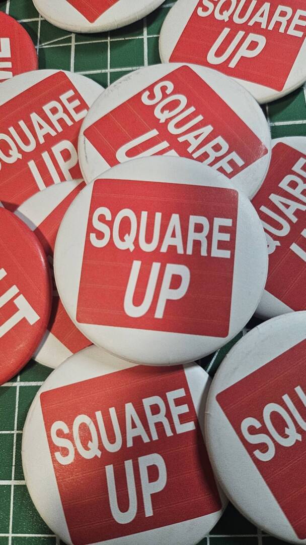
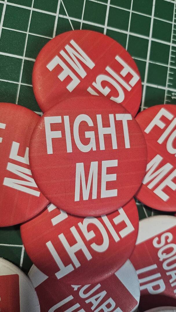
Instead of making buttons that quietly express something personal or decorative, I went for something that felt more like a statement or challenge. These buttons are meant to be worn with attitude. They’re direct, aggressive, but also meant to be taken with humor because at the end of the day it’s only a button to be worn.
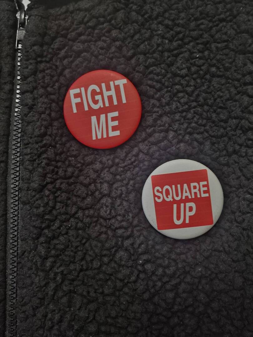
I made 10 of each phrase and designed them with the phrases in mind. For the “FIGHT ME” buttons I went for all caps for the provocative nature and italicized the “me” to draw attention to who is starting the fight. Whereas for the “SQUARE UP” one I leaned into more of a humourous feeling with having the square up be inside a literal square to ease some tension from the phrase.
The phrases I used are ones often seen online or in casual arguments, usually not meant seriously but still full of energy that grabs others’ attention. That mix of humor and tension is what I was aiming for. With something as small as a button, I wanted to show how you can still make a strong impression or provoke thought, just through a few carefully chosen words.
You must be logged in to post a comment.