Madeleine’s Work

Week 1

Sol Lewitt Video: Lewitt is a conceptual artist, meaning for many of his pieces all of the planning and ideas are flushed out before the construction of a final piece even begins. He uses instruction-like-blueprints for his final pieces that other artists refer to to construct the piece. Notice my use of the term construct rather than create. These artists simply use his pre-determined instruction, or his ideas, to finish the work. Thus, enforcing the idea that Sol’s ideas are the machine that makes the work. In terms of the artist’s hands in the final piece, I think that the hand is seen more as a tool. The hand is much like a hammer hammering a nail into a board indicated by, for example, instructions for an IKEA bed frame. The hand does not lend any creative element in the piece.

Yoko Ono Video: In the video Ono is reading descriptions of different “paintings” one can make. In terms of drawing boundaries around the artwork, I think anything that creates a dialogue about the notions of what is art or what are the boundaries surrounding a work of art is hard to put boundaries around at all. I think that the “boundaries” we put around art are constantly changing and that change is how art and what we consider art evolves throughout history. Ono challenges the viewer’s stereotypical notions of a “painting”. For instance, in many of her scenarios the canvas itself is the painting (by being reworked, stepped on, hung in windows, being punched through) rather than painted on. In terms of me liking the work, I think what is like most and respect about it is the dialogue and discussion it can produce rather than the work itself. I feel like when an artist can accomplish that it says a lot more about the impact the work can have on society than something aesthetically pleasing.

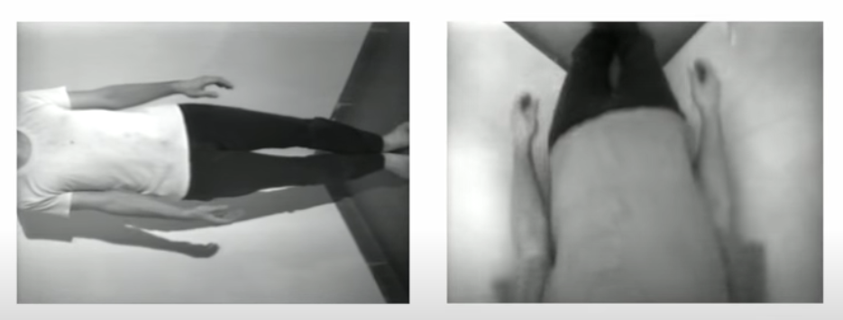
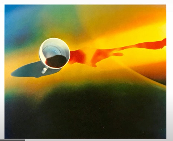
Bruce Nauman Video: The two works I chose of Nauman are: “Bouncing in the Corner No 1”, 1968 and “Coffee Spilled Because the Cup Was Too Hot”, 1966-67. In the first piece Nauman utilizes himself for the work by taking an everyday action (gently falling against a wall and getting back up again) and repeats it over and over again. The repetition seems to take the meaning out of the action itself, much like repeating a word over and over makes it loose its meaning. The second work shows exactly what the tittle describes, a spilt cup of coffee. Nauman frames an instant of everyday life this framing forces us to look at this action in a different way emotionally, in my opinion. If one where do spill their hot coffee: one, it probably hurt and two, its probably would make someone angry or at the least, irritated. However, when I look at Nauman’s piece I do not feel those emotions, I did not spill coffee, I am simply looking at spilt coffee.
Week 1 Activity: Make a Kilometre

I happened to stumble upon my kilometre for this assignment, originally I had planned to go on a kilometre long walk and collect things from my walk as evidence because I enjoy going on walks as they help me to unwind. However, the other day I was visiting a friend and they were excited to show me this new video game they had started to play. It is a Japanese game called “Katamari”. The basic goal, as far as I understood, was to roll a ball around the different rooms and places set up for each level. There are a bunch things strewn about and as you roll through the game you pick them up to create a bigger and bigger ball, much like making a snowman. And at the end of each level you ball of stuff is transformed into a star. As I watched my friend play I noticed that is kept track of how “big” your ball gets. I asked my friend if he had ever gotten it to be a kilometre long and he said depending on the level you could get them to be really big. So, long story short I rolled up a virtual ball of virtual stuff to make a virtual kilometre. Due to the quality of my camera it is a little hard to tell but there is a flower in the upper left corner that shows the ball is a kilometre long.
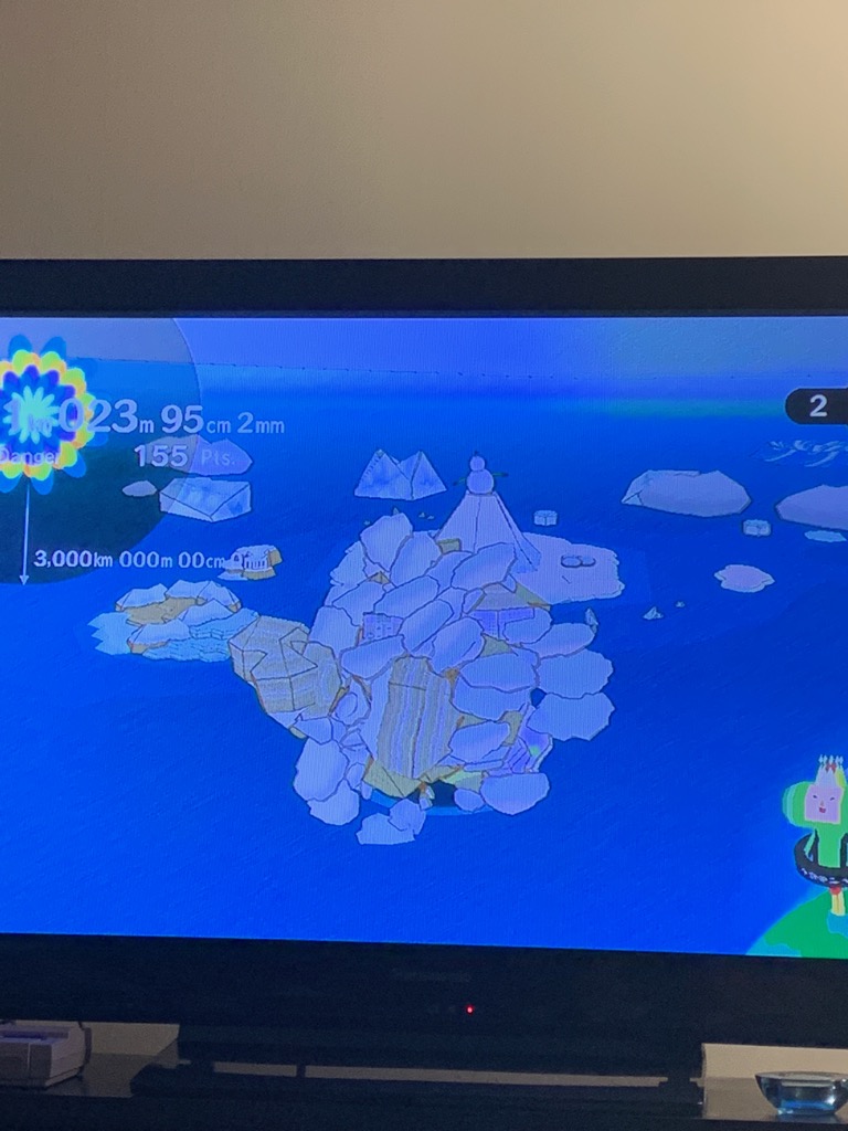
Week 2 Activity: 1 Hour

For my one hour activity I decided to stand on one leg. I was inspired by this drinking card game my roommate has. One of the cards has everyone playing stand up on one leg and the first person to put their other leg down drinks. I was actually surprised that some of us could last as long as we did. My roommate and I have gotten to around 15 minutes before with no issues other than getting bored and thus quitting. It made me wonder how long I could actually stand on my leg for. I think, like a few other of my classmates, I put a focus on trying to get into a more meditative state like Marina Abramovic seems to do in her performances. I was pretty good at the beginning then it stated to get a bit rocky. I ended up finding one area of my room to focus on and just lost myself in that. I did not actually make the full hour because my roommate came home while I was doing it and it startled me, but it was an interesting experience nonetheless.

Week 3 Notes:

Lee Walton

“Making Changes” Move an unsuspecting object to a new spot.

“Sitting” Sit in close proximity next to an unsuspecting stranger.

Jon Sasaki

“Ladder Climb” Climb a ladder with nothing to support it but yourself.

“Dead End, Eastern Market, Detroit” Drive to a dead end, only to turn back around.

Lenka Clayton

“The distance I can be from my son” Physically demonstrate the distance in which one can be away from their son

Yunla Berevoski

“Several observations” Give an inanimate object a soothing massage

Week 3 Activity:

“How Baristas Really Feel About Pumpkin Spice Season”

This is a picture of a Pumpkin Cream Cold Brew (AKA the most popular drink at Starbucks right now) that I had thrown into the air. This drink had to be remade right before the end of my shift so I decided to take it home and throw it into the air out of slight frustration. These drinks are notoriously more complex to make then others because of the cold foam and when you’re behind bar during a rush with a line up of these guys its a little tiresome. That being said, I do not wish to deter anyone from ordering one, they’re popular for a reason and many of your friendly neighborhood baristas love them too 🙂 aaand it made a cool picture so I guess they’re not all that bad.

Week 4

Notes:

Studio Visit: Adad Hannah works to capture the “moment of pose”. He states that when having a photo taken humans tend to get into “pose” or a moment of stillness. This is what a lot of Adad’s is reflective of.

Handheld Case Study: Adad recodes and hand in almost contorted positions while holding coloured balls. Although the colours seem to be fun and happy, you can see the hand moving and shaking while being in such a strained position. The videos become almost uncomfortable to watch once I realized this and thought of my own, smaller, hands trying to do this.

Burghers of Vancouver: Adad has dressed people up to resemble a public statue in Vancouver and videotaped them trying to be still. The video cuts to a shot of the original piece as if to compare the two. When I saw this shot I realized who very un-still the performers actually were. It shows that being still is not a simple task and may even be one that is impossible to accomplish.

The Screen: This photo was a little different from the others that I looked at. Composition wise it was very complex. It must have taken several adjustments and camera angles to get it just perfect. When I was looking at it, it really did feel like there was a type of screen in front of these people and they were actually clothed behind it. It felt like the people had no idea how exposed they really where. The idea of the screen invites the viewer to look at the people in an extremely private way.

Social Distance: In terms of formula, most of the subjects were centered in the frame and there were mostly full body shots. I found those wearing masks were a bit eerie to look at. It spoke to how still all of our lives have become during this pandemic.

My Work

Notes: I chose to do a self portrait because I was nervous to ask a stranger and my roommate is unfortunate a very busy person. However, doing a self portrait gave me the opportunity to really think about what I wanted to convey. I have always really loved windows and the way they frame the outside world. It occurred to me that looking out a window was very similar to Adad’s work. When I look out my own the trees are in the same spot, the buildings never shift or move, sometimes there is the odd person or animal, but it stays a relatively “still” composition. The trees are moved slightly by the wind in a similar way that those hands in the Handheld Case Study shake while holding the balls.

“This is my view outside of my apartment. This is what I look at almost every morning, afternoon, and evening through my window. I especially love this view in the morning while the sun is on this side of the building. Hearing the crunch of the gravel as people walk the path behind me is comforting, hearing them talk and laugh. It is nice to hear other people going about their own lives, especially right now. It is such a comforting view for me that I wondered what it would feel like to stand in it. It was nice.”

Week 6

I really enjoyed this article for this weeks assignment. I jotted down some quotes that caught my attention, found interseting, or related to.

  • “my face is my trademark and my main mode of communication”
    • I really related to this, I feel like wearing a mask inhibits strangers to “know” me or “see who I am” from simple/short interactions, compared to before. For example, at work the most important part of our job that is constantly drilled into our heads is making customer connections. To do that, I need to make an effort to “know” the customer and have them “know” me, if only in that small moment. Our faces are representative of our whole beings, like the author says our feet or other parts of our body do not convey who we are. So, at least without a mask on we all see each other as a somebody, but now we are just strangers to one another more than ever before.
  • “the face is ground zero of expression”
    • I think I took for granted how much I relied on expression to help me understand what someone is trying to communicate with me. When I pass a stranger on the street they no longer see the small smile under my mask as a silent greeting. I can only hope it reaches my eyes and they are paying enough attention to even catch that.
  • “when looking at masked people my brain still feels like its malfunctioning, skipping a sensation, a tenuous connection is reached for and missed”
    • I totally agree with this. It still feels so weird to see people in masks everywhere. It makes me feel like we are all still around one another but so very very separate. Like these other quote have hinted at, without the face I can not “see” the strangers around me. I feel like when our brains subconsciously normally take that quick second to pass judgment on strangers it creates somewhat of a narrative surrounding somebody. But, with the mask concealing that integral part, the face, my brain misses that part. I’m just alone in a sea of strangers.
  • “my face, as I age, has become less interesting to men. this is what women mean when they say they feel invisible”
    • although I cannot directly relate with this statement I used it as a jumping point to think about how the pandemic in relation to masks has affected my self image. I feel less noticeable in a mask and by feeling less noticeable I feel less important, easily forgettable. These feeling are obviously not ideal during I time when we are supposed to be distancing ourselves from others. The act of wearing a mask itself has physically affected my face. It cause unmanageable and painful acne for me, which affected my self confidence.

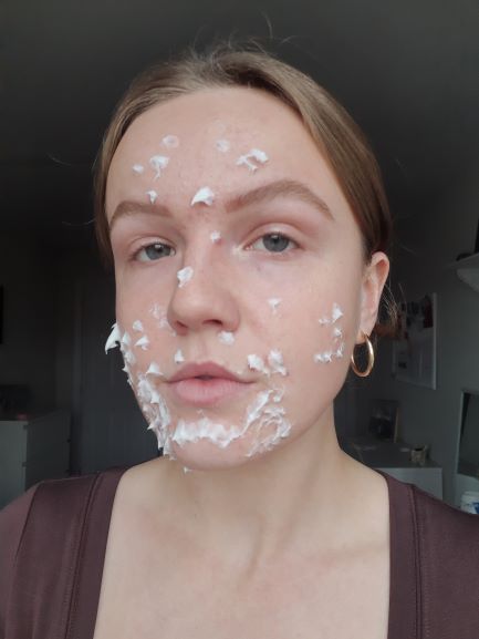
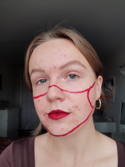
Week 6 Activity: “Serums, Spot Treatments, and Skincare”

For this weeks assignment I decided to focus changing the visual evidence that mask-wearing leave on my face. I do not think I have ever cared about my skin so much and nobody can even see it right now! Its kind of ironic, the mask is what conceals my battle with acne from the outside world but also the same thing that causes it. I wanted to experiment with different funny ways of concealing it or making light of it. My hope was that if I could interact with this unwanted side-effect of mask wearing in a humorous manner I could maybe make it less important to me. *Although I feel very comfortable with everyone in this class and sharing this issue I have been struggling with I do ask that everyone is respectful in their comments :)*
Week 7

Notes:

Janet Cardiff, “Lost in Memory Palace: 40 part Motet”

  • took multiple recordings of choirs and had them playing through an oval of speakers, singing a 15th c song
  • it was different from conventional music because, as described in the video, it was like “stepping a song” and being surrounded by music, which is something that concerts and headphones cannot do
  • it kept interest by being able to walk around an hear the voices from different areas of the oval, which made the piece more complex and gave listeners the ability to listen over and over but hear the different nuances every time
  • the way I experienced it was different than in person but I can understand how it would be a very moving experience and I wish I could have experienced the emotion release that others did

Alter Banhof “Video Walk”

  • was a video on one walking along to a video of the exact same walk with a voice over of someone directing you around while also hearing all of the noise that had been around that person whilst recording
  • it is obviously not like typical music as it is a voice over of a video, which is a little reminiscent of the idea of music videos, but not quite
  • the background noise was consistent, her directions were repetitive, while her “chatting” in-between her repetitive direction giving changed, what she was talking about was easy to get lost in and when she gave a direction it brought you back into the present (even though you are watching a video of the past)
  • i experienced a sense of calm while watching the video, i am the kind of person who enjoys background or white noise while studying, working, and trying to sleep
  • this one was the most inspirational for my proposal as i am focusing on the noises around me at work and how that background noise of people and machines whirring can be very comforting

Christian Marclay “Guitar Drags”

  • this particular piece was different from the other two as it was just a sound recording of a guitar being strummed or dragged
  • the prompt seemed to be to make was many guitar noises possible, maybe even with objects that were not the hands
  • it did not feel like any kind of music as there was no melody or any obvious form of repetition of notes that i could follow like in a song
  • the sounds very very jarring and made for a very tense experience as a listener
  • however, it did keep my interest as within the sounds i was hearing i related them to ones i have heard before like thunder or large crowds

Proposal

There were three main artists that inspired me for this proposal of a work to be completed for next weeks class. I found a quote from John Cage while exploring dome of his work: “I have come through my music to enjoy the sounds that are in my environment wherever I am”. I thought about all the places that I am normally at right now. More often than not, I am at home for work. The pandemic has obviously limited the places that I can spend my time so I thought it would be interesting to really explore these places and try to enjoy the sounds that they make. Both Janett Cardiff (especially in her “Audio Walks” series) and Emeka Ogboh make use of the natural ambiance produced by the environments in which they are working in. Ogboh even goes as far to say that Lagos (a heavily populated city in Africa he uses in much of his work) composes. For this work, I would like see what my environment’s sounds compose. I want to focus my attention more at work as I have less control over the sounds there. My plan is to take a one minute recording of the sounds produced by my work environment and listen back to it to see if I am pleased with what it composed. I did think about recording lots of sounds and cutting and pasting them together to make my own composition. However, I like the calming aspect of Cardiff’s work as one long “flow”. Picking sounds and putting them together would be too choppy and now have the ambiance affect I want.

Final Work

Milky Way

This is an audio recording of me steaming different milk and milk alternatives at work. It was interesting for me to focus of the subtle and sometimes jarring differences that these kinds of milks made. For me I hear them constantly at work and they have all blurred together over the past 3 years. I could more so tell the difference between them by the way they acted when handled and the kinds of foam they create. So, focusing on their sound was an interesting challenge. I did try my best to get little background disturbance, however being in an establishment such as a Starbucks it was hard to avoid.

Final Proposal

I really liked Teching Hsieh’s One Year Preformace. In particular I liked the idea of documenting an object or action at a precise time consistently. It made me think about the candle I have in my room. I burn it when I am studying in the evening once it is dark out to make my room cozy.

I decided to take some pictures of if every hour while it burned while I studied. I thought it would be interesting to see how there would be small subtleties in each photo.

Final Conceptual Portrait

I filmed the view of my window for 24 hours. I included the end of my bed in a bit of the frame so that not only what was going on outside was documented but also what was going on inside. I did include sound, so you can here some of my zooms, my roommates around the apartment, mu music etc. Unfortunately, I did miss hours 4 and 5am. However, I have never tried to make a piece such as this and I am just happy that I got up for the hours of 2 to 3am and 6 to 7am.
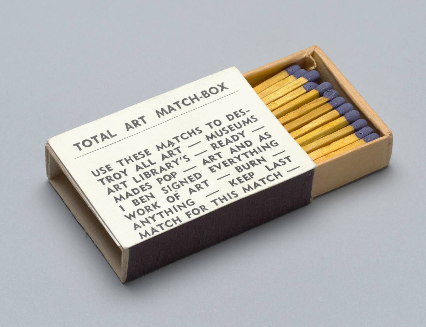
Artist Multiples

Fluxus

‘Fluxus’ is the name of a transatlantic art movement that first came to prominence in the early 1960s. Its name which derives from the Latin word for ‘flux’ or ‘flow’ was coined by the artist George Maciunas in 1961. The many artists linked to the movement sought to blur the divisions between art forms and erode the boundary between art and life.1 Initially recognised for its street and stage concerts, which combined elements of visual art, theatre and musical performance, the movement later gained attention for its multiples, with which it hoped to democratise the art market.

Fluxus multiple examples:

http://www.publiccollectors.org/Steven%20Leiber%20photos%20web/Steve%20Leiber%20fluxus%20web/StevenLeiber_Fluxus_SMS.htm

WHAT ARE MULTIPLES?

As the name itself suggests, ‘multiples’ are artworks of which many copies are produced. Each copy is typically identical, with none considered the original. Romanian-born Swiss artist Daniel Spoerri is credited with introducing the term to the art world in 1959, when he began a publishing initiative called Edition MAT (Multiplication d’Art Transformable).1 The purpose of this venture was to produce small, three-dimensional artworks in editions and sell these at lower prices than unique works.2 In this way, art would be made available to a larger audience and thus be rendered more accessible. While prints, books and sculptures have been replicated for centuries, Spoerri helped expand the horizons of editioned art to encompass modern art forms, such as sculptures using found or ‘readymade’ objects, and kinetic art, in which Edition MAT specialised. In doing so, he took a cue from the French artist Marcel Duchamp, who between 1935 and 1941 had produced small-scale copies of his own readymade sculptures and other works, issuing them together in a box entitled Boîte-en-valise.

Spoerri’s embrace of multiples was connected with a democratic impulse that would resonate throughout the 1960s. As the decade progressed, the art world would expand considerably, and so too would the market for multiples. By the end of the 1960s, young gallerists specialising in editioned works, along with dedicated art fairs, large-scale public exhibitions, and displays in popular venues like department stores had helped place multiples in the hands of a new and larger audience for art.3

A key facilitator of these developments was the Fluxus movement, which emerged in the early sixties and with which Spoerri was affiliated. Multiples played a central role in Fluxus, and were the focus of the publishing activities of one of the movement’s founding members, Lithuanian-born American artist George Maciunas. In 1963, as part of his initiative to break down the elitism of the art market, Maciunas opened his ‘Fluxshop’ in downtown New York. From this base, he produced and sold so-called ‘Flux Boxes’ and ‘Flux-Kits.’ Typically no larger than a briefcase, these compact containers housed a wider variety of multiples, created by many different artists.4 In the context of Fluxus multiples assumed a range of new, and often humorous guises, including scores for events and performances, interactive games, small booklets and other forms of printed matter.

As an affiliate member of Fluxus in Europe, who worked with Maciunas on several occasions, Beuys was well aware of his colleague’s activities and in 1965 began producing multiples of his own. In contrast to the works that Maciunas published, which often fit snuggly in the palm of one’s hand, Beuys’s first multiples were larger and were often more complex to produce. In place of small sheets of printed paper or boxes containing simple, prefabricated objects, Beuys favoured work with a more sculptural character, in which found materials were combined with hand-formed elements. This latter trait also set his works apart from Fluxus multiples, as well as those of Edition MAT, which avoided suggestions of hand-production. Many of Beuys later multiples also bore signs of the artist’s hand, in the form of signatures, inscriptions, and manually applied stamps. Like both Spoerri and Maciunas, Beuys had a strongly democratic vision for art, to which end he conceived his multiples as ‘vehicles’ for increasing art’s accessibility and distributing his ideas to a wider public.5 When his work began to take an explicitly political turn in the early 1970s, multiples became an ideal means of publicising his social concerns.

Fhttp://pinakothek-beuys-multiples.de/en/what-are-multiples/

I Really Should… – 2002
Audio CD, 48+ minutes, unlimited edition 
Audio recording of 1000 things I really should do…
Not Fragile – 2012
Water-jet cut, powder coated sheet steel, plexiglass, LED lights & electronics 
12″ diameter x 2″
Edition of 25 + 5 AP
Co-published with Paul M Conway Editions
Photo credit: Toni Hafkenscheid

 1/3No Tofu/No Yoga Mat (Zippo) – 2009
Brushed stainless steel Zippo lighter w/ laser engraving on both sides 
1.5″ x 2.25″ x .75″ 
Edition of 25 + 5 AP 

 1/2God Damn (Watch) – 2018
Custom designed laser engraved watch
40 mm diameter, 20 mm onyx black leather strap
Edition of 25 + 1 APExhibition History:
2018 Olga Korper Gallery (Toronto, ON);


 1/2
God Damn (Watch) – 2018
Custom designed laser engraved watch
40 mm diameter, 20 mm onyx black leather strap
Edition of 25 + 1 AP
Exhibition History:
2018 Olga Korper Gallery (Toronto, ON);


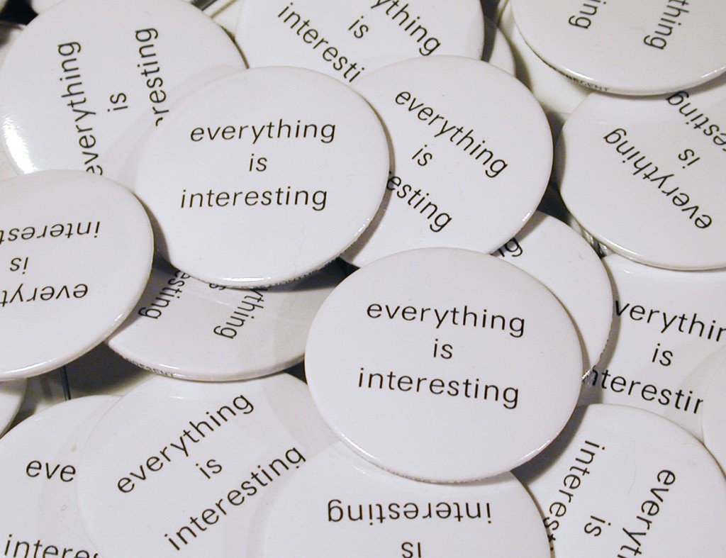
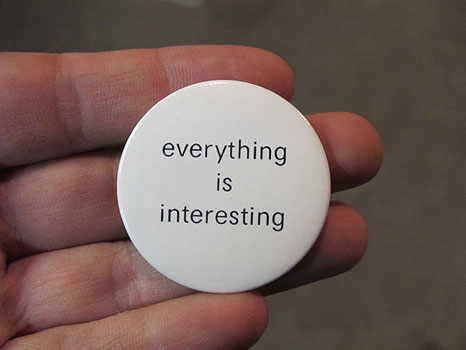
 1/3Everything is Interesting – 2003
1.5″ diameter
Produced for the Ikon Gallery. Birmingham, UKGill Saunders & Rosie Miles: “Prints Now” London: V&A Publications, 2006 (excerpt) 
As part of her 2003 exhibition at the Ikon Gallery in Birmingham, Canadian artist Kelly Mark used badges, postcards, interventions and installations to extend the reach of the work beyond the institution. Badges and postcards printed with the statement “everything is interesting” (also the title of the exhibition) were circulated around Birmingham – they were on sale at the gallery but also distributed through letter-drops and mailings. Mark saw these anonymous statements as small works of art feeding into the fabric of life in the city, circulating her message by an ephemeral low-key strategy characteristic of her focus on the minutiae of everyday life. By disseminating the idea way beyond the circles of the initiated and those who visited the gallery, the badges offered a modest epiphany to an unknown and random audience.

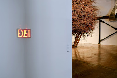
Kelly Mark | Exist

Kelly Mark
Exist
Toronto, Canada: Self-published, 2009
7.5″ x 12″ x 2″
Edition of 25 + 2 AP

Altered exit sign, water-jet cut powder coated aluminum w/ LED lights

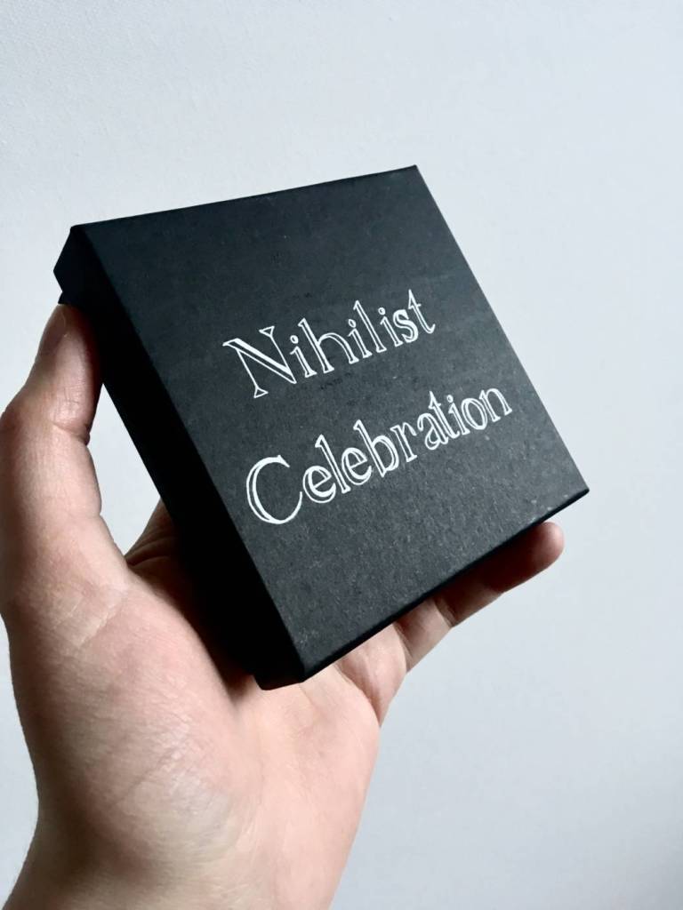
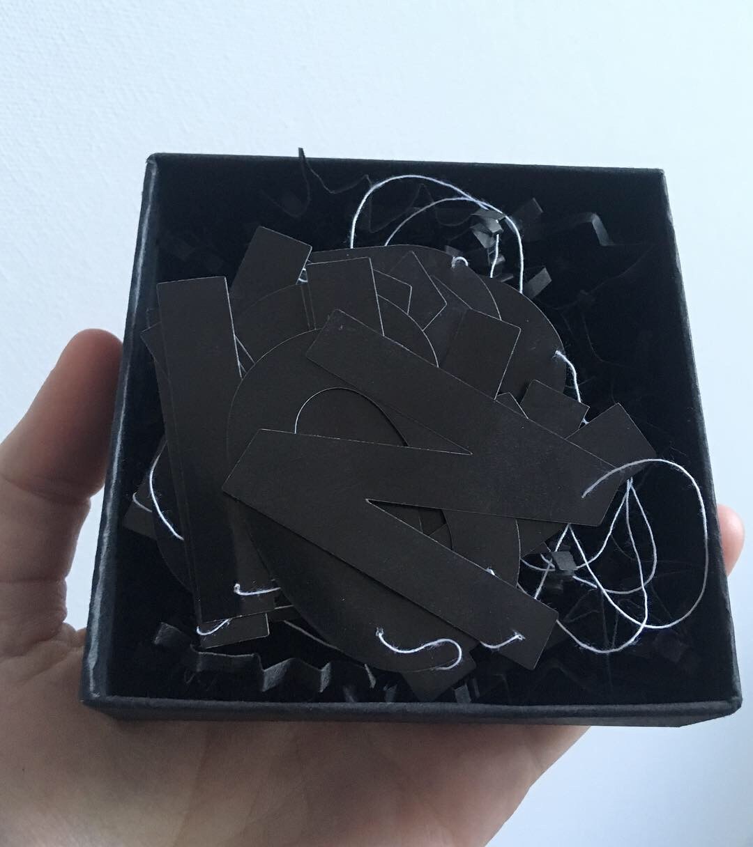
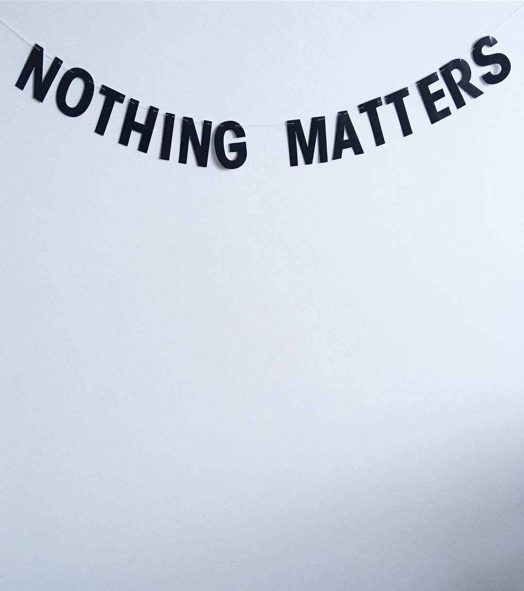
Shay Donavon, Nihilist Celebration, 2019


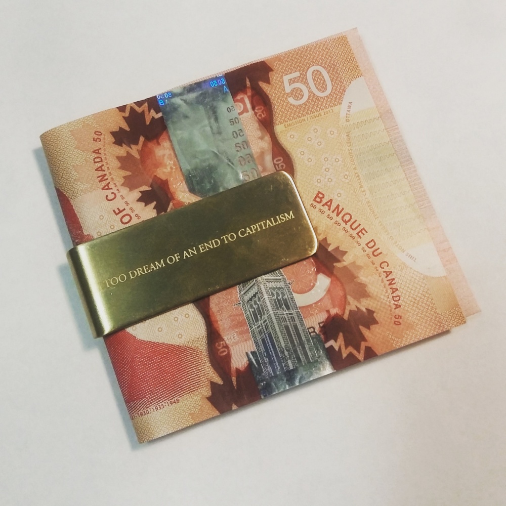
An End

ArtistSam CotterPrice$25.00Date2017PublisherSam CotterFormatMultiplesSize5 × 1.9 × 0.7 cmGenreMoney ClipJewelleryDescription

A money clip bearing the small inscription “I too dream of an end to capitalism” — a signal of concurrence and a reminder of complicity. – Sam Cotter

Angelina Kiriakos,

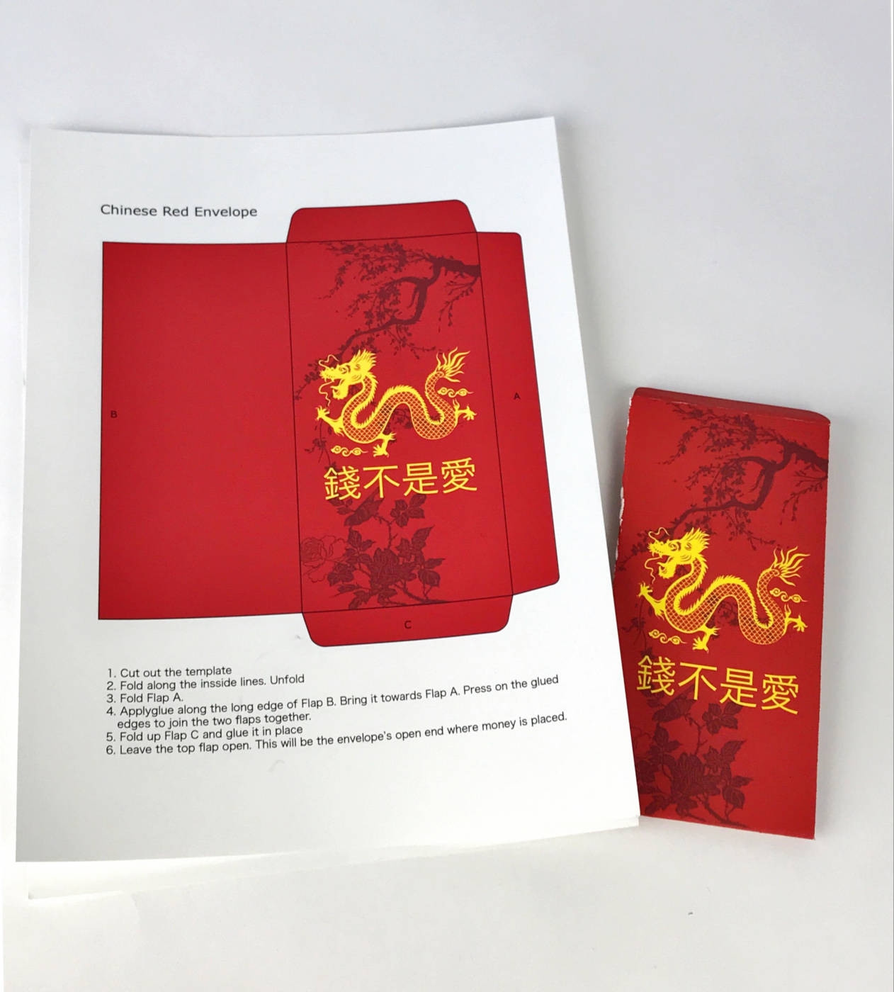
Money Isn’t Love, 2019

The artist changed the text from Happy New Year to Money Isn’t Love on a template for making a Chinese money envelope, given at celebrations.

I Heart Conceptual Art (wristwatch)

ArtistMichael BucklandPrice$100.00Publisherself publishedFormatMultiplesDetailsWristwatchDescription

Wristwatch with black leather band, in a roundplatic watch case, with printed paper insert in bottom. The white watch face is printed with the moniker “I (red heart) Conceptual Art.”

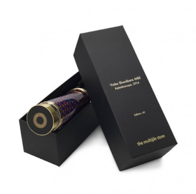
Yinka Shonibare MBE | Kaleidoscope

Yinka Shonibare MBE
Kaleidoscope
London, UK: The Multiples Store, 2014
8 x 8 x 27 cm.
Edition of 45

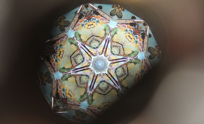
“…Shonibare playfully reclaims an object from a familiar British tradition and subverts it through the use of batik patterns and by transforming the shape into that of a phallus. The opening at the head of the phallus reveals a distorted image of Sandro Botticelli’s Birth of Venus. Shonibare has replaced the familiar image of the ideal female nude with a photograph of a well-endowed male, subverting the image and preforming an act of reverse objectification. This object can also be seen as a subversive take on 19th century Victoriana, and specifically the “peep show” images of women viewed through devices such as a kaleidoscope.”
– The Multiples Store

George Brecht
Closed on Mondays
New York City, USA: Fluxus, 1969
10 x 12 x 1.6 cm. (sizes varied)
Edition size unknown

An opaque plastic Canal street box contains adhesive material to secure itself permanently shut (it can only be opened very slightly). A black and white image designed by George Maciunas (see his mechanical for the layout, above) is adhered to the lid in which five children gather in front of two large double doors, with two of them doodling on the ground. The title appears as part of the graffiti on the doors, “Closed on Mondays, A Fluxgame, by George Brecht.”
Brecht’s original prototype (above, bottom) was a wooden box held closed with a rubber band.

The idea comes from seeing signs in restaurant windows (Ferme le lundi), but functions just as well as a comment on the inaccessibility of art on Mondays (when many galleries are closed). The work also sits along other Fluxus kits which comment on their own opening and closing, such as Ken Friedman’s Open and Shut Case.

“I made a box in Villenfranche – it had a rubber band inside. And then George came with this other thing using rubber cement and he had this photo made. That’s more or less his recreation of the original model [which] has a little plastic sign on it with engraved white letters.”

– George Brecht, 1983

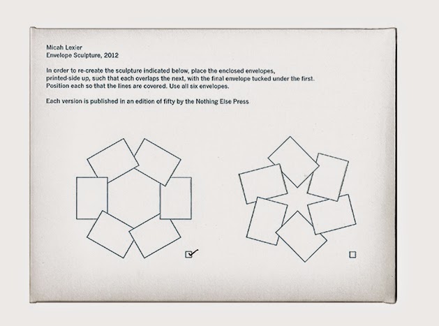
Micah Lexier
Envelope Sculpture
Toronto, Canada: Nothing Else Press, 2012
15 x 20 x 0.2 cm
Edition of 50 signed and numbered

Archival pigment print on paper, a reproduced shred of comic with the onomatopoeia of title. From the collection of the singer George Michael.

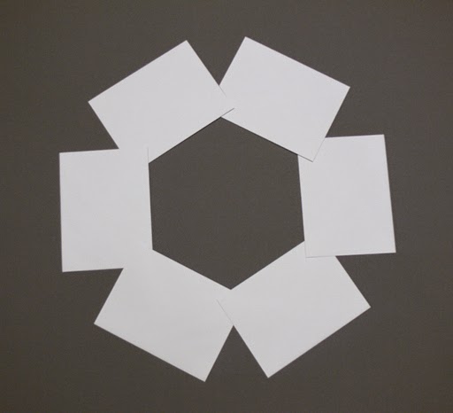
The 7th Nothing Else Press edition (and Lexier’s second) is a cardstock envelope printed with a set of instructions for making a sculpture using the six letterpressed, glueless envelopes enclosed. Star and Hexagon versions are available, each in an edition of fifty copies.

The works are available for $30.00 CDN each, or both for $50.00, from www.nothingelsepress.com or at the London Art Book Fair in two weeks time.

FIONA BANNER: TABLE STOPS

Edition of 100

Inquiries: http://www.fionabanner.com/vanitypress/

TABLE STOPS is a collection of seven ceramic full stops. Each full stop is taken from a different font: Klang, Slipstream, Avant Garde, Nuptial, Formata, Optical and Courier. The full stops are all enlarged to the same scale, though each is a very different size and shape.

See Fiona Banner’s Instagram – For examples including above: https://www.instagram.com/fionabannerakathevanitypress/

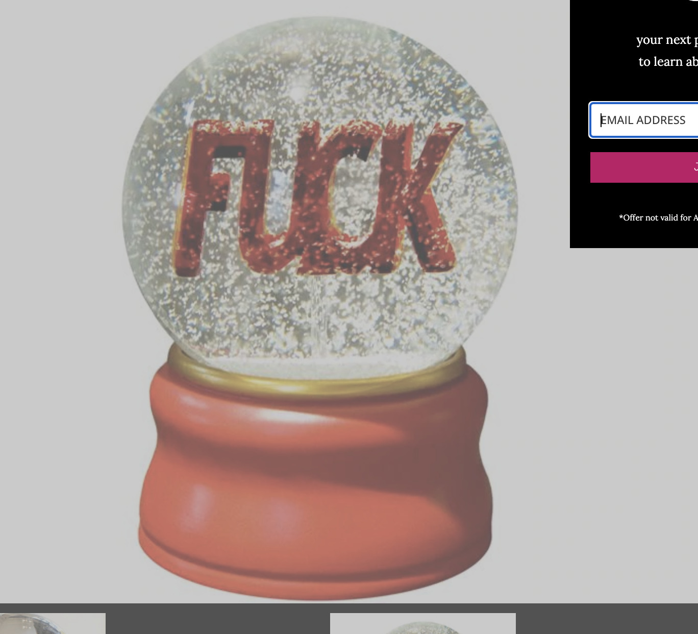
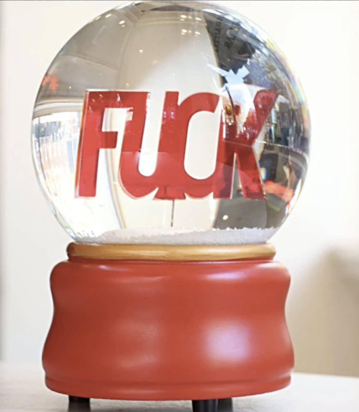
Ligorano/Reese, Fuck Snow Globe

Nora Ligorano and Marshall Reese have been collaborating since the 1980s. This best-selling multiple, from their limited edition series, showcases the designers’ sense of humor and multidisciplinary work using unusual materials and industrial processes.

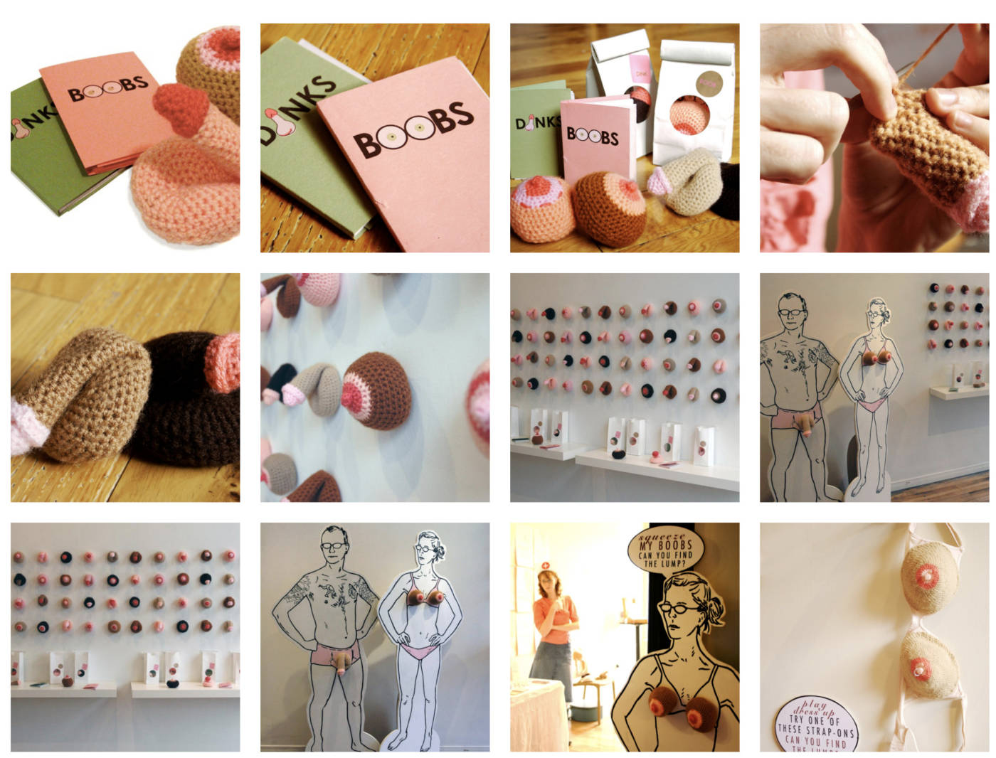
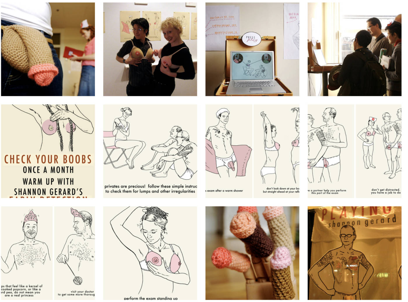
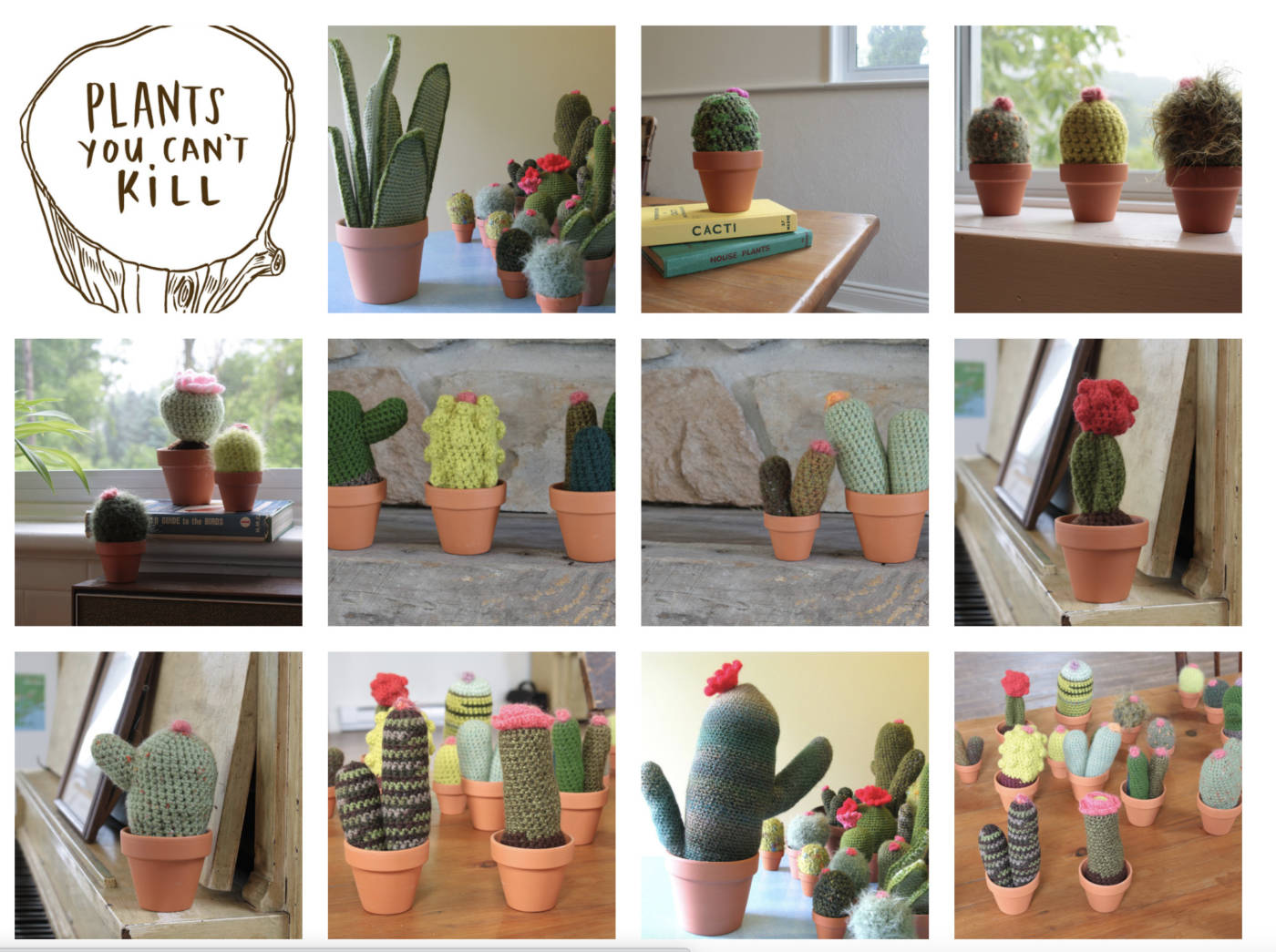
Shannon Gerard and her crocheted multiples!

Guts multiples

Like my other crochet projects, Plants You Can’t Kill are attractive on the surface while also speaking to our human insecurities. These pretty little cacti, aloe plants, flowering pots, ferns and other botanicals look darling on the windowsill but are particularly resonant with those of us who can’t keep the real thing alive.

After dozens of failed attempts at indoor gardening, I just decided to crochet plants my own damn self.

These plants are for sale in my online shop, and in several stores across Canada and the USA. See Stockists tab for locations. See: http://www.shannongerard.org/plants-you-cant-kill-1#crochetedcacti

New Museum Store:

https://www.newmuseumstore.org/limited-editions

See Dave Dyment’s site:

http://www.nothingelsepress.com/

See John Marriot’s site:

http://www.johnmarriottstudio.com/

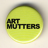
Art Mutters

ArtistJohn Marriott

Don’t it feel like the truth.

1.25 inch button taking its starting point from the PR button from the Art Gallery of Ontario that boldly proclaims “Art Matters”. Marriott’s version reflects the agony and intellectuality that at times seems to haunt it all.

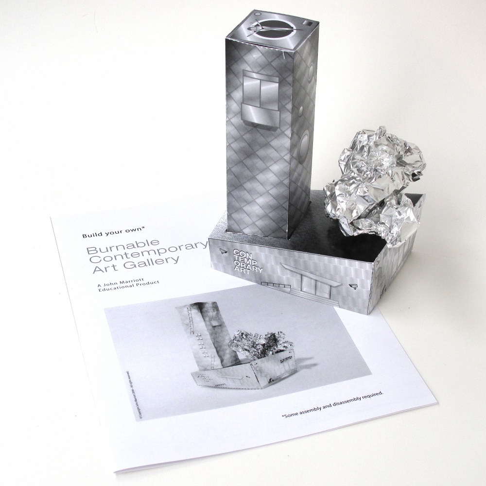
Burnable Contemporary Art Gallery

ArtistJohn Marriott

Build your own burnable contemporary art gallery with this do it yourself kit from John Marriott. Kit includes a template for a multi-story public gallery of brazen contemporary architecture along with a sheet of tinfoil to create your own free-form addition that tastefully reflects recent movements in blobitecture.

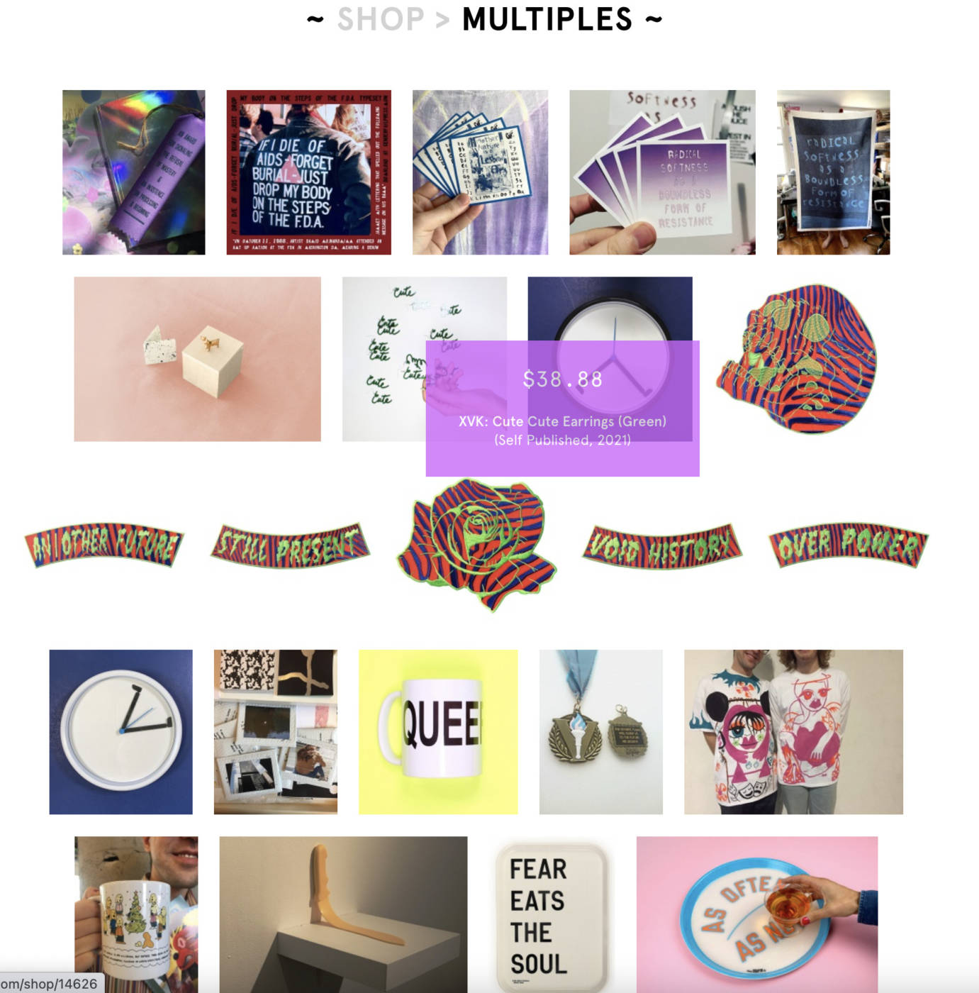
See ART METROPOLE – Artist Multiples


Make an Artist Multiple

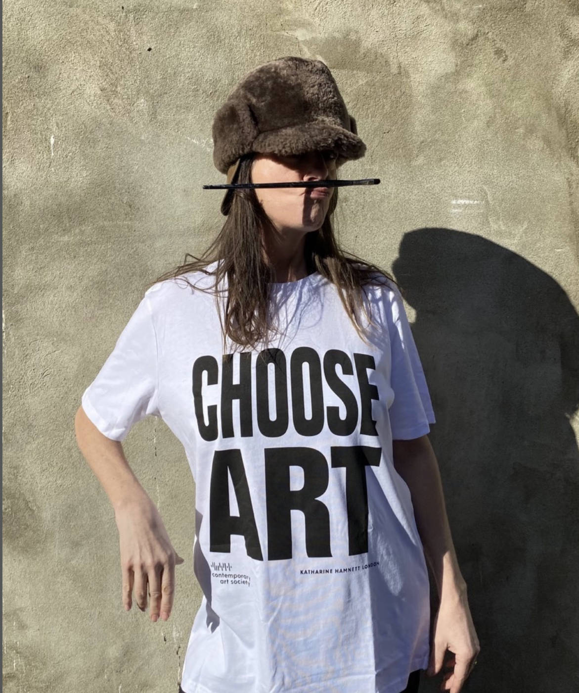
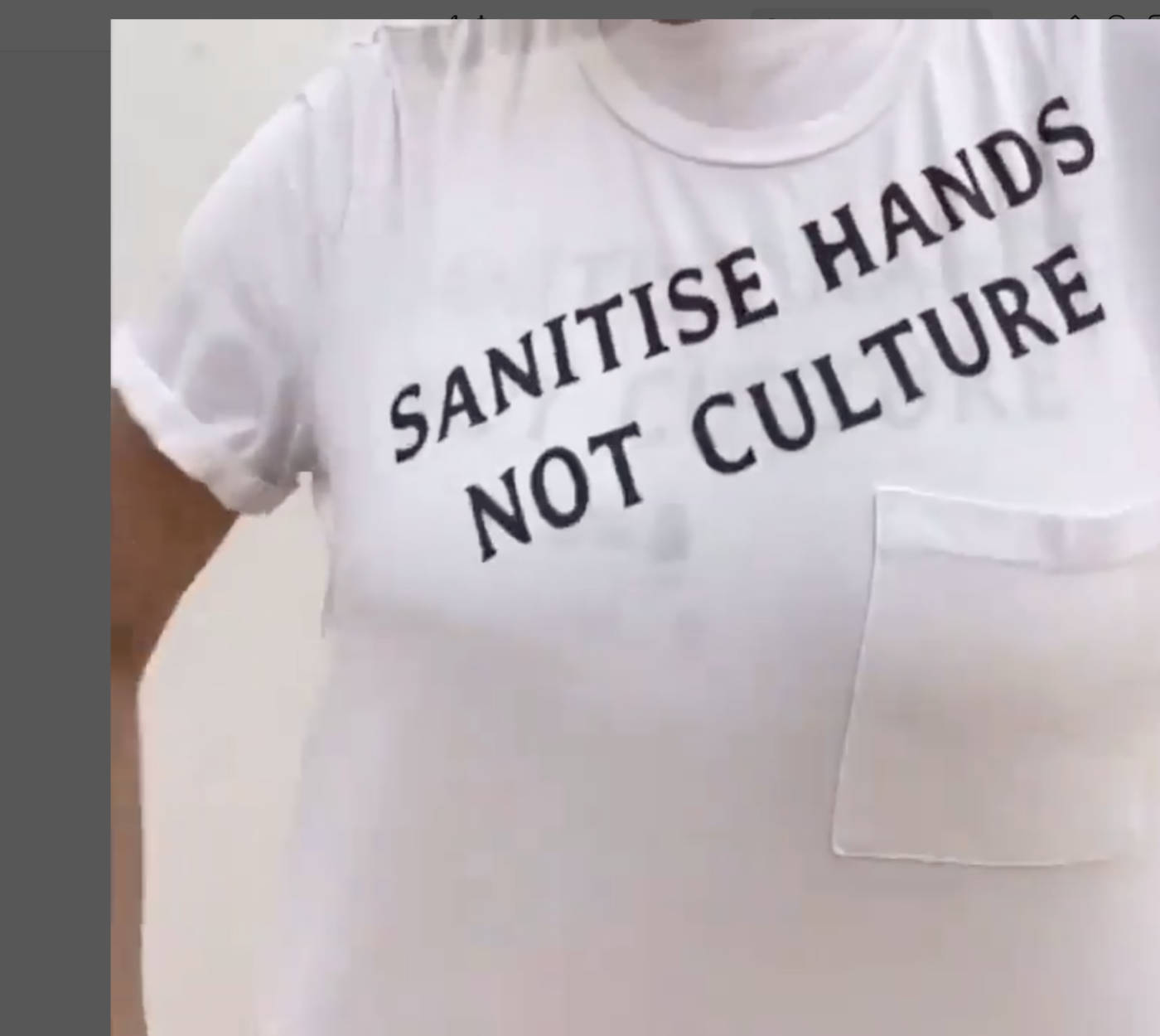
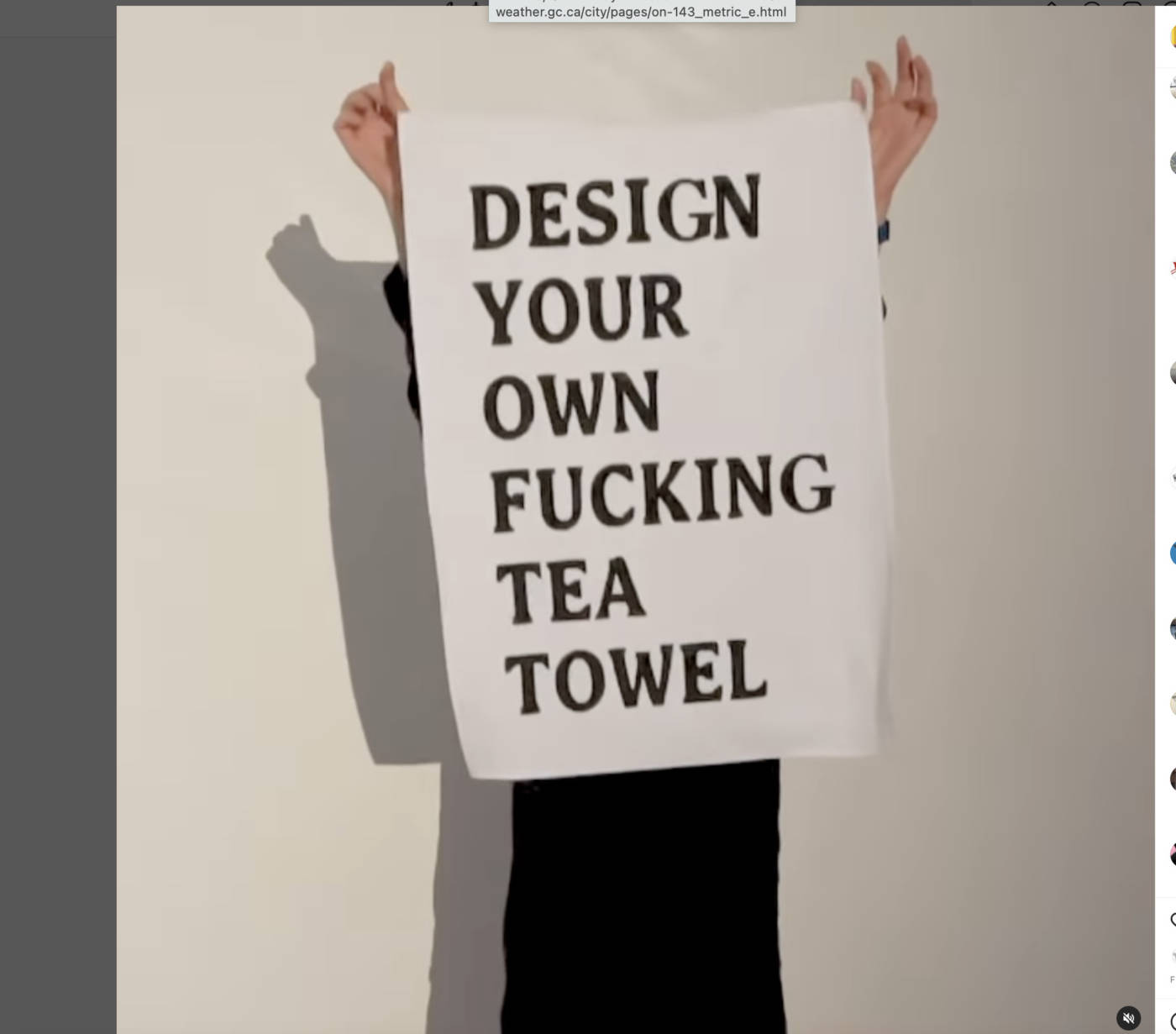
RECOMMENDED MEDIA: Posters, post-cards, T-shirts, mugs, a set of stickers, banners, matchbooks, artist books, modified products, small sculptures or other commercially-printed or mass printed media.

Due: See schedule for details

______________________________________________________________________

Since the 1950’s artists have been making accessible works in a series/edition intended for wider distribution than an expensive “original”. They would undermine the idea of precious/one-of-a-kind artworks, and be related to everyday objects and operations.

They have been made as prints, small manufactured sculptures, pins, artist books, magazines, postcards, t-shirts and other commercially reproducible media.

Artist multiples are sometimes playful and mischievous – exploring new and surprising manifestations of commercial goods – for example they are personal, satiric, highly conceptual, queer, alternative to mainstream ideas etc. They can also convey activist messages intended for wide distribution.

Students will create a playful artist multiple in a form intended to be made in “multiple”. You can create one or more of your multiples, or a few items in a series – and consider the ideal “edition” size when you show your work in critique. Your work should be finished like a product in a store, and this may include packaging to finish the work.

Consider artist multiples by some of the following artists:

Hiba Abdallah

Sandy Plotnikoff

Dave Dyment

Yoko Ono

David Shrigley

Kelly Mark

Adam David Brown

Roula Partheniou

Paige Gratland

Micah Lexier

Jessie Eisner

Tracey Emin

Piero Manzoni

John Baldessari

Fiona Banner

Germaine Koh

Jenny Holzer

Fluxus (various)

Students will document finished works at the studio with a backdrop/or in action for addition to the blog.

Two “commercial” style photos of your multiple must be posted on the blog with a title and short description by the end of the day on December 1, 2022 to receive a final grade.

CONCEPTUAL PORTRAITS: Systems, Series, Stand-Ins

Note the ways these artists create a visual method for documenting aspects of their life (or others’ lives), from where they go, to how they spend their time, to who else is in their orbit, to how long they live.

On Kawara

On Kawara has based the entirety of his collection of books, paintings, and drawings on the arbitrariness and subjectivity of the way we measure time. Many of his projects are ongoing, making Kawara himself, as the recorder of time, one of the primary materials in his conceptual works. Kawara is perhaps best known for the “date paintings” in his Today series (1966-), each of which conforms to one of eight predetermined sizes and features a date in hand-lettered typography painted over a monochromatic background. The artist completed the canvases while living or staying in over 100 cities around the world. Each date painting is displayed with a handcrafted cardboard box and a clipping from a newspaper published in the same city and on the same day that the artist made the work. Kawara continues to create new works in the series.

Source

KAWON0321_PIECE 0000
KAWON0413_PIECE 0000
KAWON0427_PIECE 0000
KAWON0450_PB_PIECE 0000

“Today” series, 1966-2013
Acrylic on canvas
8 x 10 inches (20.3 x 25.4 cm)

on-kawara-install-books-2-copy

One Million Years (Past), 1970-1971

10 leather hardbound volumes 2,000 pages

one-million-years-read2

On Kawara: Reading One Million Years (Past and Future)

installed at documenta 11, Kassel, Germany in 2002

one-million-years_future-copy

Pages from One Million Years (Future) One Million Years (Future), 1980-1998

10 leather hardbound volumes, 2,000 pages

Source

Kawara’s interest in how our society uses dates to grasp time’s elusiveness can be seen in the two–volume book project One Million Years. The first book, Past, is dedicated to “all those who have lived and died,” and covers the years from 998,031 BC to 1969 AD. The second book, Future, is dedicated to “the last one,” and begins with the year 1993 AD and ends with the year 1,001,992 AD. At the request of the artist, portions of the books have been read aloud in locations around the world. A recording of these readings is part of Kawara’s installation here.

Source

tehching-hsieh-011

Teching Hsieh
One Year Performance 1980-1981

(Video in link, first 1min 30 seconds gives a succinct explanation of the piece)


Germaine Koh:

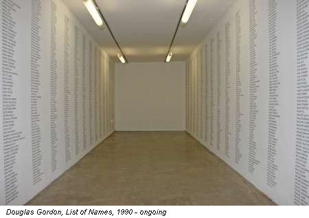
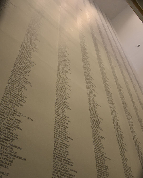
Douglas Gordon, List of Names, 1990 to ongoing

“This work consists of a list of names, displayed in columns, as if it were a war memorial or a roll of honour. They are the names of everyone the artist has ever met, or more precisely, everyone he can remember meeting. Gordon says of this work, ‘It was an accurate and honest statement but it was full of mistakes (like forgetting the names of some friends), so there were some embarrassing elements in the work, but that all seemed to be quite close to the truth of how our head functions anyway. Sometimes it works and sometimes it doesn’t.” From: https://www.a-n.co.uk/media/52431069/)

Kelly Mark: Artist Statement

I have always had an intense preoccupation with the differing shades of pathos and humour found in the repetitive mundane tasks, routines and rituals of everyday life. Hidden within these spans of time can be found startling moments of poetic individuation, and an imprint of the individual within the commonplace rituals of society. Individuation, especially within this uniformity, although subtle and frequently paradoxical, is something I find myself returning to again and again. Through my ‘will to order’ and my frequently inane sense of humour my objective is the investigation, documentation and validation of these singular ‘marked’ and ‘unmarked’ moments of our lives…

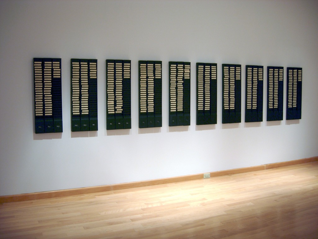
In & Out – 1997 ongoing until 2032

Steel time card racks & punched cards

Current dimensions of installed work is approximately 28 feet

This work was purchased by a private collector in 1999 and he continues to purchase each years cards

Installation view of 1997-2008: Time as Activity at Netwerk Center for Contemporary Art. Aalst, Belgium 2009

Ongoing project where I keep track of my ‘working hours’ in the studio on an old punch clock. Started in 1997, this project will end in 2032 when i turn 65.

Sourced from Kelly Mark’s Website

  1/8Hiccup #1 (Toronto) – 2000
30 day public performance/intervention 
7-channel video installation: 15 minutes each, silent 
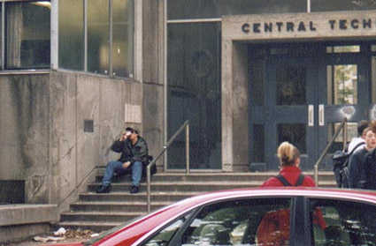
Commissioned by Public for the exhibition Being on Time at Central Tech. Toronto, 2000
Photo Credit: Emily Brian. Video credit: Marc PiccinatoThis 7-channel video entitled Hiccup is based on a 30 day performance that took place daily between 8:45 am & 9:00 am at Central Tech High School in downtown Toronto. Conceived as an orchestrated “ballet of the ordinary”, the work pivots on the play of two differentiated timelines: my standardized routine of carefully choreographed body movements, juxtaposed against the limitless variables of the everyday world.
Everyday for one month I arrived at the front of the school at the exact same time, wearing the same clothes and sitting on the same step. Then as the students began to arrive, I began my performace of a pre-set routine of simple everyday actions. I smoked a cigarette, took sips from my coffee, looked to the left, stretched my leg, adjusted my hat, red the same 5 pages from a book and underlined the same passage etc… Although appearing to be moving and acting in a completely natural and spontaneous way I was in fact, with the aid of a pre-recorded audio track on headphones, completing the exact same actions and gestures everyday at exactly the same time. For one month I entered into the normal daily routine of the people around me as a background element… a small anonymous deja-vu experience.
During this month I had 7 days of this performance video taped from across the street, this is what was exhibited, and the effect of each video shows me moving in synch with myself from monitor to monitor while everything else around me is different.

Note how these artists try to make a portrait of a larger attribute of humanity – using strategies of conceptual art, systems, series’, and stand-ins to help us make sense of abstract ideas, or things that are not usually documented, and to respond in new ways.

Micah Lexier:

tumblr_mi4aeaqel21s5ex3go1_1280
tumblr_mi4aeaqel21s5ex3go2_1280

A Portrait of David, 1994.

Life-size photographs of men and boys named David, one of each each from age 1 to age 75. Commissioned by and presented at The Winnipeg Art Gallery

screen-shot-2016-11-20-at-9-13-41-pm

David Then & Now, 2004.

Bus shelter project presented throughout downtown Winnipeg, presented by Plug In ICA. This is the follow up project to A Portrait of David, in which we photographed one David of every age, from age 1 to age 75. For this project, David Then & Now, we located as many of the original Davids as possible and photographed them exactly 10 years later.

Sourced from Micah Lexier’s Tumblr

Katie Patterson:

Langjökull, Snæfellsjökull, Solheimajökull

2007

Sound recordings from three glaciers in Iceland were pressed into three records, then cast and frozen using the meltwater from each corresponding glacier. The discs of ice were then played simultaneously on three turntables until they melted completely.

Langjökull, Snæfellsjökull, Solheimajökull

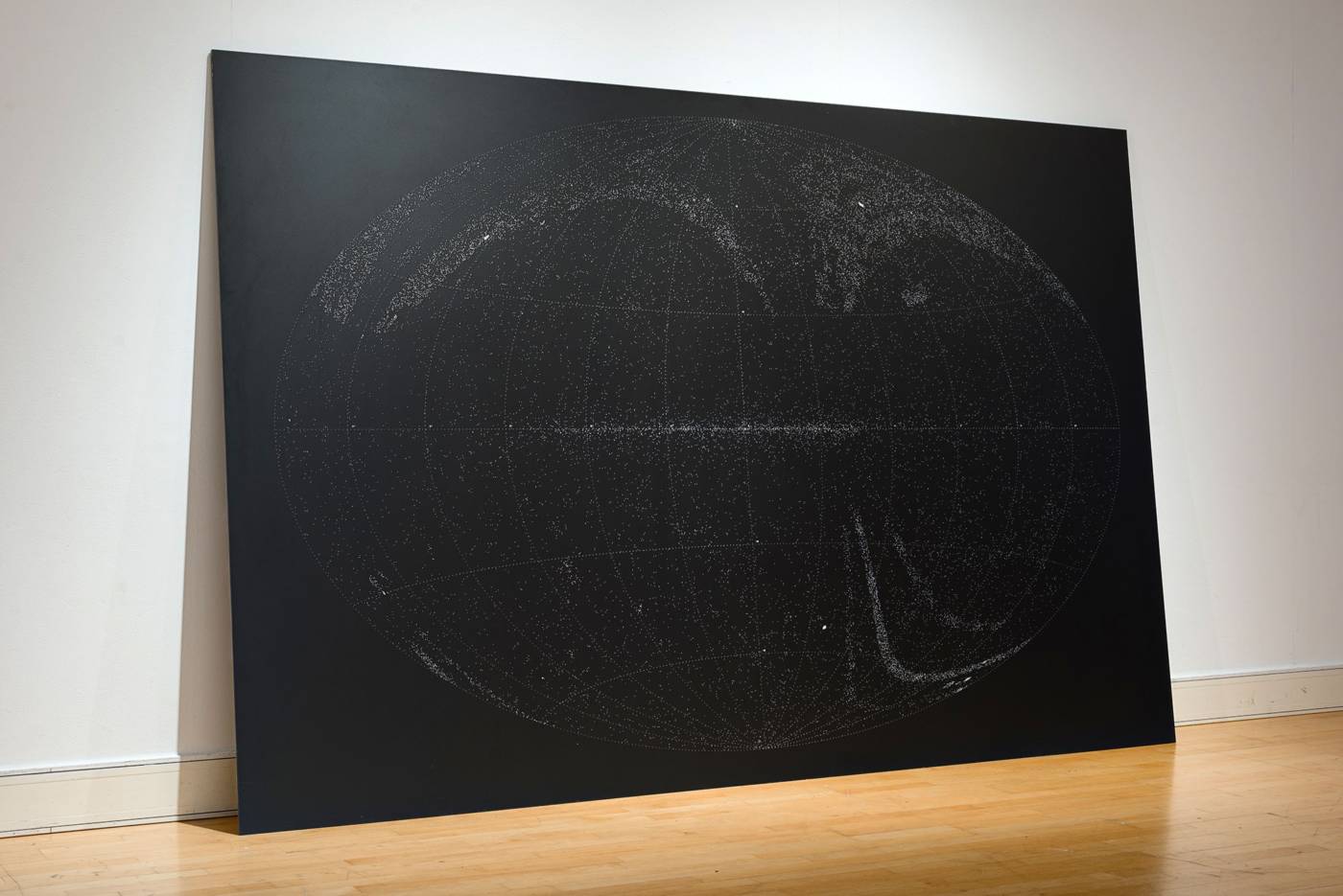
All the Dead Stars

2009

A map documenting the locations of just under 27,000 dead stars – all that have been recorded and observed by humankind.

2019

Adrian Piper

Adrian Margaret Smith Piper (b. 1948) is a first-generation Conceptual artist and analytic philosopher. She began exhibiting her artwork internationally at the age of twenty, and graduated from the School of Visual Arts in 1969. Adrian Piper produces artwork in a variety of traditional and nontraditional media, including photo-text collage, drawing on pre-printed paper, video installation, site-specific sculptural installation, digital imagery, performance and sound works. Piper’s works locate the viewer in a direct, unmediated and indexical relation to the concrete specificity of the object of awareness. They consistently explore the nature of subjecthood and agency, the limits of the self, and the continuities and discontinuities of individual identity in the metaphysical, social and political contexts.

Source

piper_01

Catalysis III, 1970

In her Catalysis series, Adrian Piper physically transformed herself into an odd or repulsive person and went out in public in New York to experience the frequently disdainful responses of others.

Source

mythicbeing
1973_ap_mythicbeing_still2_lg

The Mythic Being, 1973

In 1973, Adrian Piper created an alter-ego, the Mythic Being, who became the basis of a pioneering series of performances and photo-based works. Piper—a light-skinned woman of mixed racial heritage—transformed herself into the Mythic Being by donning an Afro wig, sunglasses, and mustache and adopting behavior conventionally identified as masculine. She then explored how she and others responded to the Mythic Being. In the process, she transformed the conceptual art practices common in the period, infusing them with strong personal and political content.

Source

ap_callingcards

Calling Card, 1986

Piper also explores issues of personal identity and social boundaries. Using the antiquated nineteenth-century social convention of calling cards, Piper adopts a passive-aggressive approach to showcase how racism and sexism are intrinsically harmful. One of the two “calling cards” in the Indiana University Art Museum’s collections (the brown one) uses misperception of her race (she is a light-skinned African American) to directly confront anyone who utters a racist remark in her presence. The white card thwarts the presumption of men that she is available simply because she is unaccompanied. She says she handed these cards out in the above situations and has since exhibited them for viewers to take and use. While not precious or valuable in the traditional sense, they clearly represent her ideology. The focus in these mass-produced objects is not on craft, but on the ideas behind their production.

Sophie Calle:

Take Care of Yourself:

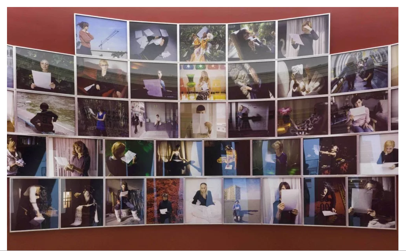
In 2007, the conceptual and performance artist Sophie Calle was chosen to represent France at the Venice Biennale. The installation she created for the French pavilion, titledPrenez soin de vous (Take Care of Yourself), comprises hundreds of photographs, documents and videos that depict 105 women’s (plus two puppets’ and a parrot’s) interpretations of the same source document: a break-up email sent to the artist by her lover in 2004 which ends with the cryptic and seemingly offensive parting, ‘Take care of yourself’. The email’s clichéd ending became the instructional imperative for the artwork but, unlike her other works, in which Calle played a central and active role as artist-protagonist, Prenez soin de vous constitutes a dispersal of autonomous artistic authorship, offering up in its place a collective form of interpretive labour by other women. By inviting so many different women to interpret the breakup email based on their professional expertise, Calle’s project engages – perhaps accidentally – in a feminist critique of women’s work in the post-industrial, service-based economy or a commentary on women’s current roles as both producers and consumers of culture.

Spring Hurlbut

Memorial portraits, representing the intangible:

SPRING HURLBUT. PEEWEE #3, 2007. NATIONAL GALLERY OF CANADA. PHOTO: NATIONAL GALLERY OF CANADA.

“Hurlbut “wanted to do something that was secular, but something that was meaningful to me, and that was to investigate the ashes of my late father, James.”
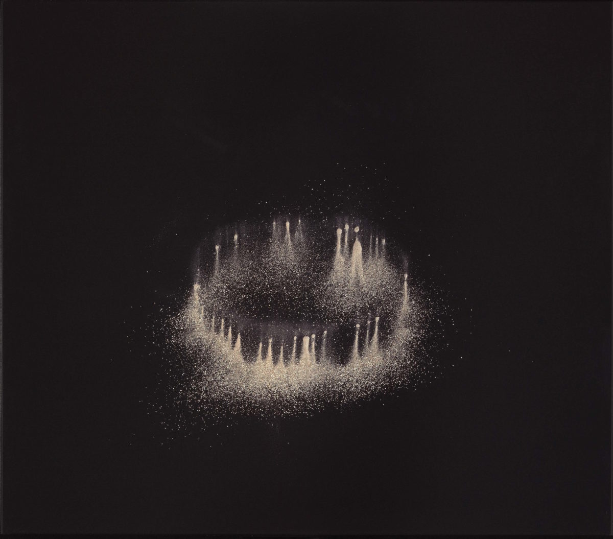
Hurlbut had her father’s ashes in her Toronto studio for five years. Finally, she decided to photograph them.
“When I began this process, I didn’t even think I could call it art. It was just something I urgently needed to do for myself.” But when she exhibited the photographs for people who had allowed her to use the ashes of their loved ones, “it turned this very sombre affair into a cathartic experience.” From https://artsfile.ca/bearing-witness-governor-generals-visual-arts-laureates-ask-much-of-the-viewer/

Felix Gonzales Torres:

Felix Gonzalez-Torres

Felix Gonzalez-Torres was born in Guáimaro, Cuba, in 1957. He earned a BFA in photography from Pratt Institute in Brooklyn, New York, in 1983. Printed Matter, Inc. in New York hosted his first solo exhibition the following year. After obtaining an MFA from the International Center of Photography and New York University in 1987, he worked as an adjunct art instructor at New York University until 1989. Throughout his career, Gonzalez-Torres’s involvement in social and political causes as an openly gay man fueled his interest in the overlap of private and public life. From 1987 to 1991, he was part of Group Material, a New York-based art collective whose members worked collaboratively to initiate community education and cultural activism. His aesthetic project was, according to some scholars, related to Bertolt Brecht’s theory of epic theater, in which creative expression transforms the spectator from an inert receiver to an active, reflective observer and motivates social action. Employing simple, everyday materials (stacks of paper, puzzles, candy, strings of lights, beads) and a reduced aesthetic vocabulary reminiscent of both Minimalism and Conceptual art to address themes such as love and loss, sickness and rejuvenation, gender and sexuality, Gonzalez-Torres asked viewers to participate in establishing meaning in his works.

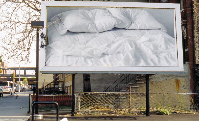
Also in 1992, Untitled (1991), a sensual black-and-white photograph of Gonzalez-Torres’s empty, unmade bed with traces of two absent bodies, was installed on 24 billboards throughout the city of New York. This enigmatic image was both a celebration of coupling and a memorial to the artist’s lover, who had recently died of AIDS. Its installation as a melancholic civic-scaled monument problematized public scrutiny of private behavior.
1989pubartex1_001b_ar3

Untitled

1989
Billboard

1990gf9040rf1_001c_lr3

Untitled (Perfect Lovers)
1987-1990
Wall clocks

Untitled (Portrait of Ross in L.A.), 1991

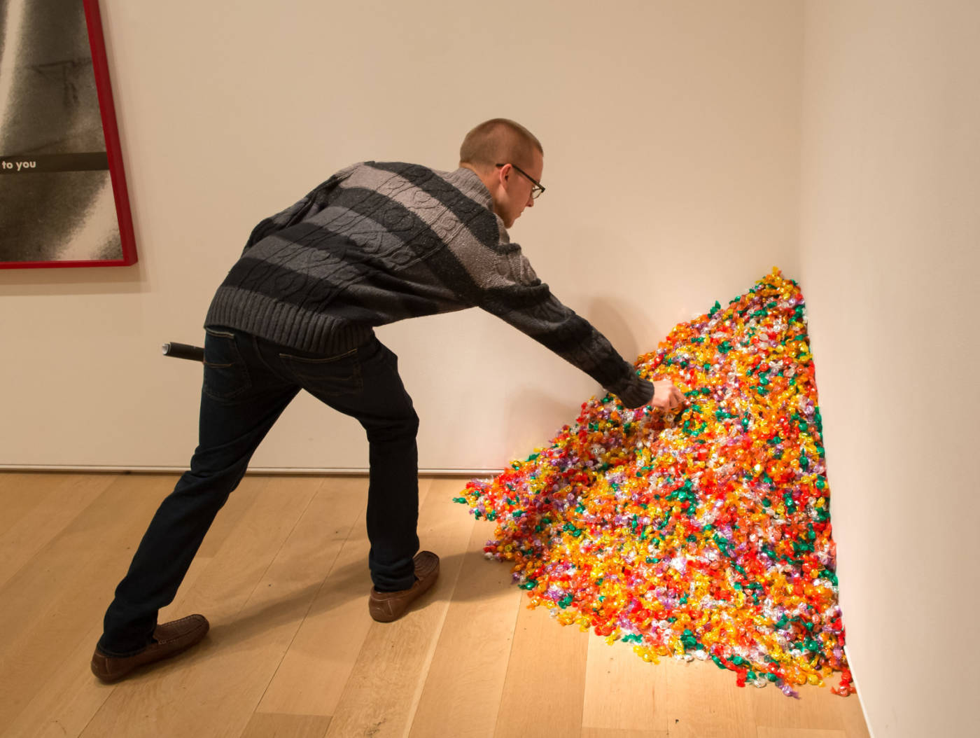
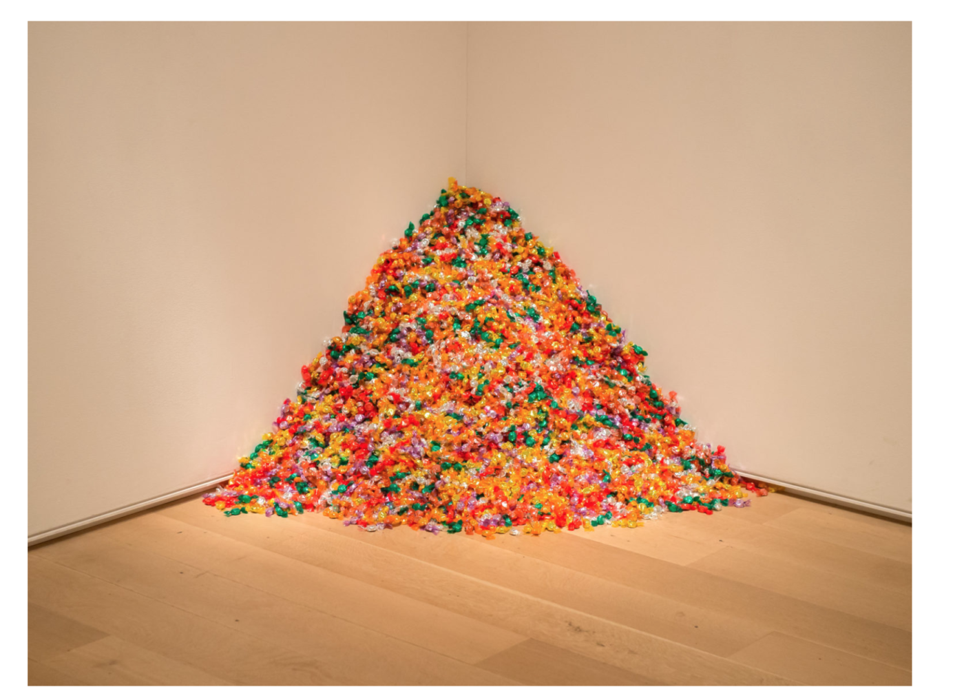
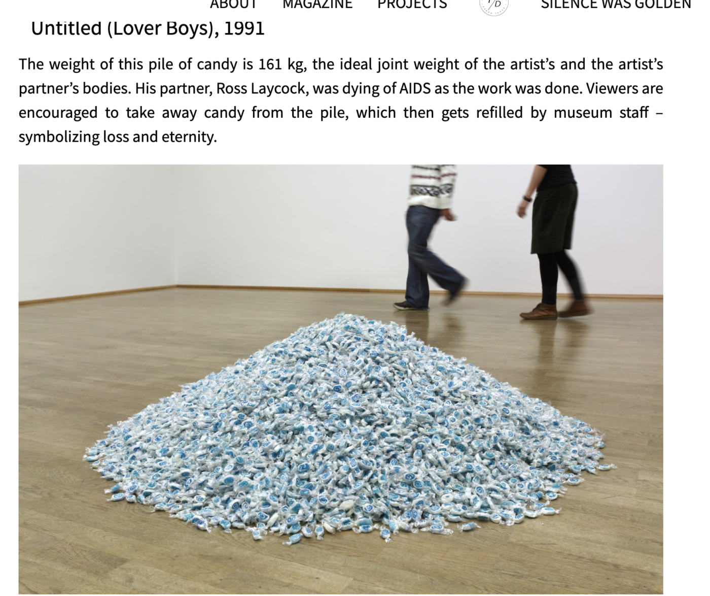
The approximate 175 pounds of candy that make up the work resembles the 175-pound body of Ross Laycock, the artists’ boyfriend who died of AIDS in 1991. As each person takes a piece of candy, they in turn act as the AIDS virus depleting Ross’ body, piece by piece taking it away until there is nothing left. Felix Gonzalez-Torres, who dedicated his artwork to the one he loved and lost, died in 1996 of AIDS.

His work doesn’t only represent the disease and its depletion on the body, but it represents the love between the person who is suffering from the disease and the person who is there to support them and suffer with them. The sweet candy, in and of itself, is a representation of love. If you think about giving candy to a loved one on valentine’s day, sweets in a box with flowers on mother’s day, candy has long been tied to affection and love. While the candy is eaten, while the body begins to disappear, the love remains.

Source

Sara Berman’s Closet – Maira Kalman

Rene Morin, 2023

Morin made this video to document the things they noticed about Canada after living abroad – a kind of portrait of a place through European eyes. They listed the items in alphabetical order, and used found images from the internet, along with some of their own photographs to document them.

What’s she thinking?

Inspired by Kelly Marks cat video, my piece shows a ‘portrait’ of Paris through her reactions. When it comes to fight or flight horses are a flight animal. They can have big reactions to small things, then no reaction at all to something that you would expect to scare them. Using Paris for this idea works perfectly because she won’t be acting. If I were to have done this with one of my friends, wether they realize it or not, their reactions would be fake or exaggerated because they know I want a reaction from them. Whereas my horse doesn’t understand what is happening. If she is scared she will run, and if she doesn’t care about what I have to show her she will just stare at me or walk away. So by using her I am able to capture a genuine reaction every time. I am happy to say I have a very curious and brave horse, which is shown through the video. It is interesting how we can get a sense of her goofy personality through watching what she thinks of something like an umbrella, or a flag. While watching you can also get a sense of our relationship. I have owned Paris for three and a half years now, overtime gaining her trust and forming a bond. Her reactions are contingent on that trust.”

Ashleigh Knight, 2023

Assignment:

Make a CONCEPTUAL PORTRAIT*

Works can be in prints, slide-show images, video, audio, or found object sculptures and installations. Consider using text in your work when needed. Maximum limit for time-based works is 3 minutes.

_____________________________________________________________________

“In conceptual art the idea or concept is the most important aspect of the work… all planning and decisions are made beforehand and the execution is a perfunctory affair. The idea becomes the machine that makes the art.”

Sol Lewitt, from Peter Osborne, Conceptual Art, Phaidon, Themes & Movements

“The system is the work of art; the visual work of art is the proof of the System. The visual aspect can’t be understood without understanding the system. It isn’t what it looks like but what it is that is of basic importance. “

Sol Lewitt

For this open media project you will create a representation of someone or something – in a non-literal way. You will create your conceptual portrait by using a system – like a rule, a formula, a series of tasks, or an experiment to plan and create the work.

Your work will not be narrative or decorative – it will include only what is necessary to convey your information, follow your task, or show the results of your experiment.

 Let the system be the “machine that makes the art.” For example the work might be:

  • An uncommon documentation of an aspect of life, using a series of images or forms of data
  • A collection of objects to make a portrait/ represent an abstract concept
  • Show the results of an experiment performed, to learn surprising truths about something

Consider, how does your series, collection, or system convey an idea, or make us understand something in a new way?

Felix Gonzales Torres
Micah Lexier
Germaine Koh
Sophie Calle
Tom Friedman
Douglas Gordon Roula Parthniou
Hannah Black Dean Baldwin Katie Patterson

On the Blog: DRAFT a proposal of your ideas for discussion in the next class

Write about an artist reference from the lecture that informs your thinking – use images and prepare to discuss your proposal in our next class meeting:

*See schedule for work time and critique dates.

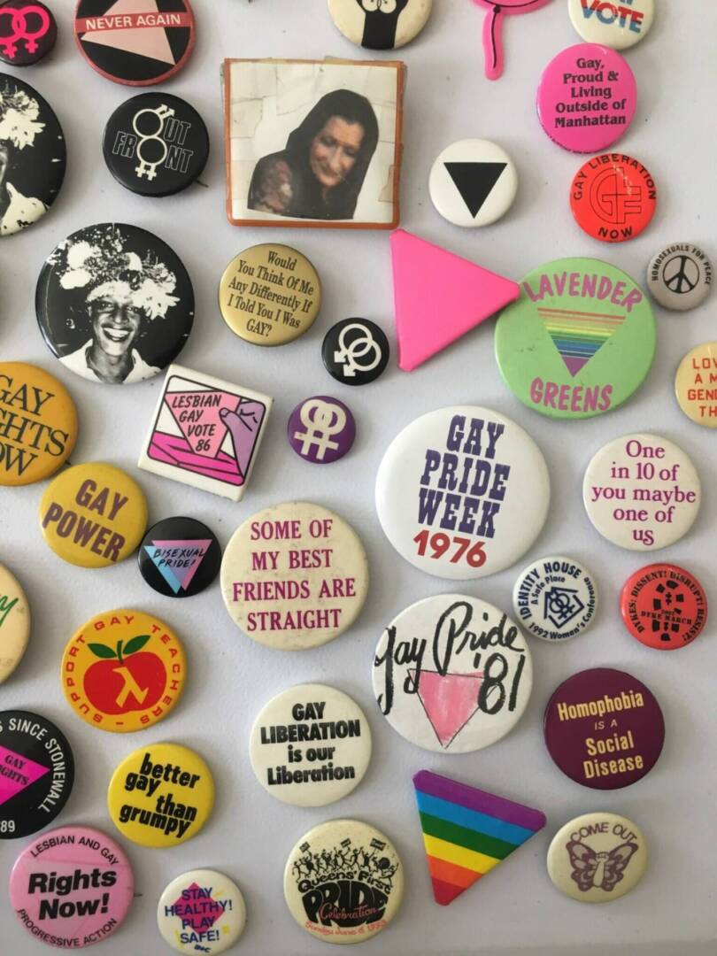
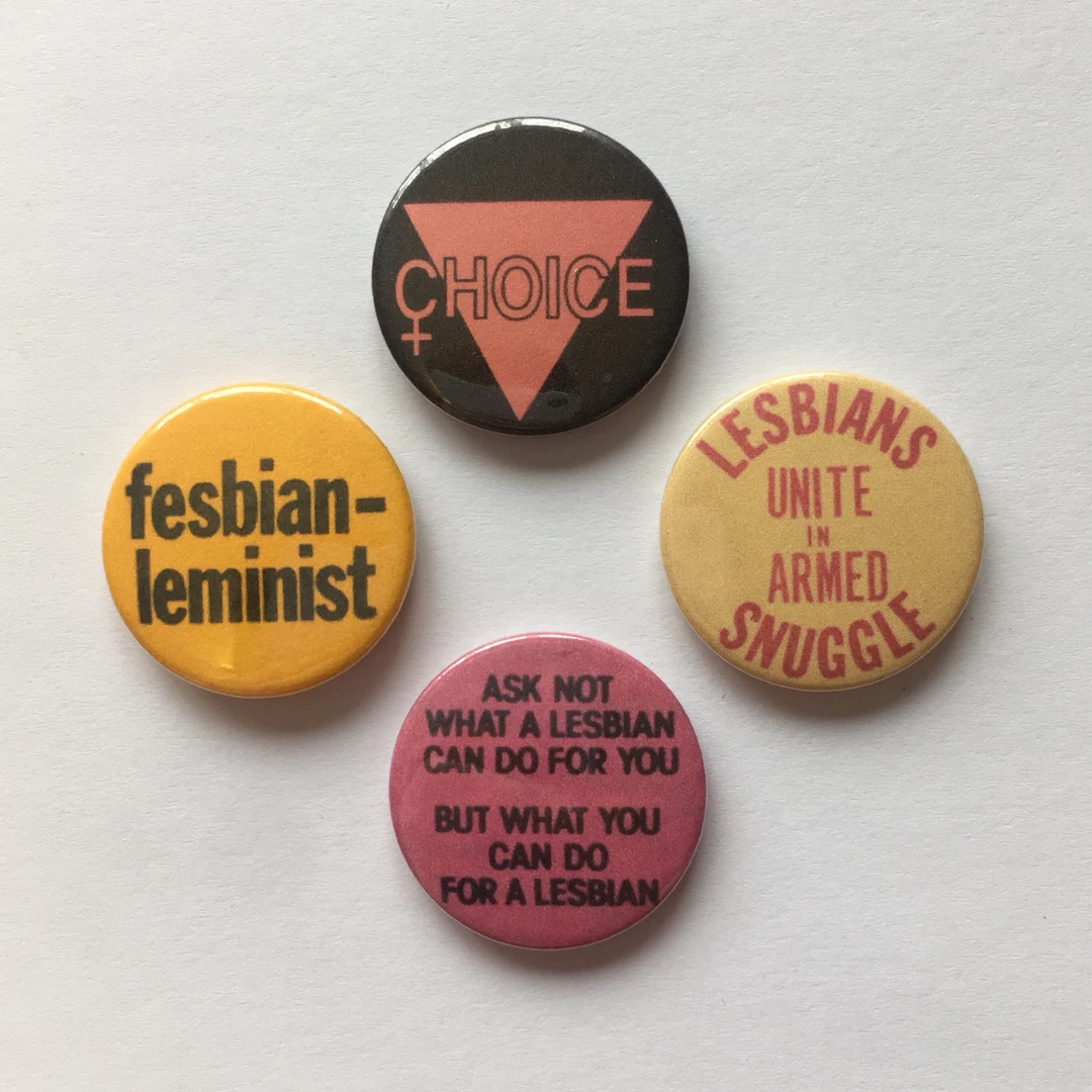
Artist Buttons

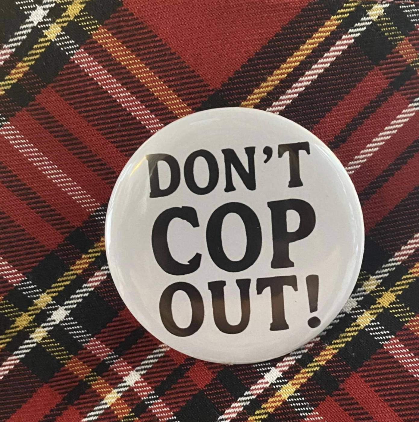
Since the 1950’s artists have been making inexpensive, accessible works in a series/edition intended for wider distribution than singular objects in museums. These have served to critique commercial/market aspects of the art world, and the myth of an expensive “original”. Artist multiples have been made as prints, small manufactured sculptures, pins, artist books, magazines, postcards, t-shirts, zines and other commercially reproducible media. They are sometimes given away for free, traded or sold for low cost in bookstores, independent art galleries, libraries, convenience stores, activists’ gatherings, and more.

Artist multiples are sometimes playful and mischievous – exploring new and surprising manifestations of commercial media – and often convey ideas and meaning against expected commercial, social, and political goals.

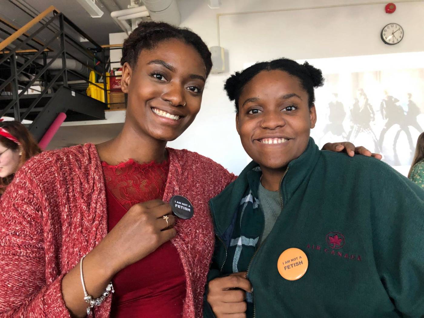
Student buttons – I am not a Fetish (2018)

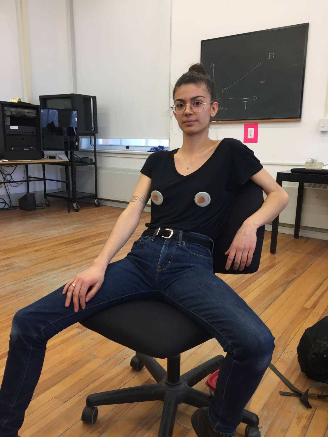
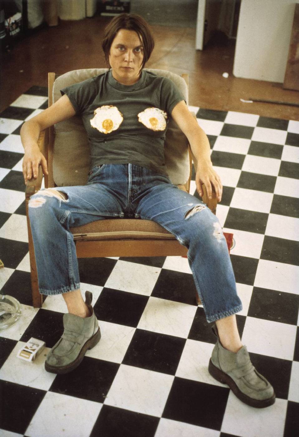
Emily Reimer, Fried Egg Buttons (After Sarah Lucas) 2018

Self Portrait with Fried Eggs 1996 Sarah Lucas born 1962 Purchased 2001 http://www.tate.org.uk/art/work/P78447

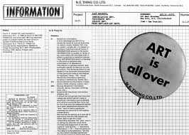
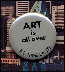
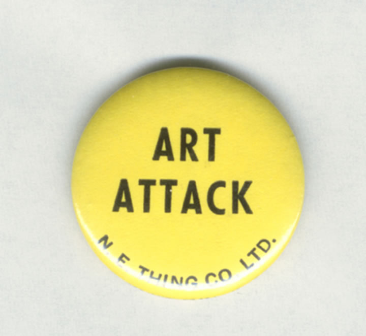
Buttons by NEThing Co. (1960’s Vancouver)

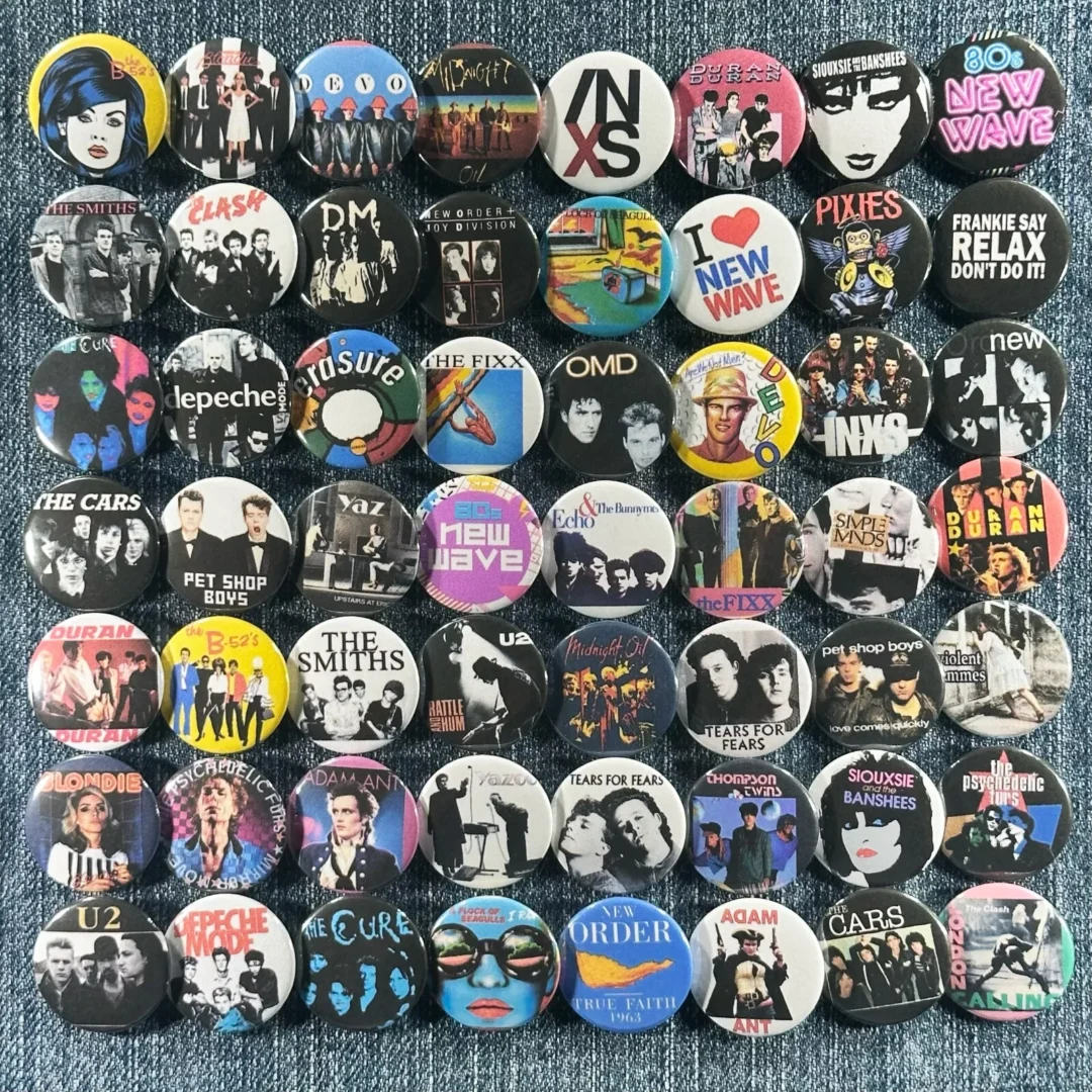
*0s music pins
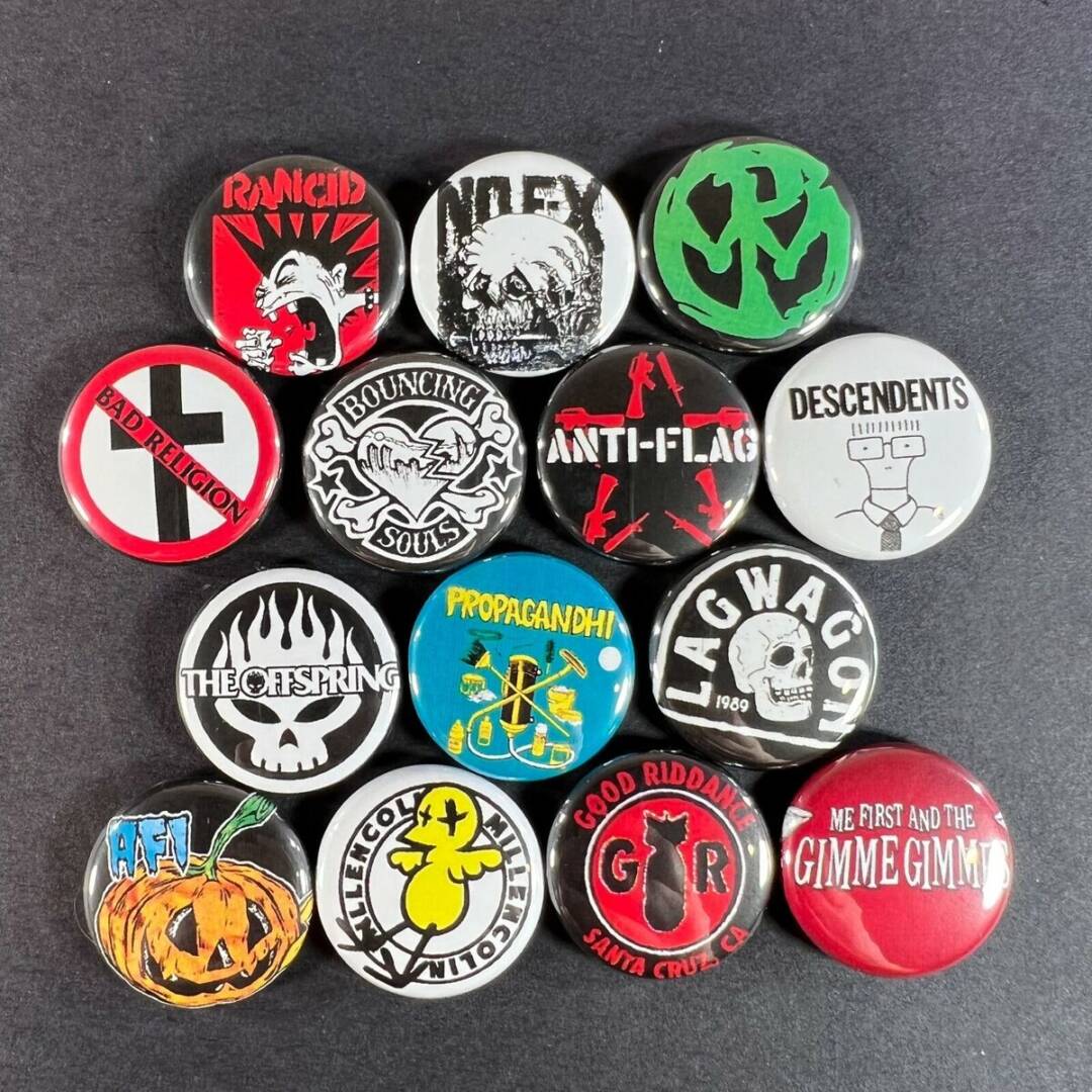
90’s punk pins

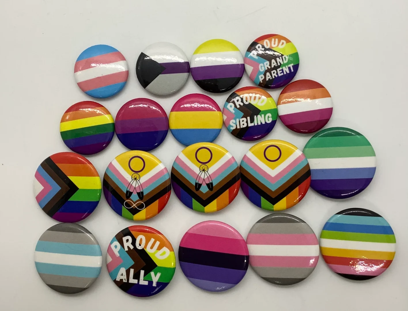
Contemporary Pride/Diversity pins
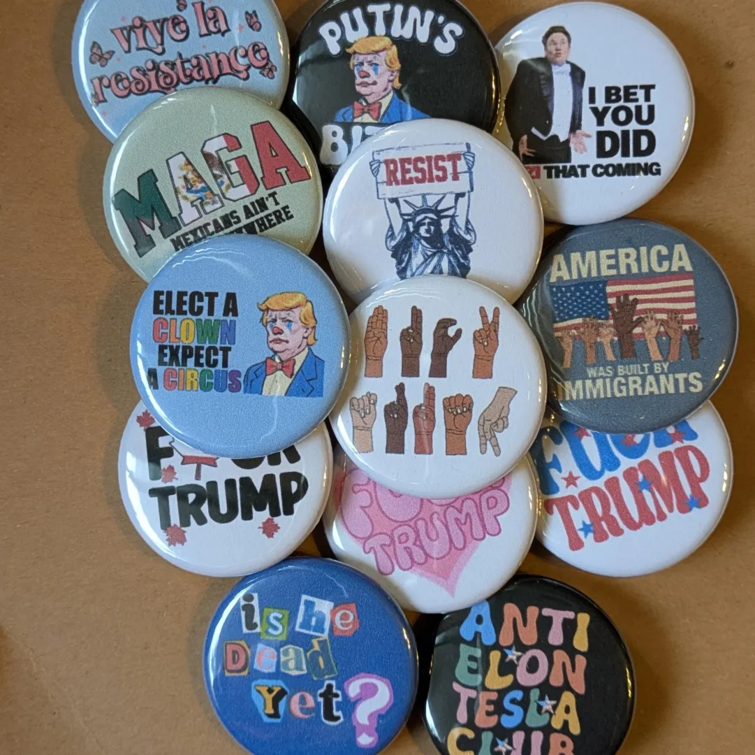
Anti-Trump pins/US
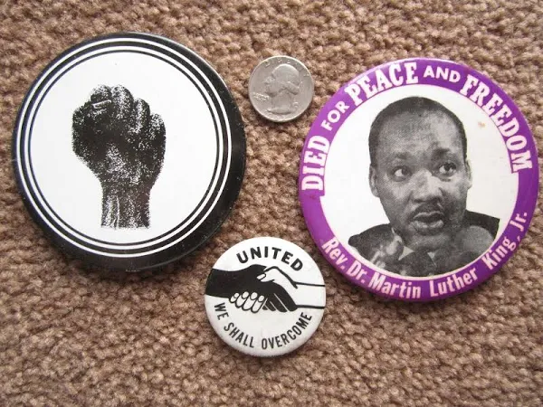
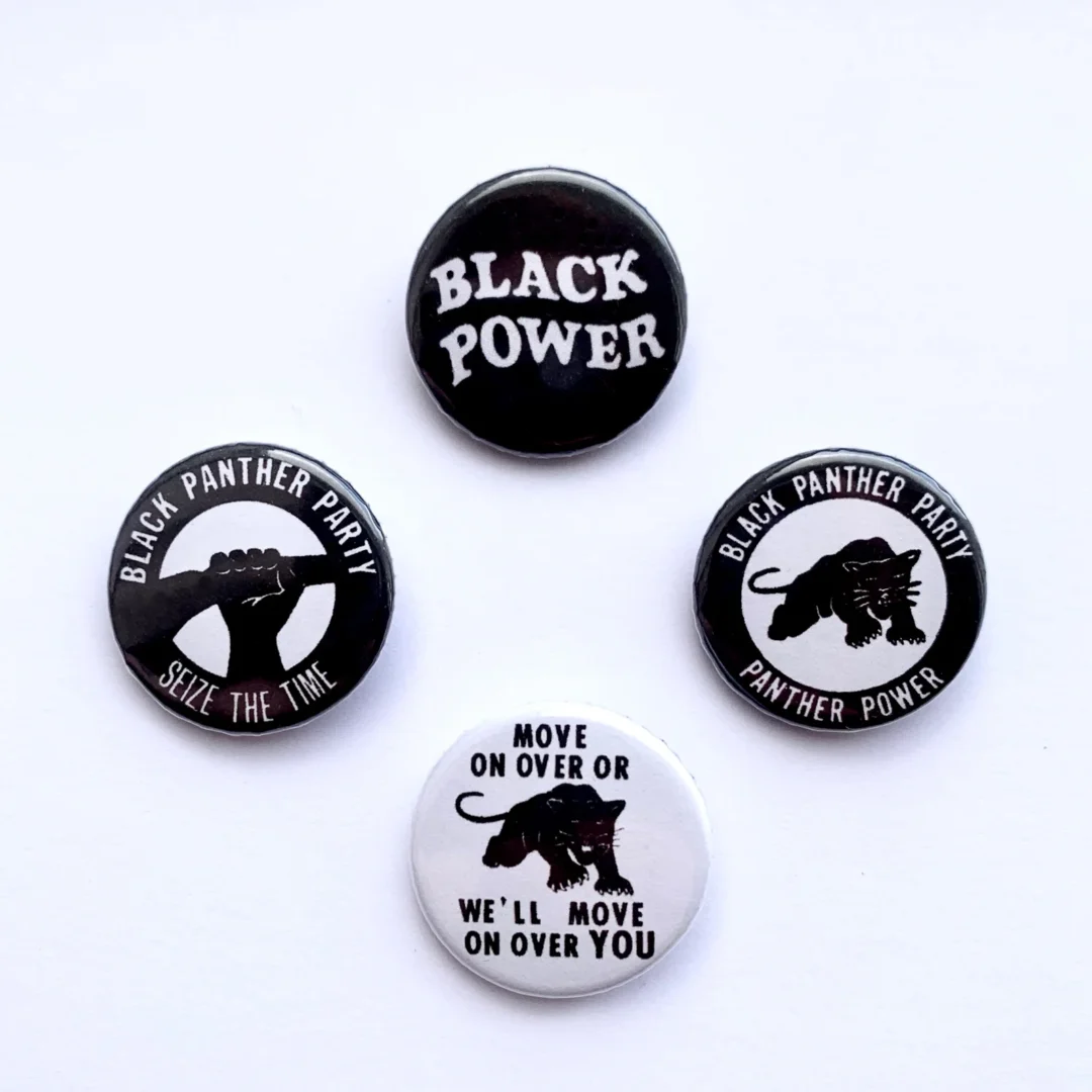
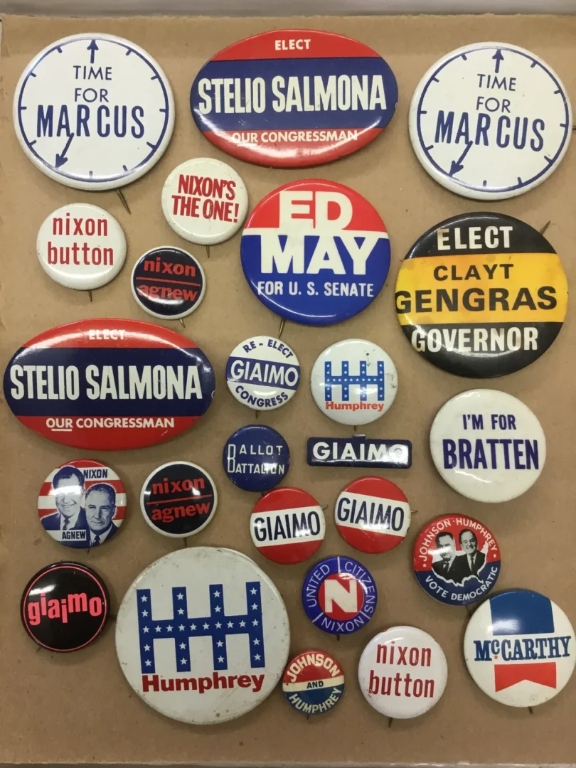
Vintage US political pins

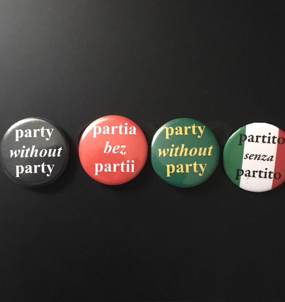
Party Without Party, Bruce Barber

RM Vaughn – Buttons

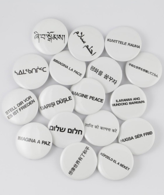
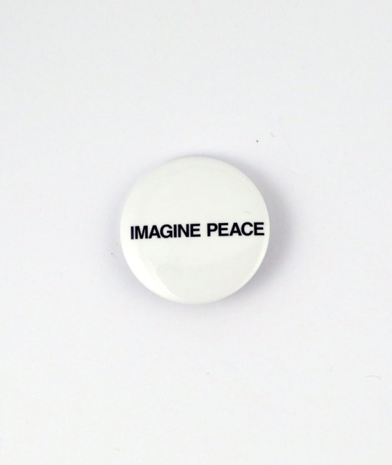
Imagine Peace Buttons by Yoko Ono

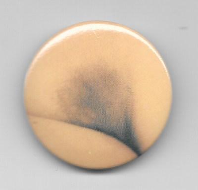
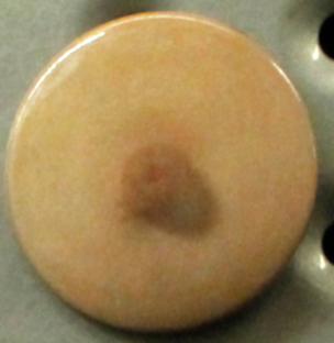
Crotch Button, and Breast Button by Yoko Ono (from Printed Matter NYC)

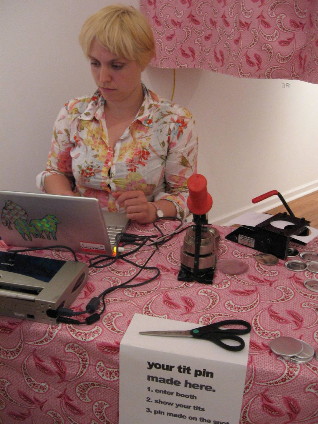
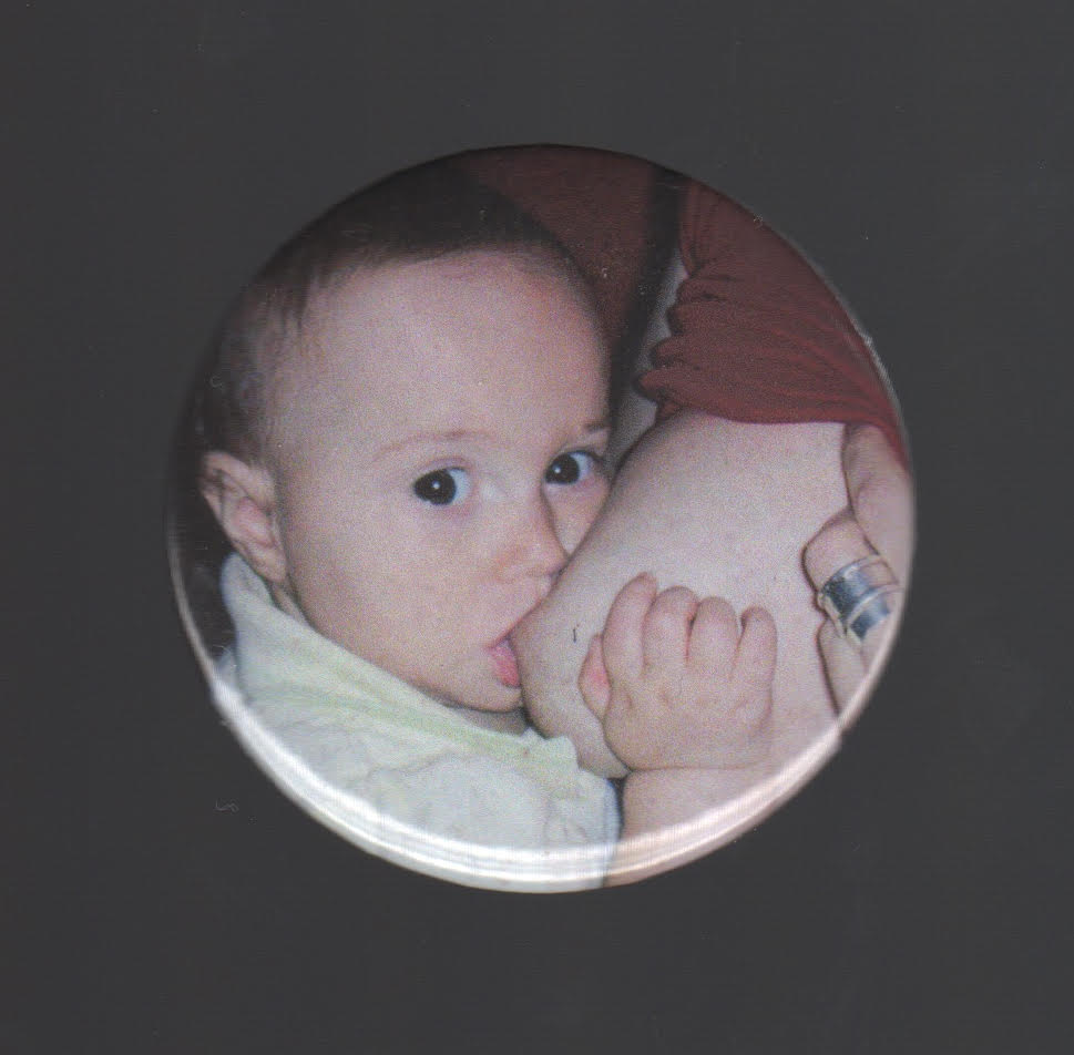
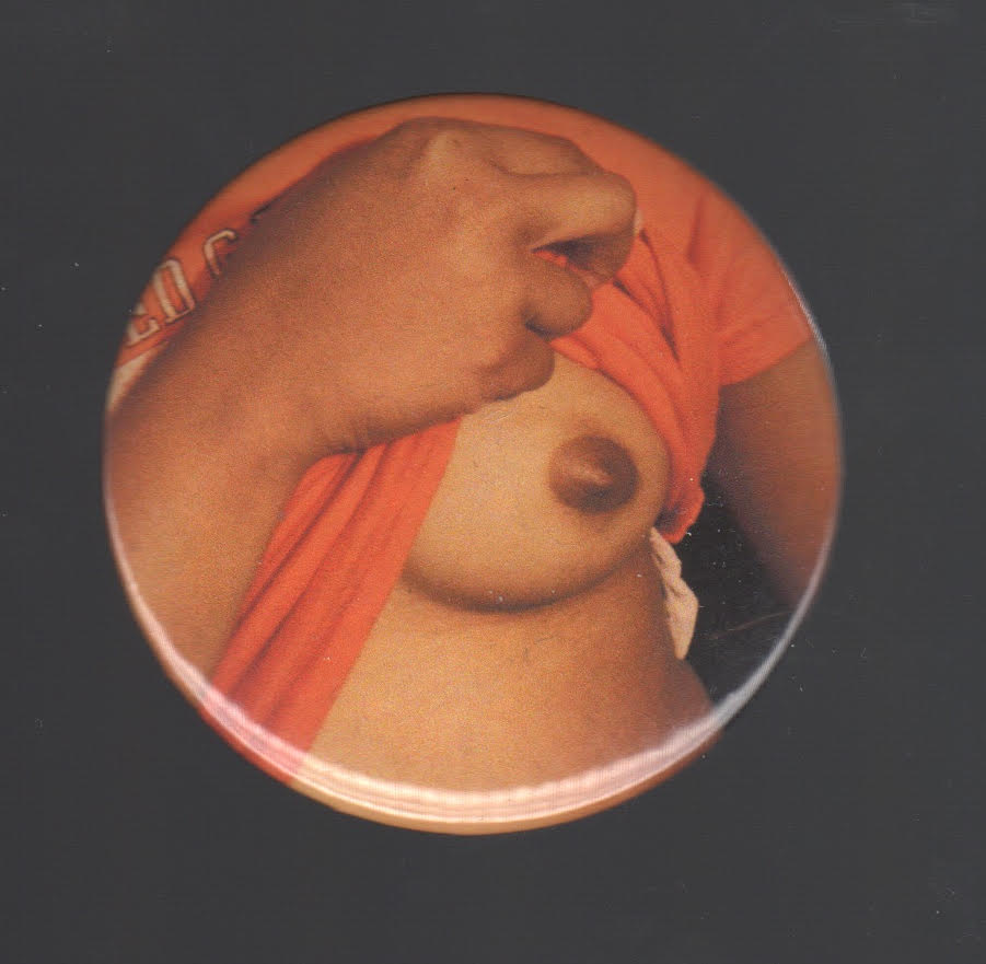
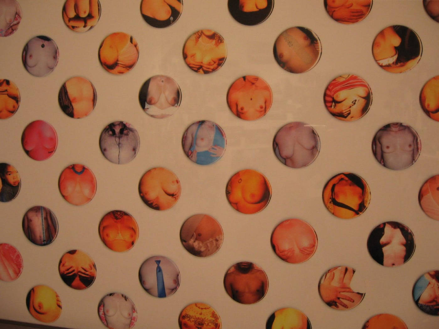
Tit Pins, by Paige Gratland, 2004

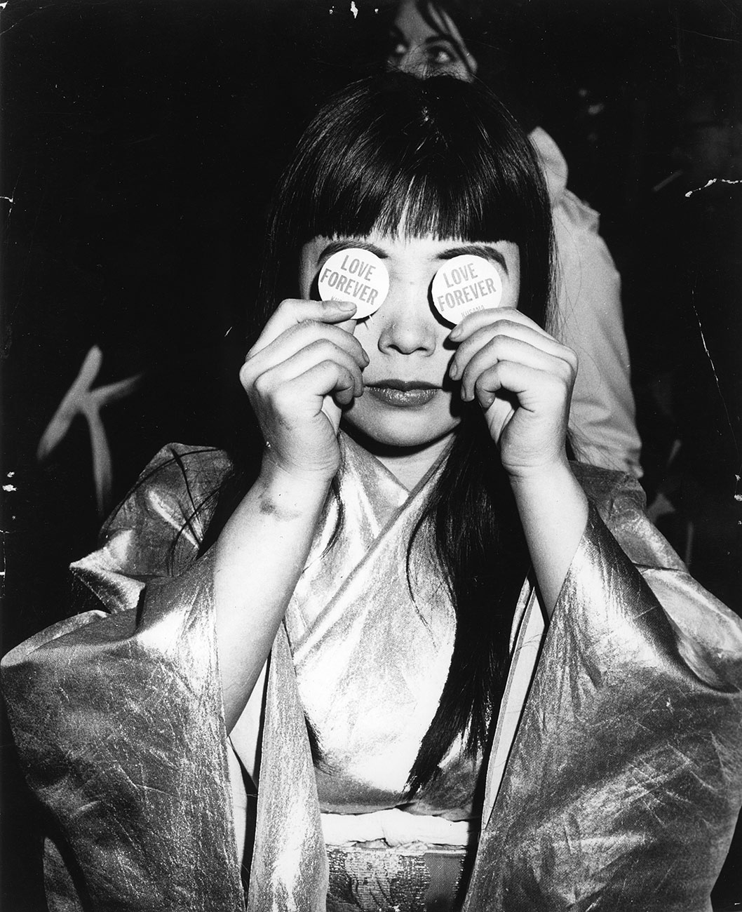
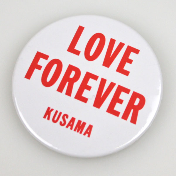
Yayoi Kusama, Love Forever

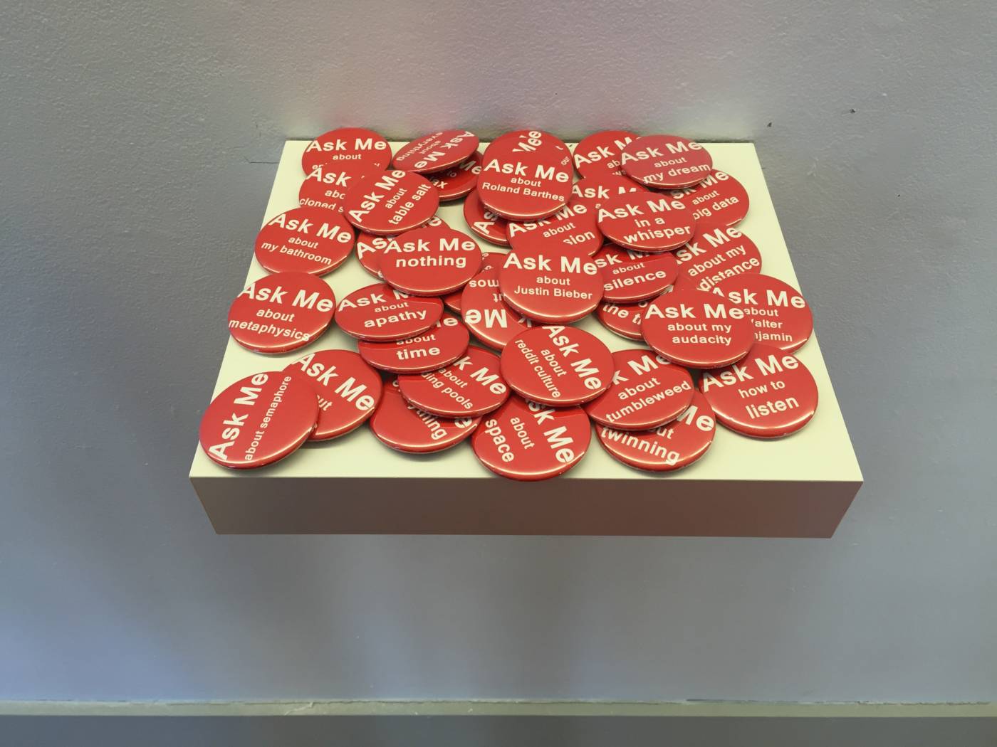
Jessie Eisner, Ask Me Buttons, 2014

Kelly Mark, Everything is Interesting, 2003

Lyla Rye –  Cameo buttons

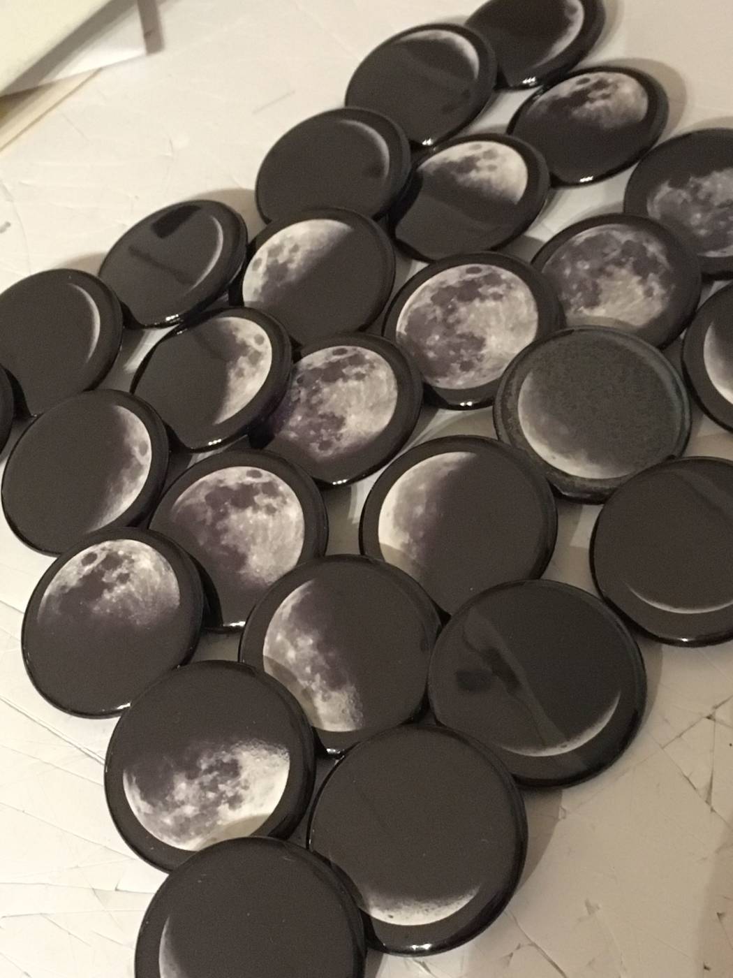
Adam David Brown, phases of the moon

Sandy Plotnikoff – Flash Pins and Velcro Pins

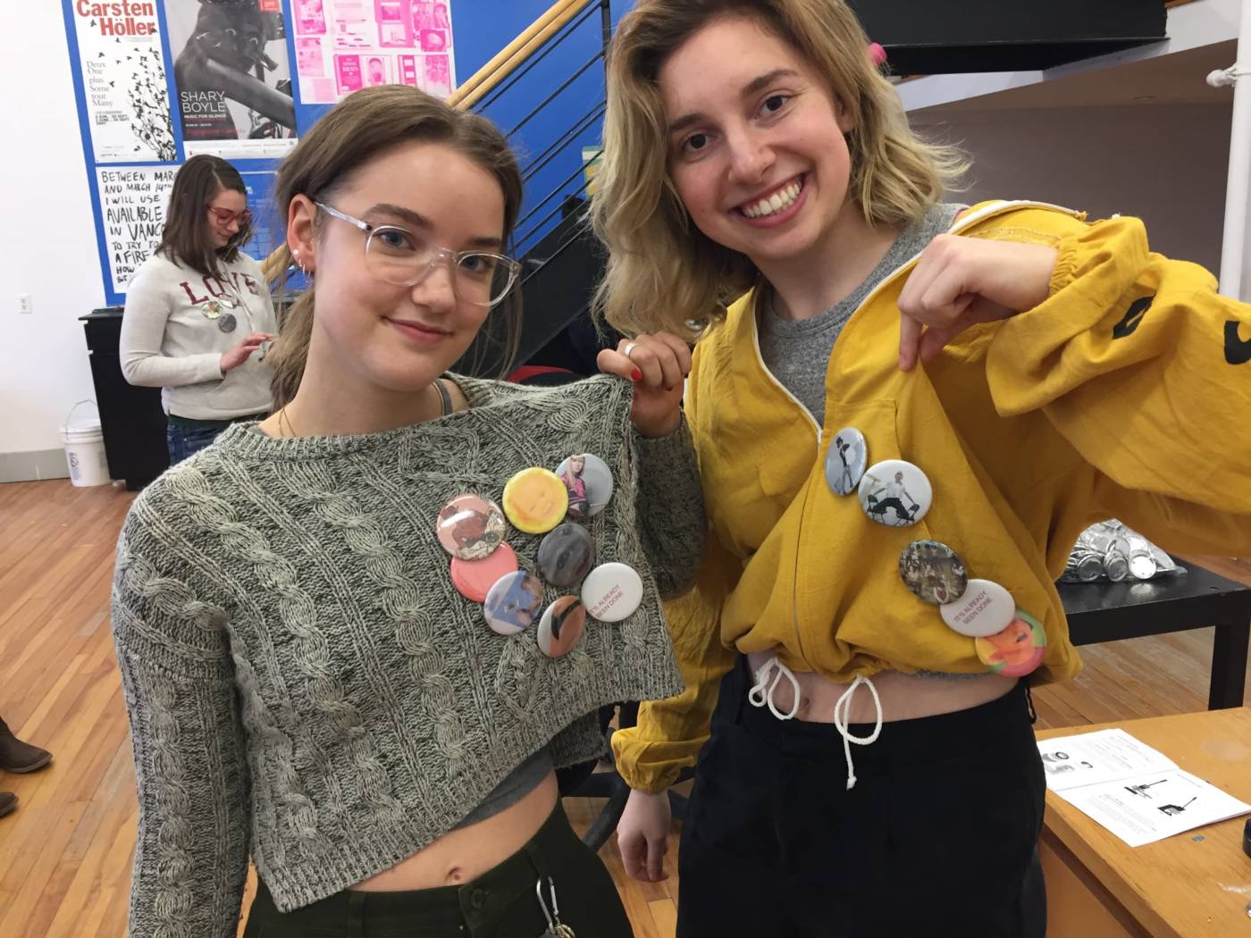
Students making buttons – 2018

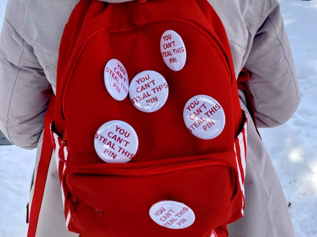
Anti-Theft Pins, 2.25 inches wide

With these pins, I wanted to run a sort of experiment on human behaviour and how people would react to seeing them. Originally, I thought that by issuing a challenge, people would be more likely to take the pin, but what really happened was the opposite.

I spent a day on campus, walking around and waiting in lines/crowded areas with the pins attached to my backpack. I thought that, since it was on my back, there were multiple to choose from, and the pins weren’t fully done up, people might be more tempted to take one. I even left some lying around in frequented areas like the library and the UC, but checking on them after a couple hours showed that out of the 12 pins I had placed on campus and on myself, only one had been picked up. The closest anyone came to taking the pins off my back were two people behind me in the Starbucks lineup that were whispering and debating about it, but eventually settled on taking a sneaky picture of my back instead. Unfortunately, people really couldn’t bring themselves to steal the pins, so they stay true to their name.

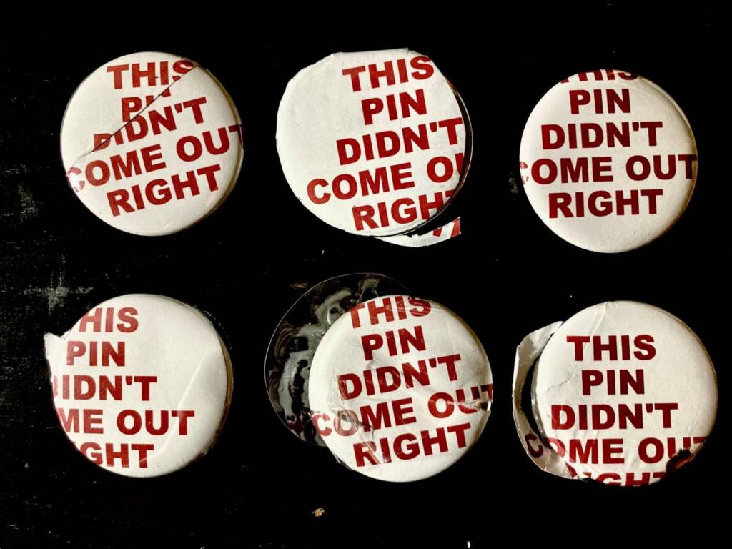
Failed Pins for Sale

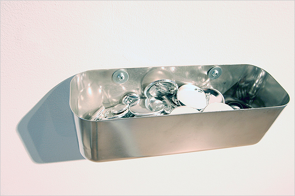
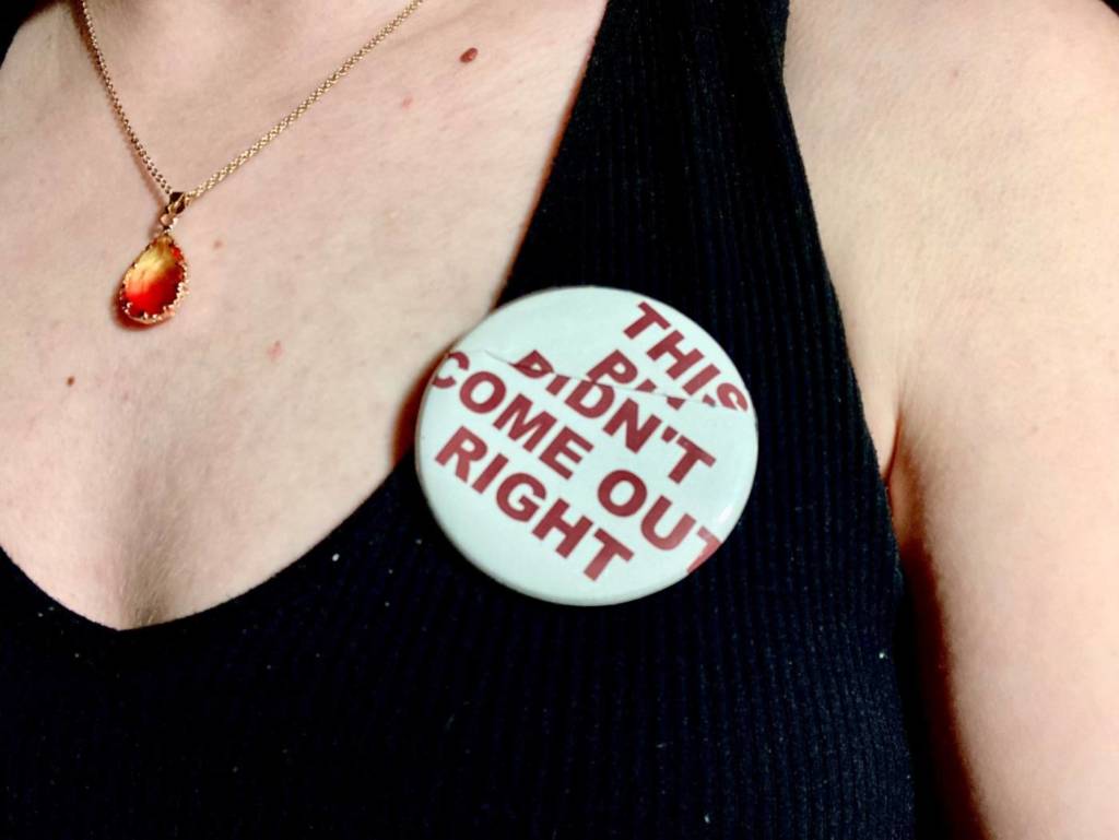
While I was making the first pin design, I was having a lot of trouble with the button maker and a lot of buttons were not usable. But! That gave me an idea for a new design to make along side of them. For these pins, I purposefully found ways to mess them up. In a way, they turned out exactly how I had planned.

I thought it would be fun to try and “sell them” and see what people would say to these messy buttons if I attached a steep price to them. I’ve posted them on a couple sites, and I’m still waiting to hear if people think I’m serious, or if they react to the advertisements in any way.

Product Pictures, used as examples in the ads

https://www.fiverr.com/anastatiart/make-you-one-of-a-kind-buttons

PLAYBOY Buttons

PLAYBOY Buttons

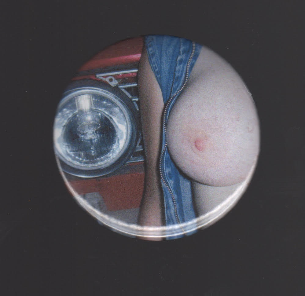
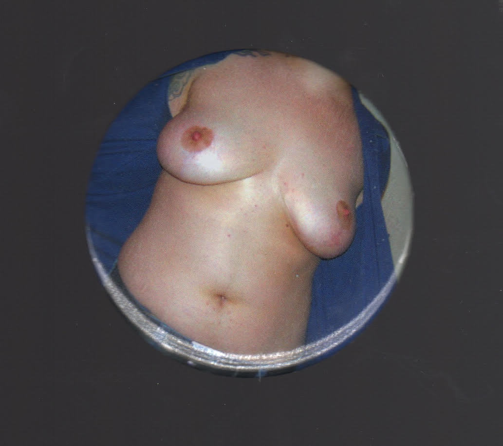
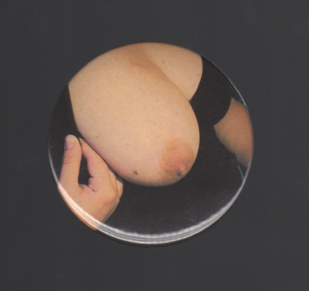
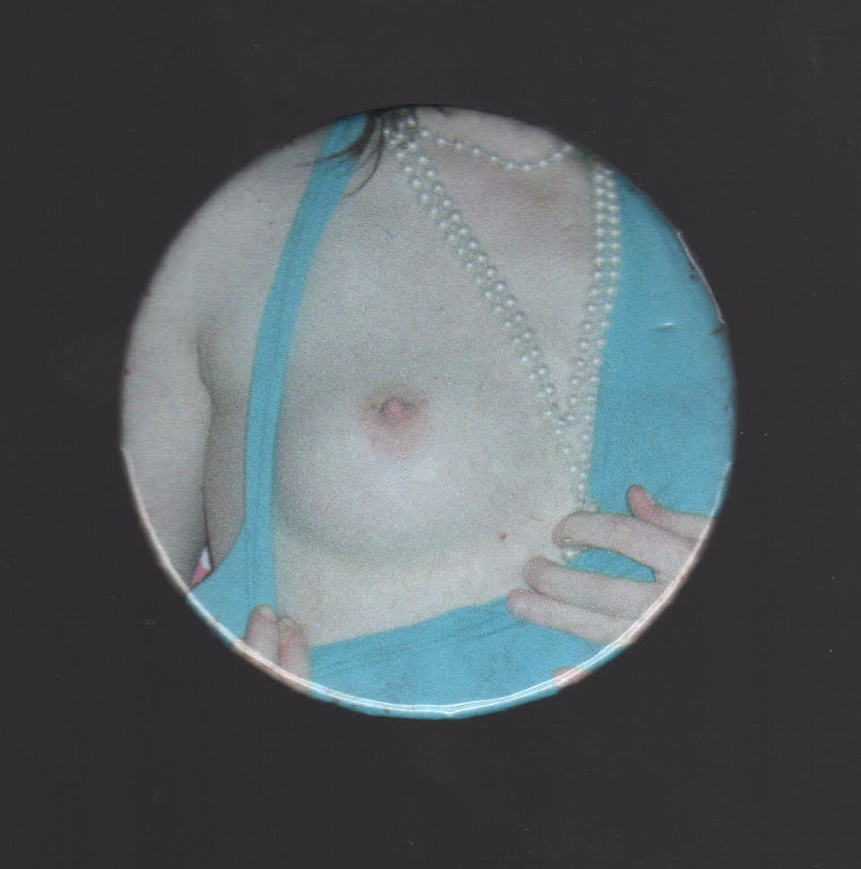
For this project I was really drawn to creating buttons that were each one of a kind and couldn’t be replicated multiple times, so from the start I wasn’t very interested in creating a graphic design for my buttons. I was also very interested in using a source of media to cut-out and create my buttons, so a magazine or newspaper seemed like the best options. I already had this 1971 February edition Playboy magazine that I had bought from an antique shop and it seemed like a very interesting material to use in order to explore aspects of femininity, empowerment, feminism and the absurdity of some of the aspects of Playboy magazines. I also really liked how the cut-outs of the magazine worked together as a collection, as each of the pieces work together to hint that these buttons are in-fact from a Playboy magazine. For example, just seeing a single button that is an explicit graphic or a naked woman doesn’t really speak to much, however as a collective the buttons make sense because you have a mix of explicit graphics, naked women, bunny iconography and erotic images viewers can gather that these are Playboy buttons. The buttons can also be quite nice as stand alone pieces (maybe pinned to a jacket or bag), however they can be quite controversial depending on the identity of the wearer. I really enjoyed the particular way that I decided to model the buttons, for example the nipple pins are quite entertaining and attention grabbing to wear over your actual nipples, especially since they are life sized. In addition, I think that my thrifted playboy jeans serve as a perfect canvas to display the buttons, the only thing that might be better would be a jean jacket version of the pants.

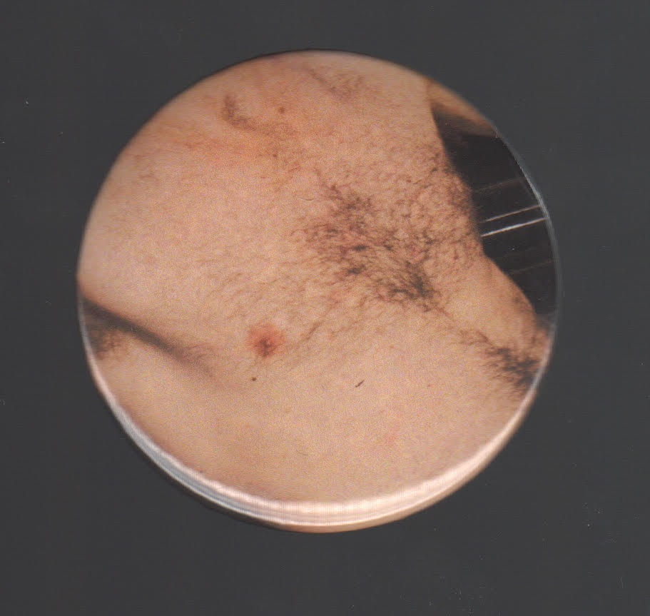
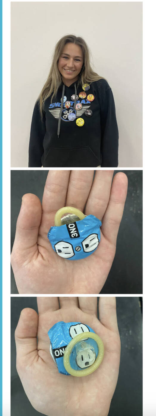
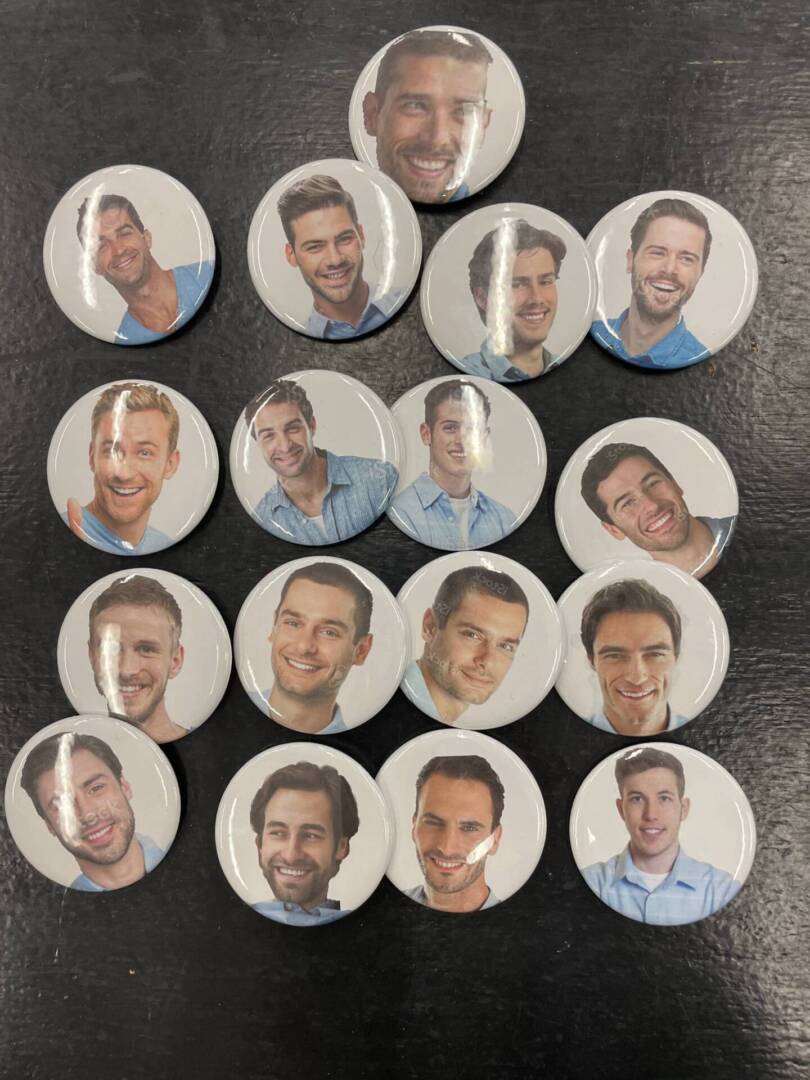
Generic Man, (Based on search for MAN on Google) Student work, 2023